shadcn.io is not affiliated with official shadcn/ui
A button opens a list of commands. One row can open a nested list when the first list would get too long.
Use it when the entries are actions, not a value the form stores. A menu that opens on right-click is a Context Menu and stays on the pointer. In Vue, Ark UI takes focus, typeahead, and Escape.
Installation
Anatomy
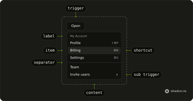
DropdownMenu
└── DropdownMenuTrigger
└── DropdownMenuContent
    └── DropdownMenuGroup
        └── DropdownMenuLabel
        └── DropdownMenuItem
        └── DropdownMenuSeparator
        └── DropdownMenuShortcut
        └── DropdownMenuSub
            └── DropdownMenuSubTrigger
            └── DropdownMenuSubContent
Usage
<script setup lang="ts">
import { Button } from "@/components/ui/button";
import {
  DropdownMenu, DropdownMenuContent, DropdownMenuGroup,
  DropdownMenuItem, DropdownMenuLabel, DropdownMenuSeparator,
  DropdownMenuShortcut, DropdownMenuSub, DropdownMenuSubContent,
  DropdownMenuSubTrigger, DropdownMenuTrigger,
} from "@/components/ui/dropdown-menu";
</script>
<DropdownMenu positioning={{ placement: "bottom-start" }}>
  <DropdownMenuTrigger asChild>
    <Button variant="outline">Open</Button>
  </DropdownMenuTrigger>
  <DropdownMenuContent className="w-40">
    <DropdownMenuGroup>
      <DropdownMenuLabel>My Account</DropdownMenuLabel>
      <DropdownMenuItem value="profile">
        Profile
        <DropdownMenuShortcut>⇧⌘P</DropdownMenuShortcut>
      </DropdownMenuItem>
      <DropdownMenuItem value="billing">
        Billing
        <DropdownMenuShortcut>⌘B</DropdownMenuShortcut>
      </DropdownMenuItem>
      <DropdownMenuItem value="settings">
        Settings
        <DropdownMenuShortcut>⌘S</DropdownMenuShortcut>
      </DropdownMenuItem>
    </DropdownMenuGroup>
    <DropdownMenuSeparator />
    <DropdownMenuGroup>
      <DropdownMenuItem value="team">Team</DropdownMenuItem>
      <DropdownMenuSub>
        <DropdownMenuSubTrigger>Invite users</DropdownMenuSubTrigger>
        <DropdownMenuSubContent>
          <DropdownMenuItem value="email">Email</DropdownMenuItem>
          <DropdownMenuItem value="message">Message</DropdownMenuItem>
          <DropdownMenuSeparator />
          <DropdownMenuItem value="more">More...</DropdownMenuItem>
        </DropdownMenuSubContent>
      </DropdownMenuSub>
      <DropdownMenuItem value="new-team">
        New Team
        <DropdownMenuShortcut>⌘+T</DropdownMenuShortcut>
      </DropdownMenuItem>
    </DropdownMenuGroup>
    <DropdownMenuSeparator />
    <DropdownMenuGroup>
      <DropdownMenuItem value="github">GitHub</DropdownMenuItem>
      <DropdownMenuItem value="support">Support</DropdownMenuItem>
      <DropdownMenuItem disabled value="api">
        API
      </DropdownMenuItem>
    </DropdownMenuGroup>
    <DropdownMenuSeparator />
    <DropdownMenuGroup>
      <DropdownMenuItem value="logout">
        Log out
        <DropdownMenuShortcut>⇧⌘Q</DropdownMenuShortcut>
      </DropdownMenuItem>
    </DropdownMenuGroup>
  </DropdownMenuContent>
</DropdownMenu>
Accessibility
- Space
- Activates/Selects the highlighted item.
- Enter
- Activates/Selects the highlighted item.
- Arrow Down
- Highlights the next item in the menu.
- Arrow Up
- Highlights the previous item in the menu.
- Arrow Right
- When focus is on trigger, opens or closes the submenu depending on reading direction.
- Arrow Left
- When focus is on trigger, opens or closes the submenu depending on reading direction.
- Escape
- Closes the menu and moves focus to the trigger.
- Home
- Go to the start.
- End
- Go to the end.
Demos
Basic
Profile, billing, and settings sit under a My Account label, then a separator, then GitHub, Support, and a disabled API row. Copy this when the menu is a short list of places plus one item that exists but cannot be used yet. The label is not a choice, so it stays out of the arrow-key sequence. Every other row should be a real destination or a real action.
Submenu
Invite users opens a second list, and that list opens a third for Calendly, Slack, and a webhook. Use a submenu when several actions share a parent and would make the first menu a scroll. Two levels is usually the limit. A third panel hides the item people just chose, and they have to find their way back with the arrow keys.
Shortcuts
Profile, billing, settings, and log out each end with a key hint, such as shift-command-P. DropdownMenuShortcut only prints that hint. It does not listen for the keys, so the binding has to live somewhere that still works while the menu is closed. Keep the hint short, and do not invent a shortcut you have not actually wired up.
Icons
A person, a card, and a gear sit in front of Profile, Billing, and Settings, and log out is marked destructive. The icon is a scanning aid, so hide it from assistive tech when the label already names the action. Skip the pictures if they do not add a second cue. Four familiar rows is about as many as this treatment can carry before it turns into decoration.
Checkboxes
Status bar starts checked, activity bar is disabled, and panel starts off, under an Appearance label. These are independent toggles, the sort of view preference you flip and then flip another without leaving the menu. Keep the checked values in state so the ticks survive the next open. If only one of the rows may be on, this is the wrong control and the radio group is the right one.
Checkboxes Icons
Email, SMS, and push, each with an icon, and more than one can be on at the same time. The pictures are doing real work here, because the three channels would otherwise be easy to mix up in a narrow menu. Email and push start on, SMS starts off. Same rule as the plain checkboxes: store the booleans yourself, and do not use this pattern for a single choice.
Radio Group
Panel position is top, bottom, or right, and only one of those can be selected. The tick remains the next time the menu opens, which is what you want for a setting and what a normal item will not remember. Hold the chosen string in state and pass it back in. Bottom starts selected so the menu is never a row of empty radios.
Radio Icons
Credit card, PayPal, and bank transfer, with one of them current. The icons are decorative and the words are the name, so do not rely on the picture alone. Start from a default, card here, because an empty radio group looks unfinished. A payment method is a setting the menu should remember, not an action that runs the moment it is clicked.
Destructive
Edit and share are ordinary rows. Delete sits after a separator with variant set to destructive, so the color warns before the click. That variant does not confirm anything. If the action cannot be undone, open an alert dialog and run the delete only from its confirm button, with the dangerous row last.
Avatar
The trigger is a round avatar, not a button that says Open. Account, billing, and notifications sit above a separator, then sign out. Use this when the menu belongs to a person and the photo is already how people find their account. The image alt is the name a screen reader gets from inside the button, so a meaningful alt matters more here than on a decorative avatar.
Complex
File, view, and account share one menu: shortcuts, nested recent projects, sidebar checkboxes, a theme choice, and a destructive sign out. Treat it as a stress test for groups and nested triggers, not a menu to ship. A list this long hides the item people came for. Split it, or move a stable set of menus into a Menubar when it is the app's main command surface.
Actions
An ellipsis on the Project Alpha row. Edit and Duplicate write the last action under the card, and Delete does not. It opens an alert dialog, and only the confirm button performs the delete. The line under the row is a live region, so the result is announced after the menu has closed and focus has moved on.
Rtl
Arabic labels run from the account submenu through view checkboxes, a position radio group, and logout. dir is rtl on the menu and on each nested panel, with the menu anchored to the end of the trigger. A page wrapper is not enough, because a submenu can still open the wrong way. Shortcuts stay at the end of the row, which here is the left side.
FAQ
How do I control whether a Dropdown Menu is open in Vue?
Keep the open flag in state and pass it back when it changes. Leave it uncontrolled when the menu should open and close on its own. Choosing an item closes it unless you opt out in the select handler.
Bind v-model:open, or listen to @open-change, which receives details.open.
How do I run code when a Dropdown Menu item is chosen?
The menu closes after a choice. Read which item it was in that handler, as the Actions demo does. A destructive action uses variant set to destructive and is still an ordinary menu item.
Listen to @select, which receives details.value. Each item needs a value.
How do I add a checkbox or radio choice to a Dropdown Menu?
Use a checkbox item when several options can be on together, and a radio group when only one can. Keep the checked value in state. The Checkboxes and Radio Group demos show both.
Checkbox items use checked and @checked-change. Bind a radio group with v-model. @value-change receives details.value.
How do I place a Dropdown Menu with Ark UI?
The menu moves to stay on screen, and it flips when there is not enough room. Set the preferred side, and set the width with a class on the popup. Nest a submenu with DropdownMenuSub, DropdownMenuSubTrigger, and DropdownMenuSubContent.
Pass positioning with placement, such as bottom-start, on Dropdown Menu.
Can I use a Dropdown Menu from the keyboard?
Yes. The Accessibility section lists the keys. Arrow Up and Arrow Down move the highlight, Enter and Space activate it, and Escape closes the menu and returns focus to the trigger. Arrow Left and Arrow Right open or close a submenu, following the reading direction. Disabled items are skipped. Typeahead jumps to a matching label.
Why is my Dropdown Menu clipped or behind a dialog?
The popup is portaled and uses z-50, so a parent with hidden overflow does not clip it. A dialog that also portals can still paint over the menu. Open the menu from inside that dialog rather than from the page behind it. Give an icon-only trigger an aria-label, as the Actions demo does.
API Reference
DropdownMenu
data-slot="menu"
open?boolean
The controlled open state of the menu. Two-way with v-model:open.
defaultOpen?boolean
The initial open state of the menu when rendered. Use when you don't need to control the open state of the menu.
triggerValue?string | null
The controlled trigger value. Two-way with v-model:triggerValue.
- Type
string | null
defaultTriggerValue?string | null
The initial trigger value when rendered. Use when you don't need to control the trigger value.
- Type
string | null
anchorPoint?Point | null
The positioning point for the menu. Can be set by the context menu trigger or the button trigger.
- Type
Point | null
closeOnSelect?boolean
Whether to close the menu when an option is selected.
- Default
true
composite?boolean
Whether the menu is a composed with other composite widgets like a combobox or tabs.
- Default
true
defaultHighlightedValue?string | null
The initial highlighted value of the menu item when rendered. Use when you don't need to control the highlighted value of the menu item.
- Type
string | null
dir?"ltr" | "rtl"
The reading direction. Inherits the nearest DirectionProvider when unset.
- Type
"ltr" | "rtl"
hideMode?"display-none" | "activity"
How to hide content when mounted but not present.
- display-none: HTML hidden attribute. Effects stay alive.
- activity: React 19 <Activity mode="hidden">. Effects pause. Requires React 19+.
- Type
"display-none" | "activity"- Default
"display-none"
highlightedValue?string | null
The controlled highlighted value of the menu item.
- Type
string | null
id?string
The unique identifier of the machine.
ids?object
The ids of the elements in the menu. Useful for composition.
- Type
{ trigger?: string | ((value?: string) → string); contextTrigger?: string | ((value?: string) → string); content?: string; groupLabel?: (id: string) → string; group?: (id: string) → string; positioner?: string; arrow?: string }
lazyMount?boolean
Whether to enable lazy mounting. Ark default: false.
- Default
true
loopFocus?boolean
Whether to loop the keyboard navigation.
- Default
false
navigate?((details: NavigateDetails) → void) | null
Function to navigate to the selected item if it's an anchor element.
- Type
((details: NavigateDetails) → void) | null- Parameters
(details– { value: string; node: HTMLAnchorElement; href: string }- Returns
void) | null
positioning?object
The options used to dynamically position the menu.
- Type
{ restoreStyles?: boolean; applyStyles?: boolean; hideWhenDetached?: boolean; strategy?: "absolute" | "fixed"; placement?: Placement; offset?: { mainAxis?: number; crossAxis?: number; }; gutter?: number; shift?: number; overflowPadding?: number; arrowPadding?: number; flip?: boolean | Placement[]; slide?: boolean; overlap?: boolean; sameWidth?: boolean; fitViewport?: boolean; sizeMiddleware?: boolean; boundary?: (() → Boundary) | Boundary | "clipping-ancestors"; listeners?: boolean | AutoUpdateOptions; onComplete?: (data: ComputePositionReturn) → void; onPositioned?: ((data: { placed: boolean; }) → void); getAnchorElement?: () → HTMLElement | VirtualElement | null; getAnchorRect?: (element: HTMLElement | VirtualElement | null) → AnchorRect | null; updatePosition?: ((data: { updatePosition: () → Promise<void>; floatingElement: HTMLElement | null; }) → void | Promise<void>) }
skipAnimationOnMount?boolean
Whether to allow the initial presence animation.
- Default
false
typeahead?boolean
Whether the pressing printable characters should trigger typeahead navigation.
- Default
true
unmountOnExit?boolean
Whether to unmount on exit. Ark default: false.
- Default
true
asChild?boolean
Use the provided child element as the default rendered element, combining their props and behavior.
@open-change(details: OpenChangeDetails) → void
Function called when the menu opens or closes.
- Type
(details: OpenChangeDetails) → void- Parameters
details– { open: boolean }- Returns
void
@trigger-value-change(details: TriggerValueChangeDetails) → void
Function called when the trigger value changes.
- Type
(details: TriggerValueChangeDetails) → void- Parameters
details– { value: string | null; triggerElement: HTMLElement | null }- Returns
void
@escape-key-down(event: KeyboardEvent) → void
Function called when the escape key is pressed.
- Parameters
event– { altKey: boolean; charCode: number; ctrlKey: boolean; code: string; getModifierState: (key: string) → boolean; key: string; keyCode: number; locale: string; location: number; metaKey: boolean; repeat: boolean; shiftKey: boolean; which: number }- Returns
void
@focus-outside(event: FocusOutsideEvent) → void
Function called when the focus is moved outside the component.
- Type
(event: FocusOutsideEvent) → void- Parameters
event– FocusOutsideEvent- Returns
void
@highlight-change(details: HighlightChangeDetails) → void
Function called when the highlighted menu item changes.
- Type
(details: HighlightChangeDetails) → void- Parameters
details– { highlightedValue: string | null }- Returns
void
@interact-outside(event: InteractOutsideEvent) → void
Function called when an interaction happens outside the component.
- Type
(event: InteractOutsideEvent) → void- Parameters
event– InteractOutsideEvent- Returns
void
@pointer-down-outside(event: PointerDownOutsideEvent) → void
Function called when the pointer is pressed down outside the component.
- Type
(event: PointerDownOutsideEvent) → void- Parameters
event– PointerDownOutsideEvent- Returns
void
@request-dismiss(event: LayerDismissEvent) → void
Function called when this layer is closed due to a parent layer being closed.
- Type
(event: LayerDismissEvent) → void- Parameters
event– LayerDismissEvent- Returns
void
@select(details: SelectionDetails) → void
Function called when a menu item is selected.
- Type
(details: SelectionDetails) → void- Parameters
details– { value: string }- Returns
void
DropdownMenuArrow
<div>
asChild?boolean
Use the provided child element as the default rendered element, combining their props and behavior.
class?string
Merged with the part's classes.
--arrow-backgroundstring
Use this variable to style the arrow background.
--arrow-offsetstring
The offset position of the arrow.
--arrow-sizestring
The size of the arrow.
--arrow-size-halfstring
Half the size of the arrow.
DropdownMenuSubContent
<div> data-slot="menu-sub-content"
asChild?boolean
Use the provided child element as the default rendered element, combining their props and behavior.
class?string
Merged with the part's classes.
data-has-nested?string
Present when another menu is nested inside it.
data-instant?stringdata-nested?string
Present when it's nested inside another menu.
data-placementstring
The placement of the content.
data-side"top" | "right" | "bottom" | "left"
The side of the trigger that the content is positioned on.
- Type
"top" | "right" | "bottom" | "left"
data-state"open" | "closed"
"open" or "closed".
- Type
"open" | "closed"
--available-heightstring
The height left between the anchor and the viewport's edge.
--layer-indexstring
The index of the dismissable in the layer stack.
--nested-layer-countstring
The number of nested menus.
--transform-originstring
Where the content scales from, on its trigger's side.
DropdownMenuQuickItem
<div>
valuestring
The unique value of the menu item option.
checked?boolean
Whether it's checked.
disabled?boolean
Whether the menu item is disabled.
valueText?string
The textual value of the option. Used in typeahead navigation of the menu. If not provided, the text content of the menu item will be used.
variant?"default" | "destructive"
The visual style.
- Type
"default" | "destructive"- Default
"default"
asChild?boolean
Use the provided child element as the default rendered element, combining their props and behavior.
class?string
Merged with the part's classes.
data-disabled?string
Present when disabled.
data-highlighted?string
Present when highlighted.
data-ownedbystring
Id of the content part.
data-valuestring
The value of the item.
data-valuetextstring
The human-readable value.
data-variant?string
Mirrors variant.
DropdownMenuGroup
<div> data-slot="menu-group"
heading?string
The heading of the menu item group.
asChild?boolean
Use the provided child element as the default rendered element, combining their props and behavior.
DropdownMenuLabel
<div> data-slot="menu-group-label"
asChild?boolean
Use the provided child element as the default rendered element, combining their props and behavior.
class?string
Merged with the part's classes.
DropdownMenuPositioner
<div> data-slot="menu-positioner"
asChild?boolean
Use the provided child element as the default rendered element, combining their props and behavior.
class?string
Merged with the part's classes.
data-has-nested?string
Present when the positioner has nested menus.
data-instant?stringdata-nested?string
Present when the positioner is nested within another menu.
--available-heightstring
The available height in viewport.
--available-widthstring
The available width in viewport.
--reference-heightstring
The height of the root.
--reference-widthstring
The width of the reference element.
--transform-originstring
The transform origin for animations.
--xstring
The x position for transform.
--ystring
The y position for transform.
--z-indexstring
The z-index value.
DropdownMenuSeparator
<hr> data-slot="menu-separator"
asChild?boolean
Use the provided child element as the default rendered element, combining their props and behavior.
class?string
Merged with the part's classes.
DropdownMenuTrigger
<button> data-slot="menu-trigger"
value?string
The value that identifies this specific trigger.
asChild?boolean
Use the provided child element as the default rendered element, combining their props and behavior.
data-controls?stringdata-current?string
Present when current.
data-disabled?string
Present when disabled.
data-placement?string
The placement of the trigger.
data-side?string
The side of the trigger that the trigger is positioned on.
data-state"open" | "closed"
"open" or "closed".
- Type
"open" | "closed"
data-value?string
The value of the item.
DropdownMenuSubTrigger
<div> data-slot="menu-sub-trigger"
asChild?boolean
Use the provided child element as the default rendered element, combining their props and behavior.
class?string
Merged with the part's classes.
DropdownMenuContent
<div> data-slot="menu-content"
asChild?boolean
Use the provided child element as the default rendered element, combining their props and behavior.
class?string
Merged with the part's classes.
data-has-nested?string
Present when another menu is nested inside it.
data-instant?stringdata-nested?string
Present when it's nested inside another menu.
data-placementstring
The placement of the content.
data-side"top" | "right" | "bottom" | "left"
The side of the trigger that the content is positioned on.
- Type
"top" | "right" | "bottom" | "left"
data-state"open" | "closed"
"open" or "closed".
- Type
"open" | "closed"
--available-heightstring
The height left between the anchor and the viewport's edge.
--layer-indexstring
The index of the dismissable in the layer stack.
--nested-layer-countstring
The number of nested menus.
--transform-originstring
Where the content scales from, on its trigger's side.
DropdownMenuItem
<div>
valuestring
The unique value of the menu item option.
checked?boolean
Whether it's checked.
disabled?boolean
Whether the menu item is disabled.
valueText?string
The textual value of the option. Used in typeahead navigation of the menu. If not provided, the text content of the menu item will be used.
variant?"default" | "destructive"
The visual style.
- Type
"default" | "destructive"- Default
"default"
asChild?boolean
Use the provided child element as the default rendered element, combining their props and behavior.
class?string
Merged with the part's classes.
data-disabled?string
Present when disabled.
data-highlighted?string
Present when highlighted.
data-ownedbystring
Id of the content part.
data-valuestring
The value of the item.
data-valuetextstring
The human-readable value.
data-variant?string
Mirrors variant.
DropdownMenuCheckboxItem
<div>
valuestring
The value of the option.
closeOnSelect?boolean
Whether the menu should be closed when the option is selected.
disabled?boolean
Whether the menu item is disabled.
valueText?string
The textual value of the option. Used in typeahead navigation of the menu. If not provided, the text content of the menu item will be used.
asChild?boolean
Use the provided child element as the default rendered element, combining their props and behavior.
class?string
Merged with the part's classes.
DropdownMenuRadioGroup
<div> data-slot="menu-radio-group"
heading?string
The heading of the menu radio item group.
asChild?boolean
Use the provided child element as the default rendered element, combining their props and behavior.
DropdownMenuRadioItem
<div> data-slot="menu-radio-item"
valuestring
The value of the option.
closeOnSelect?boolean
Whether the menu should be closed when the option is selected.
disabled?boolean
Whether the menu item is disabled.
valueText?string
The textual value of the option. Used in typeahead navigation of the menu. If not provided, the text content of the menu item will be used.
asChild?boolean
Use the provided child element as the default rendered element, combining their props and behavior.
class?string
Merged with the part's classes.
DropdownMenuSub
data-slot="menu-sub"
open?boolean
The controlled open state of the menu. Two-way with v-model:open.
defaultOpen?boolean
The initial open state of the menu when rendered. Use when you don't need to control the open state of the menu.
triggerValue?string | null
The controlled trigger value. Two-way with v-model:triggerValue.
- Type
string | null
defaultTriggerValue?string | null
The initial trigger value when rendered. Use when you don't need to control the trigger value.
- Type
string | null
anchorPoint?Point | null
The positioning point for the menu. Can be set by the context menu trigger or the button trigger.
- Type
Point | null
closeOnSelect?boolean
Whether to close the menu when an option is selected.
- Default
true
composite?boolean
Whether the menu is a composed with other composite widgets like a combobox or tabs.
- Default
true
defaultHighlightedValue?string | null
The initial highlighted value of the menu item when rendered. Use when you don't need to control the highlighted value of the menu item.
- Type
string | null
dir?"ltr" | "rtl"
The reading direction. Inherits the nearest DirectionProvider when unset.
- Type
"ltr" | "rtl"
hideMode?"display-none" | "activity"
How to hide content when mounted but not present.
- display-none: HTML hidden attribute. Effects stay alive.
- activity: React 19 <Activity mode="hidden">. Effects pause. Requires React 19+.
- Type
"display-none" | "activity"- Default
"display-none"
highlightedValue?string | null
The controlled highlighted value of the menu item.
- Type
string | null
id?string
The unique identifier of the machine.
ids?object
The ids of the elements in the menu. Useful for composition.
- Type
{ trigger?: string | ((value?: string) → string); contextTrigger?: string | ((value?: string) → string); content?: string; groupLabel?: (id: string) → string; group?: (id: string) → string; positioner?: string; arrow?: string }
lazyMount?boolean
Whether to enable lazy mounting.
- Default
false
loopFocus?boolean
Whether to loop the keyboard navigation.
- Default
false
navigate?((details: NavigateDetails) → void) | null
Function to navigate to the selected item if it's an anchor element.
- Type
((details: NavigateDetails) → void) | null- Parameters
(details– { value: string; node: HTMLAnchorElement; href: string }- Returns
void) | null
positioning?object
The options used to dynamically position the menu.
- Type
{ restoreStyles?: boolean; applyStyles?: boolean; hideWhenDetached?: boolean; strategy?: "absolute" | "fixed"; placement?: Placement; offset?: { mainAxis?: number; crossAxis?: number; }; gutter?: number; shift?: number; overflowPadding?: number; arrowPadding?: number; flip?: boolean | Placement[]; slide?: boolean; overlap?: boolean; sameWidth?: boolean; fitViewport?: boolean; sizeMiddleware?: boolean; boundary?: (() → Boundary) | Boundary | "clipping-ancestors"; listeners?: boolean | AutoUpdateOptions; onComplete?: (data: ComputePositionReturn) → void; onPositioned?: ((data: { placed: boolean; }) → void); getAnchorElement?: () → HTMLElement | VirtualElement | null; getAnchorRect?: (element: HTMLElement | VirtualElement | null) → AnchorRect | null; updatePosition?: ((data: { updatePosition: () → Promise<void>; floatingElement: HTMLElement | null; }) → void | Promise<void>) }
skipAnimationOnMount?boolean
Whether to allow the initial presence animation.
- Default
false
typeahead?boolean
Whether the pressing printable characters should trigger typeahead navigation.
- Default
true
unmountOnExit?boolean
Whether to unmount on exit.
- Default
false
asChild?boolean
Use the provided child element as the default rendered element, combining their props and behavior.
@open-change(details: OpenChangeDetails) → void
Function called when the menu opens or closes.
- Type
(details: OpenChangeDetails) → void- Parameters
details– { open: boolean }- Returns
void
@trigger-value-change(details: TriggerValueChangeDetails) → void
Function called when the trigger value changes.
- Type
(details: TriggerValueChangeDetails) → void- Parameters
details– { value: string | null; triggerElement: HTMLElement | null }- Returns
void
@escape-key-down(event: KeyboardEvent) → void
Function called when the escape key is pressed.
- Parameters
event– { altKey: boolean; charCode: number; ctrlKey: boolean; code: string; getModifierState: (key: string) → boolean; key: string; keyCode: number; locale: string; location: number; metaKey: boolean; repeat: boolean; shiftKey: boolean; which: number }- Returns
void
@focus-outside(event: FocusOutsideEvent) → void
Function called when the focus is moved outside the component.
- Type
(event: FocusOutsideEvent) → void- Parameters
event– FocusOutsideEvent- Returns
void
@highlight-change(details: HighlightChangeDetails) → void
Function called when the highlighted menu item changes.
- Type
(details: HighlightChangeDetails) → void- Parameters
details– { highlightedValue: string | null }- Returns
void
@interact-outside(event: InteractOutsideEvent) → void
Function called when an interaction happens outside the component.
- Type
(event: InteractOutsideEvent) → void- Parameters
event– InteractOutsideEvent- Returns
void
@pointer-down-outside(event: PointerDownOutsideEvent) → void
Function called when the pointer is pressed down outside the component.
- Type
(event: PointerDownOutsideEvent) → void- Parameters
event– PointerDownOutsideEvent- Returns
void
@request-dismiss(event: LayerDismissEvent) → void
Function called when this layer is closed due to a parent layer being closed.
- Type
(event: LayerDismissEvent) → void- Parameters
event– LayerDismissEvent- Returns
void
@select(details: SelectionDetails) → void
Function called when a menu item is selected.
- Type
(details: SelectionDetails) → void- Parameters
details– { value: string }- Returns
void
DropdownMenuShortcut
<span> data-slot="menu-shortcut"
asChild?boolean
Use the provided child element as the default rendered element, combining their props and behavior.
class?string
Merged with the part's classes.
useDropdownMenu
open?boolean
The controlled open state of the menu. Two-way with v-model:open.
defaultOpen?boolean
The initial open state of the menu when rendered. Use when you don't need to control the open state of the menu.
triggerValue?string | null
The controlled trigger value. Two-way with v-model:triggerValue.
- Type
string | null
defaultTriggerValue?string | null
The initial trigger value when rendered. Use when you don't need to control the trigger value.
- Type
string | null
anchorPoint?Point | null
The positioning point for the menu. Can be set by the context menu trigger or the button trigger.
- Type
Point | null
closeOnSelect?boolean
Whether to close the menu when an option is selected.
- Default
true
composite?boolean
Whether the menu is a composed with other composite widgets like a combobox or tabs.
- Default
true
defaultHighlightedValue?string | null
The initial highlighted value of the menu item when rendered. Use when you don't need to control the highlighted value of the menu item.
- Type
string | null
highlightedValue?string | null
The controlled highlighted value of the menu item.
- Type
string | null
id?string
The unique identifier of the machine.
ids?object
The ids of the elements in the menu. Useful for composition.
- Type
{ trigger?: string | ((value?: string) → string); contextTrigger?: string | ((value?: string) → string); content?: string; groupLabel?: (id: string) → string; group?: (id: string) → string; positioner?: string; arrow?: string }
loopFocus?boolean
Whether to loop the keyboard navigation.
- Default
false
navigate?((details: NavigateDetails) → void) | null
Function to navigate to the selected item if it's an anchor element.
- Type
((details: NavigateDetails) → void) | null- Parameters
(details– { value: string; node: HTMLAnchorElement; href: string }- Returns
void) | null
positioning?object
The options used to dynamically position the menu.
- Type
{ restoreStyles?: boolean; applyStyles?: boolean; hideWhenDetached?: boolean; strategy?: "absolute" | "fixed"; placement?: Placement; offset?: { mainAxis?: number; crossAxis?: number; }; gutter?: number; shift?: number; overflowPadding?: number; arrowPadding?: number; flip?: boolean | Placement[]; slide?: boolean; overlap?: boolean; sameWidth?: boolean; fitViewport?: boolean; sizeMiddleware?: boolean; boundary?: (() → Boundary) | Boundary | "clipping-ancestors"; listeners?: boolean | AutoUpdateOptions; onComplete?: (data: ComputePositionReturn) → void; onPositioned?: ((data: { placed: boolean; }) → void); getAnchorElement?: () → HTMLElement | VirtualElement | null; getAnchorRect?: (element: HTMLElement | VirtualElement | null) → AnchorRect | null; updatePosition?: ((data: { updatePosition: () → Promise<void>; floatingElement: HTMLElement | null; }) → void | Promise<void>) }
typeahead?boolean
Whether the pressing printable characters should trigger typeahead navigation.
- Default
true
@open-change(details: OpenChangeDetails) → void
Function called when the menu opens or closes.
- Type
(details: OpenChangeDetails) → void- Parameters
details– { open: boolean }- Returns
void
@trigger-value-change(details: TriggerValueChangeDetails) → void
Function called when the trigger value changes.
- Type
(details: TriggerValueChangeDetails) → void- Parameters
details– { value: string | null; triggerElement: HTMLElement | null }- Returns
void
@escape-key-down(event: KeyboardEvent) → void
Function called when the escape key is pressed.
- Parameters
event– { altKey: boolean; charCode: number; ctrlKey: boolean; code: string; getModifierState: (key: string) → boolean; key: string; keyCode: number; locale: string; location: number; metaKey: boolean; repeat: boolean; shiftKey: boolean; which: number }- Returns
void
@focus-outside(event: FocusOutsideEvent) → void
Function called when the focus is moved outside the component.
- Type
(event: FocusOutsideEvent) → void- Parameters
event– FocusOutsideEvent- Returns
void
@highlight-change(details: HighlightChangeDetails) → void
Function called when the highlighted menu item changes.
- Type
(details: HighlightChangeDetails) → void- Parameters
details– { highlightedValue: string | null }- Returns
void
@interact-outside(event: InteractOutsideEvent) → void
Function called when an interaction happens outside the component.
- Type
(event: InteractOutsideEvent) → void- Parameters
event– InteractOutsideEvent- Returns
void
@pointer-down-outside(event: PointerDownOutsideEvent) → void
Function called when the pointer is pressed down outside the component.
- Type
(event: PointerDownOutsideEvent) → void- Parameters
event– PointerDownOutsideEvent- Returns
void
@request-dismiss(event: LayerDismissEvent) → void
Function called when this layer is closed due to a parent layer being closed.
- Type
(event: LayerDismissEvent) → void- Parameters
event– LayerDismissEvent- Returns
void
@select(details: SelectionDetails) → void
Function called when a menu item is selected.
- Type
(details: SelectionDetails) → void- Parameters
details– { value: string }- Returns
void
With other components
Button
ButtonsTrigger for the menu
Avatar
MediaAccount switcher trigger
Kbd
TypographyShortcut next to the label
Dialog
OverlaysConfirm a destructive pick
Separator
LayoutSplit groups in the list
Alert Dialog
OverlaysGate a delete item
Related
Context Menu
MenusSame items, right-click
Menubar
MenusPersistent File, Edit, View
Popover
OverlaysA panel, not a list
Navigation Menu
NavigationSite nav, not commands
Select
SelectionPick one form value
Command
OverlaysSearch the actions