shadcn.io is not affiliated with official shadcn/ui
Flip a setting on or off. The change applies without a save button under the row.
Use it for a preference that should take effect immediately, like airplane mode. A Checkbox fits a choice you submit with a form, or several options that can all be true. In Vue, Ark UI still submits a named switch, so keep a label next to the thumb.
Installation
Anatomy
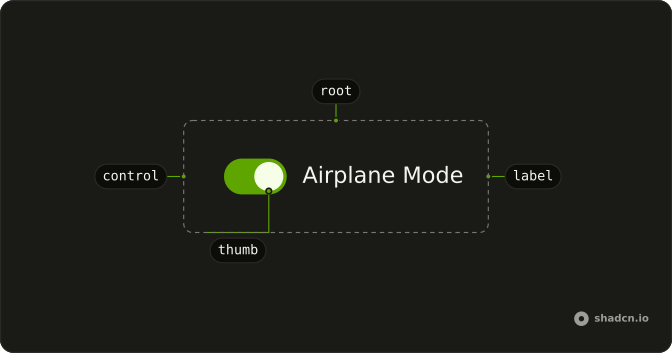
Switch
├── SwitchLabel
├── SwitchControl
└── SwitchThumb
Usage
<script setup lang="ts">
import { Field, FieldLabel } from "@/components/ui/field";
import { Switch } from "@/components/ui/switch";
</script>
<template>
  <Field class="w-fit" orientation="horizontal">
    <Switch />
    <FieldLabel>Airplane Mode</FieldLabel>
  </Field>
</template>
Accessibility
- Space
- Toggle the switch.
- Enter
- Toggle the switch.
Demos
Description
A horizontal field puts the label and a FieldDescription in FieldContent, with the switch on the other side. The description carries the consequence: sharing follows you across devices and turns off when you leave. Add that line when the label is too short to be safe, and skip it when the label is already a full sentence.
Choice Card
FieldLabel wraps the whole field, so the title, the description, and the switch are one hit target. Sharing sits next to notifications, which starts checked. Use the card when a setting needs more than one line and the empty space should toggle it. Use a plain row when a stack of cards would waste the page.
Disabled
disabled on both the Field and the Switch grays the row and blocks the toggle. Set both, because the field covers the label and the switch covers the control. Use it when the plan or role cannot change the setting, and say why nearby. Off is a chosen value, while disabled means the person cannot choose.
Invalid
invalid on the Field and aria-invalid on the Switch turn the control to the destructive color. The description says the terms have to be accepted before continuing. Use that pair for a required agreement or a setting that blocks the next step, not for a preference that is merely unset. The color does not announce itself, so the text under the label has to say what is wrong.
Sizes
size accepts sm or default. Small fits a tight settings row or secondary type, and default matches body text, which is also what you get when the prop is omitted. There is no larger step. Edit the switch styles rather than scaling the control, or the thumb blurs and the hit area drifts.
Rtl
dir set to rtl on the field and the switch, with an Arabic label and description. The text leads from the right, and the thumb moves with the writing direction instead of a left-to-right slide. Set dir on the switch when a parent direction will not reach it. Logical alignment keeps the control at the end of the row without physical margins.
FAQ
How do I control a Switch in Vue?
Keep the on or off state in state and pass it back to the Switch. Use the default prop instead when you only need the starting state.
Bind it with v-model:checked, or listen to @checked-change, which receives details.checked.
How do I add a label to a Switch?
Put the Switch in a horizontal Field next to a FieldLabel, as the default demo does: clicking the label toggles the Switch, and screen readers read the label with it. Add a FieldDescription for a line of help under it, as in the Description demo.
Does the Ark UI Switch submit its value in a form?
Yes. Give it a name: when on, it submits its value, which defaults to "on", and when off it submits nothing, like a checkbox.
How do I make a smaller Switch?
Set size="sm"; the default size is default. Both sizes appear in the Sizes demo. For a different look, edit the Switch file in your ui folder, where the track and thumb sizes are plain classes.
How do I show an error on a Switch?
Mark its Field invalid, as the Invalid demo does: the Switch takes the destructive color, and a FieldDescription or FieldError under it says what is wrong. Use it for a required agreement, like accepting terms.
Should I use a Switch or a Checkbox?
Use a Switch for a setting that takes effect at once, like turning notifications on. Use a Checkbox for a choice that is submitted later with a form, or when several options can be picked in a list.
API Reference
Switch
<label> data-slot="switch"
checked?boolean
The controlled checked state of the switch. Two-way with v-model:checked.
defaultChecked?boolean
The initial checked state of the switch when rendered. Use when you don't need to control the checked state of the switch.
idstring
The unique identifier of the machine.
dir?"ltr" | "rtl"
The document's text/writing direction.
- Type
"ltr" | "rtl"- Default
"ltr"
disabled?boolean
Whether the switch is disabled.
form?string
The id of the form that the switch belongs to.
ids?object
The ids of the elements in the switch. Useful for composition.
- Type
{ root?: string; hiddenInput?: string; control?: string; label?: string; thumb?: string }
invalid?boolean
If true, the switch is marked as invalid.
label?string
Specifies the localized strings that identifies the accessibility elements and their states.
name?string
The name of the input field in a switch (Useful for form submission).
readOnly?boolean
Whether the switch is read-only.
required?boolean
If true, the switch input is marked as required,.
size?"sm" | "default"
The size.
- Type
"sm" | "default"- Default
"default"
value?string | number
The value of switch input. Useful for form submission.
- Type
string | number- Default
"on"
asChild?boolean
Use the provided child element as the default rendered element, combining their props and behavior.
class?string
Merged with the part's classes.
@checked-change(details: CheckedChangeDetails) → void
Function to call when the switch is clicked.
- Type
(details: CheckedChangeDetails) → void- Parameters
details– { checked: boolean }- Returns
void
data-active?string
Present when active or pressed.
data-disabled?string
Present when disabled.
data-focus?string
Present when focused.
data-focus-visible?string
Present when focused with keyboard.
data-hover?string
Present when hovered.
data-invalid?string
Present when invalid.
data-readonly?string
Present when read-only.
data-required?string
Present when required.
data-size?string
Mirrors size.
data-state"checked" | "unchecked"
"checked" or "unchecked".
- Type
"checked" | "unchecked"
SwitchControl
<span> data-slot="switch-control"
asChild?boolean
Use the provided child element as the default rendered element, combining their props and behavior.
data-active?string
Present when active or pressed.
data-disabled?string
Present when disabled.
data-focus?string
Present when focused.
data-focus-visible?string
Present when focused with keyboard.
data-hover?string
Present when hovered.
data-invalid?string
Present when invalid.
data-readonly?string
Present when read-only.
data-required?string
Present when required.
data-state"checked" | "unchecked"
"checked" or "unchecked".
- Type
"checked" | "unchecked"
SwitchThumb
<span> data-slot="switch-thumb"
asChild?boolean
Use the provided child element as the default rendered element, combining their props and behavior.
data-active?string
Present when active or pressed.
data-disabled?string
Present when disabled.
data-focus?string
Present when focused.
data-focus-visible?string
Present when focused with keyboard.
data-hover?string
Present when hovered.
data-invalid?string
Present when invalid.
data-readonly?string
Present when read-only.
data-required?string
Present when required.
data-state"checked" | "unchecked"
"checked" or "unchecked".
- Type
"checked" | "unchecked"
useSwitch
With other components
Field
InputsLabel and helper text
Label
InputsClick the words
Card
LayoutSettings row frame
Accordion
DisclosureGroup in a panel
Item
LayoutRow in a list
Tooltip
OverlaysWhat the toggle changes
Related
Checkbox
SelectionWaits for submit
Toggle
SelectionPressed in a toolbar
Radio Group
SelectionOnly one choice
Toggle Group
SelectionSeveral pressed at once
Dropdown Menu
MenusOn or off in a menu
Segment Group
SelectionMore than two states