shadcn.io is not affiliated with official shadcn/ui
Stars that record a score, or show one that is already set.
Use them when the scale is obvious and a glance is enough. Labeled choices belong in a Radio Group. In Vue, Ark UI changes the score from the arrow keys, half steps included.
Installation
Anatomy
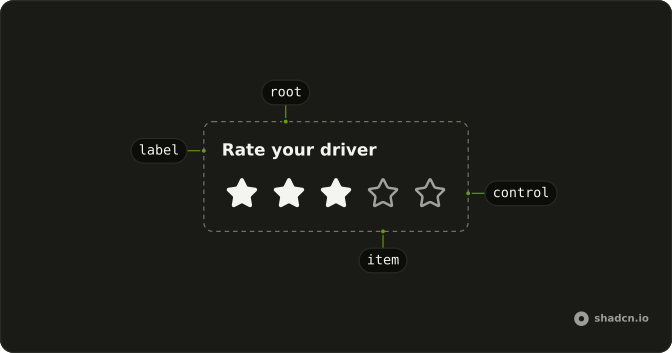
Rating
├── RatingLabel
├── RatingItem
└── RatingControl
Usage
<script setup lang="ts">
import {
  Avatar, AvatarFallback, AvatarImage,
} from "@/components/ui/avatar";
import { Button } from "@/components/ui/button";
import {
  Card, CardContent, CardDescription, CardFooter, CardHeader, CardTitle,
} from "@/components/ui/card";
import { Rating } from "@/components/ui/rating";
</script>
<template>
  <Card class="w-full max-w-xs">
    <CardHeader class="flex flex-col items-center gap-3 text-center">
      <Avatar size="lg">
        <AvatarImage alt="Driver" src="https://github.com/vinihvc.png" />
        <AvatarFallback>VV</AvatarFallback>
      </Avatar>
      <div>
        <CardTitle class="text-base">Vinicius Vicentini</CardTitle>
        <CardDescription> Tuestday morning at Mercado N.89</CardDescription>
      </div>
    </CardHeader>
    <CardContent class="space-y-2 text-center">
      <p class="font-medium text-sm">Rate your driver</p>
      <Rating />
    </CardContent>
    <CardFooter>
      <Button class="w-full">Submit</Button>
    </CardFooter>
  </Card>
</template>
Accessibility
- Arrow Right
- Moves focus to the next star, increasing the rating value based on the
allowHalfproperty. - Arrow Left
- Moves focus to the previous star, decreasing the rating value based on the
allowHalfproperty. - Enter
- Selects the focused star in the rating group.
- Space
- Activate the focused control.
- Arrow Up
- Move left.
- Arrow Down
- Move right.
- Home
- Go to the start.
- End
- Go to the end.
Demos
Controlled
The score is kept in state and passed back to the rating, and the line under the stars only checks whether that number is 5. Take control when the score drives something else, such as enabling submit once it is high enough. defaultValue is enough when the widget can hold the number and you only read it on submit.
Count
count is how many icons render, and this row is three, all selected. A shorter scale is the honest one when five stars would be false precision, as with bad, fine, and good. Leave the default of five for reviews people already know how to read. The value is still a number, and it should not be asked to mean more than count.
Custom Color
The icons paint with the current text color, so a text utility on the root recolors the empty and filled marks together. Info and success are the two shown, against the warning color the component starts with. Change it when the score means a status, or when that gold fights the page. Prefer a semantic token to a one-off palette class.
Custom Icon
icon replaces the star. Here it is a heart, allowHalf is on, and text-destructive keeps the marks from looking like a warning. Swap the icon when stars are the wrong metaphor, a favorite rather than a quality score. The empty and filled layers both use that icon, so it still has to read when it is only an outline.
Custom Size
There is no size prop. A class on the root targets the rating-item-indicator slot and scales it past the default star. Make the icons larger when this is the main control on a phone and the default is a fiddly tap. Shrink them beside a quote so the sentence stays the point, which the testimonial further down does.
Disabled
disabled blocks input and fades the icons, which fits a score that would only be a guess, such as before the trip has ended. The value can still be set. It cannot be changed, including from the keyboard. A published score that should look normal and stay fixed wants readOnly instead.
Half Star
allowHalf lets the pointer and the arrow keys stop between icons, so the value can sit halfway instead of on a whole star. Use it for an average, where that half step is a real difference. Turn it off on a personal rating if the smaller target is harder to hit than it is worth. This row starts between stars through defaultValue.
Readonly
readOnly shows the score and ignores pointer and keyboard changes, without fading the icons. That is a published average or a product rating, a number the reader did not just choose. disabled is the treatment that looks unavailable. If the icons are the only place the number exists, write it out in text beside them.
Testimonial
Five stars, readOnly, drawn smaller, sitting over a quote and a name. That is a marketing card rather than a form, and the smaller indicators keep the stars from outshouting the sentence. Drop readOnly when the reader should leave their own score. The opening preview is that form, and this card is only the quote.
FAQ
How do I control the Rating value in Vue?
Keep the score in state and pass it back to Rating, or use defaultValue when the control can manage itself. The value is a number, and a half star is a decimal such as 3.5, which the Half Star demo uses.
Bind it with v-model, or listen to @value-change, which receives details.value.
How do I allow half stars on a Rating?
Set allowHalf so a pointer or the arrow keys can stop between icons. Set count to change how many icons are shown. The default count is 5, and the Count demo uses three icons. Leave allowHalf unset for whole stars only.
What is the difference between a read-only and a disabled Rating?
Set readOnly to show a score that cannot be changed, as the Readonly demo does. Pointer events are ignored, and the value stays available. Set disabled to block changes and fade the icons, as the Disabled demo does. Use readOnly for a published score and disabled when the control is not available yet.
How do I change the Rating color or icon?
The icons use the current text color, and Rating starts as a warning color. Put another text color utility on Rating, as the Custom Color demo does. Pass icon to replace the star, as the Custom Icon demo does with a heart. Both the empty and filled layers use that icon.
Can I use a Rating from the keyboard in Vue?
Yes, the arrow keys move between icons and change the value. With allowHalf, they step by half an icon. Enter selects the focused icon, and Space activates it. Home and End jump to the first and last icon, which the Accessibility section also lists.
How do I submit a Rating with a form?
Set name on Rating when the score should be included in a form submit. The control renders a hidden input under that name. Set required when a score is mandatory. You can still control value in state if the form and the page both need it.
How do I install Rating in Vue?
Run the command in the Installation section above. It adds Rating to your ui folder. Import from that folder when the command finishes, instead of copying the source by hand, and rerun the command later if you want the latest files. The command uses the shadcn-vue CLI.
API Reference
Rating
<div> data-slot="rating"
value?number
The controlled value of the rating. Two-way with v-model.
defaultValue?number
The initial value of the rating when rendered. Use when you don't need to control the value of the rating.
idstring
The unique identifier of the machine.
allowHalf?boolean
Whether to allow half stars.
- Default
false
autoFocus?boolean
Whether to autofocus the rating.
count?number
The total number of ratings.
- Default
5
dir?"ltr" | "rtl"
The document's text/writing direction.
- Type
"ltr" | "rtl"- Default
"ltr"
disabled?boolean
Whether the rating is disabled.
form?string
The associate form of the underlying input element.
icon?VNode
The icon to use for the rating.
- Default
<StarIcon />
ids?object
The ids of the elements in the rating. Useful for composition.
- Type
{ root?: string; label?: string; hiddenInput?: string; control?: string; item?: (id: string) → string }
name?string
The name attribute of the rating element (used in forms).
readOnly?boolean
Whether the rating is readonly.
required?boolean
Whether the rating is required.
translations?object
Specifies the localized strings that identifies the accessibility elements and their states.
- Type
{ ratingValueText?: (index: number) → string }
asChild?boolean
Use the provided child element as the default rendered element, combining their props and behavior.
class?string
Merged with the part's classes.
@value-change(details: ValueChangeDetails) → void
Function to be called when the rating value changes.
- Type
(details: ValueChangeDetails) → void- Parameters
details– { value: number }- Returns
void
@hover-change(details: HoverChangeDetails) → void
Function to be called when the rating value is hovered.
- Type
(details: HoverChangeDetails) → void- Parameters
details– { hoveredValue: number }- Returns
void
RatingItem
<span> data-slot="rating-item"
indexnumber
The item's position in its list.
asChild?boolean
Use the provided child element as the default rendered element, combining their props and behavior.
class?string
Merged with the part's classes.
data-checked?string
Present when checked.
data-disabled?string
Present when disabled.
data-half?string
Present when half is true.
data-highlighted?string
Present when highlighted.
data-readonly?string
Present when read-only.
RatingControl
<div> data-slot="rating-control"
asChild?boolean
Use the provided child element as the default rendered element, combining their props and behavior.
data-disabled?string
Present when disabled.
data-readonly?string
Present when read-only.
useRating
With other components
Field
InputsLabel the score
Label
InputsName what is rated
Tooltip
OverlaysThe score in words
Card
LayoutA review
Item
LayoutA rating in a row
Button
ButtonsClear the score
Related
Slider
ControlsAny value in a range
Progress
FeedbackShow a score, do not set it
Radio Group
SelectionNamed choices
Badge
FeedbackThe score as a tag
Switch
SelectionOnly on or off
Number Input
InputsType the score