shadcn.io is not affiliated with official shadcn/ui
Type a few letters and the list narrows to the matches. If nothing is left, show an empty state.
Use it when the set is long or the names are hard to remember. Three order statuses are quicker as a Select. In Vue, Ark UI handles the popup, the highlight, and the keyboard path.
Installation
Anatomy
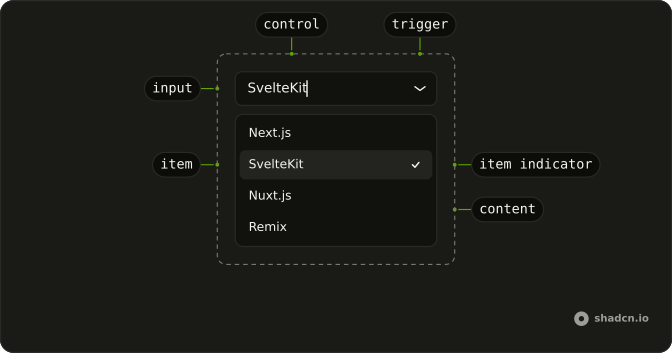
ComboboxRoot
├── ComboboxClear
├── ComboboxContent
├── ComboboxControl
├── ComboboxFieldInput
├── ComboboxItem
│   ├── ComboboxGroup
│   │   └── ComboboxGroupLabel
│   ├── ComboboxItemIndicator
│   └── ComboboxItemText
├── ComboboxLabel
├── ComboboxList
├── ComboboxPositioner
└── ComboboxTrigger
Usage
import { useListCollection } from "@ark-ui/react/collection";
import { useFilter } from "@ark-ui/react/locale";
import {
  Combobox, ComboboxContent, ComboboxEmpty, ComboboxInput, ComboboxItem,
  ComboboxList,
} from "@/components/ui/combobox";
const frameworks = ["Next.js", "SvelteKit", "Nuxt.js", "Remix", "Astro"];
const ComboboxDemo = () => {
const { contains } = useFilter({ sensitivity: "base" });
const { collection, filter } = useListCollection({
filter: contains,
initialItems: frameworks,
});
const handleInputValueChange = ({ inputValue }: { inputValue: string }) => {
filter(inputValue);
};
return (
<Combobox
collection={collection}
onInputValueChange={handleInputValueChange}
>
<ComboboxInput placeholder="Select a framework" />
<ComboboxContent>
<ComboboxEmpty>No items found.</ComboboxEmpty>
<ComboboxList>
{collection.items.map((item) => (
<ComboboxItem item={item} key={item}>
{item}
</ComboboxItem>
))}
</ComboboxList>
</ComboboxContent>
</Combobox>
);
};Accessibility
- Arrow Down
- When the combobox is closed, opens the listbox and highlights to the first option. When the combobox is open, moves focus to the next option.
- Arrow Up
- When the combobox is closed, opens the listbox and highlights to the last option. When the combobox is open, moves focus to the previous option.
- Home
- When the combobox is open, moves focus to the first option.
- End
- When the combobox is open, moves focus to the last option.
- Escape
- Closes the listbox.
- Enter
- Selects the highlighted option and closes the combobox.
- Space
- Activate the focused control.
Demos
Basic
Five framework names, an input, and a list. The filter narrows the rows as you type, and ComboboxEmpty shows when the query matches nothing. Start here. Chips, groups, and a custom row are the same control with more furniture, and you do not need them for one pick from a flat list.
Multiple
More than one framework can stay selected, and each pick is a chip you can remove without opening the list. The text field lives in that chip row, so the control grows with the selection instead of hiding it behind a closed value. Use this for tags. A field that has to end as one value should stay single-select.
Clear
The field already has a value, and showClear puts a button in the input that wipes it. Use that when empty is allowed, such as an optional framework, or when people often change their mind and should not have to select the text and delete it. Leave the button off a required field, where blank is always an error waiting to happen.
Groups
Timezones split into Americas, Europe, and Asia/Pacific, with a heading on each group and a separator between them. Use groups when people know the category better than the item, and a flat list would be a wall of offsets. Five framework names do not need this. The separator is optional, and the heading is what actually helps someone scan.
Custom
Each country is a row with the name, the continent, and the code, using Item inside ComboboxItem. Use a custom row when the label is not enough to choose, and a second line saves a lookup. Filtering still keys off the country name, so the continent is for reading, not a second search field. Keep the row short or the list becomes a table.
Invalid
The field is flagged invalid, which turns on the error styling and tells assistive tech the value is wrong. Use it after a submit that failed, next to a sentence that says why. Do not paint the combobox red on first view. An empty optional field is not invalid yet, and a red border with no explanation is just noise.
Disabled
The combobox and its input are both disabled, so the list will not open and typing does nothing. Use that for a value fixed by the plan or the role, where showing the current choice still matters and changing it does not. If there is nothing to search, plain text is clearer than a control that looks broken.
Auto Highlight
Enter should commit the obvious framework without a down-arrow first. That is worth turning on for a short list of names, and worth leaving off when the top hit is often the wrong place name. Set inputBehavior to autohighlight.
Popup
The closed control is a button that shows the selected country. Search moves inside the popup, so the field looks like a select until someone opens it. Use this when the page is dense and a full input is too loud, but the list is still long enough to need a filter. The popup is anchored to that button, not to a separate field sitting somewhere else.
Input Group
A globe sits in the input as an addon, ahead of the timezone text, and the list stays grouped by region. Use an addon when the icon explains the field better than the placeholder does. The popup is nudged so it lines up with the text, not with the icon. Otherwise the menu looks like it belongs to the wrong edge of the control.
Rtl
Arabic category names, multiple chips, and dir set to rtl on the field and the combobox. The placeholder asks for more categories, and the empty copy is in the same language. Use this when the page is right to left, so the chips, the caret, and the list sit on the correct side. A left-to-right combobox dropped into an rtl form is what this is checking.
FAQ
Should I use a Combobox or a Select?
Use a Combobox when the list is long enough that people want to type to find an option, like countries or timezones. For a short, fixed set of options, use a Select: it has no text input, so it's quicker to scan.
How do I filter Combobox options as the user types in Ark UI?
Build the options with useListCollection and a filter from useFilter, pass the collection to Combobox, and call filter from @input-value-change.
How do I select multiple values in a Combobox?
Set multiple on Combobox and show the picks as chips with ComboboxChips, as in the Multiple demo. The value is then an array.
How do I control the Combobox value in Vue?
Hold the selection yourself and pass it back on every change.
Bind v-model to an array of item values, or pass :value and listen to @value-change, which receives { value, items }.
Can users type a value that isn't in the Combobox list?
Yes, with allowCustomValue: the typed text is kept when the input loses focus.
For free text with suggestions, an Autocomplete fits better.
How do I show a message when no Combobox options match?
Put a ComboboxEmpty with the text, like "No results", in the list: it only shows when the filter leaves nothing to pick.
Is the Combobox accessible with the keyboard?
Yes. It follows the WAI-ARIA combobox pattern: the arrow keys open the list and move through the options, Enter picks the highlighted one and Escape closes the list. Screen readers announce the highlighted option while focus stays in the input.
Does the Combobox work in forms?
Yes. Connect your form state to the combobox's controlled value and its change handler, and put it in a Field for the label, description and error.
API Reference
Combobox
<div> data-slot="combobox"
inputValue?string
The controlled value of the combobox's input. Two-way with v-model:inputValue.
defaultInputValue?string
The initial value of the combobox's input when rendered. Use when you don't need to control the value of the combobox's input.
- Default
""
open?boolean
The controlled open state of the combobox. Two-way with v-model:open.
defaultOpen?boolean
The initial open state of the combobox when rendered. Use when you don't need to control the open state of the combobox.
value?string[]
The controlled value of the combobox's selected items. Two-way with v-model.
defaultValue?string[]
The initial value of the combobox's selected items when rendered. Use when you don't need to control the value of the combobox's selected items.
- Default
[]
collectionListCollection<T>
The collection of items.
- Type
ListCollection<T>
allowCustomValue?boolean
Whether to allow typing custom values in the input.
alwaysSubmitOnEnter?boolean
Whether to always submit on Enter key press, even if popup is open. Useful for single-field autocomplete forms where Enter should submit the form.
- Default
false
autoFocus?boolean
Whether to autofocus the input on mount.
closeOnSelect?boolean
Whether to close the combobox when an item is selected.
composite?boolean
Whether the combobox is a composed with other composite widgets like tabs.
- Default
true
defaultHighlightedValue?string | null
The initial highlighted value of the combobox when rendered. Use when you don't need to control the highlighted value of the combobox.
- Type
string | null
dir?"ltr" | "rtl"
The document's text/writing direction.
- Type
"ltr" | "rtl"- Default
"ltr"
disabled?boolean
Whether the combobox is disabled.
disableLayer?boolean
Whether to disable registering this a dismissable layer.
form?string
The associate form of the combobox.
hideMode?"display-none" | "activity"
How to hide content when mounted but not present.
- display-none: HTML hidden attribute. Effects stay alive.
- activity: React 19 <Activity mode="hidden">. Effects pause. Requires React 19+.
- Type
"display-none" | "activity"- Default
"display-none"
highlightedValue?string | null
The controlled highlighted value of the combobox.
- Type
string | null
id?string
The unique identifier of the machine.
ids?object
The ids of the elements in the combobox. Useful for composition.
- Type
{ root?: string; label?: string; control?: string; input?: string; content?: string; trigger?: string; clearTrigger?: string; item?: (id: string, index?: number) → string; positioner?: string; itemGroup?: (id: string | number) → string; itemGroupLabel?: (id: string | number) → string }
inputBehavior?"autohighlight" | "autocomplete" | "none"
Defines the auto-completion behavior of the combobox.
- autohighlight: The first focused item is highlighted as the user types
- autocomplete: Navigating the listbox with the arrow keys selects the item and the input is updated
- Type
"autohighlight" | "autocomplete" | "none"- Default
"none"
invalid?boolean
Whether the combobox is invalid.
lazyMount?boolean
Whether to enable lazy mounting. Ark default: false.
- Default
true
loopFocus?boolean
Whether to loop the keyboard navigation through the items.
- Default
true
multiple?boolean
Whether to allow multiple selection.
**Good to know:** When multiple is true, the selectionBehavior is automatically set to clear.
It is recommended to render the selected items in a separate container.
name?string
The name attribute of the combobox's input. Useful for form submission.
navigate?((details: NavigateDetails) → void) | null
Function to navigate to the selected item.
- Type
((details: NavigateDetails) → void) | null- Parameters
(details– { value: string; node: HTMLAnchorElement; href: string }- Returns
void) | null
openOnChange?boolean | ((details: InputValueChangeDetails) → boolean)
Whether to show the combobox when the input value changes.
- Type
boolean | ((details: InputValueChangeDetails) → boolean)- Default
true
openOnClick?boolean
Whether to open the combobox popup on initial click on the input. Ark default: false.
- Default
true
openOnKeyPress?boolean
Whether to open the combobox on arrow key press.
- Default
true
placeholder?string
The placeholder text of the combobox's input.
positioning?object
The positioning options to dynamically position the menu.
- Type
{ restoreStyles?: boolean; applyStyles?: boolean; hideWhenDetached?: boolean; strategy?: "absolute" | "fixed"; placement?: Placement; offset?: { mainAxis?: number; crossAxis?: number; }; gutter?: number; shift?: number; overflowPadding?: number; arrowPadding?: number; flip?: boolean | Placement[]; slide?: boolean; overlap?: boolean; sameWidth?: boolean; fitViewport?: boolean; sizeMiddleware?: boolean; boundary?: (() → Boundary) | Boundary | "clipping-ancestors"; listeners?: boolean | AutoUpdateOptions; onComplete?: (data: ComputePositionReturn) → void; onPositioned?: ((data: { placed: boolean; }) → void); getAnchorElement?: () → HTMLElement | VirtualElement | null; getAnchorRect?: (element: HTMLElement | VirtualElement | null) → AnchorRect | null; updatePosition?: ((data: { updatePosition: () → Promise<void>; floatingElement: HTMLElement | null; }) → void | Promise<void>) }- Default
{ placement: "bottom-start" }
readOnly?boolean
Whether the combobox is readonly. This puts the combobox in a "non-editable" mode but the user can still interact with it
required?boolean
Whether the combobox is required.
scrollToIndexFn?(details: ScrollToIndexDetails) → void
Function to scroll to a specific index.
- Type
(details: ScrollToIndexDetails) → void- Parameters
details– { index: number; immediate?: boolean; getElement: () → HTMLElement | null }- Returns
void
selectionBehavior?"clear" | "replace" | "preserve"
The behavior of the combobox input when an item is selected
- replace: The selected item string is set as the input value
- clear: The input value is cleared
- preserve: The input value is preserved
- Type
"clear" | "replace" | "preserve"- Default
"replace"
skipAnimationOnMount?boolean
Whether to allow the initial presence animation.
- Default
false
translations?object
Specifies the localized strings that identifies the accessibility elements and their states.
- Type
{ triggerLabel?: string; clearTriggerLabel?: string }
unmountOnExit?boolean
Whether to unmount on exit. Ark default: false.
- Default
true
asChild?boolean
Use the provided child element as the default rendered element, combining their props and behavior.
@input-value-change(details: InputValueChangeDetails) → void
Function called when the input's value changes.
- Type
(details: InputValueChangeDetails) → void- Parameters
details– { inputValue: string; reason?: InputValueChangeReason }- Returns
void
@open-change(details: OpenChangeDetails) → void
Function called when the popup is opened.
- Type
(details: OpenChangeDetails) → void- Parameters
details– { open: boolean; reason?: OpenChangeReason; value: string[] }- Returns
void
@value-change(details: ValueChangeDetails<T>) → void
Function called when a new item is selected.
- Type
(details: ValueChangeDetails<T>) → void- Parameters
details– ValueChangeDetails<T>- Returns
void
@focus-outside(event: FocusOutsideEvent) → void
Function called when the focus is moved outside the component.
- Type
(event: FocusOutsideEvent) → void- Parameters
event– FocusOutsideEvent- Returns
void
@highlight-change(details: HighlightChangeDetails<T>) → void
Function called when an item is highlighted using the pointer or keyboard navigation.
- Type
(details: HighlightChangeDetails<T>) → void- Parameters
details– HighlightChangeDetails<T>- Returns
void
@interact-outside(event: InteractOutsideEvent) → void
Function called when an interaction happens outside the component.
- Type
(event: InteractOutsideEvent) → void- Parameters
event– InteractOutsideEvent- Returns
void
@pointer-down-outside(event: PointerDownOutsideEvent) → void
Function called when the pointer is pressed down outside the component.
- Type
(event: PointerDownOutsideEvent) → void- Parameters
event– PointerDownOutsideEvent- Returns
void
data-invalid?string
Present when invalid.
data-readonly?string
Present when read-only.
ComboboxClear
<button> data-slot="combobox-clear"
asChild?boolean
Use the provided child element as the default rendered element, combining their props and behavior.
data-invalid?string
Present when invalid.
ComboboxContent
<div> data-slot="combobox-content"
asChild?boolean
Use the provided child element as the default rendered element, combining their props and behavior.
class?string
Merged with the part's classes.
data-empty?string
Present when the content is empty.
data-has-nested?string
Present when another listbox is nested inside it.
data-nested?string
Present when it's nested inside another listbox.
data-placementstring
The placement of the content.
data-side"top" | "right" | "bottom" | "left"
The side of the trigger that the content is positioned on.
- Type
"top" | "right" | "bottom" | "left"
data-state"open" | "closed"
"open" or "closed".
- Type
"open" | "closed"
--available-heightstring
The height left between the anchor and the viewport's edge.
--available-widthstring
The width left between the anchor and the viewport's edge.
--layer-indexstring
The index of the dismissable in the layer stack.
--nested-layer-countstring
The number of nested comboboxs.
--reference-widthstring
The trigger's width.
--transform-originstring
Where the content scales from, on its trigger's side.
ComboboxChips
<div> data-slot="combobox-chips"
asChild?boolean
Use the provided child element as the default rendered element, combining their props and behavior.
class?string
Merged with the part's classes.
data-disabled?string
Present when disabled.
data-focus?string
Present when focused.
data-invalid?string
Present when invalid.
data-state"open" | "closed"
"open" or "closed".
- Type
"open" | "closed"
ComboboxFieldInput
<input> data-slot="combobox-field-input"
asChild?boolean
Use the provided child element as the default rendered element, combining their props and behavior.
data-autofocus?string
Present when autoFocus is true.
data-invalid?string
Present when invalid.
data-state"open" | "closed"
"open" or "closed".
- Type
"open" | "closed"
ComboboxItem
<div> data-slot="combobox-item"
itemany
The item to render.
persistFocus?boolean
Whether hovering outside should clear the highlighted state.
showIndicator?boolean
Shows the selected item's check at the row's end, with room kept for it.
- Default
true
asChild?boolean
Use the provided child element as the default rendered element, combining their props and behavior.
class?string
Merged with the part's classes.
data-disabled?string
Present when disabled.
data-highlighted?string
Present when highlighted.
data-state"checked" | "unchecked"
"checked" or "unchecked".
- Type
"checked" | "unchecked"
data-valueboolean
The value of the item.
ComboboxGroup
<div> data-slot="combobox-group"
heading?string | VNode
The heading of the group.
- Type
string | VNode
asChild?boolean
Use the provided child element as the default rendered element, combining their props and behavior.
data-empty?string
Present when the content is empty.
ComboboxGroupLabel
<div> data-slot="combobox-group-label"
asChild?boolean
Use the provided child element as the default rendered element, combining their props and behavior.
class?string
Merged with the part's classes.
ComboboxItemIndicator
<div> data-slot="combobox-item-indicator"
asChild?boolean
Use the provided child element as the default rendered element, combining their props and behavior.
data-state"checked" | "unchecked"
"checked" or "unchecked".
- Type
"checked" | "unchecked"
ComboboxLabel
<label> data-slot="combobox-label"
asChild?boolean
Use the provided child element as the default rendered element, combining their props and behavior.
class?string
Merged with the part's classes.
data-disabled?string
Present when disabled.
data-focus?string
Present when focused.
data-invalid?string
Present when invalid.
data-readonly?string
Present when read-only.
data-required?string
Present when required.
ComboboxList
<div> data-slot="combobox-list"
asChild?boolean
Use the provided child element as the default rendered element, combining their props and behavior.
class?string
Merged with the part's classes.
data-empty?string
Present when the content is empty.
ComboboxPositioner
<div> data-slot="combobox-positioner"
asChild?boolean
Use the provided child element as the default rendered element, combining their props and behavior.
class?string
Merged with the part's classes.
data-has-nested?string
Present when the positioner has nested comboboxs.
data-nested?string
Present when the positioner is nested within another combobox.
--available-heightstring
The available height in viewport.
--available-widthstring
The available width in viewport.
--reference-heightstring
The height of the root.
--reference-widthstring
The width of the reference element.
--transform-originstring
The transform origin for animations.
--xstring
The x position for transform.
--ystring
The y position for transform.
--z-indexstring
The z-index value.
ComboboxTrigger
<button> data-slot="combobox-trigger"
focusable?boolean
Whether the trigger is focusable.
asChild?boolean
Use the provided child element as the default rendered element, combining their props and behavior.
class?string
Merged with the part's classes.
data-disabled?string
Present when disabled.
data-focusable?stringdata-invalid?string
Present when invalid.
data-readonly?string
Present when read-only.
data-state"open" | "closed"
"open" or "closed".
- Type
"open" | "closed"
ComboboxControl
<div> data-slot="combobox-control"
asChild?boolean
Use the provided child element as the default rendered element, combining their props and behavior.
class?string
Merged with the part's classes.
data-disabled?string
Present when disabled.
data-focus?string
Present when focused.
data-invalid?string
Present when invalid.
data-state"open" | "closed"
"open" or "closed".
- Type
"open" | "closed"
ComboboxInput
<input>
disabled?boolean
Whether the control is disabled.
- Default
false
showClear?boolean
Whether to show the clear button.
- Default
false
showTrigger?boolean
Whether to show the trigger button.
- Default
true
asChild?boolean
Use the provided child element as the default rendered element, combining their props and behavior.
class?string
Merged with the part's classes.
data-autofocus?string
Present when autoFocus is true.
data-invalid?string
Present when invalid.
data-state"open" | "closed"
"open" or "closed".
- Type
"open" | "closed"
ComboboxEmpty
<div> data-slot="combobox-empty"
asChild?boolean
Use the provided child element as the default rendered element, combining their props and behavior.
class?string
Merged with the part's classes.
ComboboxSeparator
data-slot="combobox-separator"
orientation?"horizontal" | "vertical"
The orientation of the separator.
- Type
"horizontal" | "vertical"- Default
"horizontal"
asChild?boolean
Use the provided child element as the default rendered element, combining their props and behavior.
class?string
Merged with the part's classes.
data-invalid?string
Present when invalid is true.
data-readonly?string
Present when readOnly is true.
ComboboxChip
<span> data-slot="combobox-chip"
class?string
Merged with the part's classes.
ComboboxRootProvider
<div> data-slot="combobox"
valueUseComboboxReturn<T>
What useCombobox() returns: the state and API, made outside the component to control it.
- Type
UseComboboxReturn<T>
hideMode?"display-none" | "activity"
How to hide content when mounted but not present.
- display-none: HTML hidden attribute. Effects stay alive.
- activity: React 19 <Activity mode="hidden">. Effects pause. Requires React 19+.
- Type
"display-none" | "activity"- Default
"display-none"
lazyMount?boolean
Whether to enable lazy mounting. Ark default: false.
- Default
true
skipAnimationOnMount?boolean
Whether to allow the initial presence animation.
- Default
false
unmountOnExit?boolean
Whether to unmount on exit. Ark default: false.
- Default
true
asChild?boolean
Use the provided child element as the default rendered element, combining their props and behavior.
data-invalid?string
Present when invalid is true.
data-readonly?string
Present when readOnly is true.
useCombobox
inputValue?string
The controlled value of the combobox's input. Two-way with v-model:inputValue.
defaultInputValue?string
The initial value of the combobox's input when rendered. Use when you don't need to control the value of the combobox's input.
- Default
""
open?boolean
The controlled open state of the combobox. Two-way with v-model:open.
defaultOpen?boolean
The initial open state of the combobox when rendered. Use when you don't need to control the open state of the combobox.
value?string[]
The controlled value of the combobox's selected items. Two-way with v-model.
defaultValue?string[]
The initial value of the combobox's selected items when rendered. Use when you don't need to control the value of the combobox's selected items.
- Default
[]
collectionListCollection<T>
The collection of items.
- Type
ListCollection<T>
allowCustomValue?boolean
Whether to allow typing custom values in the input.
alwaysSubmitOnEnter?boolean
Whether to always submit on Enter key press, even if popup is open. Useful for single-field autocomplete forms where Enter should submit the form.
- Default
false
autoFocus?boolean
Whether to autofocus the input on mount.
closeOnSelect?boolean
Whether to close the combobox when an item is selected.
composite?boolean
Whether the combobox is a composed with other composite widgets like tabs.
- Default
true
defaultHighlightedValue?string | null
The initial highlighted value of the combobox when rendered. Use when you don't need to control the highlighted value of the combobox.
- Type
string | null
disabled?boolean
Whether the combobox is disabled.
disableLayer?boolean
Whether to disable registering this a dismissable layer.
form?string
The associate form of the combobox.
highlightedValue?string | null
The controlled highlighted value of the combobox.
- Type
string | null
id?string
The unique identifier of the machine.
ids?object
The ids of the elements in the combobox. Useful for composition.
- Type
{ root?: string; label?: string; control?: string; input?: string; content?: string; trigger?: string; clearTrigger?: string; item?: (id: string, index?: number) → string; positioner?: string; itemGroup?: (id: string | number) → string; itemGroupLabel?: (id: string | number) → string }
inputBehavior?"autohighlight" | "autocomplete" | "none"
Defines the auto-completion behavior of the combobox.
- autohighlight: The first focused item is highlighted as the user types
- autocomplete: Navigating the listbox with the arrow keys selects the item and the input is updated
- Type
"autohighlight" | "autocomplete" | "none"- Default
"none"
invalid?boolean
Whether the combobox is invalid.
loopFocus?boolean
Whether to loop the keyboard navigation through the items.
- Default
true
multiple?boolean
Whether to allow multiple selection.
**Good to know:** When multiple is true, the selectionBehavior is automatically set to clear.
It is recommended to render the selected items in a separate container.
name?string
The name attribute of the combobox's input. Useful for form submission.
navigate?((details: NavigateDetails) → void) | null
Function to navigate to the selected item.
- Type
((details: NavigateDetails) → void) | null- Parameters
(details– { value: string; node: HTMLAnchorElement; href: string }- Returns
void) | null
openOnChange?boolean | ((details: InputValueChangeDetails) → boolean)
Whether to show the combobox when the input value changes.
- Type
boolean | ((details: InputValueChangeDetails) → boolean)- Default
true
openOnClick?boolean
Whether to open the combobox popup on initial click on the input.
- Default
false
openOnKeyPress?boolean
Whether to open the combobox on arrow key press.
- Default
true
placeholder?string
The placeholder text of the combobox's input.
positioning?object
The positioning options to dynamically position the menu.
- Type
{ restoreStyles?: boolean; applyStyles?: boolean; hideWhenDetached?: boolean; strategy?: "absolute" | "fixed"; placement?: Placement; offset?: { mainAxis?: number; crossAxis?: number; }; gutter?: number; shift?: number; overflowPadding?: number; arrowPadding?: number; flip?: boolean | Placement[]; slide?: boolean; overlap?: boolean; sameWidth?: boolean; fitViewport?: boolean; sizeMiddleware?: boolean; boundary?: (() → Boundary) | Boundary | "clipping-ancestors"; listeners?: boolean | AutoUpdateOptions; onComplete?: (data: ComputePositionReturn) → void; onPositioned?: ((data: { placed: boolean; }) → void); getAnchorElement?: () → HTMLElement | VirtualElement | null; getAnchorRect?: (element: HTMLElement | VirtualElement | null) → AnchorRect | null; updatePosition?: ((data: { updatePosition: () → Promise<void>; floatingElement: HTMLElement | null; }) → void | Promise<void>) }- Default
{ placement: "bottom-start" }
readOnly?boolean
Whether the combobox is readonly. This puts the combobox in a "non-editable" mode but the user can still interact with it
required?boolean
Whether the combobox is required.
scrollToIndexFn?(details: ScrollToIndexDetails) → void
Function to scroll to a specific index.
- Type
(details: ScrollToIndexDetails) → void- Parameters
details– { index: number; immediate?: boolean; getElement: () → HTMLElement | null }- Returns
void
selectionBehavior?"clear" | "replace" | "preserve"
The behavior of the combobox input when an item is selected
- replace: The selected item string is set as the input value
- clear: The input value is cleared
- preserve: The input value is preserved
- Type
"clear" | "replace" | "preserve"- Default
"replace"
translations?object
Specifies the localized strings that identifies the accessibility elements and their states.
- Type
{ triggerLabel?: string; clearTriggerLabel?: string }
@input-value-change(details: InputValueChangeDetails) → void
Function called when the input's value changes.
- Type
(details: InputValueChangeDetails) → void- Parameters
details– { inputValue: string; reason?: InputValueChangeReason }- Returns
void
@open-change(details: OpenChangeDetails) → void
Function called when the popup is opened.
- Type
(details: OpenChangeDetails) → void- Parameters
details– { open: boolean; reason?: OpenChangeReason; value: string[] }- Returns
void
@value-change(details: ValueChangeDetails<T>) → void
Function called when a new item is selected.
- Type
(details: ValueChangeDetails<T>) → void- Parameters
details– ValueChangeDetails<T>- Returns
void
@focus-outside(event: FocusOutsideEvent) → void
Function called when the focus is moved outside the component.
- Type
(event: FocusOutsideEvent) → void- Parameters
event– FocusOutsideEvent- Returns
void
@highlight-change(details: HighlightChangeDetails<T>) → void
Function called when an item is highlighted using the pointer or keyboard navigation.
- Type
(details: HighlightChangeDetails<T>) → void- Parameters
details– HighlightChangeDetails<T>- Returns
void
@interact-outside(event: InteractOutsideEvent) → void
Function called when an interaction happens outside the component.
- Type
(event: InteractOutsideEvent) → void- Parameters
event– InteractOutsideEvent- Returns
void
@pointer-down-outside(event: PointerDownOutsideEvent) → void
Function called when the pointer is pressed down outside the component.
- Type
(event: PointerDownOutsideEvent) → void- Parameters
event– PointerDownOutsideEvent- Returns
void
@select(details: SelectionDetails) → void
Function called when an item is selected.
- Type
(details: SelectionDetails) → void- Parameters
details– { value: string[]; itemValue: string }- Returns
void
ComboboxContext
clearHighlightValueVoidFunction
Function to clear the highlighted value.
clearValue(value?: string) → void
Function to clear the value of the combobox.
- Parameters
value?– string- Returns
void
collectionListCollection<V>
Function to toggle the combobox.
- Type
ListCollection<V>
disabledboolean
Whether the combobox is disabled.
focusVoidFunction
Function to focus on the combobox input.
focusedboolean
Whether the combobox is focused.
getItemState(props: ItemProps) → ItemState
Returns the state of a combobox item.
- Parameters
props– { persistFocus?: boolean; item: CollectionItem }- Returns
ItemState
hasSelectedItemsboolean
Whether there's a selected item.
highlightedItemV | null
The highlighted item.
- Type
V | null
highlightedValuestring | null
The value of the highlighted item.
- Type
string | null
inputValuestring
The value of the combobox input.
multipleboolean
Whether the combobox allows multiple selections.
openboolean
Whether the combobox is open.
reposition(options?: Partial<PositioningOptions>) → void
Function to set the positioning options.
- Type
(options?: Partial<PositioningOptions>) → void- Parameters
options?– Partial<PositioningOptions>- Returns
void
selectedItemsV[]
The selected items.
selectValue(value: string) → void
Function to select a value.
- Parameters
value– string- Returns
void
setHighlightValue(value: string) → void
The value of the combobox input.
- Parameters
value– string- Returns
void
setInputValue(value: string, reason?: InputValueChangeReason) → void
Function to set the input value of the combobox.
- Type
(value: string, reason?: InputValueChangeReason) → void- Parameters
value– stringreason?– InputValueChangeReason- Returns
void
setOpen(open: boolean, reason?: OpenChangeReason) → void
Function to open or close the combobox.
- Type
(open: boolean, reason?: OpenChangeReason) → void- Parameters
open– booleanreason?– OpenChangeReason- Returns
void
setValue(value: string[]) → void
Function to set the value of the combobox.
- Parameters
value– string[]- Returns
void
syncSelectedItemsVoidFunction
Function to sync the selected items with the value.
Useful when value is updated from async sources.
valuestring[]
The selected item keys.
valueAsStringstring
The string representation of the selected items.
ComboboxItemContext
disabledboolean
Whether the item is disabled.
highlightedboolean
Whether the item is highlighted via pointer or keyboard navigation.
selectedboolean
Whether the item is selected.
valuestring
The value of the item.
With other components
Field
InputsLabel, description, error
Input Group
InputsIcon on the input
Item
LayoutTitle and description
Button
ButtonsOpen from a trigger
Card
LayoutSettings on a card
Popover
OverlaysThe list in a popup
Related
Select
SelectionClosed list, no filter
Command
OverlaysPalette with search
Native Select
SelectionPhone system picker
Dropdown Menu
MenusActions, not values
Direction
LayoutRTL for the page
Autocomplete
SelectionA value you can type