shadcn.io is not affiliated with official shadcn/ui
Tabs show one panel from a short list of peer views. Four tabs is already plenty.
Use them when people switch views of the same thing, rather than reading down the page. If more than one section should stay open, use an Accordion. In Vue, Ark UI unmounts hidden panels, so a form there loses what was typed unless you keep it mounted.
Installation
Anatomy
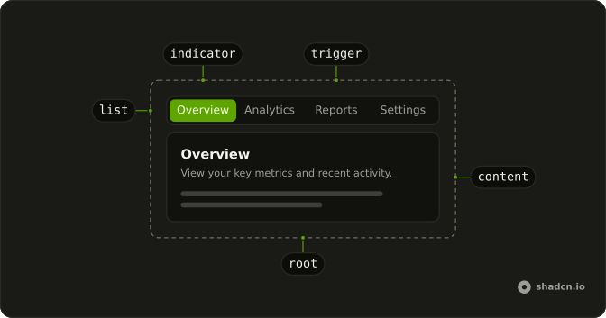
Tabs
├── TabsList
│   └── TabsIndicator
├── TabsTrigger
└── TabsContent
Usage
<script setup lang="ts">
import {
  Card, CardContent, CardDescription, CardHeader, CardTitle,
} from "@/components/ui/card";
import {
  Tabs, TabsContent, TabsList, TabsTrigger,
} from "@/components/ui/tabs";
</script>
<template>
  <Tabs class="w-[400px]" defaultValue="overview">
    <TabsList>
      <TabsTrigger value="overview">Overview</TabsTrigger>
      <TabsTrigger value="analytics">Analytics</TabsTrigger>
      <TabsTrigger value="reports">Reports</TabsTrigger>
      <TabsTrigger value="settings">Settings</TabsTrigger>
    </TabsList>
    <TabsContent value="overview">
      <Card>
        <CardHeader>
          <CardTitle>Overview</CardTitle>
          <CardDescription>
            View your key metrics and recent project activity. Track progress
            across all your active projects.
          </CardDescription>
        </CardHeader>
        <CardContent class="text-muted-foreground text-sm">
          You have 12 active projects and 3 pending tasks.
        </CardContent>
      </Card>
    </TabsContent>
    <TabsContent value="analytics">
      <Card>
        <CardHeader>
          <CardTitle>Analytics</CardTitle>
          <CardDescription>
            Track performance and user engagement metrics. Monitor trends and
            identify growth opportunities.
          </CardDescription>
        </CardHeader>
        <CardContent class="text-muted-foreground text-sm">
          Page views are up 25% compared to last month.
        </CardContent>
      </Card>
    </TabsContent>
    <TabsContent value="reports">
      <Card>
        <CardHeader>
          <CardTitle>Reports</CardTitle>
          <CardDescription>
            Generate and download your detailed reports. Export data in multiple
            formats for analysis.
          </CardDescription>
        </CardHeader>
        <CardContent class="text-muted-foreground text-sm">
          You have 5 reports ready and available to export.
        </CardContent>
      </Card>
    </TabsContent>
    <TabsContent value="settings">
      <Card>
        <CardHeader>
          <CardTitle>Settings</CardTitle>
          <CardDescription>
            Manage your account preferences and options. Customize your
            experience to fit your needs.
          </CardDescription>
        </CardHeader>
        <CardContent class="text-muted-foreground text-sm">
          Configure notifications, security, and themes.
        </CardContent>
      </Card>
    </TabsContent>
  </Tabs>
</template>
Accessibility
- Tab
- When focus moves onto the tabs, focuses the active trigger. When a trigger is focused, moves focus to the active content.
- Arrow Down
- Moves focus to the next trigger in vertical orientation and activates its associated content.
- Arrow Right
- Moves focus to the next trigger in horizontal orientation and activates its associated content.
- Arrow Up
- Moves focus to the previous trigger in vertical orientation and activates its associated content.
- Arrow Left
- Moves focus to the previous trigger in horizontal orientation and activates its associated content.
- Home
- Moves focus to the first trigger and activates its associated content.
- End
- Moves focus to the last trigger and activates its associated content.
- Enter
- In manual mode, when a trigger is focused, moves focus to its associated content.
- Space
- In manual mode, when a trigger is focused, moves focus to its associated content.
Demos
Line
The list drops the filled track and underlines the active trigger. Overview, Analytics, and Reports are the list, with no panels under them. Use the underline when the tabs sit on a page that already has cards, and another boxed list would stack containers. Keep the default list when the control is small and needs a visible boundary of its own.
Vertical
orientation is vertical, so Account, Password, and Notifications stack, and the arrow keys that move between them are up and down. Only the list is on the page, and the panel belongs beside it. Use a vertical list when the labels are long enough to wrap in a horizontal row, such as a settings column. Two short words can stay horizontal.
Disabled
Home can be selected. The settings trigger sets disabled, so it is skipped and cannot become the active tab. Use a disabled trigger for a section this account cannot open yet, a missing permission or an unfinished area, while the label stays as a promise. If it will never apply, drop the trigger rather than showing a control that goes nowhere.
Icons
Preview and Code each lead with an icon, and the icons are aria-hidden because the words are the names. Use icons when the pair is a familiar mode switch, a preview against its source, and the picture helps at a glance. Do not ship icon-only triggers. The text is what gets announced, and a mystery glyph is not a tab label.
Rtl
Arabic labels and card copy, with dir set to rtl. The list follows the reading order, and the panel text aligns to the start. The trigger values stay overview, analytics, reports, and settings, and only the visible words change. Use this for a localized product, not as a visual flip on an English page.
FAQ
How do I control the selected tab in Vue?
Keep the selected tab's value in state and pass it back to Tabs; each trigger and panel is matched by its value. Use the default prop when you only need the first tab.
Bind it with v-model, or listen to @value-change, which receives details.value.
How do I keep inactive Tabs panels mounted?
Inactive panels are unmounted by default, so their state resets when you switch back. Keep them mounted to preserve form input or scroll position.
Set lazyMount and unmountOnExit to false on Tabs.
How do I make underline Tabs with Ark UI?
Set variant="line" on TabsList, as the Line demo does: the list loses its background and the active tab gets an underline.
variant="underline", the variant's earlier name, still works.
How do I show Tabs vertically?
Set orientation="vertical" on Tabs: the list stacks the triggers on the side and the Up and Down arrow keys move between them, as in the Vertical demo.
Are the Tabs accessible with the keyboard?
Yes. Tab moves focus into the list, the arrow keys move between triggers, and Home and End jump to the first and last; disabled triggers are skipped. The next Tab moves on to the open panel, which shows a focus ring.
Focusing a tab selects it; set activationMode="manual" to select only with Enter or Space.
Should I use Tabs or an Accordion?
Use Tabs when people switch between a few views of the same area, one at a time. Use an Accordion when sections stack vertically and several may be read in order, or on narrow screens where tab labels would not fit.
API Reference
Tabs
<div> data-slot="tabs"
value?string | null
The controlled selected tab value. Two-way with v-model.
- Type
string | null
defaultValue?string | null
The initial selected tab value when rendered. Use when you don't need to control the selected tab value.
- Type
string | null
activationMode?"manual" | "automatic"
The activation mode of the tabs. Can be manual or automatic
- manual: Tabs are activated when clicked or press enter key.
- automatic: Tabs are activated when receiving focus
- Type
"manual" | "automatic"- Default
"automatic"
composite?boolean
Whether the tab is composite.
deselectable?boolean
Whether the active tab can be deselected when clicking on it.
dir?"ltr" | "rtl"
The document's text/writing direction.
- Type
"ltr" | "rtl"- Default
"ltr"
hideMode?"display-none" | "activity"
How to hide content when mounted but not present.
- display-none: HTML hidden attribute. Effects stay alive.
- activity: React 19 <Activity mode="hidden">. Effects pause. Requires React 19+.
- Type
"display-none" | "activity"- Default
"display-none"
id?string
The unique identifier of the machine.
ids?object
The ids of the elements in the tabs. Useful for composition.
- Type
{ root?: string; trigger?: (value: string) → string; list?: string; content?: (value: string) → string; indicator?: string }
lazyMount?boolean
Whether to enable lazy mounting. Ark default: false.
- Default
true
loopFocus?boolean
Whether the keyboard navigation will loop from last tab to first, and vice versa.
- Default
true
navigate?((details: NavigateDetails) → void) | null
Function to navigate to the selected tab when clicking on it. Useful if tab triggers are anchor elements.
- Type
((details: NavigateDetails) → void) | null- Parameters
(details– { value: string; node: HTMLAnchorElement; href: string }- Returns
void) | null
orientation?"horizontal" | "vertical"
The orientation of the tabs. Can be horizontal or vertical
- horizontal: only left and right arrow key navigation will work.
- vertical: only up and down arrow key navigation will work.
- Type
"horizontal" | "vertical"- Default
"horizontal"
translations?object
Specifies the localized strings that identifies the accessibility elements and their states.
- Type
{ listLabel?: string }
unmountOnExit?boolean
Whether to unmount on exit. Ark default: false.
- Default
true
asChild?boolean
Use the provided child element as the default rendered element, combining their props and behavior.
class?string
Merged with the part's classes.
@value-change(details: ValueChangeDetails) → void
Callback to be called when the selected/active tab changes.
- Type
(details: ValueChangeDetails) → void- Parameters
details– { value: string }- Returns
void
@focus-change(details: FocusChangeDetails) → void
Callback to be called when the focused tab changes.
- Type
(details: FocusChangeDetails) → void- Parameters
details– { focusedValue: string }- Returns
void
data-focus?string
Present when focused.
data-orientation"horizontal" | "vertical"
The orientation of the tabs.
- Type
"horizontal" | "vertical"
TabsList
data-slot="tabs-list"
variant?"default" | "line" | "underline"
The visual style. underline is the earlier name of line and still
works.
- Type
"default" | "line" | "underline"- Default
"default"
asChild?boolean
Use the provided child element as the default rendered element, combining their props and behavior.
class?string
Merged with the part's classes.
data-focus?string
Present when focused.
data-orientation"horizontal" | "vertical"
The orientation of the list.
- Type
"horizontal" | "vertical"
data-variant?stringTabsTrigger
data-slot="tabs-trigger"
asChild?boolean
Use the provided child element as the default rendered element, combining their props and behavior.
class?string
Merged with the part's classes.
data-disabled?string
Present when disabled.
data-focus?string
Present when focused.
data-orientation"horizontal" | "vertical"
The orientation of the trigger.
- Type
"horizontal" | "vertical"
data-ownedbystring
Id of the list part.
data-selected?string
Present when selected.
data-ssr?string
Present when not rendered in the browser. Useful for ssr styling.
data-valuestring
The value of the item.
TabsContent
data-slot="tabs-content"
asChild?boolean
Use the provided child element as the default rendered element, combining their props and behavior.
class?string
Merged with the part's classes.
data-orientation"horizontal" | "vertical"
The orientation of the content.
- Type
"horizontal" | "vertical"
data-ownedbystring
Id of the list part.
data-selected?string
Present when selected.
TabsIndicator
data-slot="tab-indicator"
data-orientation"horizontal" | "vertical"
The orientation of the indicator.
- Type
"horizontal" | "vertical"
--heightstring
The height of the element.
--leftstring
The left position value.
--topstring
The top position value.
--transition-propertystring
The transition property value for the Indicator.
--widthstring
The width of the element.
TabsRootProvider
<div> data-slot="tabs"
valueUseTabsReturn
What useTabs() returns: the state and API, made outside the component to control it.
hideMode?"display-none" | "activity"
How to hide content when mounted but not present.
- display-none: HTML hidden attribute. Effects stay alive.
- activity: React 19 <Activity mode="hidden">. Effects pause. Requires React 19+.
- Type
"display-none" | "activity"- Default
"display-none"
lazyMount?boolean
Whether to enable lazy mounting. Ark default: false.
- Default
true
unmountOnExit?boolean
Whether to unmount on exit. Ark default: false.
- Default
true
asChild?boolean
Use the provided child element as the default rendered element, combining their props and behavior.
class?string
Merged with the part's classes.
data-focus?string
Present when focused is true.
data-orientation"horizontal" | "vertical"
Mirrors the orientation prop.
- Type
"horizontal" | "vertical"
--heightstring
The measured height, for animating open and closed.
--leftstring--topstring--widthstring
The measured width, for animating open and closed.
useTabs
value?string | null
The controlled selected tab value. Two-way with v-model.
- Type
string | null
defaultValue?string | null
The initial selected tab value when rendered. Use when you don't need to control the selected tab value.
- Type
string | null
activationMode?"manual" | "automatic"
The activation mode of the tabs. Can be manual or automatic
- manual: Tabs are activated when clicked or press enter key.
- automatic: Tabs are activated when receiving focus
- Type
"manual" | "automatic"- Default
"automatic"
composite?boolean
Whether the tab is composite.
deselectable?boolean
Whether the active tab can be deselected when clicking on it.
id?string
The unique identifier of the machine.
ids?object
The ids of the elements in the tabs. Useful for composition.
- Type
{ root?: string; trigger?: (value: string) → string; list?: string; content?: (value: string) → string; indicator?: string }
loopFocus?boolean
Whether the keyboard navigation will loop from last tab to first, and vice versa.
- Default
true
navigate?((details: NavigateDetails) → void) | null
Function to navigate to the selected tab when clicking on it. Useful if tab triggers are anchor elements.
- Type
((details: NavigateDetails) → void) | null- Parameters
(details– { value: string; node: HTMLAnchorElement; href: string }- Returns
void) | null
orientation?"horizontal" | "vertical"
The orientation of the tabs. Can be horizontal or vertical
- horizontal: only left and right arrow key navigation will work.
- vertical: only up and down arrow key navigation will work.
- Type
"horizontal" | "vertical"- Default
"horizontal"
translations?object
Specifies the localized strings that identifies the accessibility elements and their states.
- Type
{ listLabel?: string }
@value-change(details: ValueChangeDetails) → void
Callback to be called when the selected/active tab changes.
- Type
(details: ValueChangeDetails) → void- Parameters
details– { value: string }- Returns
void
@focus-change(details: FocusChangeDetails) → void
Callback to be called when the focused tab changes.
- Type
(details: FocusChangeDetails) → void- Parameters
details– { focusedValue: string }- Returns
void
TabsContext
clearValueVoidFunction
Clears the value of the tabs.
focusVoidFunction
Set focus on the selected tab trigger.
focusedValuestring | null
The value of the tab that is currently focused.
- Type
string | null
getTriggerState(props: TriggerProps) → TriggerState
Returns the state of the trigger with the given props.
- Type
(props: TriggerProps) → TriggerState- Parameters
props– { value: string; disabled?: boolean }- Returns
TriggerState
selectNext(fromValue?: string) → void
Selects the next tab.
- Parameters
fromValue?– string- Returns
void
selectPrev(fromValue?: string) → void
Selects the previous tab.
- Parameters
fromValue?– string- Returns
void
setIndicatorRect(value: string) → void
Sets the indicator rect to the tab with the given value.
- Parameters
value– string- Returns
void
setValue(value: string) → void
Sets the value of the tabs.
- Parameters
value– string- Returns
void
syncTabIndexVoidFunction
Synchronizes the tab index of the content element. Useful when rendering tabs within a select or combobox
valuestring | null
The current value of the tabs.
- Type
string | null
With other components
Card
LayoutFrame around a panel
Field
InputsSettings in a panel
Badge
FeedbackCount on a trigger
Tooltip
OverlaysName an icon tab
Separator
LayoutSplit dense panel content
Input
InputsFields inside the panel
Related
Accordion
DisclosureStacked, can stay closed
Navigation Menu
NavigationSite-wide links
Toggle Group
SelectionPick a filter
Collapsible
DisclosureOne open region
Button Group
ButtonsActions, not views
Segment Group
SelectionA choice, no panels