shadcn.io is not affiliated with official shadcn/ui
Icon, title, and a short description for a message that should remain visible.
Use it when the reader may still need it after looking away. A message that dismisses itself belongs in a Toast. In Vue, Ark UI announces the alert as soon as it appears.
Installation
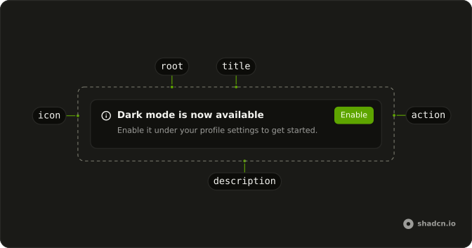
Anatomy
Usage
<script setup lang="ts">
import { CheckCircle2Icon, InfoIcon } from "lucide-vue-next";
import {
  Alert, AlertDescription, AlertTitle,
} from "@/components/ui/alert";
</script>
<template>
<div class="grid w-full max-w-md items-start gap-4">
<Alert>
<CheckCircle2Icon aria-hidden="true" />
<AlertTitle>Payment successful</AlertTitle>
<AlertDescription>
Your payment of $29.99 has been processed. A receipt has been sent to
your email address.
</AlertDescription>
</Alert>
<Alert>
<InfoIcon aria-hidden="true" />
<AlertTitle>New feature available</AlertTitle>
<AlertDescription>
We've added dark mode support. You can enable it in your account
settings.
</AlertDescription>
</Alert>
</div>
</template>
Demos
Basic
Account updated, with a check icon, a title, and one sentence about the profile being saved. This is the default variant: no variant prop, just the neutral alert. Use it for a confirmation that should sit in the page after a save. The icon is decorative, so the title has to carry the meaning on its own.
Destructive
Payment failed, with variant set to destructive and an alert icon. The border, the background, and the icon all shift to the danger treatment. Use this when something the reader tried did not work and they need to fix it, not for a mild warning. The description should say what to do next, here checking the payment method.
Action
Dark mode is available, and an Enable button sits at the end of the alert in AlertAction. There is no icon, so the text uses the full width. Use an action when the note has one obvious next step. The button is part of the alert, not a control parked underneath it.
Colors
A subscription that expires in three days, painted amber in both themes, border and text included. Built-in variants already cover warning and the other common tints. Use utility classes only when that palette is wrong for the message. Keep the title specific, here the three-day deadline, so the color is not the only signal.
Rtl
The payment success and the feature note again, with dir set to rtl and Arabic titles and descriptions. The icon stays at the start of the reading direction, and the text aligns with it. Use this to check a localized alert without flipping the whole document. A longer description still wraps inside the alert.
FAQ
What Alert variants are there in Ark UI?
variant takes default, destructive, info, success or warning, and each one tints the border, background and icon. Keep destructive for something that failed; a heads-up such as an expiring plan reads better as warning. The Colors demo shows classes for a color of your own.
Does the Alert announce itself to screen readers?
Yes: it renders with role="alert", so a screen reader announces it as soon as it appears. For information that isn't urgent, pass role="status" for a polite announcement, or remove the role for static text that is on the page from the start.
How do I make an Alert dismissible in Vue?
Keep whether it is shown in your own state, and render a close button in AlertAction that hides it. The component has no built-in dismiss, so the alert stays in place until your code removes it.
Can I use an Alert without an icon?
Yes. Leave out the icon and the layout closes its icon column, so the title and description still line up. With an icon, put the svg first in the alert; its color follows the variant.
How should I show form errors with an Alert?
Put one Alert above the form: the title says what happened and the description how to fix it. Mark the fields themselves with their own error messages, as in Field, rather than an alert per field.
API Reference
Alert
<div> data-slot="alert"
variant?"default" | "destructive" | "info" | "success" | "warning"
The visual style.
- Type
"default" | "destructive" | "info" | "success" | "warning"- Default
"default"
asChild?boolean
Use the provided child element as the default rendered element, combining their props and behavior.
class?string
Merged with the part's classes.
data-variant?stringAlertTitle
<div> data-slot="alert-title"
asChild?boolean
Use the provided child element as the default rendered element, combining their props and behavior.
class?string
Merged with the part's classes.
AlertDescription
<div> data-slot="alert-description"
asChild?boolean
Use the provided child element as the default rendered element, combining their props and behavior.
class?string
Merged with the part's classes.
AlertAction
<div> data-slot="alert-action"
asChild?boolean
Use the provided child element as the default rendered element, combining their props and behavior.
class?string
Merged with the part's classes.