shadcn.io is not affiliated with official shadcn/ui
An outline of the headings on a long page. The one in view stays marked, and choosing one scrolls there.
Put it next to a doc or any single column of sections. A hierarchy you open and close, with no tie to the scroll position, is a Tree View. In Vue, you hand Ark UI the heading ids, and it doesn't read them off the page.
Installation
Anatomy
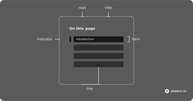
Usage
import { useCallback, useRef } from "react";
import {
  Toc, TocContent, TocIndicator, TocItem, TocLink, TocList, TocNav,
  TocTitle,
} from "@/components/ui/toc";
interface Item {
depth: number;
label: string;
lines: number;
value: string;
}
const items: Item[] = [
{
depth: 2,
label: "Introduction",
lines: 8,
value: "toc-basic-introduction",
},
{
depth: 2,
label: "Getting Started",
lines: 7,
value: "toc-basic-getting-started",
},
{
depth: 2,
label: "Installation",
lines: 6,
value: "toc-basic-installation",
},
{ depth: 2, label: "Usage", lines: 9, value: "toc-basic-usage" },
{ depth: 2, label: "Conclusion", lines: 7, value: "toc-basic-conclusion" },
];
const TocDemo = () => {
const contentRef = useRef<HTMLElement | null>(null);
const getScrollEl = useCallback(() => contentRef.current, []);
return (
<Toc className="max-w-2xl" items={items} scrollEl={getScrollEl}>
<TocContent className="h-80 pe-2" ref={contentRef}>
{items.map((item) => (
<section
className="not-first:mt-12 flex flex-col gap-3"
key={item.value}
>
<h2
className="scroll-mt-4 font-heading font-semibold text-lg"
id={item.value}
>
{item.label}
</h2>
<div
className="rounded-md bg-muted"
style={{ height: `${item.lines * 0.75}rem` }}
/>
</section>
))}
</TocContent>
<TocNav scrollToTop>
<TocTitle>On this page</TocTitle>
<TocList>
<TocIndicator />
{items.map((item) => (
<TocItem item={item} key={item.value}>
<TocLink href={`#${item.value}`}>{item.label}</TocLink>
</TocItem>
))}
</TocList>
</TocNav>
</Toc>
);
};
Demos
Nested
Headings are not all the same level. Each item carries a depth, 2 for a section and 3 for a subsection, and the list indents by that depth. The article renders the matching heading so the outline and the page agree. Use nesting when subsections exist and a flat list would hide which heading belongs under which.
Root Provider
Sometimes the active heading is needed outside the nav. useToc creates the state, a line above the article prints the active ids, and TocRootProvider feeds that state to the content and the list. Use this when a header or another control must follow the same heading. If nothing outside the outline cares, the Toc root is less machinery.
With Collapsible
A sidebar does not fit on a narrow screen. The outline collapses to a button that shows the current heading and how far through the list you are, with a small Circular Progress for the index. Opening it shows the links. Use this above the article on small layouts, and keep a permanent nav when you have the width.
With Hover
The outline can stay out of the way until the pointer is on it. Collapsed, it is a short stack of ticks, and on hover it widens so the labels appear. Use this where a full list would crowd the article. The ticks are not links, so people still need to scroll, or you should offer another way to jump.
With Indicator
TocIndicator is a marker that slides next to the active link as you scroll. These sections are very different lengths, so you can watch the marker move instead of hunting for a color change on the text. Use it when the list is long enough that the active link is easy to miss. The link still carries the name, and the marker only makes the position obvious.
With Rail
Nested headings can read as a connected outline instead of a list with a sliding bar. Each item draws a short rail, stepping inward as depth increases, and the active branch takes the primary stroke. There is no TocIndicator here. Use the rail for third and fourth level headings, when indentation alone feels like a ragged margin.
With Select
On a narrow layout the outline can be a Native Select above the article. Its value follows the heading in view, and choosing an option calls scrollTo from the toc context. Use this when a sidebar will not fit and a collapsible list is more UI than you want. The select is the navigation, so you do not also need the link list on that breakpoint.
With Tree View
Deep docs are easier to scan when branches collapse. The outline is a Tree View: a section expands when its child is the active heading, and a leaf scrolls the article to that id. Use this when people should hide the parts they are not reading. One extra level of headings is fine as indented TocItem rows, without a tree.
FAQ
How do I build a table of contents from the headings on a page?
Pass items, one per heading: its value is the heading's id, depth is its level and label is its text. The Table of Contents watches those headings as you scroll and marks the one in view as active.
How do I show nested headings in the Table of Contents?
Give each item its depth, 2 for an h2 and 3 for an h3: items are indented by depth, as in the Nested demo. Each TocItem also carries data-depth, so you can style levels differently.
How do I use the Table of Contents in a scrolling container?
Pass scrollEl, a function that returns the element that scrolls, as the default demo does. Without it, the page itself is watched, which is right for a docs page.
How does the Table of Contents decide which heading is active?
It observes the headings with an IntersectionObserver and marks those in view, using rootMargin and threshold to tune when a heading counts as visible. The active link gets data-active, and onActiveChange tells you which ids are active.
How do I add a moving indicator to the Table of Contents?
Add a TocIndicator: it slides next to the active link as you scroll, as the With Indicator demo does. The With Rail demo shows the same idea as a vertical rail.
API Reference
Toc
<div> data-slot="toc"
itemsTocItem[]
The TOC items with value (slug/id) and depth (heading level).
activeIds?string[]
The controlled active heading ids.
autoScroll?boolean
Whether to auto-scroll the TOC container so the first active item is visible when active headings change.
- Default
true
defaultActiveIds?string[]
The default active heading ids when rendered. Use when you don't need to control the active headings.
dir?"ltr" | "rtl"
The document's text/writing direction.
- Type
"ltr" | "rtl"- Default
"ltr"
id?string
The unique identifier of the machine.
ids?object
The ids of the elements in the TOC. Useful for composition.
- Type
{ root?: string; title?: string; list?: string; item?: (value: string) → string; link?: (value: string) → string; indicator?: string }
rootMargin?string
The root margin for the IntersectionObserver. Controls the effective viewport area for determining active headings.
- Default
"-20px 0px -40% 0px"
scrollBehavior?ScrollBehavior
The default scroll behavior used when auto-scrolling the TOC container
and when scrolling to a heading (via link click or api.scrollTo).
Can be overridden per-call by passing behavior to api.scrollTo.
- Default
"smooth"
scrollEl?() → HTMLElement | null
Function that returns the scroll container element to observe within. Defaults to the document/viewport.
- Type
() → HTMLElement | null- Returns
HTMLElement | null
threshold?number | number[]
The IntersectionObserver threshold. A value of 0 means the heading is
active as soon as even one pixel is visible within the root margin area.
- Type
number | number[]- Default
0
asChild?boolean
Use the provided child element as the default rendered element, combining their props and behavior.
class?string
Merged with the part's classes.
@active-change(details: ActiveChangeDetails) → void
Callback when the active (visible) headings change.
- Type
(details: ActiveChangeDetails) → void- Parameters
details– { activeIds: string[]; activeItems: TocItem[] }- Returns
void
--heightstring
The height of the element.
--leftstring
The left position value.
--topstring
The top position value.
--widthstring
The width of the element.
TocTitle
<h2> data-slot="toc-title"
asChild?boolean
Use the provided child element as the default rendered element, combining their props and behavior.
class?string
Merged with the part's classes.
TocList
<ul> data-slot="toc-list"
asChild?boolean
Use the provided child element as the default rendered element, combining their props and behavior.
class?string
Merged with the part's classes.
TocItem
<li> data-slot="toc-item"
itemobject
The TOC item.
- Type
{ value: string; depth: number }
asChild?boolean
Use the provided child element as the default rendered element, combining their props and behavior.
class?string
Merged with the part's classes.
data-active?string
Present when active or pressed.
data-depthstring
The depth of the item.
data-first?string
Present when first is true.
data-last?string
Present when last is true.
data-valuestring
The value of the item.
--depthstring
The depth value for the Item.
TocLink
<a> data-slot="toc-link"
asChild?boolean
Use the provided child element as the default rendered element, combining their props and behavior.
class?string
Merged with the part's classes.
data-active?string
Present when active or pressed.
data-valuestring
The value of the item.
TocIndicator
<div> data-slot="toc-indicator"
asChild?boolean
Use the provided child element as the default rendered element, combining their props and behavior.
class?string
Merged with the part's classes.
--heightstring
The measured height, for animating open and closed.
--topstringTocContent
<article> data-slot="toc-content"
asChild?boolean
Use the provided child element as the default rendered element, combining their props and behavior.
class?string
Merged with the part's classes.
TocNav
<nav> data-slot="toc-nav"
placement?"left" | "right"
The side of the content the outline sits on.
- Type
"left" | "right"
scrollToTop?boolean
Shows a button under the outline that scrolls back to the top.
- Default
false
asChild?boolean
Use the provided child element as the default rendered element, combining their props and behavior.
class?string
Merged with the part's classes.
TocScrollToTop
<button> data-slot="toc-scroll-to-top"
offset?number
How far the page scrolls before the button shows, in px.
- Default
DEFAULT_TOP_OFFSET
class?string
Merged with the part's classes.
TocRootProvider
<div> data-slot="toc"
valueUseTocReturn
What useToc() returns: the state and API, made outside the component to control it.
asChild?boolean
Use the provided child element as the default rendered element, combining their props and behavior.
class?string
Merged with the part's classes.
--heightstring
The measured height, for animating open and closed.
--leftstring--topstring--widthstring
The measured width, for animating open and closed.
useToc
itemsTocItem[]
The TOC items with value (slug/id) and depth (heading level).
activeIds?string[]
The controlled active heading ids.
autoScroll?boolean
Whether to auto-scroll the TOC container so the first active item is visible when active headings change.
- Default
true
defaultActiveIds?string[]
The default active heading ids when rendered. Use when you don't need to control the active headings.
id?string
The unique identifier of the machine.
ids?object
The ids of the elements in the TOC. Useful for composition.
- Type
{ root?: string; title?: string; list?: string; item?: (value: string) → string; link?: (value: string) → string; indicator?: string }
rootMargin?string
The root margin for the IntersectionObserver. Controls the effective viewport area for determining active headings.
- Default
"-20px 0px -40% 0px"
scrollBehavior?ScrollBehavior
The default scroll behavior used when auto-scrolling the TOC container
and when scrolling to a heading (via link click or api.scrollTo).
Can be overridden per-call by passing behavior to api.scrollTo.
- Default
"smooth"
scrollEl?() → HTMLElement | null
Function that returns the scroll container element to observe within. Defaults to the document/viewport.
- Type
() → HTMLElement | null- Returns
HTMLElement | null
threshold?number | number[]
The IntersectionObserver threshold. A value of 0 means the heading is
active as soon as even one pixel is visible within the root margin area.
- Type
number | number[]- Default
0
@active-change(details: ActiveChangeDetails) → void
Callback when the active (visible) headings change.
- Type
(details: ActiveChangeDetails) → void- Parameters
details– { activeIds: string[]; activeItems: TocItem[] }- Returns
void
TocContext
activeIdsstring[]
All currently active (visible) heading ids.
activeItemsTocItem[]
The active (visible) TOC items.
getItemState(props: ItemProps) → ItemState
Returns the state of a TOC item.
- Parameters
props– { item: TocItem }- Returns
ItemState
itemsTocItem[]
The resolved items list.
scrollTo(value: string, details?: ScrollToDetails) → void
Scrolls to the heading with the given id.
- Type
(value: string, details?: ScrollToDetails) → void- Parameters
value– stringdetails?– { behavior?: ScrollBehavior }- Returns
void
setActiveIds(value: string[]) → void
Manually set the active heading ids.
- Parameters
value– string[]- Returns
void
With other components
Prose
TypographyThe headings it tracks
Scroll Area
LayoutA long outline
Sidebar
NavigationThe outline in the nav
Skip Nav
NavigationSkip to the content
Separator
LayoutSplit groups of headings
Card
LayoutThe outline on a surface
Related
Navigation Menu
NavigationSite links, not headings
Breadcrumb
NavigationThe path, not the page
Tabs
NavigationA few panels
Accordion
DisclosureFold the sections
Tree View
DisclosureA nested outline you edit
Steps
NavigationA sequence, not a page