shadcn.io is not affiliated with official shadcn/ui
Nested nodes you can expand, select, and rename. Arrow keys move between rows without a tab stop on each one.
Use it when the hierarchy is the interface, like a file tree. Two sections that only show and hide can be a Collapsible. In Vue, Ark UI handles focus, expansion, and selection from the nodes you pass.
Installation
Anatomy
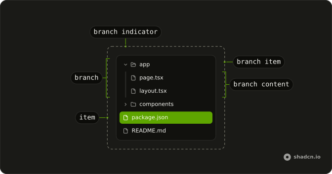
TreeViewRoot
├── TreeViewBranch
│   ├── TreeViewBranchContent
│   │   └── TreeViewBranchIndentGuide
│   ├── TreeViewBranchIndicator
│   ├── TreeViewBranchItem
│   │   └── TreeViewBranchControl
│   └── TreeViewBranchTrigger
├── TreeViewContent
│   ├── TreeViewItemIndicator
│   └── TreeViewItem
├── TreeViewLabel
├── TreeViewCheckbox
│   └── TreeViewNodeRenameInput
└── TreeViewTree
Usage
<script setup lang="ts">
import {
  createTreeCollection, TreeView, TreeViewBranch, TreeViewBranchContent,
  TreeViewBranchItem, TreeViewContent, TreeViewItem, TreeViewNode,
  TreeViewTree,
} from "@/components/ui/tree-view";
</script>
const TreeViewDemo = () => (
  <div className="w-full max-w-48">
    <TreeView collection={collection}>
      <TreeViewTree>
        {collection.rootNode.children?.map((node, index) => (
          <TreeNode indexPath={[index]} key={node.id} node={node} />
        ))}
      </TreeViewTree>
    </TreeView>
  </div>
);

const collection = createTreeCollection({
  rootNode: {
    id: "ROOT",
    name: "",
    children: [
      {
        id: "app",
        name: "app",
        children: [
          { id: "app/page.tsx", name: "page.tsx" },
          { id: "app/layout.tsx", name: "layout.tsx" },
        ],
      },
      {
        id: "components",
        name: "components",
        children: [
          { id: "components/button.tsx", name: "button.tsx" },
          { id: "components/input.tsx", name: "input.tsx" },
        ],
      },
      { id: "package.json", name: "package.json" },
      { id: "readme.md", name: "README.md" },
    ],
  },
});

const TreeNode = (props: React.ComponentProps<typeof TreeViewNode>) => {
  const { node, indexPath, ...rest } = props;

  return (
    <TreeViewNode indexPath={indexPath} node={node} {...rest}>
      {node.children ? (
        <TreeViewBranch>
          <TreeViewBranchItem>{node.name}</TreeViewBranchItem>

          <TreeViewBranchContent>
            {node.children.map((child, index) => (
              <TreeNode
                indexPath={[...indexPath, index]}
                key={child.id}
                node={child}
              />
            ))}
          </TreeViewBranchContent>
        </TreeViewBranch>
      ) : (
        <TreeViewContent>
          <TreeViewItem>{node.name}</TreeViewItem>
        </TreeViewContent>
      )}
    </TreeViewNode>
  );
};
Accessibility
- Tab
- Moves focus to the tree view, placing the first tree view item in focus.
- Enter
- Selects the item or branch node.
- Space
- Selects the item or branch node.
- Arrow Down
- Moves focus to the next node.
- Arrow Up
- Moves focus to the previous node.
- Arrow Right
- When focus is on a closed branch node, opens the branch. When focus is on an open branch node, moves focus to the first item node.
- Arrow Left
- When focus is on an open branch node, closes the node. When focus is on a item or branch node, moves focus to its parent branch node.
- Home
- Moves focus to first node without opening or closing a node.
- End
- Moves focus to the last node that can be focused without expanding any nodes that are closed.
- a-z
- Focus moves to the next node with a name that starts with the typed character. The search logic ignores nodes that are descendants of closed branch.
- A-Z
- Focus moves to the next node with a name that starts with the typed character. The search logic ignores nodes that are descendants of closed branch.
- *
- Expands all sibling nodes that are at the same depth as the focused node.
- Shift+Arrow Down
- Moves focus to and toggles the selection state of the next node.
- Shift+Arrow Up
- Moves focus to and toggles the selection state of the previous node.
- Ctrl+A
- Selects all nodes in the tree. If all nodes are selected, unselects all nodes.
- Command+A
- Select all.
- F2
- Rename the focused item.
Demos
Checkbox Tree
TreeViewCheckbox sits on each branch and file, and checkedValue is held in state. The list beside the tree prints those ids, and readme.md starts checked. Use checkboxes when the tree is a picker, such as files to export, not when a click should only open a folder. Do not also toggle selection on that click, or the two states will fight.
Context Menu
A right click on a folder offers add folder, add file, rename, and delete, while a file gets rename and delete. The menu wraps the row, so the tree keeps its keyboard behavior. Use it for actions that do not deserve a visible button on every line. These items do not change the collection, so wire that up before calling it a file manager.
Controlled
selectedValue is yours. The prompt asks for input.tsx, and the line under the tree flips once that id is selected. Control selection when opening a file or enabling a toolbar depends on the current node, and leave it uncontrolled when a highlight is enough and nothing else reads the id. The value is a list even for one node, so read the first id.
Custom Icons
fileIcons maps an extension to an icon: code for tsx, a JSON mark for json, text for md. Folders keep the default folder glyph. Use the map when the type lives in the suffix and you do not want a branch inside every row. An extension you leave out falls back to the ordinary file icon, and a special leaf can set icon on that item instead.
Custom Icons Folder
The app branch uses a package icon when closed and an open package when expanded, via icon and expandedIcon. The components branch passes null for both, so it shows only the chevron and the name. Use a custom pair when the branch is a package or a drive, not really a folder. Use null when a second icon is clutter.
Custom Icons Item
Every file sets icon on TreeViewItem to a star, and folders stay on the default. Use the item icon when a leaf needs a marker the extension map does not cover, such as a favorite, and prefer fileIcons when the choice is only the suffix. A star on every file, as here, is a stand-in. If the name already identifies the row, hide the icon from assistive tech.
Editor
Choosing a file, not a folder, opens a tab named for that file, with a placeholder for the contents and a control to close it. Folders only expand. Use this split for an editor sidebar: the tree navigates, and selection decides whether to open a document, so do not open a tab for a branch. Nothing here loads real file text, and the handoff is the part to copy.
Links
Rows are anchors: documentation children stay in the app, the GitHub row opens in a new tab, and llms.txt is a leaf link. TreeViewLabel names the tree Docs, and branch icons are off so it reads as navigation. Use links for a site map, and selection when a choice should not navigate. An external row still needs a cue that it leaves the site, the icon beside GitHub.
Multiple Selection
selectionMode set to multiple lets more than one node stay highlighted, and Shift with the arrow keys extends that selection. Use it for a batch action, such as moving several files. It is not the checkbox tree: there is no checked state, only a highlight, and that highlight is easy to lose. If the set must stay obvious while someone scrolls, checkboxes say it more clearly.
Rename
canRename allows every node, and onRenameComplete writes the new label back with replace on the collection. Focus a row and press F2 to edit in place. Use rename when people change labels in the tree, such as a folder they just created. If a server owns the name, update it there and then replace the node, because editing only the input snaps back.
FAQ
How do I render a file tree with the Tree View in Vue?
Build a collection with createTreeCollection from a root node whose children are your folders and files, each with an id and a name, and pass it as collection. Render the root's children with TreeViewNode, as the default demo does.
How do I control which Tree View item is selected?
Keep the selected ids in state and pass them as selectedValue, an array; use defaultSelectedValue for a starting selection. Set selectionMode="multiple" to allow several, as the Multiple Selection demo does.
Listen to @selection-change, which receives details.selectedValue.
How do I expand Tree View folders by default?
Pass the ids of the open branches as defaultExpandedValue, or control them with expandedValue and onExpandedChange. Clicking a branch toggles it, unless you set expandOnClick to false.
How do I add checkboxes to the Tree View?
Render a TreeViewCheckbox in each item and control the checked ids with checkedValue and onCheckedChange, as the Checkbox Tree demo does. Checking a folder checks its children, and a partly checked folder shows an indeterminate box.
How do I load Tree View children lazily?
Pass loadChildren, an async function that returns a branch's children when it first opens. The branch shows its loading state meanwhile, and onLoadChildrenComplete gives you the updated collection to keep.
How do I change the icons or rename items in the Tree View?
Give a node an icon, and a folder an expandedIcon, as the Custom Icons demos do. For renaming, pass canRename and handle onRenameComplete, as the Rename demo does.
API Reference
TreeView
<div> data-slot="tree-view"
collectionTreeCollection<T>
The collection of tree nodes.
- Type
TreeCollection<T>
canRename?(node: T, indexPath: IndexPath) → boolean
Function to determine if a node can be renamed.
- Type
(node: T, indexPath: IndexPath) → boolean- Parameters
node– TindexPath– IndexPath- Returns
boolean
checkedValue?string[]
The controlled checked node value.
defaultCheckedValue?string[]
The initial checked node value when rendered. Use when you don't need to control the checked node value.
defaultExpandedValue?string[]
The initial expanded node ids when rendered. Use when you don't need to control the expanded node value.
defaultFocusedValue?string | null
The initial focused node value when rendered. Use when you don't need to control the focused node value.
- Type
string | null
defaultSelectedValue?string[]
The initial selected node value when rendered. Use when you don't need to control the selected node value.
dir?"ltr" | "rtl"
The document's text/writing direction.
- Type
"ltr" | "rtl"- Default
"ltr"
expandedValue?string[]
The controlled expanded node ids.
expandOnClick?boolean
Whether clicking on a branch should open it or not.
- Default
true
focusedValue?string | null
The value of the focused node.
- Type
string | null
hideMode?"display-none" | "activity"
How to hide content when mounted but not present.
- display-none: HTML hidden attribute. Effects stay alive.
- activity: React 19 <Activity mode="hidden">. Effects pause. Requires React 19+.
- Type
"display-none" | "activity"- Default
"display-none"
id?string
The unique identifier of the machine.
ids?object
The ids of the tree elements. Useful for composition.
- Type
{ root?: string; tree?: string; label?: string; node?: (value: string) → string }
lazyMount?boolean
Whether to enable lazy mounting. Ark default: false.
- Default
true
loadChildren?(details: LoadChildrenDetails<T>) → Promise<T[]>
Function to load children for a node asynchronously. When provided, branches will wait for this promise to resolve before expanding.
- Type
(details: LoadChildrenDetails<T>) → Promise<T[]>- Parameters
details– LoadChildrenDetails<T>- Returns
Promise<T[]>
scrollToIndexFn?(details: ScrollToIndexDetails<T>) → void
Function to scroll to a specific index. Useful for virtualized tree views.
- Type
(details: ScrollToIndexDetails<T>) → void- Parameters
details– ScrollToIndexDetails<T>- Returns
void
selectedValue?string[]
The controlled selected node value.
selectionMode?"single" | "multiple"
Whether the tree supports multiple selection - "single": only one node can be selected - "multiple": multiple nodes can be selected
- Type
"single" | "multiple"- Default
"single"
translations?object
Specifies the localized strings that identifies the accessibility elements and their states.
- Type
{ treeLabel?: string; renameInputLabel?: string }
typeahead?boolean
Whether the tree supports typeahead search.
- Default
true
unmountOnExit?boolean
Whether to unmount on exit. Ark default: false.
- Default
true
asChild?boolean
Use the provided child element as the default rendered element, combining their props and behavior.
class?string
Merged with the part's classes.
@before-rename(details: RenameCompleteDetails) → boolean
Called before a rename is completed. Return false to prevent the rename.
- Type
(details: RenameCompleteDetails) → boolean- Parameters
details– { value: string; label: string; indexPath: IndexPath }- Returns
boolean
@checked-change(details: CheckedChangeDetails) → void
Called when the checked value changes.
- Type
(details: CheckedChangeDetails) → void- Parameters
details– { checkedValue: string[] }- Returns
void
@expanded-change(details: ExpandedChangeDetails<T>) → void
Called when the tree is opened or closed.
- Type
(details: ExpandedChangeDetails<T>) → void- Parameters
details– ExpandedChangeDetails<T>- Returns
void
@focus-change(details: FocusChangeDetails<T>) → void
Called when the focused node changes.
- Type
(details: FocusChangeDetails<T>) → void- Parameters
details– FocusChangeDetails<T>- Returns
void
@load-children-complete(details: LoadChildrenCompleteDetails<T>) → void
Called when a node finishes loading children.
- Type
(details: LoadChildrenCompleteDetails<T>) → void- Parameters
details– LoadChildrenCompleteDetails<T>- Returns
void
@load-children-error(details: LoadChildrenErrorDetails<T>) → void
Called when loading children fails for one or more nodes.
- Type
(details: LoadChildrenErrorDetails<T>) → void- Parameters
details– LoadChildrenErrorDetails<T>- Returns
void
@rename-complete(details: RenameCompleteDetails) → void
Called when a node label rename is completed.
- Type
(details: RenameCompleteDetails) → void- Parameters
details– { value: string; label: string; indexPath: IndexPath }- Returns
void
@rename-start(details: RenameStartDetails<T>) → void
Called when a node starts being renamed.
- Type
(details: RenameStartDetails<T>) → void- Parameters
details– RenameStartDetails<T>- Returns
void
@selection-change(details: SelectionChangeDetails<T>) → void
Called when the selection changes.
- Type
(details: SelectionChangeDetails<T>) → void- Parameters
details– SelectionChangeDetails<T>- Returns
void
data-motion?string
Present after onExpandedChange.
TreeViewBranch
<div> data-slot="tree-view-branch"
asChild?boolean
Use the provided child element as the default rendered element, combining their props and behavior.
class?string
Merged with the part's classes.
data-branchstring
Mirrors value.
data-depthstring
Mirrors depth.
data-disabled?string
Present when disabled is true.
data-loading?string
Present when loading is true.
data-ownedbystring
Id of the tree part.
data-pathstringdata-selected?string
Present when selected is true.
data-state"open" | "closed"
"open" or "closed".
- Type
"open" | "closed"
data-valuestring
The item's value.
--depthstring--icon-sizestring--indentationstring--item-gapstring--padding-blockstring--padding-inlinestringTreeViewBranchContent
<div> data-slot="tree-view-branch-content"
asChild?boolean
Use the provided child element as the default rendered element, combining their props and behavior.
class?string
Merged with the part's classes.
data-depthstring
Mirrors depth.
data-pathstringdata-state"open" | "closed"
"open" or "closed".
- Type
"open" | "closed"
data-valuestring
The item's value.
--depthstring--icon-sizestring--indentationstring--padding-inlinestringTreeViewBranchItem
<div> data-slot="tree-view-branch-control"
expandedIcon?React.JSX.ElementType | null
Custom expanded icon.
- Type
React.JSX.ElementType | null- Default
<FolderOpenIcon />
icon?React.JSX.ElementType | null
Custom icon.
- Type
React.JSX.ElementType | null- Default
<FolderIcon />
asChild?boolean
Use the provided child element as the default rendered element, combining their props and behavior.
class?string
Merged with the part's classes.
data-checked?string
Present when checked.
data-depthstring
Mirrors depth.
data-disabled?string
Present when disabled is true.
data-focus?string
Present when focused is true.
data-indeterminate?string
Present when indeterminate.
data-loading?string
Present when loading is true.
data-pathstringdata-renaming?string
Present when renaming is true.
data-selected?string
Present when selected is true.
data-state"open" | "closed"
"open" or "closed".
- Type
"open" | "closed"
data-valuestring
The item's value.
TreeViewBranchIndentGuide
<div> data-slot="tree-view-branch-indent-guide"
asChild?boolean
Use the provided child element as the default rendered element, combining their props and behavior.
data-depthstring
Mirrors depth.
--depthstring--icon-sizestring--indentationstring--padding-inlinestringTreeViewBranchIndicator
<div> data-slot="tree-view-branch-indicator"
asChild?boolean
Use the provided child element as the default rendered element, combining their props and behavior.
class?string
Merged with the part's classes.
data-disabled?string
Present when disabled is true.
data-focus?string
Present when focused is true.
data-loading?string
Present when loading is true.
data-selected?string
Present when selected is true.
data-state"open" | "closed"
"open" or "closed".
- Type
"open" | "closed"
TreeViewContent
<div> data-slot="tree-view-item"
asChild?boolean
Use the provided child element as the default rendered element, combining their props and behavior.
class?string
Merged with the part's classes.
data-checked?string
Present when checked.
data-depthstring
Mirrors depth.
data-disabled?string
Present when disabled is true.
data-focus?string
Present when focused is true.
data-indeterminate?string
Present when indeterminate.
data-ownedbystring
Id of the tree part.
data-pathstringdata-renaming?string
Present when renaming is true.
data-selected?string
Present when selected is true.
data-valuestring
The item's value.
--depthstringTreeViewItem
<span> data-slot="tree-view-item-title"
icon?React.JSX.ElementType
Custom file icon.
- Default
<FileIcon />
asChild?boolean
Use the provided child element as the default rendered element, combining their props and behavior.
class?string
Merged with the part's classes.
data-disabled?string
Present when disabled is true.
data-focus?string
Present when focused is true.
data-selected?string
Present when selected is true.
--item-gapstringTreeViewLabel
<h3> data-slot="tree-view-label"
asChild?boolean
Use the provided child element as the default rendered element, combining their props and behavior.
class?string
Merged with the part's classes.
TreeViewCheckbox
<span> data-slot="tree-view-checkbox"
asChild?boolean
Use the provided child element as the default rendered element, combining their props and behavior.
class?string
Merged with the part's classes.
data-disabled?string
Present when disabled.
data-state"checked" | "unchecked" | "indeterminate"
"checked", "unchecked" or "indeterminate".
- Type
"checked" | "unchecked" | "indeterminate"
TreeViewNodeRenameInput
<input> data-slot="tree-view-node-rename-input"
asChild?boolean
Use the provided child element as the default rendered element, combining their props and behavior.
TreeViewTree
<div> data-slot="tree-view-tree"
asChild?boolean
Use the provided child element as the default rendered element, combining their props and behavior.
class?string
Merged with the part's classes.
data-branch?string--icon-sizestringTreeViewNode
data-slot="tree-view-node"
indexPathnumber[]
The index path of the tree node.
nodeT
The tree node.
asChild?boolean
Use the provided child element as the default rendered element, combining their props and behavior.
useTreeView
collectionTreeCollection<T>
The collection of tree nodes.
- Type
TreeCollection<T>
canRename?(node: T, indexPath: IndexPath) → boolean
Function to determine if a node can be renamed.
- Type
(node: T, indexPath: IndexPath) → boolean- Parameters
node– TindexPath– IndexPath- Returns
boolean
checkedValue?string[]
The controlled checked node value.
defaultCheckedValue?string[]
The initial checked node value when rendered. Use when you don't need to control the checked node value.
defaultExpandedValue?string[]
The initial expanded node ids when rendered. Use when you don't need to control the expanded node value.
defaultFocusedValue?string | null
The initial focused node value when rendered. Use when you don't need to control the focused node value.
- Type
string | null
defaultSelectedValue?string[]
The initial selected node value when rendered. Use when you don't need to control the selected node value.
expandedValue?string[]
The controlled expanded node ids.
expandOnClick?boolean
Whether clicking on a branch should open it or not.
- Default
true
focusedValue?string | null
The value of the focused node.
- Type
string | null
id?string
The unique identifier of the machine.
ids?object
The ids of the tree elements. Useful for composition.
- Type
{ root?: string; tree?: string; label?: string; node?: (value: string) → string }
loadChildren?(details: LoadChildrenDetails<T>) → Promise<T[]>
Function to load children for a node asynchronously. When provided, branches will wait for this promise to resolve before expanding.
- Type
(details: LoadChildrenDetails<T>) → Promise<T[]>- Parameters
details– LoadChildrenDetails<T>- Returns
Promise<T[]>
scrollToIndexFn?(details: ScrollToIndexDetails<T>) → void
Function to scroll to a specific index. Useful for virtualized tree views.
- Type
(details: ScrollToIndexDetails<T>) → void- Parameters
details– ScrollToIndexDetails<T>- Returns
void
selectedValue?string[]
The controlled selected node value.
selectionMode?"single" | "multiple"
Whether the tree supports multiple selection - "single": only one node can be selected - "multiple": multiple nodes can be selected
- Type
"single" | "multiple"- Default
"single"
translations?object
Specifies the localized strings that identifies the accessibility elements and their states.
- Type
{ treeLabel?: string; renameInputLabel?: string }
typeahead?boolean
Whether the tree supports typeahead search.
- Default
true
@before-rename(details: RenameCompleteDetails) → boolean
Called before a rename is completed. Return false to prevent the rename.
- Type
(details: RenameCompleteDetails) → boolean- Parameters
details– { value: string; label: string; indexPath: IndexPath }- Returns
boolean
@checked-change(details: CheckedChangeDetails) → void
Called when the checked value changes.
- Type
(details: CheckedChangeDetails) → void- Parameters
details– { checkedValue: string[] }- Returns
void
@expanded-change(details: ExpandedChangeDetails<T>) → void
Called when the tree is opened or closed.
- Type
(details: ExpandedChangeDetails<T>) → void- Parameters
details– ExpandedChangeDetails<T>- Returns
void
@focus-change(details: FocusChangeDetails<T>) → void
Called when the focused node changes.
- Type
(details: FocusChangeDetails<T>) → void- Parameters
details– FocusChangeDetails<T>- Returns
void
@load-children-complete(details: LoadChildrenCompleteDetails<T>) → void
Called when a node finishes loading children.
- Type
(details: LoadChildrenCompleteDetails<T>) → void- Parameters
details– LoadChildrenCompleteDetails<T>- Returns
void
@load-children-error(details: LoadChildrenErrorDetails<T>) → void
Called when loading children fails for one or more nodes.
- Type
(details: LoadChildrenErrorDetails<T>) → void- Parameters
details– LoadChildrenErrorDetails<T>- Returns
void
@rename-complete(details: RenameCompleteDetails) → void
Called when a node label rename is completed.
- Type
(details: RenameCompleteDetails) → void- Parameters
details– { value: string; label: string; indexPath: IndexPath }- Returns
void
@rename-start(details: RenameStartDetails<T>) → void
Called when a node starts being renamed.
- Type
(details: RenameStartDetails<T>) → void- Parameters
details– RenameStartDetails<T>- Returns
void
@selection-change(details: SelectionChangeDetails<T>) → void
Called when the selection changes.
- Type
(details: SelectionChangeDetails<T>) → void- Parameters
details– SelectionChangeDetails<T>- Returns
void
With other components
Button
ButtonsExpand a node
Checkbox
SelectionSelect nodes
Scroll Area
LayoutA deep tree
Context Menu
MenusActions on a node
Badge
FeedbackA count on a node
Separator
LayoutSplit the roots
Related
Accordion
DisclosureOne level of disclosure
Collapsible
DisclosureA single panel
Sidebar
NavigationA tree used as nav
Listbox
SelectionA flat list
Command
OverlaysSearch instead of browse
Table of Contents
NavigationHeadings, not data