shadcn.io is not affiliated with official shadcn/ui
A collapsible hides one section behind a button.
Use it for a single show-more, like an address under an order status. For several sections in a list, use an Accordion so the arrow keys move between them. In Vue, Ark UI connects the button to the panel.
Installation
Anatomy
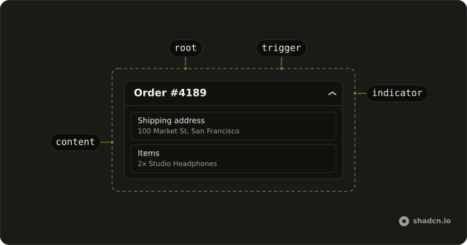
Collapsible
├── CollapsibleTrigger
├── CollapsibleContent
└── CollapsibleIndicator
Usage
import { ChevronsUpDownIcon } from "lucide-react";
import { useState } from "react";
import { Button } from "@/components/ui/button";
import {
  Collapsible, CollapsibleContent, CollapsibleTrigger,
} from "@/components/ui/collapsible";
const CollapsibleDemo = () => {
const [isOpen, setIsOpen] = useState(false);
const handleOpenChange = (details: { open: boolean }) => {
setIsOpen(details.open);
};
return (
<Collapsible
className="flex w-[350px] flex-col gap-2"
onOpenChange={handleOpenChange}
open={isOpen}
>
<div className="flex items-center justify-between gap-4 px-4">
<h4 className="font-semibold text-sm">Order #4189</h4>
<CollapsibleTrigger asChild>
<Button className="size-8" size="icon-md" variant="ghost">
<ChevronsUpDownIcon aria-hidden="true" />
<span className="sr-only">Toggle details</span>
</Button>
</CollapsibleTrigger>
</div>
<div className="flex items-center justify-between rounded-md border px-4 py-2 text-sm">
<span className="text-muted-foreground">Status</span>
<span className="font-medium">Shipped</span>
</div>
<CollapsibleContent className="flex flex-col gap-2">
<div className="rounded-md border px-4 py-2 text-sm">
<p className="font-medium">Shipping address</p>
<p className="text-muted-foreground">100 Market St, San Francisco</p>
</div>
<div className="rounded-md border px-4 py-2 text-sm">
<p className="font-medium">Items</p>
<p className="text-muted-foreground">2x Studio Headphones</p>
</div>
</CollapsibleContent>
</Collapsible>
);
};Accessibility
- Space
- Opens/closes the collapsible.
- Enter
- Opens/closes the collapsible.
Demos
Basic
A card holds one full-width trigger, Product details, and a chevron that turns when the panel is open. Inside is a short note and a Learn More button. Nothing outside reads the open state, so the collapsible keeps it. Use that when the trigger is the only control that should care, and treat the card as just a frame.
Settings
Two radius fields stay on screen. The bottom corners live in CollapsibleContent and show up when the icon button is pressed. The button's accessible name switches between show and hide, which is why open is controlled: the icon depends on it. Use this for advanced values that would double the form for most people, and do not hide a field this way if it has to be filled.
File Tree
Folders are nested collapsibles and files are plain buttons. Each level opens on its own, which is enough for a small static outline in a card. There is no selection, no typeahead, and no rename, so a real navigator should be a Tree View instead of stacked disclosures. Arrow keys will not walk these rows, because each trigger is its own button.
Rtl
The same order summary, in Arabic, with dir set to rtl. The status row and the hidden address follow the text, and the toggle sits at the inline end. Set direction on the collapsible when this block is translated even if the page around it is not. The chevron does not point to a physical side, so leave it, and keep margins logical or the rows drift.
FAQ
Should I use a Collapsible or an Accordion?
Use a Collapsible for one region that shows and hides on its own, like "Show more" or a settings group. When several sections sit together and work as one list, with arrow keys between the headers, use an Accordion instead of stacking Collapsibles.
How do I open a Collapsible from another button in Vue?
Hold the open state yourself and pass it in: the trigger still toggles it, and your other button writes the same state.
Bind v-model:open, or pass :open and listen to @open-change, which receives { open }.
How do I make a Collapsible start open?
Set defaultOpen on Collapsible.
It still opens and closes on its own afterwards. If people should find it the way they left it, save the state yourself and pass it back as the controlled value.
Does the content of a closed Collapsible stay in the page?
Yes, by default it stays mounted and hidden, so fields inside it still submit with a form. Set lazyMount to render it only on first open, or unmountOnExit to remove it when it closes.
How do I use my own button as the Collapsible trigger in Ark UI?
Render your button through CollapsibleTrigger so it gets the open state and the ARIA attributes.
Pass asChild and put your button inside.
An icon-only trigger needs an aria-label.
How do I change or turn off the Collapsible animation?
The content animates its height when it opens and closes. Set disableAnimation on CollapsibleContent to open and close it at once, or edit the timing classes in the collapsible file in your components/ui folder. People who ask for reduced motion don't get the animation.
API Reference
Collapsible
<div> data-slot="collapsible"
open?boolean
The controlled open state of the collapsible. Two-way with v-model:open.
defaultOpen?boolean
The initial open state of the collapsible when rendered. Use when you don't need to control the open state of the collapsible.
collapsedHeight?number | string
The height of the content when collapsed.
- Type
number | string
collapsedWidth?number | string
The width of the content when collapsed.
- Type
number | string
dir?"ltr" | "rtl"
The document's text/writing direction.
- Type
"ltr" | "rtl"- Default
"ltr"
disabled?boolean
Whether the collapsible is disabled.
hideMode?"display-none" | "activity"
How to hide content when mounted but not present.
- display-none: HTML hidden attribute. Effects stay alive.
- activity: React 19 <Activity mode="hidden">. Effects pause. Requires React 19+.
- Type
"display-none" | "activity"- Default
"display-none"
id?string
The unique identifier of the machine.
ids?object
The ids of the elements in the collapsible. Useful for composition.
- Type
{ root?: string; content?: string; trigger?: string }
lazyMount?boolean
Whether to enable lazy mounting.
- Default
false
onExitComplete?VoidFunction
The callback invoked when the exit animation completes.
unmountOnExit?boolean
Whether to unmount on exit.
- Default
false
asChild?boolean
Use the provided child element as the default rendered element, combining their props and behavior.
class?string
Merged with the part's classes.
@open-change(details: OpenChangeDetails) → void
The callback invoked when the open state changes.
- Type
(details: OpenChangeDetails) → void- Parameters
details– { open: boolean }- Returns
void
data-partial-collapse?string
Present when collapsedHeight is set.
data-state"open" | "closed"
"open" or "closed".
- Type
"open" | "closed"
CollapsibleTrigger
<button> data-slot="collapsible-trigger"
asChild?boolean
Use the provided child element as the default rendered element, combining their props and behavior.
class?string
Forwarded to the part.
data-disabled?string
Present when disabled.
data-state"open" | "closed"
"open" or "closed".
- Type
"open" | "closed"
CollapsibleContent
<div> data-slot="collapsible-content"
disableAnimation?boolean
Opens and closes it at once, without the height animation.
- Default
false
asChild?boolean
Use the provided child element as the default rendered element, combining their props and behavior.
class?string
Merged with the part's classes.
data-collapsible""
- Default
""
data-disabled?string
Present when disabled.
data-has-collapsed-size?string
Present when the content has collapsed width or height.
data-state"open" | "closed"
"open" or "closed".
- Type
"open" | "closed"
--collapsed-heightstring
The height of the Content.
--collapsed-widthstring
The width of the Content.
--heightstring
The height of the element.
--widthstring
The width of the element.
CollapsibleIndicator
<div> data-slot="collapsible-indicator"
asChild?boolean
Use the provided child element as the default rendered element, combining their props and behavior.
class?string
Merged with the part's classes.
data-disabled?string
Present when disabled.
data-state"open" | "closed"
"open" or "closed".
- Type
"open" | "closed"
CollapsibleRootProvider
<div> data-slot="collapsible"
valueobject
What useCollapsible() returns: the state and API, made outside the component to control it.
- Type
{ isUnmounted?: boolean; hideMode: HideMode }
asChild?boolean
Use the provided child element as the default rendered element, combining their props and behavior.
class?string
Merged with the part's classes.
data-state"open" | "closed"
"open" or "closed".
- Type
"open" | "closed"
useCollapsible
open?boolean
The controlled open state of the collapsible. Two-way with v-model:open.
defaultOpen?boolean
The initial open state of the collapsible when rendered. Use when you don't need to control the open state of the collapsible.
collapsedHeight?number | string
The height of the content when collapsed.
- Type
number | string
collapsedWidth?number | string
The width of the content when collapsed.
- Type
number | string
disabled?boolean
Whether the collapsible is disabled.
hideMode?"display-none" | "activity"
How to hide content when mounted but not present.
- display-none: HTML hidden attribute. Effects stay alive.
- activity: React 19 <Activity mode="hidden">. Effects pause. Requires React 19+.
- Type
"display-none" | "activity"- Default
"display-none"
id?string
The unique identifier of the machine.
ids?object
The ids of the elements in the collapsible. Useful for composition.
- Type
{ root?: string; content?: string; trigger?: string }
lazyMount?boolean
Whether to enable lazy mounting.
- Default
false
onExitComplete?VoidFunction
The callback invoked when the exit animation completes.
unmountOnExit?boolean
Whether to unmount on exit.
- Default
false
@open-change(details: OpenChangeDetails) → void
The callback invoked when the open state changes.
- Type
(details: OpenChangeDetails) → void- Parameters
details– { open: boolean }- Returns
void
CollapsibleContext
disabledboolean
Whether the collapsible is disabled.
hideMode"display-none" | "activity"
Resolved hide strategy for mounted content.
- Type
"display-none" | "activity"
measureSizeVoidFunction
Function to measure the size of the content.
openboolean
Whether the collapsible is open.
setOpen(open: boolean) → void
Function to open or close the collapsible.
- Parameters
open– boolean- Returns
void
visibleboolean
Whether the collapsible is visible (open or closing).
isUnmounted?boolean
Whether the content is unmounted.