shadcn.io is not affiliated with official shadcn/ui
The card opens on hover and stays up so the pointer can move inside. People can select the text in it.
Use it for a preview that takes more than a glance, like a handle and a short bio. A Tooltip is enough for a few words on an icon button. In Vue, Ark UI waits briefly before closing so the pointer can cross into the card.
Installation
Anatomy
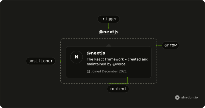
HoverCardArrow
└── HoverCardArrowTip
HoverCardTrigger
HoverCardContent
└── HoverCardPositioner
Usage
<script setup lang="ts">
import { Button } from "@/components/ui/button";
import {
  HoverCard, HoverCardContent, HoverCardTrigger,
} from "@/components/ui/hover-card";
</script>
<template>
  <HoverCard>
    <HoverCardTrigger as-child>
      <Button variant="link">Hover Here</Button>
    </HoverCardTrigger>
    <HoverCardContent class="flex w-64 flex-col gap-0.5">
      <div class="font-semibold">@nextjs</div>
      <div>The React Framework – created and maintained by @vercel.</div>
      <div class="mt-1 text-muted-foreground text-xs">
        Joined December 2021
      </div>
    </HoverCardContent>
  </HoverCard>
</template>
Accessibility
- Tab
- Opens the hover card once focus reaches the trigger, after the open delay. Closes it when focus leaves.
- Escape
- If open, closes the hover card.
- Enter
- Activate the focused item.
- Space
- Activate the focused control.
Demos
Sides
Four buttons open the same card on the left, top, bottom, and right, and each card says which side it used. The open and close delays are short here so you can move between them. Pin a side when the default would cover the link the person is reading. Leave it unset when there is room for the card to flip on its own.
Rtl
The card is a product preview in Arabic, wireless headphones and a price, opened from buttons for each physical side. A second row is labeled as the start and the end of the line. Direction is set on the wrapper and again on the card, so the price and the title align with the page instead of hugging the wrong edge.
FAQ
How do I control whether a Hover Card is open in Vue?
Leave the card uncontrolled and it opens from hover and keyboard focus, then closes after the pointer and focus leave. Control it when another part of the screen must force it open or closed, using defaultOpen only for the first state, because the close delay is what lets the pointer move into the content.
Bind v-model:open, or listen to @open-change, which receives details.open.
How do I choose which side a Hover Card appears on with Ark UI?
The Sides demo places the card on the left, top, bottom, or right, and the content is portaled and stacked at z-50 so overflow on a parent does not clip it. A longer close delay, measured in milliseconds, makes the card easier to reach.
Set positioning.placement on HoverCard, and set openDelay and closeDelay there too, which this file defaults to 10 and 100.
How do I use a button as the Hover Card trigger in Vue?
The trigger must be focusable, or keyboard users cannot open the card, so a Button or a link is the right host. The card then opens from hover and from focus, and Escape closes it, as the Accessibility section describes. Do not put the preview text inside the trigger label.
Set asChild on HoverCardTrigger, pass one Button, and use HoverCardContent as the popup.
Can I open a Hover Card from the keyboard?
Yes, focus opens a Hover Card after the delay, and moving focus away closes it, while Escape dismisses an open card. The Accessibility section also lists Enter and Space for activating the focused control. On a touch screen there is no hover, so use a Popover when the preview must open from a tap and stay until dismissed.
How do I install Hover Card?
Run the command in the Installation section above. It adds Hover Card, its trigger, and its content to your ui folder. Install from that section rather than pasting a partial tree, so the positioning parts stay together, and check the Anatomy section for the arrow and positioner on the builds that render them. The command uses the shadcn-vue CLI.
Why does a Hover Card close before I can read it?
The pointer left the trigger before the close delay elapsed, so the Hover Card shut, and raising the close delay gives the pointer time to cross the gap into the content. The open delay is the wait before it appears, which avoids flashing while the pointer passes by. Both are milliseconds, and the side question above says which component receives them.
API Reference
HoverCard
data-slot="hover-card"
open?boolean
The controlled open state of the hover card. Two-way with v-model:open.
defaultOpen?boolean
The initial open state of the hover card when rendered. Use when you don't need to control the open state of the hover card.
triggerValue?string | null
The controlled trigger value. Two-way with v-model:triggerValue.
- Type
string | null
defaultTriggerValue?string | null
The initial trigger value when rendered. Use when you don't need to control the trigger value.
- Type
string | null
closeDelay?number
The duration from when the mouse leaves the trigger or content until the hover card closes. Ark default: 300.
- Default
100
dir?"ltr" | "rtl"
The document's text/writing direction.
- Type
"ltr" | "rtl"- Default
"ltr"
disabled?boolean
Whether the hover card is disabled.
hideMode?"display-none" | "activity"
How to hide content when mounted but not present.
- display-none: HTML hidden attribute. Effects stay alive.
- activity: React 19 <Activity mode="hidden">. Effects pause. Requires React 19+.
- Type
"display-none" | "activity"- Default
"display-none"
id?string
The unique identifier of the machine.
ids?object
The ids of the elements in the popover. Useful for composition.
- Type
{ trigger?: string | ((value?: string) → string); content?: string; positioner?: string; arrow?: string }
lazyMount?boolean
Whether to enable lazy mounting. Ark default: false.
- Default
true
openDelay?number
The duration from when the mouse enters the trigger until the hover card opens. Ark default: 600.
- Default
10
positioning?object
The user provided options used to position the popover content.
- Type
{ restoreStyles?: boolean; applyStyles?: boolean; hideWhenDetached?: boolean; strategy?: "absolute" | "fixed"; placement?: Placement; offset?: { mainAxis?: number; crossAxis?: number; }; gutter?: number; shift?: number; overflowPadding?: number; arrowPadding?: number; flip?: boolean | Placement[]; slide?: boolean; overlap?: boolean; sameWidth?: boolean; fitViewport?: boolean; sizeMiddleware?: boolean; boundary?: (() → Boundary) | Boundary | "clipping-ancestors"; listeners?: boolean | AutoUpdateOptions; onComplete?: (data: ComputePositionReturn) → void; onPositioned?: ((data: { placed: boolean; }) → void); getAnchorElement?: () → HTMLElement | VirtualElement | null; getAnchorRect?: (element: HTMLElement | VirtualElement | null) → AnchorRect | null; updatePosition?: ((data: { updatePosition: () → Promise<void>; floatingElement: HTMLElement | null; }) → void | Promise<void>) }- Default
{ placement: "bottom" }
skipAnimationOnMount?boolean
Whether to allow the initial presence animation.
- Default
false
unmountOnExit?boolean
Whether to unmount on exit. Ark default: false.
- Default
true
asChild?boolean
Use the provided child element as the default rendered element, combining their props and behavior.
@open-change(details: OpenChangeDetails) → void
Function called when the hover card opens or closes.
- Type
(details: OpenChangeDetails) → void- Parameters
details– { open: boolean }- Returns
void
@trigger-value-change(details: TriggerValueChangeDetails) → void
Function called when the trigger value changes.
- Type
(details: TriggerValueChangeDetails) → void- Parameters
details– { value: string | null; triggerElement: HTMLElement | null }- Returns
void
@focus-outside(event: FocusOutsideEvent) → void
Function called when the focus is moved outside the component.
- Type
(event: FocusOutsideEvent) → void- Parameters
event– FocusOutsideEvent- Returns
void
@interact-outside(event: InteractOutsideEvent) → void
Function called when an interaction happens outside the component.
- Type
(event: InteractOutsideEvent) → void- Parameters
event– InteractOutsideEvent- Returns
void
@pointer-down-outside(event: PointerDownOutsideEvent) → void
Function called when the pointer is pressed down outside the component.
- Type
(event: PointerDownOutsideEvent) → void- Parameters
event– PointerDownOutsideEvent- Returns
void
HoverCardArrow
<div> data-slot="hover-card-arrow"
asChild?boolean
Use the provided child element as the default rendered element, combining their props and behavior.
class?string
Merged with the part's classes.
--arrow-backgroundstring
Use this variable to style the arrow background.
--arrow-offsetstring
The offset position of the arrow.
--arrow-sizestring
The size of the arrow.
--arrow-size-halfstring
Half the size of the arrow.
HoverCardArrowTip
<div>
asChild?boolean
Use the provided child element as the default rendered element, combining their props and behavior.
HoverCardTrigger
<button> data-slot="hover-card-trigger"
value?string
The value that identifies this specific trigger.
asChild?boolean
Use the provided child element as the default rendered element, combining their props and behavior.
data-current?string
Present when current.
data-placement?string
The placement of the trigger.
data-side?string
The side of the trigger that the trigger is positioned on.
data-state"open" | "closed"
"open" or "closed".
- Type
"open" | "closed"
data-value?string
The value of the item.
HoverCardPositioner
<div> data-slot="hover-card-positioner"
asChild?boolean
Use the provided child element as the default rendered element, combining their props and behavior.
data-has-nested?string
Present when the positioner has nested hover cards.
data-nested?string
Present when the positioner is nested within another hover card.
--available-heightstring
The available height in viewport.
--available-widthstring
The available width in viewport.
--reference-heightstring
The height of the root.
--reference-widthstring
The width of the reference element.
--transform-originstring
The transform origin for animations.
--xstring
The x position for transform.
--ystring
The y position for transform.
--z-indexstring
The z-index value.
HoverCardContent
<div> data-slot="hover-card-content"
asChild?boolean
Use the provided child element as the default rendered element, combining their props and behavior.
class?string
Merged with the part's classes.
data-has-nested?string
Present when another popover is nested inside it.
data-nested?string
Present when it's nested inside another popover.
data-placementstring
The placement of the content.
data-side"top" | "right" | "bottom" | "left"
The side of the trigger that the content is positioned on.
- Type
"top" | "right" | "bottom" | "left"
data-state"open" | "closed"
"open" or "closed".
- Type
"open" | "closed"
--layer-indexstring
The index of the dismissable in the layer stack.
--nested-layer-countstring
The number of nested hover-cards.
--transform-originstring
Where the content scales from, on its trigger's side.
useHoverCard
open?boolean
The controlled open state of the hover card. Two-way with v-model:open.
defaultOpen?boolean
The initial open state of the hover card when rendered. Use when you don't need to control the open state of the hover card.
triggerValue?string | null
The controlled trigger value. Two-way with v-model:triggerValue.
- Type
string | null
defaultTriggerValue?string | null
The initial trigger value when rendered. Use when you don't need to control the trigger value.
- Type
string | null
closeDelay?number
The duration from when the mouse leaves the trigger or content until the hover card closes.
- Default
300
disabled?boolean
Whether the hover card is disabled.
id?string
The unique identifier of the machine.
ids?object
The ids of the elements in the popover. Useful for composition.
- Type
{ trigger?: string | ((value?: string) → string); content?: string; positioner?: string; arrow?: string }
openDelay?number
The duration from when the mouse enters the trigger until the hover card opens.
- Default
600
positioning?object
The user provided options used to position the popover content.
- Type
{ restoreStyles?: boolean; applyStyles?: boolean; hideWhenDetached?: boolean; strategy?: "absolute" | "fixed"; placement?: Placement; offset?: { mainAxis?: number; crossAxis?: number; }; gutter?: number; shift?: number; overflowPadding?: number; arrowPadding?: number; flip?: boolean | Placement[]; slide?: boolean; overlap?: boolean; sameWidth?: boolean; fitViewport?: boolean; sizeMiddleware?: boolean; boundary?: (() → Boundary) | Boundary | "clipping-ancestors"; listeners?: boolean | AutoUpdateOptions; onComplete?: (data: ComputePositionReturn) → void; onPositioned?: ((data: { placed: boolean; }) → void); getAnchorElement?: () → HTMLElement | VirtualElement | null; getAnchorRect?: (element: HTMLElement | VirtualElement | null) → AnchorRect | null; updatePosition?: ((data: { updatePosition: () → Promise<void>; floatingElement: HTMLElement | null; }) → void | Promise<void>) }
@open-change(details: OpenChangeDetails) → void
Function called when the hover card opens or closes.
- Type
(details: OpenChangeDetails) → void- Parameters
details– { open: boolean }- Returns
void
@trigger-value-change(details: TriggerValueChangeDetails) → void
Function called when the trigger value changes.
- Type
(details: TriggerValueChangeDetails) → void- Parameters
details– { value: string | null; triggerElement: HTMLElement | null }- Returns
void
@focus-outside(event: FocusOutsideEvent) → void
Function called when the focus is moved outside the component.
- Type
(event: FocusOutsideEvent) → void- Parameters
event– FocusOutsideEvent- Returns
void
@interact-outside(event: InteractOutsideEvent) → void
Function called when an interaction happens outside the component.
- Type
(event: InteractOutsideEvent) → void- Parameters
event– InteractOutsideEvent- Returns
void
@pointer-down-outside(event: PointerDownOutsideEvent) → void
Function called when the pointer is pressed down outside the component.
- Type
(event: PointerDownOutsideEvent) → void- Parameters
event– PointerDownOutsideEvent- Returns
void
With other components
Avatar
MediaFace in the preview
Button
ButtonsLink-style trigger
Badge
FeedbackRole next to the name
Separator
LayoutSplit bio from stats
Skeleton
FeedbackWhile the profile loads
Aspect Ratio
LayoutImage in the preview
Related
Tooltip
OverlaysOne line, not a card
Popover
OverlaysClick, stays put
Dialog
OverlaysFull focus overlay
Dropdown Menu
MenusActions on click
Navigation Menu
NavigationRich nav preview
Hint
FeedbackA smaller note