shadcn.io is not affiliated with official shadcn/ui
Bulk actions for selected rows sit at the bottom of the screen.
Use it for the life of a selection. Actions that are always available belong in a Button Group. In Vue, set open when the selection isn't empty, and Ark UI shows the bar.
Installation
Anatomy
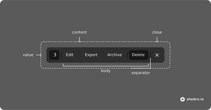
Usage
<script setup lang="ts">
import {
  ArchiveIcon, DownloadIcon, PencilIcon, Trash2Icon, XIcon,
} from "lucide-vue-next";
import {
  ActionBar, ActionBarBody, ActionBarClose, ActionBarContent,
  ActionBarSeparator, ActionBarTrigger, ActionBarValue,
} from "@/components/ui/action-bar";
import { Button } from "@/components/ui/button";
</script>
<template>
  <ActionBar>
    <ActionBarTrigger as-child>
      <Button variant="outline">Open</Button>
    </ActionBarTrigger>
    <ActionBarContent aria-label="Bulk actions">
      <ActionBarValue :count=3 />
      <ActionBarSeparator />
      <ActionBarBody>
        <Button variant="ghost">
          <PencilIcon />
          <span class="max-sm:sr-only">Edit</span>
        </Button>
        <Button variant="ghost">
          <DownloadIcon />
          <span class="max-sm:sr-only">Export</span>
        </Button>
        <Button variant="ghost">
          <ArchiveIcon />
          <span class="max-sm:sr-only">Archive</span>
        </Button>
        <ActionBarSeparator />
        <Button variant="destructive">
          <Trash2Icon />
          <span class="max-sm:sr-only">Delete</span>
        </Button>
      </ActionBarBody>
      <ActionBarSeparator />
      <ActionBarClose as-child>
        <Button size="icon-md" variant="ghost">
          <XIcon />
        </Button>
      </ActionBarClose>
    </ActionBarContent>
  </ActionBar>
</template>
Accessibility
- Enter
- Activate the focused control.
- Space
- Activate the focused control.
Demos
Close Trigger
The X is ActionBarClose, a button that asks the bar to close. Here open is controlled, so that click comes back through onOpenChange as false and you can clear the selection in the same handler. Use a visible close when Escape is easy to miss, especially on a phone. If closing must leave the checkboxes alone, do not put that reset in the close handler.
Controlled
No trigger lives inside the bar. A Toggle button outside it flips open, and the bar reports every close through onOpenChange, including the X and Escape. Control open when visibility follows a selection or some other state, which is the real product case. An ActionBarTrigger only fits when people open the bar on purpose, and a selection is not that.
Custom Spacing
ActionBarContent pads itself from the --space token. The component starts at spacing step 2, and this class sets that same step so the override has an obvious place. Pass a smaller or larger step when the bar should sit tighter on a dense table, or roomier around large actions. The count, the buttons, and the close control share that padding, so you change it once.
Dialog
Delete does not run immediately. The destructive button opens an alert dialog that names the action and asks for a confirm. Put a dialog on any bar action that destroys data or is hard to undo, and leave export or edit as plain buttons. The bar is where the action starts, the dialog is where it is confirmed, and cancel returns to the same selection.
Gutter
Two buttons set positioning.gutter to 24px or 32px, with placement staying at the bottom. Gutter is the gap between the bar and the screen edge. The default is 16px, and the bar also adds the bottom safe-area inset so a phone home indicator does not cover the actions. Raise the gutter when a banner or a mini player already occupies that edge.
Menu
The body of the bar is a single menu, opened upward with placement set to top, holding Archive, Duplicate, and a destructive Delete. Use a menu when the rare actions would make the bar a long row, and keep the everyday ones as buttons beside it. Upward matters because the bar is already at the bottom of the screen. A menu that opens downward runs off the viewport.
Positioning
Three buttons set positioning.placement to bottom-start, bottom, or bottom-end. Centered is the usual bulk bar, in the middle of the viewport. Start and end pin it to a corner when the selection lives in a sidebar or a narrow pane and a centered bar would cover the wrong column. The bar stays on the bottom edge, and placement will not move it to the top.
Table
Checkboxes on the orders drive the bar: open is true while the selected ids are not empty, and closing the bar clears that selection. The content shows the count, Send, Edit, a more menu, and Delete behind an alert dialog that lists the chosen orders. Copy this when the selection is rows. A bar with an Open button is only for trying the parts.
FAQ
When should I use an Action Bar instead of a toolbar or a menu?
Use an Action Bar for actions on a selection: it floats at the bottom of the screen while items are selected, as in the Table demo. For actions that are always on screen, use a Button Group; for a few actions on a single item, a Dropdown Menu.
How do I show the Action Bar when rows are selected in Vue?
Control it from your selection state and clear the selection when it closes.
Pass :open, such as selected.length > 0, and listen to @open-change, which receives false when the bar closes. The Table demo does this with checkboxes.
How do I show how many items are selected in the Action Bar?
Add ActionBarValue with count: it renders the number in a secondary badge. Pass label or children for text such as 3 selected, and variant, size or pill to restyle the badge.
How do I change where the Action Bar appears on the screen?
Pass positioning on ActionBar: placement is bottom, bottom-start or bottom-end, and gutter sets the distance from the edge, 16px by default. The bar also adds the bottom safe-area inset on phones. The Positioning and Gutter demos show both.
Does the Action Bar close when I press Escape?
Yes. Escape closes it and calls onOpenChange with false. Set closeOnEscape to false to keep it open until the selection is cleared, for example when Escape should only clear a search field.
Is the Ark UI Action Bar accessible to screen readers?
Its content renders in a portal as a role="toolbar", so give ActionBarContent an aria-label such as Bulk actions, as in the Usage example. Icon buttons can hide their text on small screens with max-sm:sr-only and still keep it for screen readers.
API Reference
ActionBar
open?boolean
The open state of the action bar. Two-way with v-model:open.
defaultOpen?boolean
The default open state of the action bar.
- Default
false
closeOnEscape?boolean
Whether to close the action bar when the Escape key is pressed.
- Default
true
lazyMount?boolean
Whether to lazy mount the action bar.
- Default
true
positioning?object
Placement and gutter of the action bar.
- Type
{ gutter?: string; placement?: "bottom" | "bottom-start" | "bottom-end" }
unmountOnExit?boolean
The function to call when the action bar is mounted.
- Default
true
@open-change(open: boolean) → void
The function to call when the open state of the action bar changes.
- Parameters
open– boolean- Returns
void
ActionBarTrigger
<button> data-slot="action-bar-trigger"
asChild?boolean
Use the provided child element as the default rendered element, combining their props and behavior.
data-state?string
"open" when isOpen is true, otherwise "closed".
--gutterstringActionBarContent
<div> data-slot="action-bar-positioner"
placement?"bottom" | "bottom-end" | "bottom-start"
Where it sits at the bottom of the screen: bottom, bottom-start or
bottom-end.
- Type
"bottom" | "bottom-end" | "bottom-start"- Default
"bottom"
asChild?boolean
Use the provided child element as the default rendered element, combining their props and behavior.
class?string
Merged with the part's classes.
data-placement?string
Mirrors placement.
--spacestringActionBarSeparator
data-slot="action-bar-separator"
orientation?"horizontal" | "vertical"
The orientation of the separator. Ark default: horizontal.
- Type
"horizontal" | "vertical"- Default
vertical
asChild?boolean
Use the provided child element as the default rendered element, combining their props and behavior.
class?string
Merged with the part's classes.
ActionBarClose
<button> data-slot="action-bar-close"
asChild?boolean
Use the provided child element as the default rendered element, combining their props and behavior.
class?string
Merged with the part's classes.
data-state?string
"open" when isOpen is true, otherwise "closed".
ActionBarValue
data-slot="action-bar-value"
countnumber
The number of items selected.
- Default
0
label?string
The label of the selection trigger.
pill?boolean
Fully rounded corners.
- Default
false
size?"lg" | "md" | "sm"
The size.
- Type
"lg" | "md" | "sm"- Default
"md"
variant?"default" | "destructive" | "ghost" | "info" | "link" | "outline" | "secondary" | "success" | "warning"
Ark default: default.
- Type
"default" | "destructive" | "ghost" | "info" | "link" | "outline" | "secondary" | "success" | "warning"- Default
secondary
asChild?boolean
Use the provided child element as the default rendered element, combining their props and behavior.
class?string
Merged with the part's classes.
ActionBarBody
<div> data-slot="action-bar-body"
asChild?boolean
Use the provided child element as the default rendered element, combining their props and behavior.
class?string
Merged with the part's classes.
With other components
Table
DataAppears when rows are selected
Checkbox
SelectionThe selection that opens it
Button
ButtonsThe actions in the bar
Dropdown Menu
MenusMore actions in one slot
Tooltip
OverlaysName an icon action
Dialog
OverlaysConfirm a destructive action
Related
Button Group
ButtonsActions that stay on screen
Context Menu
MenusActions on right-click
Menubar
MenusCommands that are always there
Command
OverlaysSearch for an action
Sheet
OverlaysA panel for the details
Sidebar
NavigationTools pinned to the side