shadcn.io is not affiliated with official shadcn/ui
Click or tap opens a short note, and a mouse hover can open it too.
Use it when the note has to work on a touch screen. A Tooltip is enough for a hint that only shows on hover or focus. In Vue, Ark UI keeps the note open until it's dismissed.
Installation
Anatomy
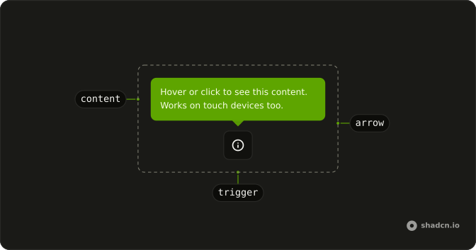
ToggleTooltipArrow
└── ToggleTooltipArrowTip
ToggleTooltipAnchor
ToggleTooltipTrigger
ToggleTooltipIndicator
ToggleTooltipContent
└── ToggleTooltipPositioner
ToggleTooltipTitle
ToggleTooltipDescription
ToggleTooltipCloseTrigger
Usage
<script setup lang="ts">
import { InfoIcon } from "lucide-vue-next";
import { Button } from "@/components/ui/button";
import {
  ToggleTooltip, ToggleTooltipContent, ToggleTooltipTrigger,
} from "@/components/ui/toggle-tooltip";
</script>
<template>
  <ToggleTooltip>
    <ToggleTooltipTrigger as-child>
      <Button aria-label="More information" size="icon-md" variant="outline">
        <InfoIcon />
      </Button>
    </ToggleTooltipTrigger>
    <ToggleTooltipContent class="max-w-52">
      Hover or click to see this content. Works on touch devices too.
    </ToggleTooltipContent>
  </ToggleTooltip>
</template>
Accessibility
- Enter
- Activate the focused control.
- Space
- Activate the focused control.
Demos
Info Icon
Each row of a data list gets its own info button: New Users, Sales, and Revenue, with one sentence in the note. The button is named for that metric, because the icon alone does not say which number it describes. Put it beside a label when a definition would clutter the row, and keep the note short. A long explanation belongs on the page, not in the bubble.
Side
Four triggers open the note on a different side: left, top, bottom, and right, via positioning and placement. Pin a side when the trigger sits in a corner or against a toolbar and the default would cover the thing it explains. The note can still flip if that side has no room. The content here is only the side name, so you can see the placement without reading a paragraph.
With Link
The note holds a real link, which is the reason to prefer this over a hover tooltip. A tooltip closes when the pointer moves toward the link, so the click never lands. Here the note stays open until a second click, a click outside, or Escape. Keep the interactive bit small, and put a form in a Popover instead.
FAQ
What is a Toggle Tooltip and when should I use it?
It is a tooltip that opens on click or tap instead of hover, so it also works on touch screens. Use it for an info icon next to a label or a setting; for hover hints on desktop, use a Tooltip.
How do I change where the Toggle Tooltip opens in Vue?
Pass positioning with a placement such as top, bottom, left or right, as the Side demo does. It flips to the other side when there is not enough room.
How do I open the Toggle Tooltip from code?
Keep the open state in state and pass it as open; use defaultOpen to start open.
Bind it with v-model:open, or listen to @open-change, which receives details.open.
How do I close the Toggle Tooltip?
It closes on a second click of its trigger, a click outside, or Escape. It does not trap focus or block the page, so people can keep working while it is open.
API Reference
ToggleTooltip
data-slot="toggle-tooltip"
open?boolean
The controlled open state of the popover. Two-way with v-model:open.
defaultOpen?boolean
The initial open state of the popover when rendered. Use when you don't need to control the open state of the popover.
triggerValue?string | null
The controlled trigger value. Two-way with v-model:triggerValue.
- Type
string | null
defaultTriggerValue?string | null
The initial trigger value when rendered. Use when you don't need to control the trigger value.
- Type
string | null
autoFocus?boolean
Whether to automatically set focus on the first focusable content within the popover when opened.
- Default
true
closeOnEscape?boolean
Whether to close the popover when the escape key is pressed.
- Default
true
closeOnInteractOutside?boolean
Whether to close the popover when the user clicks outside of the popover.
- Default
true
dir?"ltr" | "rtl"
The document's text/writing direction.
- Type
"ltr" | "rtl"- Default
"ltr"
finalFocusEl?() → MaybeElement
Element to receive focus when the popover is closed.
- Returns
MaybeElement
hideMode?"display-none" | "activity"
How to hide content when mounted but not present.
- display-none: HTML hidden attribute. Effects stay alive.
- activity: React 19 <Activity mode="hidden">. Effects pause. Requires React 19+.
- Type
"display-none" | "activity"- Default
"display-none"
id?string
The unique identifier of the machine.
ids?object
The ids of the elements in the popover. Useful for composition.
- Type
{ anchor?: string; trigger?: string | ((value?: string) → string); content?: string; title?: string; description?: string; closeTrigger?: string; positioner?: string; arrow?: string }
initialFocusEl?() → HTMLElement | null | false
The element to focus on when the popover is opened.
Return false to skip moving focus, or null to use the default.
- Type
() → HTMLElement | null | false- Returns
HTMLElement | null | false
lazyMount?boolean
Whether to enable lazy mounting. Ark default: false.
- Default
true
modal?boolean
Whether the popover should be modal. When set to true:
- interaction with outside elements will be disabled
- only popover content will be visible to screen readers
- scrolling is blocked
- focus is trapped within the popover
- Default
false
persistentElements?Array<() → Element | null>
Returns the persistent elements that: - should not have pointer-events disabled - should not trigger the dismiss event
- Type
Array<() → Element | null>
portalled?boolean
Whether the popover is portalled. This will proxy the tabbing behavior regardless of the DOM position of the popover content.
- Default
true
positioning?object
The user provided options used to position the popover content.
- Type
{ restoreStyles?: boolean; applyStyles?: boolean; hideWhenDetached?: boolean; strategy?: "absolute" | "fixed"; placement?: Placement; offset?: { mainAxis?: number; crossAxis?: number; }; gutter?: number; shift?: number; overflowPadding?: number; arrowPadding?: number; flip?: boolean | Placement[]; slide?: boolean; overlap?: boolean; sameWidth?: boolean; fitViewport?: boolean; sizeMiddleware?: boolean; boundary?: (() → Boundary) | Boundary | "clipping-ancestors"; listeners?: boolean | AutoUpdateOptions; onComplete?: (data: ComputePositionReturn) → void; onPositioned?: ((data: { placed: boolean; }) → void); getAnchorElement?: () → HTMLElement | VirtualElement | null; getAnchorRect?: (element: HTMLElement | VirtualElement | null) → AnchorRect | null; updatePosition?: ((data: { updatePosition: () → Promise<void>; floatingElement: HTMLElement | null; }) → void | Promise<void>) }- Default
{ placement: "top" }
restoreFocus?boolean
Whether to restore focus to the element that had focus before the popover was opened.
- Default
true
skipAnimationOnMount?boolean
Whether to allow the initial presence animation.
- Default
false
translations?object
Specifies the localized strings that identifies the accessibility elements and their states.
- Type
{ closeTriggerLabel?: string }
unmountOnExit?boolean
Whether to unmount on exit. Ark default: false.
- Default
true
asChild?boolean
Use the provided child element as the default rendered element, combining their props and behavior.
@open-change(details: OpenChangeDetails) → void
Function invoked when the popover opens or closes.
- Type
(details: OpenChangeDetails) → void- Parameters
details– { open: boolean }- Returns
void
@trigger-value-change(details: TriggerValueChangeDetails) → void
Function called when the trigger value changes.
- Type
(details: TriggerValueChangeDetails) → void- Parameters
details– { value: string | null; triggerElement: HTMLElement | null }- Returns
void
@escape-key-down(event: KeyboardEvent) → void
Function called when the escape key is pressed.
- Parameters
event– { altKey: boolean; charCode: number; ctrlKey: boolean; code: string; getModifierState: (key: string) → boolean; key: string; keyCode: number; locale: string; location: number; metaKey: boolean; repeat: boolean; shiftKey: boolean; which: number }- Returns
void
@focus-outside(event: FocusOutsideEvent) → void
Function called when the focus is moved outside the component.
- Type
(event: FocusOutsideEvent) → void- Parameters
event– FocusOutsideEvent- Returns
void
@interact-outside(event: InteractOutsideEvent) → void
Function called when an interaction happens outside the component.
- Type
(event: InteractOutsideEvent) → void- Parameters
event– InteractOutsideEvent- Returns
void
@pointer-down-outside(event: PointerDownOutsideEvent) → void
Function called when the pointer is pressed down outside the component.
- Type
(event: PointerDownOutsideEvent) → void- Parameters
event– PointerDownOutsideEvent- Returns
void
@request-dismiss(event: LayerDismissEvent) → void
Function called when this layer is closed due to a parent layer being closed.
- Type
(event: LayerDismissEvent) → void- Parameters
event– LayerDismissEvent- Returns
void
ToggleTooltipArrow
<div> data-slot="toggle-tooltip-arrow"
asChild?boolean
Use the provided child element as the default rendered element, combining their props and behavior.
--arrow-backgroundstring
Use this variable to style the arrow background.
--arrow-offsetstring
The offset position of the arrow.
--arrow-sizestring
The size of the arrow.
--arrow-size-halfstring
Half the size of the arrow.
ToggleTooltipArrowTip
<div>
asChild?boolean
Use the provided child element as the default rendered element, combining their props and behavior.
ToggleTooltipTrigger
<button> data-slot="toggle-tooltip-trigger"
value?string
The value that identifies this specific trigger.
asChild?boolean
Use the provided child element as the default rendered element, combining their props and behavior.
data-current?string
Present when current.
data-placement?string
The placement of the trigger.
data-side?string
The side of the trigger that the trigger is positioned on.
data-state"open" | "closed"
"open" or "closed".
- Type
"open" | "closed"
data-value?string
The value of the item.
ToggleTooltipPositioner
<div> data-slot="toggle-tooltip-positioner"
asChild?boolean
Use the provided child element as the default rendered element, combining their props and behavior.
data-has-nested?string
Present when the positioner has nested popovers.
data-nested?string
Present when the positioner is nested within another popover.
--available-heightstring
The available height in viewport.
--available-widthstring
The available width in viewport.
--reference-heightstring
The height of the root.
--reference-widthstring
The width of the reference element.
--transform-originstring
The transform origin for animations.
--xstring
The x position for transform.
--ystring
The y position for transform.
--z-indexstring
The z-index value.
ToggleTooltipContent
<div> data-slot="toggle-tooltip-content"
asChild?boolean
Use the provided child element as the default rendered element, combining their props and behavior.
class?string
Merged with the part's classes.
data-expanded?string
Present when expanded.
data-has-nested?string
Present when another popover is nested inside it.
data-nested?string
Present when it's nested inside another popover.
data-placementstring
The placement of the content.
data-side"top" | "right" | "bottom" | "left"
The side of the trigger that the content is positioned on.
- Type
"top" | "right" | "bottom" | "left"
data-state"open" | "closed"
"open" or "closed".
- Type
"open" | "closed"
--layer-indexstring
The index of the dismissable in the layer stack.
--nested-layer-countstring
The number of nested popovers.
--transform-originstring
Where the content scales from, on its trigger's side.
With other components
Button
ButtonsThe control
Toggle
SelectionA pressed state with a hint
Tooltip
OverlaysThe same hint on hover
Kbd
TypographyThe shortcut in the hint
Badge
FeedbackA mark on the control
Separator
LayoutGroup the controls
Related
Popover
OverlaysMore than a sentence
Hover Card
OverlaysA preview
Hint
FeedbackA note that is always there
Dropdown Menu
MenusA list, not a sentence
Toggle Group
SelectionSeveral pressed states
Button Group
ButtonsActions side by side