shadcn.io is not affiliated with official shadcn/ui
The panel moves with the drag and closes when the swipe finishes. On a wider layout it can dock to another edge.
Use it when people should drag it closed, like filters or a short form on a phone. A Sheet stays put on a large screen, and it opens from a button. In Vue, Ark UI handles focus and the drag.
Installation
Anatomy
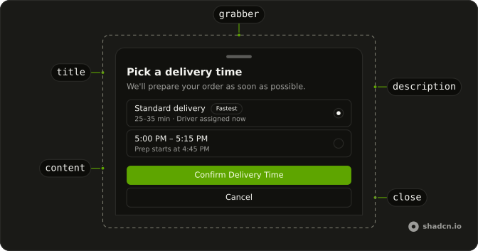
DrawerPositioner
DrawerPositioner
DrawerTitle
DrawerDescription
DrawerTrigger
DrawerOverlay
DrawerGrabber
└── DrawerGrabberIndicator
DrawerClose
DrawerSwipeArea
Usage
import { useState } from "react";
import { Badge } from "@/components/ui/badge";
import { Button } from "@/components/ui/button";
import {
  Drawer, DrawerClose, DrawerContent, DrawerDescription, DrawerFooter,
  DrawerHeader, DrawerTitle, DrawerTrigger,
} from "@/components/ui/drawer";
import {
  Field, FieldContent, FieldDescription, FieldLabel, FieldTitle,
} from "@/components/ui/field";
import {
  RadioGroup, RadioGroupItem,
} from "@/components/ui/radio-group";
import { toast } from "@/components/ui/toast";
import { useIsMobile } from "@/hooks/use-is-mobile";
const deliveryTimes = [
{
badge: "Fastest",
description: "25–35 min · Driver assigned now",
id: "delivery-asap",
label: "Standard delivery",
value: "asap",
},
{
description: "Prep starts at 4:45 PM",
id: "delivery-5-00",
label: "5:00 PM – 5:15 PM",
value: "5-00",
},
{
description: "Good if you're heading home",
id: "delivery-5-30",
label: "5:30 PM – 5:45 PM",
value: "5-30",
},
{
description: "Most popular · High demand",
id: "delivery-6-00",
label: "6:00 PM – 6:15 PM",
value: "6-00",
},
{
description: "Last slot before kitchen closes",
id: "delivery-6-30",
label: "6:30 PM – 6:45 PM",
value: "6-30",
},
];
const DrawerDemo = () => {
const [open, setOpen] = useState(false);
const [deliveryTime, setDeliveryTime] = useState("asap");
const isMobile = useIsMobile();
const handleOpenChange = (details: { open: boolean }) => {
setOpen(details.open);
};
const handleDeliveryTimeChange = (details: { value: string | null }) => {
if (details.value !== null) {
setDeliveryTime(details.value);
}
};
const handleConfirm = () => {
const selected = deliveryTimes.find((time) => time.value === deliveryTime);
if (!selected) {
return;
}
setOpen(false);
toast.create({
description: selected.label,
title: "Delivery time confirmed",
});
};
return (
<Drawer
onOpenChange={handleOpenChange}
open={open}
swipeDirection={isMobile ? "down" : "right"}
>
<DrawerTrigger asChild>
<Button variant="secondary">Open Drawer</Button>
</DrawerTrigger>
<DrawerContent showBar={isMobile}>
<DrawerHeader>
<DrawerTitle>Pick a delivery time</DrawerTitle>
<DrawerDescription>
We'll prepare your order as soon as possible.
</DrawerDescription>
</DrawerHeader>
<div className="scroll-fade flex-1 overflow-y-auto p-4">
<RadioGroup
className="gap-2"
onValueChange={handleDeliveryTimeChange}
value={deliveryTime}
>
{deliveryTimes.map((time) => (
<FieldLabel key={time.value}>
<Field orientation="horizontal">
<FieldContent>
<FieldTitle className="flex items-center gap-2">
{time.label}
{time.badge ? (
<Badge variant="secondary">{time.badge}</Badge>
) : null}
</FieldTitle>
<FieldDescription>{time.description}</FieldDescription>
</FieldContent>
<RadioGroupItem value={time.value}>
<span className="sr-only">{time.label}</span>
</RadioGroupItem>
</Field>
</FieldLabel>
))}
</RadioGroup>
</div>
<DrawerFooter>
<Button className="h-[34px]" onClick={handleConfirm}>
Confirm Delivery Time
</Button>
<DrawerClose asChild>
<Button variant="outline">Cancel</Button>
</DrawerClose>
</DrawerFooter>
</DrawerContent>
</Drawer>
);
};
Accessibility
- Enter
- Activate the focused control.
- Space
- Activate the focused control.
- End
- Go to the end.
Demos
Sides
Bottom is the default, and it is the wrong edge for a tray that should sit beside the page. Open from the left, the right, or the top when the panel is a side editor, and hide the grabber if a close button is enough. Keep the bar on a bottom sheet. That is the handle people actually drag.
Swipe Handle
showBar on DrawerContent draws the grabber along the edge you swipe from. Use it on a bottom sheet, where the bar is the hint that the panel can be dragged closed. A side drawer often turns it off, because a handle on a vertical edge is easy to miss and the close button already covers dismissal.
Nested
A drawer opened from another drawer's footer, several levels deep, all along the same edge. The parent stays mounted behind the child, so closing the front panel returns you to the previous step. Use that for a short drill-in, such as a category and then an item, knowing two levels is usually enough and this file only keeps going to show the stack still works.
Non Modal
It is not modal, and a click on the page does not dismiss it. The panel sits on the right so the rest of the screen stays usable, which is what you want for a reference tray beside a form. A choice the person must finish, such as the delivery time in the hero, should stay modal so focus does not wander off into the page.
Snap Points
snapPoints gives the vertical drawer two stops: a compact peek at 31rem, and a near full-height stop at 1. Dragging the bar settles on one or the other, instead of only open or closed. Use this for a map, a playlist, or a comment sheet that should preview and then expand. A side panel does not snap this way.
Dialog
One profile form and one open flag: on a wide screen it renders as a Dialog, and on a phone as a drawer with the same email and username fields. Use the split when the form is short enough for both and the phone should drag the sheet. Do not fork the fields. If desktop wants a side tray, pair the drawer with a sheet instead.
FAQ
Should I use a Drawer or a Sheet?
Use a Drawer when people drag it with a finger, mostly on phones: it follows the swipe, closes when swiped away and can stop at snap points. Use a Sheet for a side panel on larger screens, like filters or a cart, that opens and closes with buttons.
How do I open the Drawer from the left or right in Ark UI?
Set swipeDirection on Drawer to the direction that closes it: down for a bottom drawer, the default, left for one on the left.
The Sides demo shows each edge.
How do I control the Drawer open state in Vue?
Bind v-model:open, or pass :open and listen to @open-change, which receives { open }.
That's also how you close it after an action, like a saved form.
How do I add snap points to a Drawer?
Pass snapPoints to Drawer: an array of heights, as fractions of the screen like 0.5 or as CSS lengths like "31rem", and the drawer stops at each one while dragged. The Snap Points demo shows preset heights.
How do I stop a Drawer from closing on an outside click?
Set closeOnInteractOutside to false, and closeOnEscape to false for the Escape key.
Then give people a button that closes it, so they aren't stuck.
Can I open a Drawer from another Drawer?
Yes. Put a second Drawer inside the first one's content: it opens on top, as in the Nested demo. Two levels are usually enough; deeper than that, the first drawer is often better as a page.
API Reference
Drawer
data-slot="drawer"
open?boolean
Whether the drawer is open. Two-way with v-model:open.
defaultOpen?boolean
The initial open state of the drawer.
snapPoint?SnapPoint | null
The currently active snap point. Two-way with v-model:snapPoint.
- Type
SnapPoint | null
defaultSnapPoint?drawer.SnapPoint
The snap point it opens at, when you don't control snapPoint.
triggerValue?string | null
The value of the trigger that currently controls the drawer. Two-way with v-model:triggerValue.
- Type
string | null
defaultTriggerValue?string | null
The default trigger value (uncontrolled).
- Type
string | null
closeOnEscape?boolean
Whether to close the drawer when the escape key is pressed.
- Default
true
closeOnInteractOutside?boolean
Whether to close the drawer when the outside is clicked.
- Default
true
closeThreshold?number
The threshold distance for dismissing the drawer.
- Default
0.25
dir?"ltr" | "rtl"
The document's text/writing direction.
- Type
"ltr" | "rtl"- Default
"ltr"
finalFocusEl?() → MaybeElement
Element to receive focus when the sheet is closed.
- Returns
MaybeElement
hideMode?"display-none" | "activity"
How to hide content when mounted but not present.
- display-none: HTML hidden attribute. Effects stay alive.
- activity: React 19 <Activity mode="hidden">. Effects pause. Requires React 19+.
- Type
"display-none" | "activity"- Default
"display-none"
id?string
The unique identifier of the machine.
ids?object
The ids of the elements in the drawer. Useful for composition.
- Type
{ backdrop?: string; positioner?: string; content?: string; title?: string; description?: string; header?: string; trigger?: string | ((value?: string) → string); grabber?: string; grabberIndicator?: string; closeTrigger?: string; swipeArea?: string }
initialFocusEl?() → MaybeElement | false
Element to receive focus when the sheet is opened.
Return false to skip moving focus, or null to use the default.
- Type
() → MaybeElement | false- Returns
MaybeElement | false
lazyMount?boolean
Whether to enable lazy mounting. Ark default: false.
- Default
true
modal?boolean
Whether to prevent pointer interaction outside the element and hide all content below it.
- Default
true
preventDragOnScroll?boolean
Whether to prevent dragging on scrollable elements. When enabled, the sheet will not start dragging if the user is interacting with a scrollable element.
- Default
true
preventScroll?boolean
Whether to prevent scrolling behind the sheet when it's opened. Ark default: true.
- Default
(inPreview ? false : modal)
restoreFocus?boolean
Whether to restore focus to the element that had focus before the sheet was opened.
- Default
true
role?"dialog" | "alertdialog"
The sheet's role.
- Type
"dialog" | "alertdialog"- Default
"dialog"
skipAnimationOnMount?boolean
Whether to allow the initial presence animation.
- Default
false
snapPoints?SnapPoint[]
The snap points of the drawer. Array of numbers or strings representing the snap points.
- Default
[1]
snapToSequentialPoints?boolean
Whether the drawer should snap to sequential points when swiping.
- Default
false
stack?object
Optional external store for coordinating app-level drawer stack visuals (e.g. indent and background layers).
- Type
{ getSnapshot: () → DrawerStackSnapshot; subscribe: (listener: () → void) → () → void; register: (id: string) → void; unregister: (id: string) → void; setOpen: (id: string, open: boolean) → void; setHeight: (id: string, height: number) → void; setSwipe: (id: string, swiping: boolean, progress: number) → void }
swipeDirection?ArkSwipeDirection | "left" | "right"
The direction in which the drawer can be swiped.
- Type
ArkSwipeDirection | "left" | "right"- Default
"down"
swipeVelocityThreshold?number
The threshold velocity (in pixels/s) for closing the drawer.
- Default
700
trapFocus?boolean
Whether to trap focus inside the sheet when it's opened.
- Default
true
unmountOnExit?boolean
Whether to unmount on exit. Ark default: false.
- Default
true
asChild?boolean
Use the provided child element as the default rendered element, combining their props and behavior.
@open-change(details: OpenChangeDetails) → void
Function called when the open state changes.
- Type
(details: OpenChangeDetails) → void- Parameters
details– { open: boolean }- Returns
void
@snap-point-change(details: SnapPointChangeDetails) → void
Callback fired when the snap point changes.
- Type
(details: SnapPointChangeDetails) → void- Parameters
details– { snapPoint: SnapPoint | null }- Returns
void
@trigger-value-change(details: TriggerValueChangeDetails) → void
Callback when the active trigger value changes.
- Type
(details: TriggerValueChangeDetails) → void- Parameters
details– { value: string | null; triggerElement: HTMLElement | null }- Returns
void
@escape-key-down(event: KeyboardEvent) → void
Function called when the escape key is pressed.
- Parameters
event– { altKey: boolean; charCode: number; ctrlKey: boolean; code: string; getModifierState: (key: string) → boolean; key: string; keyCode: number; locale: string; location: number; metaKey: boolean; repeat: boolean; shiftKey: boolean; which: number }- Returns
void
@focus-outside(event: FocusOutsideEvent) → void
Function called when the focus is moved outside the component.
- Type
(event: FocusOutsideEvent) → void- Parameters
event– FocusOutsideEvent- Returns
void
@interact-outside(event: InteractOutsideEvent) → void
Function called when an interaction happens outside the component.
- Type
(event: InteractOutsideEvent) → void- Parameters
event– InteractOutsideEvent- Returns
void
@pointer-down-outside(event: PointerDownOutsideEvent) → void
Function called when the pointer is pressed down outside the component.
- Type
(event: PointerDownOutsideEvent) → void- Parameters
event– PointerDownOutsideEvent- Returns
void
@request-dismiss(event: LayerDismissEvent) → void
Function called when this layer is closed due to a parent layer being closed.
- Type
(event: LayerDismissEvent) → void- Parameters
event– LayerDismissEvent- Returns
void
DrawerPositioner
<div> data-slot="drawer-positioner"
variant?"default" | "inset"
The visual style.
- Type
"default" | "inset"- Default
"default"
asChild?boolean
Use the provided child element as the default rendered element, combining their props and behavior.
class?string
Merged with the part's classes.
data-has-nested?string
Present when the positioner has nested drawers.
data-nested?string
Present when the positioner is nested within another drawer.
data-state"open" | "closed"
"open" or "closed".
- Type
"open" | "closed"
data-swipe-directionstring
Mirrors physicalDirection.
--bleedstring--stack-heightstring--stack-peekstring--stack-scalestring--stack-stepstringDrawerContent
<div> data-slot="drawer-content"
draggable?boolean
Whether the drawer content is draggable. If false, the drawer can only be dragged by the grabber.
- Default
true
showBar?boolean
Show the drag bar indicator.
- Default
true
showCloseButton?boolean
Show close button at the top right corner.
- Default
false
variant?"default" | "inset"
The visual style.
- Type
"default" | "inset"- Default
"default"
asChild?boolean
Use the provided child element as the default rendered element, combining their props and behavior.
class?string
Merged with the part's classes.
data-dragging?string
Present when in the dragging state.
data-expanded?string
Present when expanded.
data-has-nested?string
Present when the content has nested drawers.
data-nested?string
Present when the content is nested within another drawer.
data-nested-drawer-open?stringdata-nested-drawer-swiping?stringdata-snap-points?string
Present when snapPoints is set.
data-state"open" | "closed"
"open" or "closed".
- Type
"open" | "closed"
data-swipe-axis?string
Mirrors swipeAxis.
data-swipe-direction?stringdata-swiping?string--drawer-frontmost-heightstring
The height of the Content.
--drawer-heightstring
The height of the Content.
--drawer-snap-point-offset-xstring
The offset position for drawer snap point.
--drawer-snap-point-offset-ystring
The offset position for drawer snap point.
--drawer-swipe-movement-xstring
The drawer swipe movement x value for the Content.
--drawer-swipe-movement-ystring
The drawer swipe movement y value for the Content.
--drawer-swipe-strengthstring
The drawer swipe strength value for the Content.
--drawer-translatestring
The drawer translate value for the Content.
--drawer-translate-xstring
The drawer translate x value for the Content.
--drawer-translate-ystring
The drawer translate y value for the Content.
--layer-indexstring
The index of the dismissable in the layer stack.
--nested-drawersstring
The nested drawers value for the Content.
--nested-layer-countstring
The number of nested drawers.
DrawerTitle
<h2> data-slot="drawer-title"
asChild?boolean
Use the provided child element as the default rendered element, combining their props and behavior.
class?string
Merged with the part's classes.
DrawerDescription
<div> data-slot="drawer-description"
asChild?boolean
Use the provided child element as the default rendered element, combining their props and behavior.
class?string
Merged with the part's classes.
DrawerTrigger
<button> data-slot="drawer-trigger"
value?string
The value that identifies this specific trigger.
asChild?boolean
Use the provided child element as the default rendered element, combining their props and behavior.
data-current?string
Present when current.
data-state"open" | "closed"
"open" or "closed".
- Type
"open" | "closed"
data-value?string
The value of the item.
DrawerOverlay
<div> data-slot="drawer-backdrop"
asChild?boolean
Use the provided child element as the default rendered element, combining their props and behavior.
class?string
Merged with the part's classes.
data-has-nested?string
Present when the backdrop has nested drawers.
data-nested?string
Present when the backdrop is nested within another drawer.
data-state"open" | "closed"
"open" or "closed".
- Type
"open" | "closed"
data-swipingstring--drawer-swipe-progressstring
The drawer swipe progress value for the Backdrop.
--drawer-swipe-strengthstring
The drawer swipe strength value for the Backdrop.
--insetstring--layer-indexstring
The index of the dismissable in the layer stack.
DrawerGrabber
<div> data-slot="drawer-grabber"
show?boolean
Whether to render the grabber for top and bottom drawers.
- Default
true
asChild?boolean
Use the provided child element as the default rendered element, combining their props and behavior.
class?string
Merged with the part's classes.
DrawerClose
<button> data-slot="drawer-close"
asChild?boolean
Use the provided child element as the default rendered element, combining their props and behavior.
DrawerProvider
<div> data-slot="drawer-indent"
asChild?boolean
Use the provided child element as the default rendered element, combining their props and behavior.
class?string
Merged with the part's classes.
--drawer-swipe-progressstring--indent-opacitystring--indent-radiusstringDrawerHeader
<div> data-slot="drawer-header"
description?string
The description of the drawer.
title?string
The title of the drawer.
asChild?boolean
Use the provided child element as the default rendered element, combining their props and behavior.
class?string
Merged with the part's classes.
DrawerBody
<div> data-slot="drawer-body"
scrollFade?boolean
Add a fade effect to the scroll area.
- Default
false
asChild?boolean
Use the provided child element as the default rendered element, combining their props and behavior.
class?string
Merged with the part's classes.
--spacestringDrawerFooter
<div> data-slot="drawer-footer"
asChild?boolean
Use the provided child element as the default rendered element, combining their props and behavior.
class?string
Merged with the part's classes.
DrawerRootProvider
data-slot="drawer"
valueUseDrawerReturn
What useDrawer() returns: the state and API, made outside the component to control it.
hideMode?"display-none" | "activity"
How to hide content when mounted but not present.
- display-none: HTML hidden attribute. Effects stay alive.
- activity: React 19 <Activity mode="hidden">. Effects pause. Requires React 19+.
- Type
"display-none" | "activity"- Default
"display-none"
lazyMount?boolean
Whether to enable lazy mounting. Ark default: false.
- Default
true
skipAnimationOnMount?boolean
Whether to allow the initial presence animation.
- Default
false
unmountOnExit?boolean
Whether to unmount on exit. Ark default: false.
- Default
true
asChild?boolean
Use the provided child element as the default rendered element, combining their props and behavior.
useDrawer
open?boolean
Whether the drawer is open. Two-way with v-model:open.
defaultOpen?boolean
The initial open state of the drawer.
snapPoint?SnapPoint | null
The currently active snap point. Two-way with v-model:snapPoint.
- Type
SnapPoint | null
defaultSnapPoint?drawer.SnapPoint
The snap point it opens at, when you don't control snapPoint.
triggerValue?string | null
The value of the trigger that currently controls the drawer. Two-way with v-model:triggerValue.
- Type
string | null
defaultTriggerValue?string | null
The default trigger value (uncontrolled).
- Type
string | null
closeOnEscape?boolean
Whether to close the drawer when the escape key is pressed.
- Default
true
closeOnInteractOutside?boolean
Whether to close the drawer when the outside is clicked.
- Default
true
closeThreshold?number
The threshold distance for dismissing the drawer.
- Default
0.25
finalFocusEl?() → MaybeElement
Element to receive focus when the sheet is closed.
- Returns
MaybeElement
id?string
The unique identifier of the machine.
ids?object
The ids of the elements in the drawer. Useful for composition.
- Type
{ backdrop?: string; positioner?: string; content?: string; title?: string; description?: string; header?: string; trigger?: string | ((value?: string) → string); grabber?: string; grabberIndicator?: string; closeTrigger?: string; swipeArea?: string }
initialFocusEl?() → MaybeElement | false
Element to receive focus when the sheet is opened.
Return false to skip moving focus, or null to use the default.
- Type
() → MaybeElement | false- Returns
MaybeElement | false
modal?boolean
Whether to prevent pointer interaction outside the element and hide all content below it.
- Default
true
preventDragOnScroll?boolean
Whether to prevent dragging on scrollable elements. When enabled, the sheet will not start dragging if the user is interacting with a scrollable element.
- Default
true
preventScroll?boolean
Whether to prevent scrolling behind the sheet when it's opened.
- Default
true
restoreFocus?boolean
Whether to restore focus to the element that had focus before the sheet was opened.
- Default
true
role?"dialog" | "alertdialog"
The sheet's role.
- Type
"dialog" | "alertdialog"- Default
"dialog"
snapPoints?SnapPoint[]
The snap points of the drawer. Array of numbers or strings representing the snap points.
- Default
[1]
snapToSequentialPoints?boolean
Whether the drawer should snap to sequential points when swiping.
- Default
false
stack?object
Optional external store for coordinating app-level drawer stack visuals (e.g. indent and background layers).
- Type
{ getSnapshot: () → DrawerStackSnapshot; subscribe: (listener: () → void) → () → void; register: (id: string) → void; unregister: (id: string) → void; setOpen: (id: string, open: boolean) → void; setHeight: (id: string, height: number) → void; setSwipe: (id: string, swiping: boolean, progress: number) → void }
swipeDirection?"up" | "down" | "start" | "end"
The direction in which the drawer can be swiped.
- Type
"up" | "down" | "start" | "end"- Default
"down"
swipeVelocityThreshold?number
The threshold velocity (in pixels/s) for closing the drawer.
- Default
700
trapFocus?boolean
Whether to trap focus inside the sheet when it's opened.
- Default
true
@open-change(details: OpenChangeDetails) → void
Function called when the open state changes.
- Type
(details: OpenChangeDetails) → void- Parameters
details– { open: boolean }- Returns
void
@snap-point-change(details: SnapPointChangeDetails) → void
Callback fired when the snap point changes.
- Type
(details: SnapPointChangeDetails) → void- Parameters
details– { snapPoint: SnapPoint | null }- Returns
void
@trigger-value-change(details: TriggerValueChangeDetails) → void
Callback when the active trigger value changes.
- Type
(details: TriggerValueChangeDetails) → void- Parameters
details– { value: string | null; triggerElement: HTMLElement | null }- Returns
void
@escape-key-down(event: KeyboardEvent) → void
Function called when the escape key is pressed.
- Parameters
event– { altKey: boolean; charCode: number; ctrlKey: boolean; code: string; getModifierState: (key: string) → boolean; key: string; keyCode: number; locale: string; location: number; metaKey: boolean; repeat: boolean; shiftKey: boolean; which: number }- Returns
void
@focus-outside(event: FocusOutsideEvent) → void
Function called when the focus is moved outside the component.
- Type
(event: FocusOutsideEvent) → void- Parameters
event– FocusOutsideEvent- Returns
void
@interact-outside(event: InteractOutsideEvent) → void
Function called when an interaction happens outside the component.
- Type
(event: InteractOutsideEvent) → void- Parameters
event– InteractOutsideEvent- Returns
void
@pointer-down-outside(event: PointerDownOutsideEvent) → void
Function called when the pointer is pressed down outside the component.
- Type
(event: PointerDownOutsideEvent) → void- Parameters
event– PointerDownOutsideEvent- Returns
void
@request-dismiss(event: LayerDismissEvent) → void
Function called when this layer is closed due to a parent layer being closed.
- Type
(event: LayerDismissEvent) → void- Parameters
event– LayerDismissEvent- Returns
void
DrawerContext
draggingboolean
Whether the drawer is currently being dragged.
getContentSize() → number | null
Get the current main-axis size of the drawer content.
- Type
() → number | null- Returns
number | null
getOpenPercentage() → number
Get the current open percentage of the drawer. - 0 = fully closed - 1 = fully open at current snap point
- Returns
number
getSnapPointIndex() → number
Get the index of the currently active snap point.
- Returns
number
openboolean
Whether the drawer is open.
setOpen(open: boolean) → void
Function to open or close the menu.
- Parameters
open– boolean- Returns
void
setSnapPoint(snapPoint: SnapPoint | null) → void
Function to set the active snap point.
- Type
(snapPoint: SnapPoint | null) → void- Parameters
snapPoint– SnapPoint | null- Returns
void
setTriggerValue(value: string | null) → void
Set the active trigger value.
- Type
(value: string | null) → void- Parameters
value– string | null- Returns
void
snapPointSnapPoint | null
The currently active snap point.
- Type
SnapPoint | null
snapPointsSnapPoint[]
The snap points of the drawer.
swipeDirection"up" | "down" | "start" | "end"
The swipe direction of the drawer.
- Type
"up" | "down" | "start" | "end"
triggerValuestring | null
The value of the active trigger.
- Type
string | null
With other components
Button
ButtonsTrigger and footer actions
Dialog
OverlaysDesktop at the md breakpoint
Field
InputsFields inside the panel
Input
InputsEmail, username
Label
InputsName the fields
Scroll Area
LayoutLong lists inside
Related
Sheet
OverlaysSlide-over, no swipe
Alert Dialog
OverlaysYes or no
Sidebar
NavigationPersistent nav
Popover
OverlaysNo overlay trap
Dropdown Menu
MenusMenu, not a panel
Floating Panel
OverlaysA window you can move