shadcn.io is not affiliated with official shadcn/ui
Branch changes and running tasks show up as short lines in a transcript.
Use it for that one system note, in the same column as the messages. A rule with no words is a Separator. In Vue, Ark UI renders that row, so keep the note to one line.
Installation
Anatomy
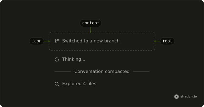
Marker
├── MarkerIcon
└── MarkerContent
Usage
<script setup lang="ts">
import { CheckIcon } from "lucide-vue-next";
import {
  Marker, MarkerContent, MarkerIcon,
} from "@/components/ui/marker";
</script>
<template>
  <Marker class="max-w-full min-w-0">
    <MarkerIcon>
      <CheckIcon aria-hidden="true" class="size-4" />
    </MarkerIcon>
    <MarkerContent>Explored 4 files</MarkerContent>
  </Marker>
</template>
Demos
Variants
Three values of variant, with no icons, so the shape is the only difference: default is an inline note, separator is a labeled rule, and border is a bordered row. Use default inside a transcript, separator for a break such as Today, and border when the notes are a short log you scan as separate items. The root sets data-variant if a style needs to target one.
Status
role is status because the text changes on its own. A spinner sits in MarkerIcon for a compacting line, and again on a separator row while tests run. Use the role for a live task so assistive tech can announce the update, and skip it on a note that never changes. The icon stays decorative, and the sentence is what gets read.
Shimmer
The words carry the motion: MarkerContent uses the shimmer class, on a plain status line and on a separator, for Thinking and for Reading 4 files. Use that class when a spinner would be one icon too many and the label itself should look in progress. It is not another variant, and the text still has to say what is happening. Motion with an empty label is just decoration.
Separator
Three separator rows, with no icons, mark breaks in a transcript: Today, a duration, and conversation compacted. variant set to separator draws a rule with the label in it. If there is nothing to say, use a Separator and skip Marker. Keep the label short, because MarkerContent is one inline span, not a paragraph.
Border
Three bordered rows, each with an icon: a branch switch, files reviewed, notes opened. The gap is tight so they read as a log rather than three unrelated sentences. Use variant border for completed events someone might scan later, where an inline note would disappear into the prose. It is still one note per marker, and it does not line up columns the way a table would.
Icon
MarkerIcon holds the graphic and MarkerContent holds the words. One row is inline, one is a separator, and one is stacked with flex-col so the icon sits above the label. Icons are hidden from assistive tech, and the text is the name of the row. Add an icon when it helps a log be scanned, and leave it off when the words are the whole point.
FAQ
What do the Marker variants change?
variant default is an inline note, separator is a labeled rule, and border is a bordered row, with default as the default. The root exposes data-variant so one style can be targeted without a new component. Put icons in MarkerIcon and the words in MarkerContent, and keep the meaning in the text because the icon is hidden from assistive tech.
How do I make a Marker a link or button in Vue?
Render the marker as that element instead of nesting a link in the text. The Links and Buttons demo on this page shows the swap for this target. The accessible name is the MarkerContent text, because the icon is decorative. Use a button for an action and an anchor when the row navigates.
How do I announce a live Marker?
Set role to status when the text updates on its own, such as a running task, which is what the status demo does with a spinner in MarkerIcon. The Shimmer demo uses that same role with a highlighted label. The icon stays decorative, so the text is what gets announced.
When should I use Marker instead of Separator?
Use Separator for a rule with no text. Use Marker with variant separator when the rule needs a label, such as a system note in a transcript. Marker is a full row, not a one-word badge. Keep the label in MarkerContent so the row still has an accessible name without the icon.
Can I put several lines in one Marker?
MarkerContent is a single inline span, meant for one short note. Stack several Marker rows when you have several notes, rather than forcing a paragraph into the content. The separator variant is still one label on a rule. For a conversation row with an avatar, use Message instead.
How do I style a Marker with Ark UI?
Edit the marker file under components/ui. Variant styles are the default, separator, and border classes, selected by the variant prop and reflected on data-variant. The icon slot does not shrink, and the content is allowed to wrap. Change those classes in the file so every marker picks up the same spacing.
API Reference
Marker
<div> data-slot="marker"
variant?"border" | "default" | "separator"
The visual style.
- Type
"border" | "default" | "separator"- Default
"default"
asChild?boolean
Renders your child element as the marker, with its styles.
- Default
false
class?string
Merged with the part's classes.
data-variant?string
Mirrors variant.
MarkerContent
<span> data-slot="marker-content"
class?string
Merged with the part's classes.
MarkerIcon
<span> data-slot="marker-icon"
class?string
Merged with the part's classes.
With other components
Message
MediaBetween chat rows
Spinner
FeedbackLive in-progress text
Button
ButtonsMarker as a trigger
Collapsible
DisclosureExpand a tool call
Attachment
MediaFiles in the thread
Tooltip
OverlaysWhat the mark means