shadcn.io is not affiliated with official shadcn/ui
One line of a conversation, in a colored box. It can sit to one side and take a reaction.
Use it when the view is just the thread, not a card around each line. When a line also needs an avatar or a time, use a Message. In Vue, Ark UI has a frameless option so a long reply can use the full width.
Installation
Anatomy
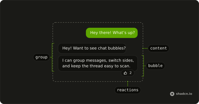
Bubble
├── BubbleContent
└── BubbleReactions
BubbleGroup
├── Bubble
│ └── BubbleContent
└── Bubble
└── BubbleContentUsage
<script setup lang="ts">
import {
  Bubble, BubbleContent, BubbleReactions,
} from "@/components/ui/bubble";
</script>
<template>
  <Bubble class="max-w-full min-w-0">
    <BubbleContent>
      I checked the registry output and removed the stale route.
    </BubbleContent>
    <BubbleReactions>
      <span>👍</span>
    </BubbleReactions>
  </Bubble>
</template>
Demos
Variants
Every variant in one column: default, secondary, muted, tinted, outline, destructive, and ghost. A common split is tinted or default for the person's own messages and muted for the other side. Destructive is for a failure, and ghost drops the frame and the width cap so a long assistant reply can use the row. Pick the color for who is speaking, not as decoration.
Alignment
align defaults to start, the other person's side. end is the reader's own messages, and it follows writing direction, so a right-to-left layout still puts them on the correct side. Set it on each bubble. If the row also has an avatar and a timestamp, set the alignment on Message and let the bubble follow that.
Group
Consecutive messages from one person should not look like separate turns. BubbleGroup tightens the gap between them. Keep align on each bubble, not on the group, and start a new group when the sender changes. A reaction on the last bubble can use align start so it sits toward the thread instead of hanging off the outer corner.
Collapsible
A long note should not take over the thread. The bubble shows the first stretch of the text, then a show-more control inside a Collapsible reveals the rest, and show-less puts it back. Use this for a review, a log, or an assistant reply that runs long. Short chat stays visible, and the control lives in the bubble so you do not grow a second panel.
Tooltip
A read receipt is not part of the sentence. The check icon sits in BubbleReactions, and a Tooltip on that icon carries the time. Use this for a timestamp, a delivery state, or any one-line fact that would clutter the message. The tooltip leaves when focus does, so if the detail is several lines, put a popover in that same slot instead.
Popover
A failed command needs the error, but that text is not the line people should read first. The bubble says it failed, and an info button in BubbleReactions opens a Popover with the exit code and the missing file. Use this when the extra text is more than a tooltip and less than a dialog. That slot is already on the failed bubble, so it is the anchor.
Markdown
Assistant text is often more than one sentence: emphasis, code, a second paragraph. variant ghost removes the frame and the width cap so that content can use the row, while the person's own short line stays a normal muted bubble. You render the markdown, and the bubble only supplies the container. Keep a frame when the text is a chat reply rather than a small document.
FAQ
What is the difference between Bubble and Message?
A Bubble is the colored box around the text. Message is the whole chat row around it: avatar, name, time and actions. Use a Bubble alone for simple chats, and a Message when each line carries that metadata, with a Bubble inside for the text.
What Bubble variants are available in Ark UI?
variant takes default, secondary, muted, tinted, outline, destructive or ghost. A common pairing is tinted for the reader's own messages and muted for replies; the Variants demo shows each one.
How do I group consecutive chat Bubbles from the same person?
Wrap them in BubbleGroup, as in the Group demo: it stacks them with a tighter gap than separate messages. Keep align on each Bubble, not on the group.
How do I make a Bubble clickable, such as a suggestion chip, in Vue?
Pass as-child to BubbleContent and put a button or a link inside.
The Links and Buttons demo shows a clickable reply.
How do I add emoji reactions to a Bubble?
Add BubbleReactions inside the bubble: it overlaps the bubble's edge, on the bottom by default, as in the Reactions demo. Leave extra space between messages so the next bubble doesn't cover them.
How do I show a long AI reply with Markdown in a Bubble?
Use variant="ghost": it removes the frame and the 80% maximum width, so headings, lists and code can use the whole row, as in the Markdown demo. Keep framed bubbles for short messages.
API Reference
Bubble
<div> data-slot="bubble"
align?"start" | "end"
The side of the conversation it sits on: start (theirs) or end * (yours).
- Type
"start" | "end"- Default
"start"
variant?"default" | "destructive" | "ghost" | "muted" | "outline" | "secondary" | "tinted"
The visual style.
- Type
"default" | "destructive" | "ghost" | "muted" | "outline" | "secondary" | "tinted"- Default
"default"
class?string
Merged with the part's classes.
data-align?string
Mirrors align.
data-variant?string
Mirrors variant.
BubbleContent
<div> data-slot="bubble-content"
asChild?boolean
Use the provided child element as the default rendered element, combining their props and behavior.
- Default
false
class?string
Merged with the part's classes.
BubbleGroup
<div> data-slot="bubble-group"
class?string
Merged with the part's classes.
BubbleReactions
<div> data-slot="bubble-reactions"
align?"start" | "end"
Which end of the bubble the reactions sit at: start or end.
- Type
"start" | "end"- Default
"end"
side?"top" | "bottom"
Whether the reactions sit above (top) or below (bottom) the bubble.
- Type
"top" | "bottom"- Default
"bottom"
class?string
Merged with the part's classes.
data-align?string
Mirrors align.
data-side?string
Mirrors side.
With other components
Message
MediaAvatar, name, timestamp
Collapsible
DisclosureShow more on long text
Tooltip
OverlaysRead receipt on hover
Popover
OverlaysFull error details
Button
ButtonsClickable reaction chips
Attachment
MediaFile next to the text