shadcn.io is not affiliated with official shadcn/ui
A short note that appears next to a control the moment it is hovered or focused.
Use it when that note can live in the same parent as the control. If an ancestor hides overflow, the note gets clipped, so use a Tooltip that portals out. In Svelte, Ark UI shows it immediately on hover or focus, unless another control has to open it.
Installation
Anatomy
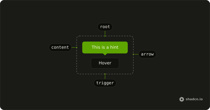
Usage
<script lang="ts">
import { Button } from "@/components/ui/button";
import { Hint, HintContent, HintTrigger } from "@/components/ui/hint";
</script>
<Hint>
  <HintTrigger>
    {#snippet asChild(props)}
      <Button {...props()} variant="outline">Hover</Button>
    {/snippet}
  </HintTrigger>
  <HintContent>This is a hint</HintContent>
</Hint>
Accessibility
- Enter
- Activate the focused control.
- Space
- Activate the focused control.
Demos
Controlled
open and onOpenChange are tied to state. The trigger still responds to hover and focus, and a second button shows or hides the note from outside. Control open when the hint must appear for another reason, a failed check or a tour step, not only because the pointer is on the trigger. Leave it uncontrolled for an ordinary hover note, since defaultOpen only sets the first state.
Positions
Four triggers set positioning.placement to left, top, bottom, and right, and top is what you get if you omit it. Set a side when the trigger sits against an edge and the default would run out of the parent. Hint is not portaled, so placement is relative to the hint root, and a parent that hides overflow will clip every side. positioning.gutter is the gap.
FAQ
How do I control whether a Hint is open in Svelte?
Keep a boolean in state and pass it back when another control must show or hide the hint, and leave it unset so the hint opens on its own from hover and focus. defaultOpen sets only the first state, and closed content unmounts unless you set lazyMount and unmountOnExit to false on HintContent.
Pass open, and onOpenChange receives the next boolean, not a details object.
How do I place a Hint above or beside the trigger?
Set positioning.placement to top, bottom, left, or right. Top is the default, and the Positions demo shows all four. positioning.gutter is a CSS length, 10px by default, and the hint writes it to the --gutter variable. The content is position absolute inside Hint, so the placement is relative to that root, not the viewport.
Why is my Hint clipped by a parent?
Hint does not use a portal. HintContent is absolutely positioned inside Hint, at z-50, so an ancestor with overflow hidden cuts it off. Move the Hint root to a parent that can show the overflow, or use a Tooltip, which is portaled. The arrow and the content both follow data-placement if you restyle them in the component file.
Should I use a Hint, a Tooltip, or a Hover Card?
Use Hint for a short note that can sit next to the trigger inside the same parent. Use a Tooltip when the note must float out of overflow and follow the usual tooltip timing. Use a Hover Card when the content is a preview the pointer can move into. Use a Popover when it should open on click.
Can keyboard users open a Hint?
Yes, focusing the trigger opens a Hint and blur closes it, because the trigger listens for focus as well as hover. HintContent has role tooltip, the trigger points at it with aria-describedby, and there is no delay and no Escape handler. Keep HintTrigger as a button, or replace it with asChild on your own button.
In Svelte, asChild is a snippet, not a boolean.
How do I restyle a Hint?
Edit the Hint file in your ui folder. The root sets data-slot hint, data-state open or closed, and data-placement, while the content uses hint-content and the arrow uses hint-arrow. Colors come from the foreground and background tokens. Change those classes in the file rather than overriding a one-off hint, so every hint matches.
How do I install Hint in Svelte?
Run the command in the Installation section above. It adds Hint, HintTrigger, and HintContent to your ui folder, and the arrow is drawn inside the content so you do not install it separately. Install from that section rather than pasting a partial tree, because Hint is a small local tooltip, not the portaled Tooltip. The command uses the shadcn-svelte CLI.
API Reference
Hint
<div>
open?boolean
Controlled open state. When set, defaultOpen is ignored.
defaultOpen?boolean
Initial open state when uncontrolled.
- Default
false
onOpenChange?(open: boolean) → void
Called when the open state should change (hover/focus or programmatic updates).
- Parameters
open– boolean- Returns
void
positioning?{ /** * The gutter from the trigger in pixels. * * @default "10px" */ gutter?: string; /** * The placement of the hint relative to the trigger. * * @default "top" */ placement?: "top" | "bottom" | "left" | "right"; }
Placement and gutter of the hint.
- Type
{ /** * The gutter from the trigger in pixels. * * @default "10px" */ gutter?: string; /** * The placement of the hint relative to the trigger. * * @default "top" */ placement?: "top" | "bottom" | "left" | "right"; }
asChild?Snippet<[PropsFn]>
Render your own element: a snippet that gets the part's props to spread on it.
- Type
Snippet<[PropsFn]>
class?string
Merged with the part's classes.
HintTrigger
<button> data-slot="hint-trigger"
asChild?Snippet<[PropsFn]>
Render your own element: a snippet that gets the part's props to spread on it.
- Type
Snippet<[PropsFn]>
class?string
Merged with the part's classes.
data-state?string
"open" when isVisible is true, otherwise "closed".
--gutterstringHintContent
<div> data-slot="hint-content"
placement?"bottom" | "left" | "right" | "top"
The side of the trigger it's on.
- Type
"bottom" | "left" | "right" | "top"- Default
"top"
asChild?Snippet<[PropsFn]>
Render your own element: a snippet that gets the part's props to spread on it.
- Type
Snippet<[PropsFn]>
class?string
Merged with the part's classes.
data-placement?string
Mirrors placement.
data-state?string
"open" when isVisible is true, otherwise "closed".
HintArrow
<div> data-slot="hint-arrow"
asChild?Snippet<[PropsFn]>
Render your own element: a snippet that gets the part's props to spread on it.
- Type
Snippet<[PropsFn]>
class?string
Merged with the part's classes.
data-placement?string
Mirrors placement.
With other components
Button
ButtonsThe control it explains
Input
InputsA note on a field
Label
InputsThe caption it sits by
Field
InputsHint under the label
Kbd
TypographyThe shortcut in the note
Badge
FeedbackA mark the note points at
Related
Tooltip
OverlaysOpens on hover
Popover
OverlaysOpens on click, holds more
Hover Card
OverlaysA preview, not a note
Toggle Tooltip
ButtonsStays until the next click
Alert
FeedbackA message in the page
Announcement
FeedbackA note for the whole page