shadcn.io is not affiliated with official shadcn/ui
The label, the input or choice, and the line of help or error under it.
Use it when a control needs a label, a description, or an error. A prefix or a button on the input is an Input Group, not another caption. In Svelte, Ark UI handles the layout and the accessible name, not validation.
Installation
Anatomy
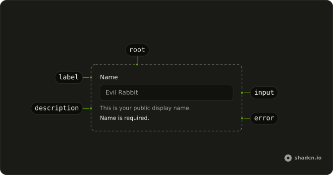
Usage
<script lang="ts">
import {
  Field, FieldDescription, FieldLabel,
} from "@/components/ui/field";
import { Input } from "@/components/ui/input";
</script>
const FieldDemo = () => (
  <Field className="max-w-xs">
    <FieldLabel>Name</FieldLabel>
    <Input placeholder="Evil Rabbit" type="text" />
    <FieldDescription>This is your public display name.</FieldDescription>
  </Field>
);
Accessibility
- Space
- Activate the focused control.
- Enter
- Activate the focused control.
- Arrow Up
- Move up.
- Arrow Down
- Move down.
- Arrow Left
- Move left.
- Arrow Right
- Move right.
- Home
- Go to the start.
- End
- Go to the end.
Demos
Input
Password, with the rule above the box: at least 8 characters. Put FieldDescription before the control when people need the constraint before they type. The hero does the opposite and parks the hint underneath, which suits a note they can ignore. The input's type is password, so the characters stay masked while the rule stays readable.
Textarea
Feedback is a four-row textarea with a label and no helper line. The placeholder is the only hint, and it disappears once someone types, so use that only when the prompt is disposable. A rule that still matters after focus belongs in FieldDescription. A second paragraph under an already tall field is easy to miss.
Select
Department is chosen from engineering, design, or marketing rather than typed. The field label names the question, and the select keeps a placeholder until a value is picked. Use this for any short closed list in a form. A job title people invent goes back to a text input, with the label still outside the control so it stays visible after a choice.
Slider
Volume starts at 40, with the field label as the only caption. A slider often has no text of its own, so this is what makes the drag mean something. The control also carries its own accessible name. Drop that if the field label is already associated, or the name is read twice, and use a slider for a range rather than a number that has to be exact.
Fieldset
Street and city sit under one Address legend. FieldSet and FieldLegend are the wrap when several inputs answer a single question, the way a mailing address does. Each inner field still has its own label. The legend is announced with those labels and does not replace them, so two unrelated inputs do not need a set.
Checkbox
Same as shipping address starts checked, box and label in one horizontal row. Set orientation to horizontal for a single boolean. A label stacked over a tiny box looks like a heading that lost its section. The label is the choice itself, so normal weight is enough, and a checked default should be the common case rather than a quiet opt-in.
Radio
Monthly or yearly, under a legend that reads Subscription plan. The set is the question, and each option is its own horizontal field so the hit target includes the word. FieldLegend with variant set to label is quieter than the address legend, which fits a short choice. Only one plan can be on, and a checkbox list would lie about that.
Switch
Multi-factor authentication puts the label on one side and the switch on the other. Horizontal orientation matches a settings row. A switch stacked under a bold label looks like a field that forgot its input. There is no description, so if enabling it has a consequence, keep that sentence with the label and the row height stays even.
Choice Card
The whole plan row chooses the radio, not a 16 pixel circle. Wrap Field in FieldLabel, use FieldTitle for Monthly or Yearly, and put the radio at the end. FieldTitle is the visual name when another label nested inside the wrapping label would confuse the association. Save this for a handful of cards, because a long list is just a radio group with extra chrome.
Group
Email, a rule, then name. FieldGroup stacks them and FieldSeparator is only a pause between unrelated questions, so there is no shared legend. Use the rule when the stack would otherwise read as one blob. Skip it when a fieldset legend already says why the inputs belong together, and give the separator a short word such as or only when the pause itself needs a label.
Rtl
The public-name field in Arabic: caption, input, and the sentence about the display name, with dir set to rtl on the wrapper. Alignment follows that direction, which is the check before a translated form ships. A physical left margin on the label lands on the wrong side, and this is where it shows. The placeholder may stay in another language, but the caption should not.
Responsive
The label and the hint stay a pair, and the input moves beside them once the container is wide. orientation set to responsive only switches inside a FieldGroup, because the breakpoint is a container query on the group, not the viewport. FieldContent holds the caption and the description so a horizontal field can line that pair up with the control. Narrow, it stacks, which is what a card column wants.
FAQ
How do I label a Field in Svelte?
Place FieldLabel and the control inside Field, and use FieldDescription for helper text. If the label does not wrap the control, set the same id on the control and htmlFor on FieldLabel. A label that only sits beside an input is not associated until those match. FieldTitle is a visual title when you do not want a label element.
How do I put a Field label beside the control?
orientation defaults to vertical, which stacks the label over the control. horizontal puts them in a row. responsive stacks them until the container is wide, then uses a row. Put responsive inside FieldGroup, because that switch is a container query on the group. The root sets data-orientation. The Responsive demo shows the switch.
reverse puts the control before the label.
How do I show an error on a Field?
Set invalid when validation fails. The root can then expose data-invalid for the destructive styles. Render the message with FieldError. The field does not store the value. The control does, the same way it does outside a field.
FieldError is the field error text and shows while the field is invalid. You can also set disabled, readOnly, or required on Field.
How do I group more than one Field?
Use FieldGroup for a stack of fields, or FieldSet with FieldLegend when they are one question. FieldLegend variant defaults to legend, and label is the quieter legend, as the Choice Card demo uses. FieldSeparator draws a rule between fields. It sets data-content when you pass a label as its child.
How do I make a choice card with Field?
Wrap Field in FieldLabel so the whole row chooses the control, as the Choice Card demo does. For a checkbox, radio, or switch in a row, set orientation to horizontal. The keyboard is that control's own keys. Field does not add arrow-key behavior of its own. The Accessibility section lists keys for the controls people focus inside it.
How do I restyle a Field?
Edit components/ui/field. Layout follows data-orientation, and the invalid treatment follows data-invalid. Pass a class for a max width. FieldContent groups a label and a description so a horizontal field can align that pair with a taller control, as the Responsive demo does.
Can I use Field with a form library and Ark UI?
Yes. Field is the layout and the accessible name, not a form state holder. Wire the library to the control, set invalid from its error, and render the message in FieldError. A description is helper text, not a replacement for the error. Keep both when you need a hint and a failure.
API Reference
Field
<div> data-slot="field"
disabled?boolean
Indicates whether the field is disabled.
id?string
The id of the field.
ids?object
The ids of the field parts.
- Type
{ root?: string; control?: string; label?: string; errorText?: string; helperText?: string }
invalid?boolean
Indicates whether the field is invalid.
orientation?"horizontal" | "responsive" | "vertical"
Stacks the label over the control (vertical), puts them side by side
(horizontal), or side by side on wide containers only (responsive).
- Type
"horizontal" | "responsive" | "vertical"- Default
"vertical"
readOnly?boolean
Indicates whether the field is read-only.
required?boolean
Indicates whether the field is required.
reverse?boolean
Puts the control before its label, when the field is horizontal.
- Default
false
target?string
The target field item value the label should point to.
asChild?Snippet<[PropsFn]>
Render your own element: a snippet that gets the part's props to spread on it.
- Type
Snippet<[PropsFn]>
class?string
Merged with the part's classes.
data-orientation?string
Mirrors orientation.
FieldSet
<div> data-slot="field-set"
disabled?boolean
Indicates whether the field is disabled.
id?string
The id of the field.
ids?object
The ids of the field parts.
- Type
{ root?: string; control?: string; label?: string; errorText?: string; helperText?: string }
invalid?boolean
Indicates whether the field is invalid.
readOnly?boolean
Indicates whether the field is read-only.
required?boolean
Indicates whether the field is required.
target?string
The target field item value the label should point to.
asChild?Snippet<[PropsFn]>
Render your own element: a snippet that gets the part's props to spread on it.
- Type
Snippet<[PropsFn]>
class?string
Merged with the part's classes.
FieldLegend
data-slot="field-legend"
variant?"legend" | "label"
The variant of the legend.
- Type
"legend" | "label"- Default
"legend"
asChild?Snippet<[PropsFn]>
Render your own element: a snippet that gets the part's props to spread on it.
- Type
Snippet<[PropsFn]>
class?string
Merged with the part's classes.
data-variant?string
Mirrors variant.
FieldGroup
<div> data-slot="field-group"
asChild?Snippet<[PropsFn]>
Render your own element: a snippet that gets the part's props to spread on it.
- Type
Snippet<[PropsFn]>
class?string
Merged with the part's classes.
FieldContent
<div> data-slot="field-content"
asChild?Snippet<[PropsFn]>
Render your own element: a snippet that gets the part's props to spread on it.
- Type
Snippet<[PropsFn]>
class?string
Merged with the part's classes.
FieldLabel
<label> data-slot="field-label"
asChild?Snippet<[PropsFn]>
Render your own element: a snippet that gets the part's props to spread on it.
- Type
Snippet<[PropsFn]>
class?string
Merged with the part's classes.
FieldRequiredIndicator
<span> data-slot="field-required-indicator"
fallback?Snippet
What it shows when the field isn't required.
asChild?Snippet<[PropsFn]>
Render your own element: a snippet that gets the part's props to spread on it.
- Type
Snippet<[PropsFn]>
class?string
Merged with the part's classes.
FieldTitle
<div> data-slot="field-title"
asChild?Snippet<[PropsFn]>
Render your own element: a snippet that gets the part's props to spread on it.
- Type
Snippet<[PropsFn]>
class?string
Merged with the part's classes.
FieldDescription
<p> data-slot="field-description"
asChild?Snippet<[PropsFn]>
Render your own element: a snippet that gets the part's props to spread on it.
- Type
Snippet<[PropsFn]>
class?string
Merged with the part's classes.
FieldSeparator
<div> data-slot="field-separator"
asChild?Snippet<[PropsFn]>
Render your own element: a snippet that gets the part's props to spread on it.
- Type
Snippet<[PropsFn]>
class?string
Merged with the part's classes.
data-content?stringFieldHelper
<span> data-slot="field-helper"
asChild?Snippet<[PropsFn]>
Render your own element: a snippet that gets the part's props to spread on it.
- Type
Snippet<[PropsFn]>
class?string
Merged with the part's classes.
FieldError
<span> data-slot="field-error"
asChild?Snippet<[PropsFn]>
Render your own element: a snippet that gets the part's props to spread on it.
- Type
Snippet<[PropsFn]>
class?string
Merged with the part's classes.
useField
disabled?boolean
Indicates whether the field is disabled.
id?string
The id of the field.
ids?object
The ids of the field parts.
- Type
{ root?: string; control?: string; label?: string; errorText?: string; helperText?: string }
invalid?boolean
Indicates whether the field is invalid.
readOnly?boolean
Indicates whether the field is read-only.
required?boolean
Indicates whether the field is required.
target?string
The target field item value the label should point to.
With other components
Input
InputsText control in Field
Textarea
InputsLong copy in Field
Select
SelectionDropdown as the control
Checkbox
SelectionLabel beside the box
Radio Group
SelectionOne question, several options
Switch
SelectionCaption beside the thumb
Related
Label
InputsPrimitive FieldLabel wraps
Input Group
InputsAddons on the control
Native Select
SelectionBrowser native dropdown
Slider
ControlsRange inside a Field
Input OTP
InputsA code, one slot at a time
Editable
InputsClick the text to edit