shadcn.io is not affiliated with official shadcn/ui
Text that turns into a field on click, with save and cancel.
Use it when the edit is occasional, like a profile name. If the field should always be open, use an Input. In Svelte, Ark UI keeps the visible text and a separate draft, so save and cancel stay different.
Installation
Anatomy
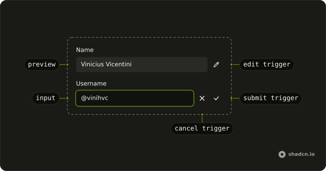
Editable
├── EditableArea
├── EditableLabel
├── EditableInput
├── EditableInput
├── EditableEditTrigger
├── EditableSubmitTrigger
├── EditableCancelTrigger
└── EditableControl
Usage
<script lang="ts">
import { CheckIcon, XIcon } from "lucide-svelte";
import { Button } from "@/components/ui/button";
import { Card, CardContent, CardHeader } from "@/components/ui/card";
import {
  Editable, EditableArea, EditableCancelTrigger, EditableControl,
  EditableInput, EditablePreview, EditableSubmitTrigger,
} from "@/components/ui/editable";
import { Field, FieldGroup, FieldLabel } from "@/components/ui/field";
import { Input } from "@/components/ui/input";
</script>
<Card class="w-full max-w-sm">
  <CardHeader
    description="Click in the field or edit button to start editing"
    title="Edit user"
  />
  <CardContent>
    <FieldGroup>
      <Field>
        <FieldLabel>Name</FieldLabel>
        <Editable defaultValue="Vinicius Vicentini">
          <EditableArea>
            <EditableInput>
              {#snippet asChild(props)}
                <Input {...props()} class="w-full" />
              {/snippet}
            </EditableInput>
            <EditablePreview />
          </EditableArea>
          <EditableControl>
            <EditableCancelTrigger>
              {#snippet asChild(props)}
                <Button {...props()} size="icon-md" variant="outline">
                  <XIcon />
                </Button>
              {/snippet}
            </EditableCancelTrigger>
            <EditableSubmitTrigger>
              {#snippet asChild(props)}
                <Button {...props()} size="icon-md" variant="outline">
                  <CheckIcon />
                </Button>
              {/snippet}
            </EditableSubmitTrigger>
          </EditableControl>
        </Editable>
      </Field>
      <Field>
        <FieldLabel>Username</FieldLabel>
        <Editable defaultValue="@vinihvc">
          <EditableArea>
            <EditableInput>
              {#snippet asChild(props)}
                <Input {...props()} />
              {/snippet}
            </EditableInput>
            <EditablePreview />
          </EditableArea>
          <EditableControl>
            <EditableCancelTrigger>
              {#snippet asChild(props)}
                <Button {...props()} size="icon-md" variant="outline">
                  <XIcon />
                </Button>
              {/snippet}
            </EditableCancelTrigger>
            <EditableSubmitTrigger>
              {#snippet asChild(props)}
                <Button {...props()} size="icon-md" variant="outline">
                  <CheckIcon />
                </Button>
              {/snippet}
            </EditableSubmitTrigger>
          </EditableControl>
        </Editable>
      </Field>
    </FieldGroup>
  </CardContent>
</Card>
Accessibility
- Enter
- Saves the edited content and exits edit mode.
- Escape
- Discards the changes and exits edit mode.
- Space
- Activate the focused control.
Demos
Activation Click
activationMode set to click waits for a click on the preview before the input opens. Tabbing through the page does not start an edit, which matters when several of these sit in one form and focus is only passing by. Save and cancel are still there. Use click when one deliberate press is the right gesture and a double-click would feel slow.
Activation Focus
Focus is the default activationMode. Landing on the preview, by tab or by click, opens the input immediately. That is the fastest path through a short profile form with two or three values. It is also easy to start an edit while moving through the page, so skip it when a stray focus should leave the text alone.
Activation None
activationMode set to none ignores clicks and focus on the preview. EditableEditTrigger is the way in, then cancel and submit finish the edit. Use this when a click on the text should select it, or when editing is rare enough to be an explicit button. The preview stays text until that button is pressed.
Controlled
One button in the card header owns the edit, and both fields follow it. activationMode is none, and edit is the flag you pass in, so a click on the text cannot fight the header. Use this when several values should enter and leave edit mode together, a name and a username on the same card. A single field rarely needs the flag.
Dblclick
activationMode set to dblclick leaves a single click alone and edits on the second one. That matches renaming a file, where the first click selects and the second renames. Save and cancel are still there if you would rather not rely on the keyboard. Use it when the text also needs to be selectable without opening the field.
Orientation Horizontal
The preview and the buttons sit on one row. orientation horizontal is the default, and it fits a short value, a name or a slug, when the row has room for the field and two icon buttons. If the text wraps onto several lines, that row starts to crush it. Stack the controls with the vertical orientation instead.
Orientation Vertical
The field sits above the buttons. Set orientation to vertical when the value is more than one line, or the container is a narrow card and a horizontal row would squeeze the text. This layout uses a textarea so the wrapping is obvious. Save and cancel stay under the field, lined up with the block, not with the first line only.
Size Lg
Large type is for a title or a display name, where the value is the point of the card and a default field would look timid next to it. Set size to lg on EditablePreview and on the input, and use the large icon buttons so the row lines up. In a normal form, the medium size is the one that belongs.
Size Md
Medium is the default, and it is the size to keep for a setting in a form. EditablePreview and the input both take size md, with icon buttons at the same scale, so the row matches the fields around it. You can omit size and get this anyway. Reach for small or large only when the row is clearly denser or more prominent than its neighbors.
Size Sm
Small type is for a sidebar, a table cell, or a stack of settings where the default field would dominate. Set size to sm on the preview and the input, and use the small icon buttons. The text is still edited the same way. It just stops competing with everything else on the page.
With Textarea
A description is too long for a single-line input, so the editor mounts a textarea and the preview gets the same minimum height. The controls sit underneath because orientation is vertical. Use this for a bio, a note, or any value that needs more than one line. A title still wants the single-line input, even if you are tempted to reuse this layout.
Without Controls
There is no save button and no cancel button: the preview becomes a field, Enter keeps the draft, and Escape restores the previous text. Blur also commits, because that is the default submit behavior. Use this in a list of names where an icon button on every row would be clutter. Put EditableControl back when the way to finish should be visible.
FAQ
How do I control the text of an Editable in Svelte?
Keep the string in state and pass it back. Use defaultValue when the field only needs a starting value. The preview shows the current value, and the input edits a draft until you commit it.
Pass value. onValueChange receives details.value.
How does Editable decide when editing starts?
activationMode is focus by default, so focusing the preview opens the input. click and dblclick wait for that gesture. none does not start from the preview. Pass edit yourself, as the Controlled demo does, and update it from onEditChange. The Activation Click, Activation Focus, Dblclick, and Activation None demos cover the four modes.
How do I save or cancel an Editable?
Enter saves and Escape discards, which is what the Accessibility section describes. submitMode defaults to both, so Enter and blurring the field both commit. Set it to enter, blur, or none. none waits for EditableSubmitTrigger. EditableCancelTrigger reverts. onValueCommit runs when the value is saved, and onValueRevert runs when it is discarded.
Why does Editable show both an input and a preview?
EditablePreview is the text people see, and EditableInput is the field shown while editing. Keep both inside EditableArea. They occupy the same box, and the inactive one is hidden. Pass placeholder for an empty value. The preview sets data-placeholder-shown then. selectOnFocus defaults to true, so the text is selected when editing starts.
Can I submit an Editable value with a form in Svelte?
Yes. Set name and the committed value is included in the form submit. required and maxLength constrain it. invalid marks an error, and disabled or readOnly blocks editing. autoResize grows the field with the text. The value that is still a draft is not the committed value until you save.
How do I put Editable controls under the text?
orientation defaults to horizontal, with the preview and the buttons in a row. The root sets data-orientation. Set orientation to vertical to stack them, as the vertical demo does. EditablePreview takes size of sm, md, or lg, and md is the default. Put the buttons in EditableControl, or omit them and let Enter and Escape finish the edit.
How do I install Editable in Svelte?
Run the command in the Installation section above. It adds Editable, the area, the preview, the input, and the submit, cancel, and edit triggers to your ui folder. Input and Button, used in the demos, come from their own pages. The command uses the shadcn-svelte CLI.
API Reference
Editable
<div> data-slot="editable"
edit?boolean
Whether the editable is in edit mode.
defaultEdit?boolean
Whether the editable is in edit mode by default.
onEditChange?(details: EditChangeDetails) → void
Function to call when the edit mode changes.
- Type
(details: EditChangeDetails) → void- Parameters
details– { edit: boolean }- Returns
void
value?string
The controlled value of the editable.
defaultValue?string
The initial value of the editable when rendered. Use when you don't need to control the value of the editable.
onValueChange?(details: ValueChangeDetails) → void
Function to call when the value changes.
- Type
(details: ValueChangeDetails) → void- Parameters
details– { value: string }- Returns
void
activationMode?"focus" | "dblclick" | "click" | "none"
The activation mode for the preview element. - "focus" - Enter edit mode when the preview is focused - "dblclick" - Enter edit mode when the preview is double-clicked - "click" - Enter edit mode when the preview is clicked - "none" - Edit can be triggered programmatically only
- Type
"focus" | "dblclick" | "click" | "none"- Default
"focus"
autoResize?boolean
Whether the editable should auto-resize to fit the content.
dir?"ltr" | "rtl"
The document's text/writing direction.
- Type
"ltr" | "rtl"- Default
"ltr"
disabled?boolean
Whether the editable is disabled.
finalFocusEl?() → HTMLElement | null
The element to receive focus when the editable is closed.
- Type
() → HTMLElement | null- Returns
HTMLElement | null
form?string
The associate form of the underlying input.
id?string
The unique identifier of the machine.
ids?object
The ids of the elements in the editable. Useful for composition.
- Type
{ root?: string; area?: string; label?: string; preview?: string; input?: string; control?: string; submitTrigger?: string; cancelTrigger?: string; editTrigger?: string }
invalid?boolean
Whether the input's value is invalid.
maxLength?number
The maximum number of characters allowed in the editable.
name?string
The name attribute of the editable component. Used for form submission.
onFocusOutside?(event: FocusOutsideEvent) → void
Function called when the focus is moved outside the component.
- Type
(event: FocusOutsideEvent) → void- Parameters
event– FocusOutsideEvent- Returns
void
onInteractOutside?(event: InteractOutsideEvent) → void
Function called when an interaction happens outside the component.
- Type
(event: InteractOutsideEvent) → void- Parameters
event– InteractOutsideEvent- Returns
void
onPointerDownOutside?(event: PointerDownOutsideEvent) → void
Function called when the pointer is pressed down outside the component.
- Type
(event: PointerDownOutsideEvent) → void- Parameters
event– PointerDownOutsideEvent- Returns
void
onValueCommit?(details: ValueChangeDetails) → void
Function to call when the value is committed.
- Type
(details: ValueChangeDetails) → void- Parameters
details– { value: string }- Returns
void
onValueRevert?(details: ValueChangeDetails) → void
Function to call when the value is reverted.
- Type
(details: ValueChangeDetails) → void- Parameters
details– { value: string }- Returns
void
orientation?"horizontal" | "vertical"
The orientation of the editable.
- Type
"horizontal" | "vertical"- Default
"horizontal"
placeholder?string | { edit: string; preview: string; }
The placeholder text for the editable.
- Type
string | { edit: string; preview: string; }
readOnly?boolean
Whether the editable is read-only.
required?boolean
Whether the editable is required.
selectOnFocus?boolean
Whether to select the text in the input when it is focused.
- Default
true
submitMode?"enter" | "blur" | "both" | "none"
The action that triggers submit in the edit mode:
- "enter" - Trigger submit when the enter key is pressed
- "blur" - Trigger submit when the editable is blurred
- "none" - No action will trigger submit. You need to use the submit button
- "both" - Pressing Enter and blurring the input will trigger submit
- Type
"enter" | "blur" | "both" | "none"- Default
"both"
translations?object
The translations for the editable.
- Type
{ edit?: string; submit?: string; cancel?: string; input?: string }
asChild?Snippet<[PropsFn]>
Render your own element: a snippet that gets the part's props to spread on it.
- Type
Snippet<[PropsFn]>
class?string
Merged with the part's classes.
data-orientation?string
Mirrors orientation.
EditableArea
<div> data-slot="editable-area"
asChild?Snippet<[PropsFn]>
Render your own element: a snippet that gets the part's props to spread on it.
- Type
Snippet<[PropsFn]>
class?string
Merged with the part's classes.
data-disabled?string
Present when disabled.
data-focus?string
Present when focused.
data-placeholder-shown?string
Present when placeholder is shown.
EditablePreview
<span> data-slot="editable-preview"
size?"sm" | "md" | "lg"
The size.
- Type
"sm" | "md" | "lg"- Default
"md"
asChild?Snippet<[PropsFn]>
Render your own element: a snippet that gets the part's props to spread on it.
- Type
Snippet<[PropsFn]>
class?string
Merged with the part's classes.
data-autoresize?string
Present when autoResize is true.
data-disabled?string
Present when disabled.
data-invalid?string
Present when invalid.
data-placeholder-shown?string
Present when placeholder is shown.
data-readonly?string
Present when read-only.
data-size?string
Mirrors size.
EditableInput
<input> data-slot="editable-input"
asChild?Snippet<[PropsFn]>
Render your own element: a snippet that gets the part's props to spread on it.
- Type
Snippet<[PropsFn]>
class?string
Merged with the part's classes.
data-autoresize?string
Present when autoResize is true.
data-disabled?string
Present when disabled.
data-invalid?string
Present when invalid.
data-readonly?string
Present when read-only.
EditableEditTrigger
<button> data-slot="editable-edit-trigger"
asChild?Snippet<[PropsFn]>
Render your own element: a snippet that gets the part's props to spread on it.
- Type
Snippet<[PropsFn]>
EditableSubmitTrigger
<button> data-slot="editable-submit-trigger"
asChild?Snippet<[PropsFn]>
Render your own element: a snippet that gets the part's props to spread on it.
- Type
Snippet<[PropsFn]>
EditableCancelTrigger
<button> data-slot="editable-cancel-trigger"
asChild?Snippet<[PropsFn]>
Render your own element: a snippet that gets the part's props to spread on it.
- Type
Snippet<[PropsFn]>
EditableControl
<div> data-slot="editable-control"
asChild?Snippet<[PropsFn]>
Render your own element: a snippet that gets the part's props to spread on it.
- Type
Snippet<[PropsFn]>
class?string
Merged with the part's classes.
useEditable
edit?boolean
Whether the editable is in edit mode.
defaultEdit?boolean
Whether the editable is in edit mode by default.
onEditChange?(details: EditChangeDetails) → void
Function to call when the edit mode changes.
- Type
(details: EditChangeDetails) → void- Parameters
details– { edit: boolean }- Returns
void
value?string
The controlled value of the editable.
defaultValue?string
The initial value of the editable when rendered. Use when you don't need to control the value of the editable.
onValueChange?(details: ValueChangeDetails) → void
Function to call when the value changes.
- Type
(details: ValueChangeDetails) → void- Parameters
details– { value: string }- Returns
void
activationMode?"focus" | "dblclick" | "click" | "none"
The activation mode for the preview element. - "focus" - Enter edit mode when the preview is focused - "dblclick" - Enter edit mode when the preview is double-clicked - "click" - Enter edit mode when the preview is clicked - "none" - Edit can be triggered programmatically only
- Type
"focus" | "dblclick" | "click" | "none"- Default
"focus"
autoResize?boolean
Whether the editable should auto-resize to fit the content.
disabled?boolean
Whether the editable is disabled.
finalFocusEl?() → HTMLElement | null
The element to receive focus when the editable is closed.
- Type
() → HTMLElement | null- Returns
HTMLElement | null
form?string
The associate form of the underlying input.
id?string
The unique identifier of the machine.
ids?object
The ids of the elements in the editable. Useful for composition.
- Type
{ root?: string; area?: string; label?: string; preview?: string; input?: string; control?: string; submitTrigger?: string; cancelTrigger?: string; editTrigger?: string }
invalid?boolean
Whether the input's value is invalid.
maxLength?number
The maximum number of characters allowed in the editable.
name?string
The name attribute of the editable component. Used for form submission.
onFocusOutside?(event: FocusOutsideEvent) → void
Function called when the focus is moved outside the component.
- Type
(event: FocusOutsideEvent) → void- Parameters
event– FocusOutsideEvent- Returns
void
onInteractOutside?(event: InteractOutsideEvent) → void
Function called when an interaction happens outside the component.
- Type
(event: InteractOutsideEvent) → void- Parameters
event– InteractOutsideEvent- Returns
void
onPointerDownOutside?(event: PointerDownOutsideEvent) → void
Function called when the pointer is pressed down outside the component.
- Type
(event: PointerDownOutsideEvent) → void- Parameters
event– PointerDownOutsideEvent- Returns
void
onValueCommit?(details: ValueChangeDetails) → void
Function to call when the value is committed.
- Type
(details: ValueChangeDetails) → void- Parameters
details– { value: string }- Returns
void
onValueRevert?(details: ValueChangeDetails) → void
Function to call when the value is reverted.
- Type
(details: ValueChangeDetails) → void- Parameters
details– { value: string }- Returns
void
placeholder?string | { edit: string; preview: string; }
The placeholder text for the editable.
- Type
string | { edit: string; preview: string; }
readOnly?boolean
Whether the editable is read-only.
required?boolean
Whether the editable is required.
selectOnFocus?boolean
Whether to select the text in the input when it is focused.
- Default
true
submitMode?"enter" | "blur" | "both" | "none"
The action that triggers submit in the edit mode:
- "enter" - Trigger submit when the enter key is pressed
- "blur" - Trigger submit when the editable is blurred
- "none" - No action will trigger submit. You need to use the submit button
- "both" - Pressing Enter and blurring the input will trigger submit
- Type
"enter" | "blur" | "both" | "none"- Default
"both"
translations?object
The translations for the editable.
- Type
{ edit?: string; submit?: string; cancel?: string; input?: string }
EditableContext
cancelVoidFunction
Function to exit edit mode, and discard any changes.
clearValueVoidFunction
Function to clear the value of the editable.
editVoidFunction
Function to enter edit mode.
editingboolean
Whether the editable is in edit mode.
emptyboolean
Whether the editable value is empty.
setValue(value: string) → void
Function to set the value of the editable.
- Parameters
value– string- Returns
void
submitVoidFunction
Function to exit edit mode, and submit any changes.
valuestring
The current value of the editable.
valueTextstring
The current value of the editable, or the placeholder if the value is empty.
With other components
Input
InputsThe field while editing
Button
ButtonsSave or cancel
Tooltip
OverlaysClick to edit
Kbd
TypographyEnter saves, Escape cancels
Card
LayoutA title you can rename
Field
InputsLabel and error
Related
Textarea
InputsAlways an editor
Autocomplete
SelectionSuggest while they edit
Input Group
InputsA field with an addon
Label
InputsA caption that is not the value
Dialog
OverlaysEdit in a modal
Item
LayoutA row with a title