shadcn.io is not affiliated with official shadcn/ui
One press for a click, a form submit, or a link that should look like a button.
Use it for Save or Send. When the control should stay on, use a Toggle. In Svelte, Ark UI renders a real button, and the default doesn't submit the form.
Installation
Anatomy
Usage
<script lang="ts">
import { ArrowUpIcon } from "lucide-svelte";
import { Button } from "@/components/ui/button";
</script>
<div class="flex flex-wrap items-center gap-2 md:flex-row">
  <Button variant="outline">Button</Button>
  <Button aria-label="Submit" size="icon-md" variant="outline">
    <ArrowUpIcon aria-hidden="true" />
  </Button>
</div>
Accessibility
- Enter
- Activate the focused control.
- Space
- Activate the focused control.
Demos
Size
size runs from xs to lg in this row, each label paired with a square icon-* sibling. Extra small belongs in a dense toolbar, small sits beside body text, and the default is the action the screen is about. Icon sizes stay square so a lone glyph does not stretch, and xl or icon-xl is there when the button has to be read from across a room.
Variant Default
variant="default" is the filled button, the one that should win a glance. Spend it on the action you want taken, such as save or pay, and let everything else drop to outline or ghost. A row of filled buttons is just several buttons arguing.
Outline
variant="outline" keeps a border and drops the fill, which is the right weight beside a primary action. Cancel next to Save, or a filter that should look pressable without shouting, both sit well here. It still reads as a button before anyone hovers, which is where ghost starts to vanish.
Secondary
variant="secondary" fills the button in a quieter color, for an action that is real but not the preferred one. Pair it with the default variant when both deserve a fill, such as Save and Save as draft. A border with no fill is outline instead, and it is the lighter of the two.
Ghost
variant="ghost" shows no border until hover or focus, so it fits a low-stakes action in a toolbar or a table row. Do not use it for the only action on a page. People skip past it. Reach for outline instead when the control has to stay visible at rest.
Destructive
variant="destructive" is the red control for delete, remove, and anything that should not be casual. Put that color on the button that confirms, not on the one that only opens a dialog. One red control in a group is plenty, and the others should stay neutral so the danger stays obvious.
Link
variant="link" only paints the button as underlined text, and it does not navigate. It fits a tertiary action inside a sentence, such as forgot-password beside a field label. When the press should go somewhere, put the same styles on a real link, which is the As Child demo rather than this one.
Icon
An icon-only button uses an icon-* size so the target stays square, and this one is icon-md. The glyph is aria-hidden, so aria-label has to carry the name, here Submit. Use the pattern for a repeated action whose meaning is already obvious, and keep a visible word when the icon could mean two things.
With Icon
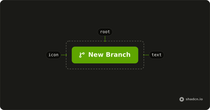
The icon lives in the button, and data-icon is inline-start or inline-end so the gap is right and a right-to-left layout can mirror it. Start is the side for a new-branch mark. End is the side for an arrow that points onward. Drop the attribute and the icon sits on the words.
Rounded
The buttons add rounded-full, and the pill prop does the same thing without a one-off class. A capsule suits a single marketing action, or a round icon that floats over content. In an app the default radius is calmer, since a row of pills starts to look like a set of tags. Match the icon button, or it stays a rounded square beside a capsule.
Spinner
A Spinner beside the label keeps the action readable while it runs, as with Generating and Downloading. The button is disabled, and data-icon on the spinner holds the gap an icon would. Keep the words when the name still matters. isLoading is the other pattern: it replaces the label with a centered spinner, holds the width, and sets aria-busy.
As Child
Login here is a real link wearing button styles, so it navigates and still matches the other controls. Use that when the destination is an address, a login page or a pricing page. variant="link" only changes the paint. The prop that merges styles differs by library, and the link question in the FAQ names each one.
Rtl
dir="rtl" on the row flips the cluster: Arabic labels, a destructive action, an icon button, and a loading label, with the arrow on data-icon="inline-end" so it mirrors. Use the attribute when this group is an island of right-to-left UI. A larger subtree should take Direction instead of a dir on every wrapper. A physical margin on the icon will fight that flip.
FAQ
How do I make a Button that links to another page in Svelte?
Pass asChild and spread the props it gives you on your link: the button's styles move onto it.
variant="link" only changes the look; it doesn't navigate.
Why doesn't my Button submit the form?
Its type is button by default, so it never submits a form by accident. Pass type="submit" to the one button that should submit.
What Button variants and sizes are there?
variant takes default, secondary, outline, ghost, destructive or link. size goes from xs to xl, and icon-xs to icon-xl makes a square icon button. pill rounds it fully; the Size and variant demos show them all.
Should I disable a Button or hide it when an action isn't available?
Usually disable it: a missing button looks like a bug, while a disabled one shows the action exists. Explain why nearby, since a disabled button can't show a tooltip on hover in most browsers.
How do I install the Button in Svelte?
Run the command in the Installation section above: it adds button to your components/ui folder with the Spinner it uses. React and Solid use the shadcn CLI, Vue uses shadcn-vue and Svelte uses shadcn-svelte, each after its one-time setup.
API Reference
Button
<button> data-slot="button"
clickEffect?boolean
Apply a click effect to the button.
- Default
true
isLoading?boolean
Show a loading indicator.
- Default
false
pill?boolean
Fully rounded corners.
- Default
false
size?"icon-lg" | "icon-md" | "icon-sm" | "icon-xl" | "icon-xs" | "lg" | "md" | "sm" | "xl" | "xs"
The size.
- Type
"icon-lg" | "icon-md" | "icon-sm" | "icon-xl" | "icon-xs" | "lg" | "md" | "sm" | "xl" | "xs"- Default
"md"
variant?"default" | "destructive" | "ghost" | "link" | "outline" | "secondary"
The visual style.
- Type
"default" | "destructive" | "ghost" | "link" | "outline" | "secondary"- Default
"default"
asChild?Snippet<[PropsFn]>
Render your own element: a snippet that gets the part's props to spread on it.
- Type
Snippet<[PropsFn]>
class?string
Merged with the part's classes.
data-pill?string
Present when pill is set.
data-size?string
Mirrors size.
data-state?string
"loading" when isLoading is true, otherwise "idle".
data-variant?string
Mirrors variant.
With other components
Field
InputsSubmit and reset
Dialog
OverlaysConfirm and cancel
Dropdown Menu
MenusThe menu trigger
Spinner
FeedbackLoading inside the label
Tooltip
OverlaysName an icon button
Input
InputsSearch next to the field
Related
Button Group
ButtonsAdjacent fused actions
Toggle
SelectionStays pressed
Alert Dialog
OverlaysConfirm a delete
Pagination
NavigationNext and previous
Badge
FeedbackA label, not a click
Link Overlay
NavigationThe whole card is the link