shadcn.io is not affiliated with official shadcn/ui
Show a spinning icon on a button or a row for the short wait after a click.
Use it while a request is in flight, and disable the control that started the work. If it would keep spinning, or you already know the layout, use a Skeleton. In Svelte, Ark UI takes the icon color from the text around it.
Installation
Anatomy
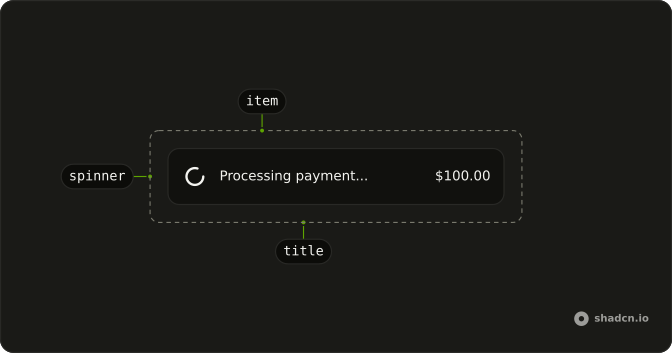
Usage
<script lang="ts">
import {
  Item, ItemContent, ItemMedia, ItemTitle,
} from "@/components/ui/item";
import { Spinner } from "@/components/ui/spinner";
</script>
<div class="flex w-full max-w-xs flex-col gap-4 [--radius:1rem]">
  <Item variant="muted">
    <ItemMedia>
      <Spinner />
    </ItemMedia>
    <ItemContent>
      <ItemTitle class="line-clamp-1">Processing payment...</ItemTitle>
    </ItemContent>
    <ItemContent class="flex-none justify-end">
      <span class="text-sm tabular-nums">$100.00</span>
    </ItemContent>
  </Item>
</div>
Demos
Custom
The spinner is a loader icon with animate-spin, a role of status, and a label of Loading. Swap the glyph in the component file when the default clashes with your other icons, and keep the role and the label so it still announces. Size and color stay classes on the element, not a separate prop.
Size
There is no size prop. Pass a size class: size-3 inside a dense badge, size-4 beside body text, size-6 or size-8 when the wheel is alone in an empty area. It scales like any other icon, and a text color on the parent tints all four because the stroke is currentColor.
Button
The wheel goes before the label, with data-icon set to inline-start, so the button's own icon spacing applies. Disable the button until the request finishes, or people will click it again. Default, outline, and secondary all use that pattern, and the label should say what is happening rather than leaving the announcement to the wheel alone.
Badge
Syncing, Updating, and Processing are statuses, not buttons, so the wheel sits in a badge rather than a control someone might press. data-icon set to inline-start places it before the word, and the badge variant stays whatever you would have picked. Use it on a row or a table cell where the work is ongoing and there is nothing to activate.
Input Group
When the field itself is waiting, disable it and put the wheel in an InputGroupAddon: a one-line message with the spinner at the end, or a textarea whose addon reads Validating while send stays in the corner. Use that for a lookup or a check that blocks typing. If the wait belongs to the submit action, the button is the place for the spinner instead.
Rtl
The payment row from the top of the page, in Arabic, with dir set to rtl. The wheel stays at the start and the amount at the end, the opposite physical side from left to right, so set direction on the item or a parent rather than on the spinner. The icon has no text to flip.
FAQ
How do I change the size of the Spinner?
Pass a size class such as size-6 or size-8: it defaults to size-4. It is an SVG icon, so className sizes it like any other icon, as the Size demo shows.
How do I change the Spinner color?
It draws with currentColor, so it takes the text color around it. Set a text class on it or on its parent, for example text-muted-foreground or text-primary.
Is the Spinner accessible to screen readers?
Yes. It renders with role="status" and an aria-label of "Loading", so assistive technology announces that something is loading. Pass your own aria-label to say what is loading, such as "Saving changes".
How do I stop the Spinner animation for reduced motion?
The spin comes from the animate-spin class. Add motion-reduce:animate-none to stop it for people who ask for less motion; the icon then stays still.
When should I use a Spinner instead of a Skeleton?
Use a Spinner for a short wait on an action, like submitting a form or saving. Use a Skeleton when a whole area is loading and you know its layout, so the page does not jump when the content arrives.
API Reference
Spinner
data-slot="spinner"
class?string
Merged with the part's classes.
With other components
Button
ButtonsSubmit while it saves
Badge
FeedbackSyncing status chip
Input Group
InputsValidating the field
Empty
FeedbackFirst load wait
Item
LayoutPayment row in flight
Attachment
MediaInside the media slot