shadcn.io is not affiliated with official shadcn/ui
An icon, a short title, one sentence, and a next step, for a view that loaded empty.
Use it when the request succeeded and the result is nothing. While data is still loading, use a Skeleton. In Svelte, Ark UI is only the layout you render once the list is empty.
Installation
Anatomy
Usage
<script lang="ts">
import { FolderCodeIcon } from "lucide-svelte";
import { Button } from "@/components/ui/button";
import {
  Empty, EmptyContent, EmptyDescription, EmptyHeader, EmptyMedia,
  EmptyTitle,
} from "@/components/ui/empty";
</script>
<Empty>
<EmptyHeader>
<EmptyMedia variant="icon">
<FolderCodeIcon aria-hidden="true" />
</EmptyMedia>
<EmptyTitle>No Projects Yet</EmptyTitle>
<EmptyDescription>
You haven't created any projects yet.
</EmptyDescription>
</EmptyHeader>
<EmptyContent>
<Button>Create Project</Button>
</EmptyContent>
</Empty>
Demos
Outline
A dashed border on Empty turns the block into a boundary. This one is unused cloud storage, with an upload button under the title. Use the outline when the region is a slot people are meant to fill, and a solid fill would look like content that is already there. The border is a class you add, since the component does not ship one of its own.
Background
A muted background, and the block stretches to the height of its pane. The copy is an inbox with nothing in it, plus a refresh action. Use a fill when Empty occupies a panel and a transparent hole looks unfinished. Keep the color quiet, because a strong wash reads as an alert and an empty inbox is not a failure.
Avatar
EmptyMedia holds one avatar, and variant stays off the icon tile so the face is not crammed into that small square. The title says the person is offline, and the action is to leave a message. Use a portrait when the empty state is about someone specific. A generic user glyph says less than their picture, even in grayscale.
Avatar Group
Three overlapping avatars sit in EmptyMedia, and the action invites members. Use a cluster when the missing thing is other people and the faces say that faster than a folder icon. The icon variant frames a single glyph, so leave variant unset for a group. The avatars are not a control, and the invite button is what people should find.
Input Group
A missing page, with a search Input Group under the title and a support link in a second description. The slash hint sits at the end of the field. Put a search here when the next step is to look for something else, not to create the thing that is absent. A not-found page that only offers home wastes the fact that the person was looking.
Card
Create and Import sit in one row, and a quieter learn-more link sits under them. Those actions are real links and buttons. Use this stack when the empty state should send people to create, import, or read, and the link belongs with the message. You do not need a card around it, because Empty is already the centered frame and another wrapper mostly adds a second border.
Rtl
dir is rtl and the copy is Arabic. The title, the two actions, and the learn-more link follow the inline direction, and the arrow still points outward. Set dir on Empty when this block can land in a right-to-left page even if the surrounding preview is not. Empty itself has no physical left or right, so margins you add should stay logical or the buttons drift.
FAQ
How do I build an Empty state in Svelte?
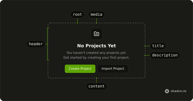
Use Empty as the centered frame, EmptyHeader for the message, and EmptyContent for actions. Inside the header, EmptyMedia holds an icon or an avatar, EmptyTitle is the short message, and EmptyDescription is the longer one. Put a button, a link, or an Input Group in the content, as the demos do.
How do I show an icon in an Empty state?
Set variant on EmptyMedia. icon draws the small icon tile. default is the plain slot, which the Avatar demo uses for an avatar or a group. The part sets data-variant. Mark a decorative icon aria-hidden, as the usage does, because the title already names the state. The icon does not replace EmptyTitle.
How do I style an Empty state?
Edit components/ui/empty, or pass a class on Empty. The Outline demo adds a dashed border. The Background demo sets a background on Empty. The root is a centered column and full width, and it does not ship a border of its own. Keep the title and description short enough that the centered measure stays readable.
When should I use Empty instead of a Skeleton?
Use Empty when the request finished and there is nothing to show. Use a Skeleton while data is still loading, so the list does not look permanently empty. Empty is not an error alert. If the request failed, say what failed in EmptyDescription and put the retry action in EmptyContent.
How do I make an Empty state accessible?
EmptyTitle is text, not a heading element. If this state should be in the page outline, put a real heading in the header. The description can contain a link. Do not rely on color alone. Hide decorative icons from assistive tech when the title repeats them. Actions in EmptyContent are normal buttons and links, so they stay in the tab order.
Does Empty follow a right-to-left page?
Yes. It is normal document flow, centered, so it follows the page direction. The Rtl demo shows that. Nothing in Empty is pinned to the physical left or right. If you add your own spacing, use logical margins and padding so the actions stay aligned with the text.
API Reference
Empty
<div> data-slot="empty"
class?string
Merged with the part's classes.
EmptyHeader
<div> data-slot="empty-header"
class?string
Merged with the part's classes.
EmptyMedia
<div> data-slot="empty-icon"
variant?"default" | "icon"
The visual style.
- Type
"default" | "icon"- Default
"default"
class?string
Merged with the part's classes.
data-variant?string
Mirrors variant.
EmptyTitle
<div> data-slot="empty-title"
class?string
Merged with the part's classes.
EmptyDescription
<div> data-slot="empty-description"
class?string
Merged with the part's classes.
EmptyContent
<div> data-slot="empty-content"
class?string
Merged with the part's classes.