shadcn.io is not affiliated with official shadcn/ui
The bar fills from a number your code already has. It doesn't watch the request for you.
Use it for an upload or a numbered step when people should see how much is left. If there is nothing to measure, use a Spinner. In Svelte, Ark UI draws the bar and can leave it indeterminate when you do not know the end.
Installation
Anatomy
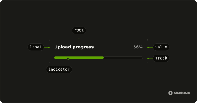
Progress
├── ProgressLabel
├── ProgressTrack
├── ProgressIndicator
├── ProgressValue
├── ProgressView
└── ProgressCircle
    ├── ProgressCircleTrack
    └── ProgressCircleRange
Usage
import { useEffect, useState } from "react";
import { Progress } from "@/components/ui/progress";
const ProgressDemo = () => {
const [progress, setProgress] = useState(13);
useEffect(() => {
const timer = setTimeout(() => setProgress(66), 500);
return () => clearTimeout(timer);
}, []);
return <Progress className="w-[60%]" value={progress} />;
};Demos
Label
ProgressLabel names the bar, here an upload, and ProgressValue prints the percent beside it. Both sit in Progress and follow value. Use them when a bare bar on the page could be any of several tasks. The label also names the bar for assistive tech, so you can skip a separate aria-label when the visible word is the right name.
Controlled
The bar only displays value. A Slider writes that number here so you can drag and watch the fill, which is a stand-in for the real source. In the app, the number comes from the upload or from the step you are on, and the bar will not subscribe to a request. Use a controlled value whenever the task can report how far it has gotten.
Rtl
dir set to rtl puts the Arabic caption and the percent on a right-to-left row. The number is the same value. Use this to check a translated page, not as a variant you render only for one language. Set dir on Progress when this bar should follow a right-to-left parent even if you have not flipped the whole document.
FAQ
How do I update the Progress value in Svelte?
Pass value and change it as the work advances: Progress shows the number you give it and doesn't watch your request. For an upload, set it from the request's progress events; for a multi-step task, set it per step.
Pass value from the start, since Ark's defaultValue is 50.
The Controlled demo above drives it from a Slider.
How do I show an indeterminate Progress bar when I don't know how long it will take?
Pass null as value: the bar reports an indeterminate state instead of a percentage.
If there's nothing to measure at all, a Spinner says "working" more honestly than an empty bar.
How do I count steps instead of percent with the Ark UI Progress?
Set min and max on Progress (0 and 100 by default), then pass value in the same units, such as 3 with a max of 5 for the third of five steps.
How do I change what screen readers hear for the Ark UI Progress?
formatOptions formats the value (a percent by default), and translations replaces the text it reads out.
How do I show a label and the percentage next to the Progress bar?
Add ProgressLabel for the name and ProgressValue for the number inside Progress, as in the Label demo above. The value text follows value, and the label names the bar for screen readers too.
When should I use a Slider or a Circular Progress instead of a Progress bar?
Progress only displays a value. If people should set the number, use a Slider; for a ring in a small space, use Circular Progress; and for work with no measurable amount, use a Spinner.
API Reference
Progress
<div> data-slot="progress"
value?number | null
The controlled value of the progress bar.
- Type
number | null
defaultValue?number | null
The initial value of the progress bar when rendered. Use when you don't need to control the value of the progress bar.
- Type
number | null- Default
50
onValueChange?(details: ValueChangeDetails) → void
Callback fired when the value changes.
- Type
(details: ValueChangeDetails) → void- Parameters
details– { value: number | null }- Returns
void
dir?"ltr" | "rtl"
The document's text/writing direction.
- Type
"ltr" | "rtl"- Default
"ltr"
formatOptions?Intl.NumberFormatOptions
The options to use for formatting the value.
- Default
{ style: "percent" }
id?string
The unique identifier of the machine.
ids?object
The ids of the elements in the progress bar. Useful for composition.
- Type
{ root?: string; track?: string; label?: string; circle?: string }
locale?string
The locale to use for formatting the value.
- Default
"en-US"
max?number
The maximum allowed value of the progress bar.
- Default
100
min?number
The minimum allowed value of the progress bar.
- Default
0
orientation?"horizontal" | "vertical"
The orientation of the element.
- Type
"horizontal" | "vertical"- Default
"horizontal"
translations?object
The localized messages to use.
- Type
{ value?: (details: ValueTranslationDetails) → string }
asChild?Snippet<[PropsFn]>
Render your own element: a snippet that gets the part's props to spread on it.
- Type
Snippet<[PropsFn]>
class?string
Merged with the part's classes.
data-max?stringdata-orientation?string
The orientation of the progress.
data-state"indeterminate" | "loading" | "complete"
"indeterminate", "loading" or "complete".
- Type
"indeterminate" | "loading" | "complete"
data-value?string
The value of the item.
--circumferencestring
The circumference value for the root.
--offsetstring
The offset position of the element.
--percentstring
The percent value for the root.
--radiusstring
The border radius value.
ProgressLabel
<span> data-slot="progress-label"
asChild?Snippet<[PropsFn]>
Render your own element: a snippet that gets the part's props to spread on it.
- Type
Snippet<[PropsFn]>
class?string
Merged with the part's classes.
data-orientation?string
The orientation of the label.
ProgressTrack
<div> data-slot="progress-track"
asChild?Snippet<[PropsFn]>
Render your own element: a snippet that gets the part's props to spread on it.
- Type
Snippet<[PropsFn]>
class?string
Merged with the part's classes.
data-max?stringdata-orientation?string
The orientation of the track.
data-state"indeterminate" | "loading" | "complete"
"indeterminate", "loading" or "complete".
- Type
"indeterminate" | "loading" | "complete"
ProgressIndicator
<div> data-slot="progress-indicator"
asChild?Snippet<[PropsFn]>
Render your own element: a snippet that gets the part's props to spread on it.
- Type
Snippet<[PropsFn]>
class?string
Merged with the part's classes.
data-orientation?string
The orientation of the range.
data-state"indeterminate" | "loading" | "complete"
"indeterminate", "loading" or "complete".
- Type
"indeterminate" | "loading" | "complete"
ProgressValue
<span> data-slot="progress-value"
asChild?Snippet<[PropsFn]>
Render your own element: a snippet that gets the part's props to spread on it.
- Type
Snippet<[PropsFn]>
class?string
Merged with the part's classes.
ProgressRange
asChild?Snippet<[PropsFn]>
Render your own element: a snippet that gets the part's props to spread on it.
- Type
Snippet<[PropsFn]>
useProgress
value?number | null
The controlled value of the progress bar.
- Type
number | null
defaultValue?number | null
The initial value of the progress bar when rendered. Use when you don't need to control the value of the progress bar.
- Type
number | null- Default
50
onValueChange?(details: ValueChangeDetails) → void
Callback fired when the value changes.
- Type
(details: ValueChangeDetails) → void- Parameters
details– { value: number | null }- Returns
void
formatOptions?Intl.NumberFormatOptions
The options to use for formatting the value.
- Default
{ style: "percent" }
id?string
The unique identifier of the machine.
ids?object
The ids of the elements in the progress bar. Useful for composition.
- Type
{ root?: string; track?: string; label?: string; circle?: string }
locale?string
The locale to use for formatting the value.
- Default
"en-US"
max?number
The maximum allowed value of the progress bar.
- Default
100
min?number
The minimum allowed value of the progress bar.
- Default
0
orientation?"horizontal" | "vertical"
The orientation of the element.
- Type
"horizontal" | "vertical"- Default
"horizontal"
translations?object
The localized messages to use.
- Type
{ value?: (details: ValueTranslationDetails) → string }