shadcn.io is not affiliated with official shadcn/ui
The chip shows the file name, then a spinner or an error during the upload. It doesn't upload the file.
Use it in a composer while a PDF, an image, or an archive is waiting to send. The picker itself is File Upload. In Svelte, Ark UI only draws the chip, and you set its state as the request moves.
Installation
Anatomy
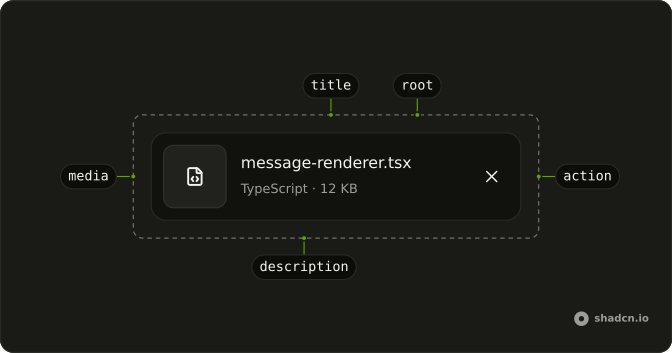
Attachment
├── AttachmentMedia
├── AttachmentContent
│   ├── AttachmentTitle
│   └── AttachmentDescription
├── AttachmentActions
│   └── AttachmentAction
└── AttachmentTrigger
Use AttachmentGroup to lay out multiple attachments in a scrollable row.
AttachmentGroup
├── Attachment
└── Attachment
Usage
<script lang="ts">
import { FileTextIcon, XIcon } from "lucide-svelte";
import {
  Attachment, AttachmentAction, AttachmentActions, AttachmentContent,
  AttachmentDescription, AttachmentMedia, AttachmentTitle,
} from "@/components/ui/attachment";
</script>
<Attachment class="max-w-full min-w-0">
  <AttachmentMedia>
    <FileTextIcon aria-hidden="true" class="size-4" />
  </AttachmentMedia>
  <AttachmentContent class="max-w-full min-w-0">
    <AttachmentTitle>sales-dashboard.pdf</AttachmentTitle>
    <AttachmentDescription>PDF · 2.4 MB</AttachmentDescription>
  </AttachmentContent>
  <AttachmentActions>
    <AttachmentAction aria-label="Remove sales-dashboard.pdf">
      <XIcon aria-hidden="true" class="size-4" />
    </AttachmentAction>
  </AttachmentActions>
</Attachment>
Demos
Image
variant set to image on AttachmentMedia, with the picture inside, stacked vertically and named underneath. Each card is also a link: AttachmentTrigger wraps an anchor, and the remove button stays clickable above that link. Use the image variant for screenshots in a composer. A PDF with no preview stays on the icon, which is the default media.
States
Five values of state, in the order a file actually moves: idle is dashed and not sent yet, uploading shows a spinner, processing waits on the server, error turns the media red and offers retry, and done is the quiet finished chip. You set the state, because the component does not watch the request. Idle is also the right look for a slot that is chosen but not started.
Sizes
default, sm, and xs on the same PDF chip. Default fits a composer, small sits beside message text, and extra small drops the description for a dense list of shared files. Pick the smallest size that still leaves the filename readable. xs is a title only, so skip it when the type or the weight has to stay visible.
Group
AttachmentGroup lays mixed files on one row that scrolls sideways: a PDF, a screenshot, a CSV, and a source file, each with its own remove button. Use it under a composer when several attachments should stay on one line. A single file does not need the group. Stack those in a column with a gap, and save the scroller for a real pile.
Trigger
AttachmentTrigger covers the card, and here it opens a Dialog that names the PDF. Copy and remove sit in AttachmentActions, above that layer, so they still take the click. Use the trigger when the card itself should open a preview or a link, and give it an aria-label that includes the filename. The actions do not need to be repeated inside the dialog.
FAQ
Does the Attachment component upload files?
No. It shows a file and its upload state; the request is yours. Set state as your upload moves along: idle, uploading, processing, error or done, the default. For picking and dropping files, use File Upload.
How do I show upload progress on an Attachment?
Set state to uploading or processing: the title shimmers while the file is on its way. error turns the media and description red, and idle draws a dashed border for an empty slot. The States demo shows each one.
How do I show an image preview in an Attachment?
Set variant="image" on AttachmentMedia and put an img inside, as in the Image demo. Before the server has the file, a URL from URL.createObjectURL shows the local file right away.
How do I show many Attachments in one row?
Wrap them in AttachmentGroup: it lays them out in one row that scrolls sideways, snaps to each card and fades at the edges, as in the Group demo. It suits a message composer with several files.
What sizes does the Attachment come in?
size takes default, sm or xs, and orientation stacks the media above the text with vertical. Use the default in a composer, sm next to message text and xs in a dense list of shared files; the Sizes demo compares them.
How do I add a remove button to an Attachment in Ark UI?
Put an AttachmentAction in AttachmentActions: it's a small ghost icon button. Give it an aria-label naming the file, such as Remove report.pdf, so screen readers know which file it removes.
How do I install the Attachment in Svelte?
Run the command in the Installation section above: it adds attachment to your components/ui folder with the Button it uses. React and Solid use the shadcn CLI, Vue uses shadcn-vue and Svelte uses shadcn-svelte, each after its one-time setup.
API Reference
Attachment
<div> data-slot="attachment"
orientation?"horizontal" | "vertical"
Lays its preview and details out in a row (horizontal) or a column
(vertical).
- Type
"horizontal" | "vertical"- Default
"horizontal"
size?"default" | "sm" | "xs"
The size.
- Type
"default" | "sm" | "xs"- Default
"default"
state?"idle" | "uploading" | "processing" | "error" | "done"
Its upload state, which sets its look: idle, uploading, processing, * error or done.
- Type
"idle" | "uploading" | "processing" | "error" | "done"- Default
"done"
class?string
Merged with the part's classes.
data-orientation?string
Mirrors orientation.
data-size?string
Mirrors size.
data-state?string
Mirrors state.
AttachmentAction
data-slot="attachment-action"
clickEffect?boolean
Apply a click effect to the button.
- Default
true
isLoading?boolean
Show a loading indicator.
- Default
false
pill?boolean
Fully rounded corners.
- Default
false
size?"icon-lg" | "icon-md" | "icon-sm" | "icon-xl" | "icon-xs" | "lg" | "md" | "sm" | "xl" | "xs"
Ark default: md.
- Type
"icon-lg" | "icon-md" | "icon-sm" | "icon-xl" | "icon-xs" | "lg" | "md" | "sm" | "xl" | "xs"- Default
"icon-xs"
variant?"default" | "destructive" | "ghost" | "link" | "outline" | "secondary"
Ark default: default.
- Type
"default" | "destructive" | "ghost" | "link" | "outline" | "secondary"- Default
"ghost"
asChild?Snippet<[PropsFn]>
Render your own element: a snippet that gets the part's props to spread on it.
- Type
Snippet<[PropsFn]>
class?string
Merged with the part's classes.
AttachmentActions
<div> data-slot="attachment-actions"
class?string
Merged with the part's classes.
AttachmentContent
<div> data-slot="attachment-content"
class?string
Merged with the part's classes.
AttachmentDescription
<span> data-slot="attachment-description"
class?string
Merged with the part's classes.
AttachmentGroup
<div> data-slot="attachment-group"
class?string
Merged with the part's classes.
AttachmentMedia
<div> data-slot="attachment-media"
variant?"icon" | "image"
The visual style.
- Type
"icon" | "image"- Default
"icon"
class?string
Merged with the part's classes.
data-variant?string
Mirrors variant.
AttachmentTitle
<span> data-slot="attachment-title"
class?string
Merged with the part's classes.
AttachmentTrigger
<button> data-slot="attachment-trigger"
asChild?Snippet<[PropsFn]>
Render your own element: a snippet that gets the part's props to spread on it.
- Type
Snippet<[PropsFn]>- Default
false
class?string
Merged with the part's classes.