shadcn.io is not affiliated with official shadcn/ui
Previous and next buttons move through a row of slides, one filling the frame.
Use it for a gallery, a few quotes, or a short onboarding sequence. For named panels people jump between, use Tabs. In Svelte, Ark UI keeps previous and next labeled, so an icon with no name is not enough.
Installation
Anatomy
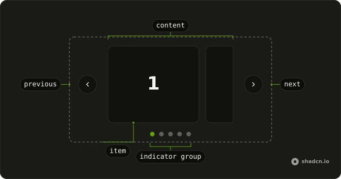
Carousel
├── CarouselItem
│   └── CarouselContent
├── CarouselControl
├── CarouselNext
├── CarouselPrevious
├── CarouselIndicator
│   └── CarouselIndicatorGroup
├── CarouselAutoplayTrigger
└── CarouselProgressText
Usage
<script lang="ts">
import { Card, CardContent } from "@/components/ui/card";
import {
  Carousel, CarouselContent, CarouselControl, CarouselItem,
  CarouselNext, CarouselPrevious,
} from "@/components/ui/carousel";
</script>
const slides = [1, 2, 3, 4, 5];

const CarouselDemo = () => (
  <Carousel
    className="w-full max-w-[12rem] sm:max-w-xs"
    slideCount={slides.length}
  >
    <CarouselContent>
      {slides.map((slide, index) => (
        <CarouselItem index={index} key={slide}>
          <div className="p-1">
            <Card>
              <CardContent className="flex aspect-square items-center justify-center p-6">
                <span className="font-semibold text-4xl">{slide}</span>
              </CardContent>
            </Card>
          </div>
        </CarouselItem>
      ))}
    </CarouselContent>
    <CarouselControl>
      <CarouselPrevious />
      <CarouselNext />
    </CarouselControl>
  </Carousel>
);Accessibility
- Enter
- Activate the focused control.
- Space
- Activate the focused control.
- Arrow Down
- Move to the next item.
- Arrow Up
- Move to the previous item.
- Arrow Right
- Move to the next item.
- Arrow Left
- Move to the previous item.
- Home
- Go to the start.
- End
- Go to the end.
Demos
Size
Each card is narrower than the frame, so two sit side by side and a third can appear once the carousel is wide. Use that for thumbnails or logos, where one full-bleed slide wastes the row. The next card peeks in, which is the hint that more exist. Cap the width or the cards grow until that peek disappears.
Spacing
A multi-card row with a small gap, so neighboring borders do not touch. Tight spacing reads as one group, and a wide gutter reads as separate sections, which fights a carousel. A few pixels is enough when the cards already have an edge. Drop the gap for full-bleed photos that should meet.
Orientation
The track runs downward, about two cards in a fixed height, and the buttons point up and down. Set orientation to vertical and give the content a height, or the column grows with every slide and nothing actually scrolls. A short rail beside a detail view is the fit. A gallery across a page should stay horizontal, which is the default and the direction people expect to swipe.
Api
A line under the carousel says which slide is current, out of five, and updates as you move. The label is your markup, not a built-in caption, so it can match the way the rest of the page speaks. Use it when dots are not enough and a heading or side panel must stay in step. The FAQ shows how each stack reports that index.
Plugin
Slides advance on a two second timer and pause while the pointer is over the track. Leaving the track starts them again. Use a timer for a decorative gallery, not for a sentence someone must read. Keep previous and next, because autoplay is easy to miss, and pausing on hover is the minimum rather than a flourish.
Multiple
On a wide screen several cards share the row, and previous and next hide on small screens where one card already fills the width. Use several per view for tiles people compare, not for a hero. Hiding the buttons works only when a peek of the next card is hint enough. On touch, visible controls beat hoping for a swipe.
Rtl
The numerals are Arabic, and dir is rtl on the carousel, so forward sits where forward is on that page. Previous and next trade sides with the reading order. Set direction on the carousel itself. An ancestor with the right direction can still leave the scroll axis left to right, so try a translated slide rather than English cards with a direction attribute.
FAQ
How do I show several slides at once in the Carousel?
Set slidesPerPage, such as 3, along with the required slideCount, as in the Multiple demo. spacing sets the gap between slides.
How do I make the Carousel autoplay in Svelte?
Pass autoplay, or autoplay with a delay in milliseconds, and add loop so it starts over at the end. The Plugin demo also pauses it on hover.
Let readers pause it, and avoid autoplay for content they need time to read.
How do I get the current slide of the Carousel?
Control page and read it in onPageChange, which receives { page }, as in the Api demo.
How do I loop the Carousel back to the first slide?
Add loop: Next on the last slide goes back to the first.
How do I make a vertical Carousel?
Set orientation="vertical" and give CarouselContent a height, such as h-[270px], as in the Orientation demo. The previous and next buttons turn to point up and down.
API Reference
Carousel
<div> data-slot="carousel"
page?number
The controlled page of the carousel.
defaultPage?number
The initial page to scroll to when rendered. Use when you don't need to control the page of the carousel.
- Default
0
onPageChange?(details: PageChangeDetails) → void
Function called when the page changes.
- Type
(details: PageChangeDetails) → void- Parameters
details– { page: number; pageSnapPoint: number }- Returns
void
slideCountnumber
The total number of slides. Useful for SSR to render the initial ating the snap points.
allowMouseDrag?boolean
Whether to allow scrolling via dragging with mouse.
- Default
false
autoplay?boolean | { delay: number; }
Whether to scroll automatically. The default delay is 4000ms.
- Type
boolean | { delay: number; }- Default
false
autoSize?boolean
Whether to enable variable width slides.
- Default
false
dir?"ltr" | "rtl"
The document's text/writing direction.
- Type
"ltr" | "rtl"- Default
"ltr"
id?string
The unique identifier of the machine.
ids?object
The ids of the elements in the carousel. Useful for composition.
- Type
{ root?: string; item?: (index: number) → string; itemGroup?: string; nextTrigger?: string; prevTrigger?: string; indicatorGroup?: string; indicator?: (index: number) → string }
inViewThreshold?number | number[]
The threshold for determining if an item is in view.
- Type
number | number[]- Default
0.6
loop?boolean
Whether the carousel should loop around.
- Default
false
onAutoplayStatusChange?(details: AutoplayStatusDetails) → void
Function called when the autoplay status changes.
- Type
(details: AutoplayStatusDetails) → void- Parameters
details– { type: "autoplay.start" | "autoplay" | "autoplay.stop"; page: number; isPlaying: boolean }- Returns
void
onDragStatusChange?(details: DragStatusDetails) → void
Function called when the drag status changes.
- Type
(details: DragStatusDetails) → void- Parameters
details– { type: "dragging.start" | "dragging" | "dragging.end"; page: number; isDragging: boolean }- Returns
void
orientation?"horizontal" | "vertical"
The orientation of the element.
- Type
"horizontal" | "vertical"- Default
"horizontal"
padding?string
Defines the extra space added around the scrollable area, enabling nearby items to remain partially in view.
slidesPerMove?number | "auto"
The number of slides to scroll at a time.
When set to auto, the number of slides to scroll is determined by the
slidesPerPage property.
- Type
number | "auto"- Default
"auto"
slidesPerPage?number
The number of slides to show at a time.
- Default
1
snapType?"proximity" | "mandatory"
The snap type of the item.
- Type
"proximity" | "mandatory"- Default
"mandatory"
spacing?string
The amount of space between items. Ark default: 0px.
- Default
"16px"
translations?object
The localized messages to use.
- Type
{ nextTrigger?: string; prevTrigger?: string; indicator?: (index: number) → string; item?: (index: number, count: number) → string; autoplayStart?: string; autoplayStop?: string; progressText?: (details: ProgressTextDetails) → string }
asChild?Snippet<[PropsFn]>
Render your own element: a snippet that gets the part's props to spread on it.
- Type
Snippet<[PropsFn]>
class?string
Merged with the part's classes.
data-orientation"horizontal" | "vertical"
The orientation of the carousel.
- Type
"horizontal" | "vertical"
--slide-item-sizestring
The calculated size of each slide item.
--slide-spacingstring
The spacing between slides.
--slides-per-pagestring
The number of slides visible per page.
CarouselContent
<div> data-slot="carousel-group"
asChild?Snippet<[PropsFn]>
Render your own element: a snippet that gets the part's props to spread on it.
- Type
Snippet<[PropsFn]>
class?string
Merged with the part's classes.
data-dragging?string
Present when in the dragging state.
data-orientation"horizontal" | "vertical"
The orientation of the item.
- Type
"horizontal" | "vertical"
CarouselItem
<div> data-slot="carousel-item"
indexnumber
The index of the item.
snapAlign?"start" | "end" | "center"
The snap alignment of the item.
- Type
"start" | "end" | "center"- Default
"start"
asChild?Snippet<[PropsFn]>
Render your own element: a snippet that gets the part's props to spread on it.
- Type
Snippet<[PropsFn]>
class?string
Merged with the part's classes.
data-indexstring
The index of the item.
data-inview?string
Present when in viewport.
data-orientation"horizontal" | "vertical"
The orientation of the item.
- Type
"horizontal" | "vertical"
CarouselControl
<div> data-slot="carousel-control"
asChild?Snippet<[PropsFn]>
Render your own element: a snippet that gets the part's props to spread on it.
- Type
Snippet<[PropsFn]>
class?string
Merged with the part's classes.
data-orientation"horizontal" | "vertical"
The orientation of the control.
- Type
"horizontal" | "vertical"
CarouselNext
<button> data-slot="carousel-next"
asChild?Snippet<[PropsFn]>
Render your own element: a snippet that gets the part's props to spread on it.
- Type
Snippet<[PropsFn]>
class?string
Merged with the part's classes.
data-orientation"horizontal" | "vertical"
The orientation of the nexttrigger.
- Type
"horizontal" | "vertical"
CarouselPrevious
<button> data-slot="carousel-previous"
asChild?Snippet<[PropsFn]>
Render your own element: a snippet that gets the part's props to spread on it.
- Type
Snippet<[PropsFn]>
class?string
Merged with the part's classes.
data-orientation"horizontal" | "vertical"
The orientation of the prevtrigger.
- Type
"horizontal" | "vertical"
CarouselIndicatorGroup
<div> data-slot="carousel-indicator-group"
asChild?Snippet<[PropsFn]>
Render your own element: a snippet that gets the part's props to spread on it.
- Type
Snippet<[PropsFn]>
class?string
Merged with the part's classes.
data-orientation"horizontal" | "vertical"
The orientation of the indicatorgroup.
- Type
"horizontal" | "vertical"
CarouselIndicator
<button> data-slot="carousel-indicator"
indexnumber
The index of the indicator.
readOnly?boolean
Whether the indicator is read only.
- Default
false
asChild?Snippet<[PropsFn]>
Render your own element: a snippet that gets the part's props to spread on it.
- Type
Snippet<[PropsFn]>
class?string
Merged with the part's classes.
data-current?string
Present when current.
data-indexstring
The index of the item.
data-orientation"horizontal" | "vertical"
The orientation of the indicator.
- Type
"horizontal" | "vertical"
data-readonly?string
Present when read-only.
CarouselAutoplayTrigger
<button> data-slot="carousel-autoplay-trigger"
asChild?Snippet<[PropsFn]>
Render your own element: a snippet that gets the part's props to spread on it.
- Type
Snippet<[PropsFn]>
class?string
Forwarded to the part.
data-orientation"horizontal" | "vertical"
The orientation of the autoplaytrigger.
- Type
"horizontal" | "vertical"
data-pressed?string
Present when pressed.
CarouselProgressText
<span> data-slot="carousel-progress-text"
asChild?Snippet<[PropsFn]>
Render your own element: a snippet that gets the part's props to spread on it.
- Type
Snippet<[PropsFn]>
class?string
Merged with the part's classes.
CarouselAutoplayIndicator
<span> data-slot="carousel-autoplay-indicator"
fallback?Snippet
The fallback content to render when autoplay is paused.
asChild?Snippet<[PropsFn]>
Render your own element: a snippet that gets the part's props to spread on it.
- Type
Snippet<[PropsFn]>
CarouselRootProvider
<div> data-slot="carousel"
valueUseCarouselReturn
What useCarousel() returns: the state and API, made outside the component to control it.
asChild?Snippet<[PropsFn]>
Render your own element: a snippet that gets the part's props to spread on it.
- Type
Snippet<[PropsFn]>
class?string
Merged with the part's classes.
data-orientation"horizontal" | "vertical"
Mirrors the orientation prop.
- Type
"horizontal" | "vertical"
--slide-item-sizestring--slide-spacingstring--slides-per-pagestringuseCarousel
page?number
The controlled page of the carousel.
defaultPage?number
The initial page to scroll to when rendered. Use when you don't need to control the page of the carousel.
- Default
0
onPageChange?(details: PageChangeDetails) → void
Function called when the page changes.
- Type
(details: PageChangeDetails) → void- Parameters
details– { page: number; pageSnapPoint: number }- Returns
void
slideCountnumber
The total number of slides. Useful for SSR to render the initial ating the snap points.
allowMouseDrag?boolean
Whether to allow scrolling via dragging with mouse.
- Default
false
autoplay?boolean | { delay: number; }
Whether to scroll automatically. The default delay is 4000ms.
- Type
boolean | { delay: number; }- Default
false
autoSize?boolean
Whether to enable variable width slides.
- Default
false
id?string
The unique identifier of the machine.
ids?object
The ids of the elements in the carousel. Useful for composition.
- Type
{ root?: string; item?: (index: number) → string; itemGroup?: string; nextTrigger?: string; prevTrigger?: string; indicatorGroup?: string; indicator?: (index: number) → string }
inViewThreshold?number | number[]
The threshold for determining if an item is in view.
- Type
number | number[]- Default
0.6
loop?boolean
Whether the carousel should loop around.
- Default
false
onAutoplayStatusChange?(details: AutoplayStatusDetails) → void
Function called when the autoplay status changes.
- Type
(details: AutoplayStatusDetails) → void- Parameters
details– { type: "autoplay.start" | "autoplay" | "autoplay.stop"; page: number; isPlaying: boolean }- Returns
void
onDragStatusChange?(details: DragStatusDetails) → void
Function called when the drag status changes.
- Type
(details: DragStatusDetails) → void- Parameters
details– { type: "dragging.start" | "dragging" | "dragging.end"; page: number; isDragging: boolean }- Returns
void
orientation?"horizontal" | "vertical"
The orientation of the element.
- Type
"horizontal" | "vertical"- Default
"horizontal"
padding?string
Defines the extra space added around the scrollable area, enabling nearby items to remain partially in view.
slidesPerMove?number | "auto"
The number of slides to scroll at a time.
When set to auto, the number of slides to scroll is determined by the
slidesPerPage property.
- Type
number | "auto"- Default
"auto"
slidesPerPage?number
The number of slides to show at a time.
- Default
1
snapType?"proximity" | "mandatory"
The snap type of the item.
- Type
"proximity" | "mandatory"- Default
"mandatory"
spacing?string
The amount of space between items.
- Default
"0px"
translations?object
The localized messages to use.
- Type
{ nextTrigger?: string; prevTrigger?: string; indicator?: (index: number) → string; item?: (index: number, count: number) → string; autoplayStart?: string; autoplayStop?: string; progressText?: (details: ProgressTextDetails) → string }
CarouselContext
canScrollNextboolean
Whether the carousel is can scroll to the next view.
canScrollPrevboolean
Whether the carousel is can scroll to the previous view.
getProgress() → number
Returns the current scroll progress as a percentage.
- Returns
number
getProgressText() → string
Returns the progress text.
- Returns
string
isDraggingboolean
Whether the carousel is being dragged. This only works when draggable is true.
isInView(index: number) → boolean
Whether the item is in view.
- Parameters
index– number- Returns
boolean
isPlayingboolean
Whether the carousel is auto playing.
pagenumber
The current index of the carousel.
pageSnapPointsnumber[]
The current snap points of the carousel.
pauseVoidFunction
Function to pause autoplay.
playVoidFunction
Function to start/resume autoplay.
refreshVoidFunction
Function to re-compute the snap points and clamp the page
scrollNext(instant?: boolean) → void
Function to scroll to the next page.
- Parameters
instant?– boolean- Returns
void
scrollPrev(instant?: boolean) → void
Function to scroll to the previous page.
- Parameters
instant?– boolean- Returns
void
scrollTo(page: number, instant?: boolean) → void
Function to scroll to a specific page.
- Type
(page: number, instant?: boolean) → void- Parameters
page– numberinstant?– boolean- Returns
void
scrollToIndex(index: number, instant?: boolean) → void
Function to scroll to a specific item index.
- Type
(index: number, instant?: boolean) → void- Parameters
index– numberinstant?– boolean- Returns
void
With other components
Card
LayoutEach slide is a card
Button
ButtonsPrev and next chrome
Aspect Ratio
LayoutPhotos keep their frame
Badge
FeedbackSale tag on a slide
Avatar
MediaFace on a quote
Dialog
OverlaysOpen the full photo
Related
Scroll Area
LayoutOverflow without snap
Pagination
NavigationJump to a page
Tabs
NavigationPick one panel
Skeleton
FeedbackWhile images load
Empty
FeedbackNo slides yet
Marquee
MediaA loop that does not stop