shadcn.io is not affiliated with official shadcn/ui
Frame a photo with a draggable rectangle or circle. Lock the aspect when the crop should stay fixed.
Use it when you will store that region later, like a profile photo. A click that only magnifies is Image Zoom. In Svelte, Ark UI puts handles on the selection so the keys can nudge it.
Installation
Anatomy
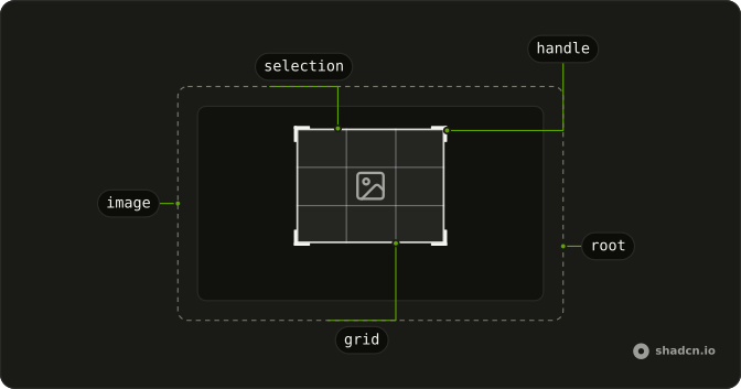
ImageCropper
├── ImageCropperViewport
├── ImageCropperImage
├── ImageCropperSelection
├── ImageCropperHandle
└── ImageCropperGrid
Usage
<script lang="ts">
import {
  ImageCropper, ImageCropperImage, ImageCropperSelection,
} from "@/components/ui/image-cropper";
</script>
<ImageCropper class="aspect-video w-full max-w-lg">
  <ImageCropperImage
    alt="Crop me"
    src="https://images.unsplash.com/photo-1662692735672-544412d65934?w=600&auto=format"
  />
  <ImageCropperSelection />
</ImageCropper>
Demos
Aspect Ratio
aspectRatio is width divided by height, so 16 / 9 stays widescreen while the selection is resized. Lock it for a cover, a video poster, or any slot with a fixed frame, and omit it when the person should be free to drag a tall crop or a wide one. A circle is not a ratio. Set cropShape when the mask itself has to be round.
Circle Crop
cropShape="circle" rounds the selection, which is what an avatar upload wants, and ImageCropperSelection still draws the grid and the handles. Use a circle only when the destination is round, because a rectangular crop rounded later with CSS will not match the file you store. The aspect can stay free. The shape is what the mask follows.
Controlled Zoom
zoom is held in state so the buttons and the wheel share one number. Those buttons step a quarter at a time and stop between zero and three. Take control when the page needs a visible zoom in and zoom out, or when another control must show the scale. Omit zoom and the cropper owns it, starting from defaultZoom.
Fixed Crop Area
fixedCropArea pins the selection and asks the person to pan and zoom the photo under it. Use that for an avatar or a cover whose output size is already decided, where the only choice is which part of the picture lands inside. Leave it off when they should draw the rectangle themselves. Min and max size are the softer limit, for a box that can still move.
Initial Crop
initialCrop takes x, y, width, and height, so the first rectangle is not the automatic one. Use it to reopen a saved crop or to start on a known region, and read later drags from onCropChange, which reports those same fields. The component never uploads the file. Your own submit handler sends the image plus that rectangle.
Min Max Size
minWidth, minHeight, maxWidth, and maxHeight keep the selection from collapsing or swallowing the frame, and this one stays between 80 pixels and a box of 280 by 160. The minimums default to 40 if you set nothing. Use limits when a tiny crop would be useless or a huge one would break the frame you print into. A fixed crop area is stricter, because that box cannot move at all.
Zoom Limits
minZoom and maxZoom cap the wheel. Here the photo can shrink to half and grow only to twice, where the defaults are 1 and 5. Drop the minimum when the picture is larger than the viewport, and keep the maximum tight when a deep zoom would export soft. These props only bound the range, while the controlled demo is about who stores the number.
FAQ
How do I lock an Image Cropper's aspect ratio?
Set aspectRatio to width divided by height, such as 16 / 9, as the Aspect Ratio demo does, and omit it when the selection can be resized freely. Set cropShape to circle for a round crop, or leave the default rectangle. The selection uses data-shape so the circle is fully rounded. ImageCropperSelection draws the grid and the handles for you.
How do I control Image Cropper zoom in Svelte?
Keep the zoom number in state when buttons must zoom in and out, and pass it back so the wheel and the buttons agree. Omit zoom and the cropper owns it, with defaultZoom as the start, minZoom defaulting to 1, and maxZoom defaulting to 5, as the Zoom Limits demo tightens.
onZoomChange receives details.zoom, and you pass that number as zoom.
How do I stop an Image Cropper selection from growing?
Set minWidth, minHeight, maxWidth, and maxHeight on ImageCropper. The minimums default to 40. Set fixedCropArea when the selection must stay put and people pan and zoom the image instead, as the Fixed Crop Area demo does. flip takes horizontal and vertical booleans, and rotation is degrees, if you need those transforms too.
Can I use an Image Cropper from the keyboard?
Yes, arrow keys nudge the Image Cropper selection by nudgeStep, which defaults to 1 pixel, while Shift and Ctrl or Cmd use nudgeStepShift and nudgeStepCtrl. Alt with an arrow resizes from the bottom or right handle, and plus zooms in while minus zooms out. The selection is the focusable part, so do not hide it if keyboard users must crop.
How do I read the crop from an Image Cropper?
Pass initialCrop with x, y, width, and height when the first rectangle should not be the automatic one. onCropChange then receives details.crop with those same fields as the user drags. Image Cropper does not upload or replace the file. Send the original image plus that rectangle from your own submit handler.
How do I restyle an Image Cropper?
Edit the Image Cropper file in your ui folder. The root sets --cropper-accent, --cropper-handler-size, and --cropper-handler-width, and the handles and grid read them. data-dragging and data-panning mark an active gesture, and data-shape is circle or rectangle. The image itself is data-slot image-cropper-image and should keep an alt.
Should I use Image Cropper or Image Zoom?
Use Image Cropper when people must choose a rectangle or a circle and you need that region. Use Image Zoom when a click should only magnify the picture, SVG, or diagram, with nothing to export. Cropper is the editor and Zoom is a viewer, so they solve different tasks, and a page can use both.
How do I install Image Cropper in Svelte?
Run the command in the Installation section above. It adds ImageCropper, ImageCropperImage, and ImageCropperSelection to your ui folder, and the selection includes the grid and handles. Install from that section rather than pasting a partial tree, and put src and alt on ImageCropperImage, as Usage does.
The command uses the shadcn-svelte CLI.
API Reference
ImageCropper
<div> data-slot="image-cropper"
flip?object
The controlled flip state of the image.
- Type
{ horizontal: boolean; vertical: boolean }
defaultFlip?object
The initial flip state to apply to the image.
- Type
{ horizontal: boolean; vertical: boolean }- Default
{ horizontal: false, vertical: false }
onFlipChange?(details: FlipChangeDetails) → void
Callback fired when the flip state changes.
- Type
(details: FlipChangeDetails) → void- Parameters
details– { flip: FlipState }- Returns
void
rotation?number
The controlled rotation of the image in degrees (0 - 360).
defaultRotation?number
The initial rotation to apply to the image in degrees.
- Default
0
onRotationChange?(details: RotationChangeDetails) → void
Callback fired when the rotation changes.
- Type
(details: RotationChangeDetails) → void- Parameters
details– { rotation: number }- Returns
void
zoom?number
The controlled zoom level of the image.
defaultZoom?number
The initial zoom factor to apply to the image.
- Default
1
onZoomChange?(details: ZoomChangeDetails) → void
Callback fired when the zoom level changes.
- Type
(details: ZoomChangeDetails) → void- Parameters
details– { zoom: number }- Returns
void
aspectRatio?number
The aspect ratio to maintain for the crop area (width / height). For example, an aspect ratio of 16 / 9 will maintain a width to height ratio of 16:9. If not provided, the crop area can be freely resized.
cropShape?"rectangle" | "circle"
The shape of the crop area.
- Type
"rectangle" | "circle"- Default
"rectangle"
dir?"ltr" | "rtl"
The document's text/writing direction.
- Type
"ltr" | "rtl"- Default
"ltr"
fixedCropArea?boolean
Whether the crop area is fixed in size and position.
- Default
false
id?string
The unique identifier of the machine.
ids?object
The ids of the image cropper elements.
- Type
{ root?: string; viewport?: string; image?: string; selection?: string; handle?: (position: string) → string }
initialCrop?object
The initial rectangle of the crop area. If not provided, a smart default will be computed based on viewport size and aspect ratio.
- Type
{ y: number; x: number }
maxHeight?number
The maximum height of the crop area.
- Default
Infinity
maxWidth?number
The maximum width of the crop area.
- Default
Infinity
maxZoom?number
The maximum zoom factor allowed.
- Default
5
minHeight?number
The minimum height of the crop area.
- Default
40
minWidth?number
The minimum width of the crop area.
- Default
40
minZoom?number
The minimum zoom factor allowed.
- Default
1
nudgeStep?number
The base nudge step for keyboard arrow keys (in pixels).
- Default
1
nudgeStepCtrl?number
The nudge step when Ctrl/Cmd key is held (in pixels).
- Default
50
nudgeStepShift?number
The nudge step when Shift key is held (in pixels).
- Default
10
onCropChange?(details: CropChangeDetails) → void
Callback fired when the crop area changes.
- Type
(details: CropChangeDetails) → void- Parameters
details– { crop: Rect }- Returns
void
translations?object
Specifies the localized strings that identify accessibility elements and their states.
- Type
{ rootLabel?: string; rootRoleDescription?: string; previewLoading?: string; previewDescription?: (details: PreviewDescriptionDetails) → string; selectionLabel?: (details: SelectionLabelDetails) → string; selectionRoleDescription?: string; selectionInstructions?: string; selectionValueText?: (details: SelectionValueTextDetails) → string }
zoomSensitivity?number
Controls how responsive pinch-to-zoom is.
- Default
2
zoomStep?number
The amount of zoom applied per wheel step.
- Default
0.1
asChild?Snippet<[PropsFn]>
Render your own element: a snippet that gets the part's props to spread on it.
- Type
Snippet<[PropsFn]>
class?string
Merged with the part's classes.
data-dragging?string
Present when in the dragging state.
data-fixed?string
Present when fixedCropArea is true.
data-panning?string
Present when panning is true.
data-pinch?string
Present when pinch.
data-shapestring
Mirrors cropShape.
--crop-heightstring
The height of the Root.
--crop-widthstring
The width of the Root.
--crop-xstring
The crop x value for the Root.
--crop-ystring
The crop y value for the Root.
--image-offset-xstring
The offset position for image.
--image-offset-ystring
The offset position for image.
--image-rotationstring
The image rotation value for the Root.
--image-zoomstring
The image zoom value for the Root.
ImageCropperViewport
<div> data-slot="image-cropper-viewport"
asChild?Snippet<[PropsFn]>
Render your own element: a snippet that gets the part's props to spread on it.
- Type
Snippet<[PropsFn]>
data-disabled?string
Present when disabled.
data-ownedbystring
Id of the root part.
ImageCropperImage
<img> data-slot="image-cropper-image"
asChild?Snippet<[PropsFn]>
Render your own element: a snippet that gets the part's props to spread on it.
- Type
Snippet<[PropsFn]>
class?string
Merged with the part's classes.
data-flip-horizontal?string
Present when flipHorizontal is true.
data-flip-vertical?string
Present when flipVertical is true.
data-ownedbystring
Id of the viewport part.
data-ready?string
Present when isImageReady is true.
ImageCropperSelection
<div> data-slot="image-cropper-selection"
axis?"horizontal" | "vertical" | "both"
The axis of the grid to show.
- Type
"horizontal" | "vertical" | "both"- Default
"both"
asChild?Snippet<[PropsFn]>
Render your own element: a snippet that gets the part's props to spread on it.
- Type
Snippet<[PropsFn]>
class?string
Merged with the part's classes.
data-disabled?string
Present when disabled.
data-dragging?string
Present when in the dragging state.
data-measured?string
Present when isMeasured is true.
data-panning?string
Present when panning is true.
data-shapestring
Mirrors cropShape.
--cropper-accentstringImageCropperHandle
<div> data-slot="image-cropper-handle"
position"n" | "e" | "s" | "w" | "ne" | "se" | "sw" | "nw"
The position of the handle.
- Type
"n" | "e" | "s" | "w" | "ne" | "se" | "sw" | "nw"
asChild?Snippet<[PropsFn]>
Render your own element: a snippet that gets the part's props to spread on it.
- Type
Snippet<[PropsFn]>
class?string
Merged with the part's classes.
data-disabled?string
Present when disabled.
data-placement?string
The placement of the handle.
data-positionstring
Mirrors handlePosition.
--cropper-accentstring--cropper-handler-sizestring--cropper-handler-widthstringImageCropperGrid
<div> data-slot="image-cropper-grid"
axis"horizontal" | "vertical"
The axis of the grid lines to display.
- Type
"horizontal" | "vertical"
asChild?Snippet<[PropsFn]>
Render your own element: a snippet that gets the part's props to spread on it.
- Type
Snippet<[PropsFn]>
class?string
Merged with the part's classes.
data-axisstring
The axis to resize.
data-dragging?string
Present when in the dragging state.
data-panning?string
Present when panning is true.
useImageCropper
flip?object
The controlled flip state of the image.
- Type
{ horizontal: boolean; vertical: boolean }
defaultFlip?object
The initial flip state to apply to the image.
- Type
{ horizontal: boolean; vertical: boolean }- Default
{ horizontal: false, vertical: false }
onFlipChange?(details: FlipChangeDetails) → void
Callback fired when the flip state changes.
- Type
(details: FlipChangeDetails) → void- Parameters
details– { flip: FlipState }- Returns
void
rotation?number
The controlled rotation of the image in degrees (0 - 360).
defaultRotation?number
The initial rotation to apply to the image in degrees.
- Default
0
onRotationChange?(details: RotationChangeDetails) → void
Callback fired when the rotation changes.
- Type
(details: RotationChangeDetails) → void- Parameters
details– { rotation: number }- Returns
void
zoom?number
The controlled zoom level of the image.
defaultZoom?number
The initial zoom factor to apply to the image.
- Default
1
onZoomChange?(details: ZoomChangeDetails) → void
Callback fired when the zoom level changes.
- Type
(details: ZoomChangeDetails) → void- Parameters
details– { zoom: number }- Returns
void
aspectRatio?number
The aspect ratio to maintain for the crop area (width / height). For example, an aspect ratio of 16 / 9 will maintain a width to height ratio of 16:9. If not provided, the crop area can be freely resized.
cropShape?"rectangle" | "circle"
The shape of the crop area.
- Type
"rectangle" | "circle"- Default
"rectangle"
fixedCropArea?boolean
Whether the crop area is fixed in size and position.
- Default
false
id?string
The unique identifier of the machine.
ids?object
The ids of the image cropper elements.
- Type
{ root?: string; viewport?: string; image?: string; selection?: string; handle?: (position: string) → string }
initialCrop?object
The initial rectangle of the crop area. If not provided, a smart default will be computed based on viewport size and aspect ratio.
- Type
{ y: number; x: number }
maxHeight?number
The maximum height of the crop area.
- Default
Infinity
maxWidth?number
The maximum width of the crop area.
- Default
Infinity
maxZoom?number
The maximum zoom factor allowed.
- Default
5
minHeight?number
The minimum height of the crop area.
- Default
40
minWidth?number
The minimum width of the crop area.
- Default
40
minZoom?number
The minimum zoom factor allowed.
- Default
1
nudgeStep?number
The base nudge step for keyboard arrow keys (in pixels).
- Default
1
nudgeStepCtrl?number
The nudge step when Ctrl/Cmd key is held (in pixels).
- Default
50
nudgeStepShift?number
The nudge step when Shift key is held (in pixels).
- Default
10
onCropChange?(details: CropChangeDetails) → void
Callback fired when the crop area changes.
- Type
(details: CropChangeDetails) → void- Parameters
details– { crop: Rect }- Returns
void
translations?object
Specifies the localized strings that identify accessibility elements and their states.
- Type
{ rootLabel?: string; rootRoleDescription?: string; previewLoading?: string; previewDescription?: (details: PreviewDescriptionDetails) → string; selectionLabel?: (details: SelectionLabelDetails) → string; selectionRoleDescription?: string; selectionInstructions?: string; selectionValueText?: (details: SelectionValueTextDetails) → string }
zoomSensitivity?number
Controls how responsive pinch-to-zoom is.
- Default
2
zoomStep?number
The amount of zoom applied per wheel step.
- Default
0.1
With other components
Button
ButtonsApply or cancel
Dialog
OverlaysCrop in a modal
Avatar
MediaThe result
Aspect Ratio
LayoutLock the frame
Slider
ControlsZoom the image
Field
InputsLabel the crop
Related
File Upload
InputsChoose the image first
Attachment
MediaThe file after cropping
Card
LayoutThe cropper on a surface
Progress
FeedbackSaving the crop
Popover
OverlaysA small cropper
Skeleton
FeedbackWhile the image loads