shadcn.io is not affiliated with official shadcn/ui
Avatar, bubble, and an optional name or time sit on the side of the thread for whoever sent it.
Use the row to lay out a transcript, not to color the text. The colored body is a Bubble, which has no side of its own. In Svelte, Ark UI reverses the row when you set align to end.
Installation
Anatomy
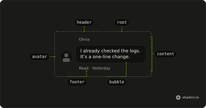
Message
├── MessageAvatar
└── MessageContent
    ├── MessageHeader
    ├── Bubble
    └── MessageFooter
MessageGroup
├── Message
└── MessageUsage
<script lang="ts">
import {
  Avatar, AvatarFallback, AvatarImage,
} from "@/components/ui/avatar";
import { Bubble, BubbleContent } from "@/components/ui/bubble";
import {
  Message, MessageAvatar, MessageContent,
} from "@/components/ui/message";
</script>
<Message class="max-w-full min-w-0">
  <MessageAvatar>
    <Avatar>
      <AvatarImage src="https://github.com/shadcn.png" alt="@shadcn" />
      <AvatarFallback>CN</AvatarFallback>
    </Avatar>
  </MessageAvatar>
  <MessageContent class="min-w-0">
    <Bubble>
      <BubbleContent>How can I help you today?</BubbleContent>
    </Bubble>
  </MessageContent>
</Message>
Demos
Avatar
MessageAvatar is the slot for an Avatar, and align="end" parks the current person on the end and reverses the row so the picture follows. Show a picture when several people share a thread and a name is easy to miss. A two-person chat can drop it after the first row from each side. The image still needs its own text alternative.
Group
MessageGroup stacks consecutive rows from one person. It does not merge bubbles, and it does not hide a repeated picture. This pair leaves the first avatar slot empty and shows the picture on the second row. Group a run when one person speaks several times and those rows should space as a unit, and do not wrap both sides in one group.
Header and Footer
MessageHeader is the name, or any other meta, above the body. MessageFooter is the line under it, here a read receipt and a day, and an end-aligned footer justifies toward that end. Use a header when there is no avatar and the name has to live in text. Use a footer for delivery state, not for the message itself.
Actions
Copy, like, dislike, and retry sit in MessageFooter as ghost icon buttons, each with an aria-label, so the row does not grow a labeled toolbar. A failed send puts the error in that same footer, beside retry. Actions earn a place on a reply someone will copy or rate. A conversation between people rarely needs a rating under every line.
Attachment
An Attachment sits in MessageContent with the bubble: a photo on the way out, a file and a download on the way back. Use it when the message is a thing and not only a sentence. The file stays outside the bubble, so a long filename does not stretch the text. align="end" still applies to the whole row, picture included.
Markdown
The row does not render markdown. The reply is formatted by the page and placed in a ghost bubble, so the answer is unframed, while the question stays an ordinary bubble. Split them that way when a generated answer has emphasis and code and a person's text should stay plain. To keep a colored surface, leave a filled bubble around the formatted body.
FAQ
How do I align a Message to the end in Svelte?
Set align to end for the current person's row, and leave the default start for the other side. end reverses the row so the avatar sits on the end side. The root sets data-align to that value, and the footer uses it to justify its contents toward the end. start is the default.
How do I group several Message rows?
Wrap consecutive rows from the same person in MessageGroup, which is only a vertical stack and does not merge bubbles or hide repeated avatars. Put MessageAvatar on the rows that should show a picture, and leave it off the rows that should not, since each row still has its own align.
Can a Message render markdown?
No. MessageContent is a layout wrapper, not a markdown renderer. Render the formatted body inside it, as the Markdown demo does, and keep a bubble around that body if you still want the colored surface. The row only handles alignment, the avatar, and the header or footer.
Should I use Message or Bubble?
Use Bubble for the colored text body, and Message for the row around it: which side it sits on, the avatar, and the header or footer. A bubble alone has no side. In a scrolling transcript, put each row in a message scroller item.
How do I style a Message with Ark UI?
Edit the message file under components/ui, where the row sets data-align to start or end and end reverses the flex direction. Header, footer, avatar, and content each set their own data-slot, and the footer already justifies to the end when the parent row is aligned end.
How do I install Message in Svelte?
Run the command in the Installation section on this page, which adds Message and the avatar, content, header, footer, and group parts to your ui folder. Bubble and Avatar are separate installs when the row should use them, so import only the parts you render. The command uses the shadcn-svelte CLI.
API Reference
Message
<div> data-slot="message"
align?"start" | "end"
The side of the conversation it sits on: start (theirs) or end (yours).
- Type
"start" | "end"- Default
"start"
asChild?Snippet<[PropsFn]>
Render your own element: a snippet that gets the part's props to spread on it.
- Type
Snippet<[PropsFn]>
class?string
Merged with the part's classes.
data-align?string
Mirrors align.
MessageGroup
<div> data-slot="message-group"
asChild?Snippet<[PropsFn]>
Render your own element: a snippet that gets the part's props to spread on it.
- Type
Snippet<[PropsFn]>
class?string
Merged with the part's classes.
MessageAvatar
<div> data-slot="message-avatar"
asChild?Snippet<[PropsFn]>
Render your own element: a snippet that gets the part's props to spread on it.
- Type
Snippet<[PropsFn]>
class?string
Merged with the part's classes.
MessageContent
<div> data-slot="message-content"
asChild?Snippet<[PropsFn]>
Render your own element: a snippet that gets the part's props to spread on it.
- Type
Snippet<[PropsFn]>
class?string
Merged with the part's classes.
MessageHeader
<div> data-slot="message-header"
asChild?Snippet<[PropsFn]>
Render your own element: a snippet that gets the part's props to spread on it.
- Type
Snippet<[PropsFn]>
class?string
Merged with the part's classes.
MessageFooter
<div> data-slot="message-footer"
asChild?Snippet<[PropsFn]>
Render your own element: a snippet that gets the part's props to spread on it.
- Type
Snippet<[PropsFn]>
class?string
Merged with the part's classes.