shadcn.io is not affiliated with official shadcn/ui
Page numbers, with previous and next, sit under a long list. The current page is marked.
Use it when a collection doesn't fit in one view. The path through the site is a Breadcrumb, not more pages of the same list. In Svelte, Ark UI renders a navigation landmark, and each page should keep its own address.
Installation
Anatomy
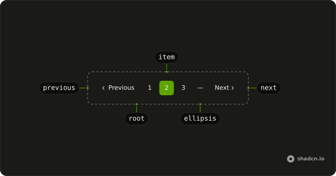
Pagination
├── PaginationItem
├── PaginationEllipsis
├── PaginationFirstTrigger
├── PaginationPrevious
├── PaginationNext
└── PaginationLastTrigger
Usage
<script lang="ts">
import {
  Pagination, PaginationContent, PaginationEllipsis, PaginationItem,
  PaginationLink, PaginationNext, PaginationPrevious,
} from "@/components/ui/pagination";
</script>
<Pagination>
  <PaginationContent>
    <PaginationItem>
      <PaginationPrevious href="#" />
    </PaginationItem>
    <PaginationItem>
      <PaginationLink href="#">1</PaginationLink>
    </PaginationItem>
    <PaginationItem>
      <PaginationLink href="#" isActive>
        2
      </PaginationLink>
    </PaginationItem>
    <PaginationItem>
      <PaginationLink href="#">3</PaginationLink>
    </PaginationItem>
    <PaginationItem>
      <PaginationEllipsis />
    </PaginationItem>
    <PaginationItem>
      <PaginationNext href="#" />
    </PaginationItem>
  </PaginationContent>
</Pagination>
Accessibility
- Enter
- Activate the focused control.
- Space
- Activate the focused control.
Demos
Simple
Five page links and nothing else, with the current one marked isActive. Use a numbers-only row when there are few pages and a previous or next control would only widen it. Once the list runs long, add those ends and an ellipsis, which is the opening preview. isActive is also how assistive tech knows which page is current.
Icons Only
Previous and next, with no numbers, beside a rows-per-page Select. That is the compact footer of a data table, where stepping matters more than jumping. Use it when the table already shows a range and numbered links would repeat it. Keep the numbers when someone may need a far page, because stepping one page at a time is a poor way to get there.
Rtl
dir="rtl" flips the row, and text on previous and next replaces the English words with Arabic labels. The arrows follow the reading order, so previous stays at the start. Pass text whenever the visible word is not the default, because that string is also the accessible name. Numbers in the same script belong in this row too.
FAQ
How do I track the current page with the Ark UI Pagination?
Pass count, the total number of items, and Pagination keeps the page itself: PaginationItems renders the numbers and ellipses, and Previous and Next disable at the ends. Control it with page and onPageChange, and set pageSize (10 by default).
How do I use Next.js Link or my router with Pagination in Svelte?
Keep a real URL per page, so people can bookmark page 12 and search engines can follow it.
SvelteKit routes plain links, so href on PaginationLink is enough.
How do I show an ellipsis when Pagination has many pages?
With count, siblingCount sets how many pages show beside the current one and boundaryCount how many at each end; PaginationItems fills each gap with PaginationEllipsis.
Why can I still click Previous on the first page?
Without count, Pagination is a plain row of links and doesn't know where it stands. Pass count and Previous and Next disable themselves at the ends, or leave PaginationPrevious out on page 1 and PaginationNext out on the last page.
How do I show only Previous and Next buttons in Pagination?
Leave out the numbered PaginationLinks and keep PaginationPrevious and PaginationNext. The Icons Only demo above does that, with a rows-per-page Select beside them.
How do I change or translate the Pagination labels?
Pass text on PaginationPrevious and PaginationNext ("Previous" and "Next" by default). For a right-to-left language, set the direction too, as in the RTL demo, so the row and its arrows follow the reading order.
API Reference
Pagination
<nav> data-slot="pagination"
page?number
The controlled active page.
defaultPage?number
The initial active page when rendered. Use when you don't need to control the active page of the pagination.
- Default
1
onPageChange?(details: PageChangeDetails) → void
Called when the page number is changed.
- Type
(details: PageChangeDetails) → void- Parameters
details– { page: number; pageSize: number }- Returns
void
pageSize?number
The controlled number of data items per page.
defaultPageSize?number
The initial number of data items per page when rendered. Use when you don't need to control the page size of the pagination.
- Default
10
onPageSizeChange?(details: PageSizeChangeDetails) → void
Called when the page size is changed.
- Type
(details: PageSizeChangeDetails) → void- Parameters
details– { pageSize: number }- Returns
void
boundaryCount?number
Number of pages to show at the beginning and end.
- Default
1
count?number
Total number of data items.
dir?"ltr" | "rtl"
The document's text/writing direction.
- Type
"ltr" | "rtl"- Default
"ltr"
getPageUrl?(details: PageUrlDetails) → string
Function to generate href attributes for pagination links.
Only used when type is set to "link".
- Type
(details: PageUrlDetails) → string- Parameters
details– { page: number; pageSize: number }- Returns
string
id?string
The unique identifier of the machine.
ids?object
The ids of the elements in the accordion. Useful for composition.
- Type
{ root?: string; ellipsis?: (index: number) → string; firstTrigger?: string; prevTrigger?: string; nextTrigger?: string; lastTrigger?: string; item?: (page: number) → string }
siblingCount?number
Number of pages to show beside active page.
- Default
1
translations?object
Specifies the localized strings that identifies the accessibility elements and their states.
- Type
{ rootLabel?: string; firstTriggerLabel?: string; prevTriggerLabel?: string; nextTriggerLabel?: string; lastTriggerLabel?: string; itemLabel?: (details: ItemLabelDetails) → string }
type?"button" | "link"
The type of the trigger element.
- Type
"button" | "link"- Default
"button"
asChild?Snippet<[PropsFn]>
Render your own element: a snippet that gets the part's props to spread on it.
- Type
Snippet<[PropsFn]>
class?string
Merged with the part's classes.
PaginationItem
<li> data-slot="pagination-item"
type?"page"
The item's type: a page.
value?number
The item's value.
asChild?Snippet<[PropsFn]>
Render your own element: a snippet that gets the part's props to spread on it.
- Type
Snippet<[PropsFn]>
class?string
Merged with the part's classes.
data-indexstring
The index of the item.
data-selected?string
Present when selected.
PaginationEllipsis
<span> data-slot="pagination-ellipsis"
index?number
The ellipsis's position in its list.
- Default
0
asChild?Snippet<[PropsFn]>
Render your own element: a snippet that gets the part's props to spread on it.
- Type
Snippet<[PropsFn]>
class?string
Merged with the part's classes.
data-index?string
The index of the item.
PaginationPrevious
<button> data-slot="pagination-previous"
isActive?boolean
Marks the link as the current page: outlined, and aria-current="page".
text?string
The button's label, beside its arrow.
- Default
"Previous"
asChild?Snippet<[PropsFn]>
Render your own element: a snippet that gets the part's props to spread on it.
- Type
Snippet<[PropsFn]>
class?string
Merged with the part's classes.
data-disabled?string
Present when disabled.
PaginationNext
<button> data-slot="pagination-next"
isActive?boolean
Marks the link as the current page: outlined, and aria-current="page".
text?string
The button's label, beside its arrow.
- Default
"Next"
asChild?Snippet<[PropsFn]>
Render your own element: a snippet that gets the part's props to spread on it.
- Type
Snippet<[PropsFn]>
class?string
Merged with the part's classes.
data-disabled?string
Present when disabled.
PaginationContent
<ul> data-slot="pagination-content"
asChild?Snippet<[PropsFn]>
Render your own element: a snippet that gets the part's props to spread on it.
- Type
Snippet<[PropsFn]>
class?string
Merged with the part's classes.
PaginationLink
<a> data-slot="pagination-link"
isActive?boolean
Marks the link as the current page: outlined, and aria-current="page".
asChild?Snippet<[PropsFn]>
Render your own element: a snippet that gets the part's props to spread on it.
- Type
Snippet<[PropsFn]>
class?string
Merged with the part's classes.
data-active?string
Mirrors isActive.
PaginationItems
data-slot="pagination-items"
children(context: UsePaginationContext) → Snippet
A function that gets context and returns what it renders.
- Type
(context: UsePaginationContext) → Snippet- Parameters
context– { page: number; count: number; pageSize: number; totalPages: number; pages: Pages; previousPage: number | null; nextPage: number | null; pageRange: PageRange; type: "button" | "link"; getPageUrl?: (page: number) → string; slice: <V>(data: V[]) → V[]; setPageSize: (size: number) → void; setPage: (page: number) → void; goToNextPage: VoidFunction; goToPrevPage: VoidFunction; goToFirstPage: VoidFunction; goToLastPage: VoidFunction; getRootProps: () → T["element"]; getEllipsisProps: (props: EllipsisProps) → T["element"]; getItemProps: (props: ItemProps) → T["element"]; getFirstTriggerProps: () → T["element"]; getPrevTriggerProps: () → T["element"]; getNextTriggerProps: () → T["element"]; getLastTriggerProps: () → T["element"] }- Returns
ReactNode
asChild?Snippet<[PropsFn]>
Render your own element: a snippet that gets the part's props to spread on it.
- Type
Snippet<[PropsFn]>
PaginationItemLink
clickEffect?boolean
Apply a click effect to the button.
- Default
true
isLoading?boolean
Show a loading indicator.
- Default
false
page?"previous" | "next" | number
The page number to link to.
- Type
"previous" | "next" | number
pill?boolean
Fully rounded corners.
- Default
false
size?"icon-lg" | "icon-md" | "icon-sm" | "icon-xl" | "icon-xs" | "lg" | "md" | "sm" | "xl" | "xs"
The size.
- Type
"icon-lg" | "icon-md" | "icon-sm" | "icon-xl" | "icon-xs" | "lg" | "md" | "sm" | "xl" | "xs"- Default
"md"
variant?"default" | "destructive" | "ghost" | "link" | "outline" | "secondary"
Ark default: default.
- Type
"default" | "destructive" | "ghost" | "link" | "outline" | "secondary"- Default
outline
asChild?Snippet<[PropsFn]>
Render your own element: a snippet that gets the part's props to spread on it.
- Type
Snippet<[PropsFn]>
class?string
Merged with the part's classes.
usePagination
page?number
The controlled active page.
defaultPage?number
The initial active page when rendered. Use when you don't need to control the active page of the pagination.
- Default
1
onPageChange?(details: PageChangeDetails) → void
Called when the page number is changed.
- Type
(details: PageChangeDetails) → void- Parameters
details– { page: number; pageSize: number }- Returns
void
pageSize?number
The controlled number of data items per page.
defaultPageSize?number
The initial number of data items per page when rendered. Use when you don't need to control the page size of the pagination.
- Default
10
onPageSizeChange?(details: PageSizeChangeDetails) → void
Called when the page size is changed.
- Type
(details: PageSizeChangeDetails) → void- Parameters
details– { pageSize: number }- Returns
void
boundaryCount?number
Number of pages to show at the beginning and end.
- Default
1
count?number
Total number of data items.
getPageUrl?(details: PageUrlDetails) → string
Function to generate href attributes for pagination links.
Only used when type is set to "link".
- Type
(details: PageUrlDetails) → string- Parameters
details– { page: number; pageSize: number }- Returns
string
id?string
The unique identifier of the machine.
ids?object
The ids of the elements in the accordion. Useful for composition.
- Type
{ root?: string; ellipsis?: (index: number) → string; firstTrigger?: string; prevTrigger?: string; nextTrigger?: string; lastTrigger?: string; item?: (page: number) → string }
siblingCount?number
Number of pages to show beside active page.
- Default
1
translations?object
Specifies the localized strings that identifies the accessibility elements and their states.
- Type
{ rootLabel?: string; firstTriggerLabel?: string; prevTriggerLabel?: string; nextTriggerLabel?: string; lastTriggerLabel?: string; itemLabel?: (details: ItemLabelDetails) → string }
type?"button" | "link"
The type of the trigger element.
- Type
"button" | "link"- Default
"button"
With other components
Select
SelectionRows per page
Table
DataFooter under the rows
Field
InputsLabel the page size
Input
InputsJump to a page
Skeleton
FeedbackWhile the next page loads
Button
ButtonsPrevious and next
Related
Breadcrumb
NavigationPath, not pages
Tabs
NavigationSwitch whole views
Carousel
MediaPrev/next slides
Button Group
ButtonsGrouped page buttons
Empty
FeedbackZero results
Steps
NavigationA known sequence