shadcn.io is not affiliated with official shadcn/ui
Grouped links in a rail beside the page. The rail can shrink to icons.
Use it for the stable navigation of a wide product. A few destinations on a phone fit better in Bottom Navigation. In Svelte, Ark UI keeps the rail open or closed, and the same header button opens it as a sheet on a narrow screen.
Installation
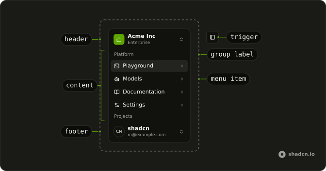
Anatomy
Usage
import {
  AudioWaveformIcon, BadgeCheckIcon, BellIcon, BookOpenIcon, BotIcon,
  ChevronRightIcon, ChevronsUpDownIcon, CommandIcon, CreditCardIcon,
  FolderIcon, ForwardIcon, FrameIcon, GalleryVerticalEndIcon,
  LogOutIcon, MapIcon, MoreHorizontalIcon, PieChartIcon, PlusIcon,
  Settings2Icon, SparklesIcon, SquareTerminalIcon, Trash2Icon,
} from "lucide-react";
import { type ElementType, useCallback, useState } from "react";
import {
  Avatar, AvatarFallback, AvatarImage,
} from "@/components/ui/avatar";
import {
  Collapsible, CollapsibleContent, CollapsibleTrigger,
} from "@/components/ui/collapsible";
import {
  Menu, MenuContent, MenuGroup, MenuGroupLabel, MenuItem, MenuSeparator,
  MenuShortcut, MenuTrigger,
} from "@/components/ui/menu";
import {
  Sidebar, SidebarContent, SidebarFooter, SidebarGroup,
  SidebarGroupLabel, SidebarHeader, SidebarInset, SidebarMenu,
  SidebarMenuAction, SidebarMenuButton, SidebarMenuItem, SidebarMenuSub,
  SidebarMenuSubButton, SidebarMenuSubItem, SidebarProvider,
  SidebarRail, SidebarTrigger, useSidebar,
} from "@/components/ui/sidebar";
const data = {
navMain: [
{
icon: SquareTerminalIcon,
isActive: true,
items: [
{ title: "History", url: "#" },
{ title: "Starred", url: "#" },
{ title: "Settings", url: "#" },
],
title: "Playground",
url: "#",
},
{
icon: BotIcon,
items: [
{ title: "Genesis", url: "#" },
{ title: "Explorer", url: "#" },
{ title: "Quantum", url: "#" },
],
title: "Models",
url: "#",
},
{
icon: BookOpenIcon,
items: [
{ title: "Introduction", url: "#" },
{ title: "Get Started", url: "#" },
{ title: "Tutorials", url: "#" },
{ title: "Changelog", url: "#" },
],
title: "Documentation",
url: "#",
},
{
icon: Settings2Icon,
items: [
{ title: "General", url: "#" },
{ title: "Team", url: "#" },
{ title: "Billing", url: "#" },
{ title: "Limits", url: "#" },
],
title: "Settings",
url: "#",
},
],
projects: [
{ icon: FrameIcon, name: "Design Engineering", url: "#" },
{ icon: PieChartIcon, name: "Sales & Marketing", url: "#" },
{ icon: MapIcon, name: "Travel", url: "#" },
],
teams: [
{
logo: GalleryVerticalEndIcon,
name: "Acme Inc",
plan: "Enterprise",
},
{
logo: AudioWaveformIcon,
name: "Acme Corp.",
plan: "Startup",
},
{
logo: CommandIcon,
name: "Evil Corp.",
plan: "Free",
},
],
user: {
avatar: "https://github.com/shadcn.png",
email: "m@example.com",
name: "shadcn",
},
};
type Team = (typeof data.teams)[number];
const TeamMenuItem = (props: {
index: number;
onSelect: (team: Team) => void;
team: Team;
}) => {
const { index, onSelect, team } = props;
const handleClick = useCallback(() => {
onSelect(team);
}, [onSelect, team]);
return (
<MenuItem className="gap-2 p-2" onClick={handleClick} value={team.name}>
<div className="flex size-6 items-center justify-center rounded-md border">
<team.logo aria-hidden="true" className="size-3.5 shrink-0" />
</div>
{team.name}
<MenuShortcut>⌘{index + 1}</MenuShortcut>
</MenuItem>
);
};
const TeamSwitcher = (props: { teams: Team[] }) => {
const { teams } = props;
const { isMobile } = useSidebar();
const [activeTeam, setActiveTeam] = useState(teams[0]);
const handleSelectTeam = useCallback((team: Team) => {
setActiveTeam(team);
}, []);
if (!activeTeam) {
return null;
}
return (
<SidebarMenu>
<SidebarMenuItem>
<Menu
positioning={{
gutter: 4,
placement: isMobile ? "bottom-start" : "right-start",
}}
>
<MenuTrigger asChild>
<SidebarMenuButton
className="data-[state=open]:bg-sidebar-accent data-[state=open]:text-sidebar-accent-foreground"
size="lg"
>
<div className="flex aspect-square size-8 items-center justify-center rounded-lg bg-sidebar-primary text-sidebar-primary-foreground">
<activeTeam.logo aria-hidden="true" className="size-4" />
</div>
<div className="grid flex-1 text-start text-sm leading-tight">
<span className="truncate font-medium">{activeTeam.name}</span>
<span className="truncate text-xs">{activeTeam.plan}</span>
</div>
<ChevronsUpDownIcon aria-hidden="true" className="ms-auto" />
</SidebarMenuButton>
</MenuTrigger>
<MenuContent className="w-(--reference-width) min-w-56 rounded-lg">
<MenuGroup>
<MenuGroupLabel className="text-muted-foreground text-xs">
Teams
</MenuGroupLabel>
{teams.map((team, index) => (
<TeamMenuItem
index={index}
key={team.name}
onSelect={handleSelectTeam}
team={team}
/>
))}
</MenuGroup>
<MenuSeparator />
<MenuGroup>
<MenuItem className="gap-2 p-2" value="add-team">
<div className="flex size-6 items-center justify-center rounded-md border bg-transparent">
<PlusIcon aria-hidden="true" className="size-4" />
</div>
<div className="font-medium text-muted-foreground">
Add team
</div>
</MenuItem>
</MenuGroup>
</MenuContent>
</Menu>
</SidebarMenuItem>
</SidebarMenu>
);
};
const NavMain = (props: {
items: {
icon?: ElementType;
isActive?: boolean;
items?: { title: string; url: string }[];
title: string;
url: string;
}[];
}) => {
const { items } = props;
return (
<SidebarGroup>
<SidebarGroupLabel>Platform</SidebarGroupLabel>
<SidebarMenu>
{items.map((item) => (
<Collapsible
asChild
className="group/collapsible"
defaultOpen={item.isActive}
key={item.title}
lazyMount={false}
unmountOnExit={false}
>
<SidebarMenuItem>
<CollapsibleTrigger asChild>
<SidebarMenuButton tooltip={item.title}>
{item.icon ? <item.icon aria-hidden="true" /> : null}
<span>{item.title}</span>
<ChevronRightIcon
aria-hidden="true"
className="ms-auto transition-transform duration-200 group-data-[state=open]/collapsible:rotate-90"
/>
</SidebarMenuButton>
</CollapsibleTrigger>
<CollapsibleContent>
<SidebarMenuSub>
{item.items?.map((subItem) => (
<SidebarMenuSubItem key={subItem.title}>
<SidebarMenuSubButton href={subItem.url}>
<span>{subItem.title}</span>
</SidebarMenuSubButton>
</SidebarMenuSubItem>
))}
</SidebarMenuSub>
</CollapsibleContent>
</SidebarMenuItem>
</Collapsible>
))}
</SidebarMenu>
</SidebarGroup>
);
};
const NavProjects = (props: {
projects: { icon: ElementType; name: string; url: string }[];
}) => {
const { projects } = props;
const { isMobile } = useSidebar();
return (
<SidebarGroup className="group-data-[collapsible=icon]:hidden">
<SidebarGroupLabel>Projects</SidebarGroupLabel>
<SidebarMenu>
{projects.map((item) => (
<SidebarMenuItem key={item.name}>
<SidebarMenuButton asChild>
<a href={item.url}>
<item.icon aria-hidden="true" />
<span>{item.name}</span>
</a>
</SidebarMenuButton>
<Menu
positioning={{
placement: isMobile ? "bottom-end" : "right-start",
}}
>
<MenuTrigger asChild>
<SidebarMenuAction showOnHover>
<MoreHorizontalIcon aria-hidden="true" />
<span className="sr-only">More</span>
</SidebarMenuAction>
</MenuTrigger>
<MenuContent className="w-48 rounded-lg">
<MenuItem value={`${item.name}-view`}>
<FolderIcon
aria-hidden="true"
className="text-muted-foreground"
/>
<span>View Project</span>
</MenuItem>
<MenuItem value={`${item.name}-share`}>
<ForwardIcon
aria-hidden="true"
className="text-muted-foreground"
/>
<span>Share Project</span>
</MenuItem>
<MenuSeparator />
<MenuItem value={`${item.name}-delete`}>
<Trash2Icon
aria-hidden="true"
className="text-muted-foreground"
/>
<span>Delete Project</span>
</MenuItem>
</MenuContent>
</Menu>
</SidebarMenuItem>
))}
<SidebarMenuItem>
<SidebarMenuButton className="text-sidebar-foreground/70">
<MoreHorizontalIcon
aria-hidden="true"
className="text-sidebar-foreground/70"
/>
<span>More</span>
</SidebarMenuButton>
</SidebarMenuItem>
</SidebarMenu>
</SidebarGroup>
);
};
const NavUser = (props: {
user: { avatar: string; email: string; name: string };
}) => {
const { user } = props;
const { isMobile } = useSidebar();
return (
<SidebarMenu>
<SidebarMenuItem>
<Menu
positioning={{
gutter: 4,
placement: isMobile ? "bottom-end" : "right-end",
}}
>
<MenuTrigger asChild>
<SidebarMenuButton
className="data-[state=open]:bg-sidebar-accent data-[state=open]:text-sidebar-accent-foreground"
size="lg"
>
<Avatar className="size-8 rounded-lg">
<AvatarImage
alt={user.name}
height={32}
src={user.avatar}
width={32}
/>
<AvatarFallback className="rounded-lg">CN</AvatarFallback>
</Avatar>
<div className="grid flex-1 text-start text-sm leading-tight">
<span className="truncate font-medium">{user.name}</span>
<span className="truncate text-xs">{user.email}</span>
</div>
<ChevronsUpDownIcon
aria-hidden="true"
className="ms-auto size-4"
/>
</SidebarMenuButton>
</MenuTrigger>
<MenuContent className="w-(--reference-width) min-w-56 rounded-lg">
<MenuGroup>
<MenuGroupLabel className="p-0 font-normal">
<div className="flex items-center gap-2 px-1 py-1.5 text-start text-sm">
<Avatar className="size-8 rounded-lg">
<AvatarImage
alt={user.name}
height={32}
src={user.avatar}
width={32}
/>
<AvatarFallback className="rounded-lg">CN</AvatarFallback>
</Avatar>
<div className="grid flex-1 text-start text-sm leading-tight">
<span className="truncate font-medium">{user.name}</span>
<span className="truncate text-xs">{user.email}</span>
</div>
</div>
</MenuGroupLabel>
</MenuGroup>
<MenuSeparator />
<MenuGroup>
<MenuItem value="upgrade">
<SparklesIcon aria-hidden="true" />
Upgrade to Pro
</MenuItem>
</MenuGroup>
<MenuSeparator />
<MenuGroup>
<MenuItem value="account">
<BadgeCheckIcon aria-hidden="true" />
Account
</MenuItem>
<MenuItem value="billing">
<CreditCardIcon aria-hidden="true" />
Billing
</MenuItem>
<MenuItem value="notifications">
<BellIcon aria-hidden="true" />
Notifications
</MenuItem>
</MenuGroup>
<MenuSeparator />
<MenuGroup>
<MenuItem value="logout">
<LogOutIcon aria-hidden="true" />
Log out
</MenuItem>
</MenuGroup>
</MenuContent>
</Menu>
</SidebarMenuItem>
</SidebarMenu>
);
};
const SidebarDemo = () => (
<div className="h-[400px] w-full overflow-hidden rounded-xl border">
<SidebarProvider
className="h-full min-h-0"
persist={false}
shortcut={false}
>
<Sidebar className="h-full" collapsible="icon">
<SidebarHeader>
<TeamSwitcher teams={data.teams} />
</SidebarHeader>
<SidebarContent>
<NavMain items={data.navMain} />
<NavProjects projects={data.projects} />
</SidebarContent>
<SidebarFooter>
<NavUser user={data.user} />
</SidebarFooter>
<SidebarRail />
</Sidebar>
<SidebarInset>
<header className="flex h-16 shrink-0 items-center gap-2 transition-[width,height] ease-linear group-has-data-[collapsible=icon]/sidebar-wrapper:h-12">
<div className="flex items-center gap-2 px-4">
<SidebarTrigger className="-ms-1" />
</div>
</header>
</SidebarInset>
</SidebarProvider>
</div>
);
Accessibility
- Enter
- Activate the focused control.
- Space
- Activate the focused control.
- Arrow Down
- Move down.
- Arrow Up
- Move up.
- Arrow Left
- Move left.
- Arrow Right
- Move right.
- Home
- Go to the start.
- End
- Go to the end.
Demos
Rtl
Arabic labels, dir set to rtl on the frame, and the rail on the right so it leads the line. collapsible is icon and variant is floating, with the team mark, groups, projects, and account menu from the main shell. Menus open toward the page. Set direction on those portaled menus too, or a dropdown stays left to right, and keep an accessible name on each icon.
FAQ
How do I control whether a Sidebar is open in Svelte?
Wrap the layout in SidebarProvider, then render Sidebar beside SidebarInset. The desktop sidebar starts open, so keep a boolean in state only when something else must open or close it.
Pass open and defaultOpen on SidebarProvider. onOpenChange receives the next boolean, and useSidebar throws if you call it outside the provider.
How do I collapse a Sidebar to icons or off the screen?
Set collapsible on Sidebar. offcanvas, the default, slides it off the screen, icon shrinks it to icons, which the usage example does, and none keeps it open. variant is sidebar, floating, or inset, and it changes the chrome around that rail. data-state is expanded or collapsed.
How do I put a Sidebar on the right with Ark UI?
The sidebar sits on the left by default, so move it to the other edge without swapping the document direction. The Rtl demo is a separate case, for right-to-left text. Set placement to right on Sidebar. placement left is the default.
What happens to a Sidebar on a narrow screen?
On a narrow viewport the sidebar opens as a Sheet instead of pushing the layout. useSidebar returns isMobile, plus open, toggleSidebar, and state, which is expanded or collapsed. Call it only under SidebarProvider. SidebarTrigger calls toggleSidebar, so the same button works on both layouts.
How do I toggle a Sidebar from the keyboard, and does it persist?
Command or Ctrl, plus B, toggles the sidebar. The desktop open state is written to a cookie named sidebar_state, but the component does not read that cookie back. Pass defaultOpen yourself if the next load should match. Set shortcut to false on SidebarProvider to remove the shortcut, and set persist to false to stop writing the cookie.
How do I mark the current Sidebar link?
Set isActive on the current SidebarMenuButton. That sets data-active, so the row uses the sidebar accent tokens. Pass tooltip with the item name. The tooltip shows while the sidebar is collapsed to icons, and it stays hidden when the sidebar is expanded or on a phone.
How do I change the Sidebar width and colors?
The provider sets the CSS variables --sidebar-width and --sidebar-width-icon. Override those variables to resize the rail and the icon rail. Colors use the sidebar background, foreground, and accent tokens. Edit the sidebar file under components/ui for structure, and keep data-state and data-collapsible working, because the layout depends on them.
How do I install Sidebar in Svelte?
Run the command in the Installation section above. It adds Sidebar and its parts to your ui folder. Import from that folder when the command finishes, instead of copying the source by hand, and rerun the command later if you want the latest files. The command uses the shadcn-svelte CLI.
API Reference
Sidebar
collapsible?"offcanvas" | "icon" | "none"
Collapse behavior on desktop.
- Type
"offcanvas" | "icon" | "none"- Default
"offcanvas"
placement?"left" | "right"
Which edge of the layout the sidebar sits on.
- Type
"left" | "right"- Default
"left"
variant?"sidebar" | "floating" | "inset"
Visual treatment of the rail.
- Type
"sidebar" | "floating" | "inset"- Default
"sidebar"
SidebarProvider
<div>
open?boolean
The open state of the sidebar.
defaultOpen?boolean
The default open state of the sidebar.
- Default
true
onOpenChange?(open: boolean) → void
The function to call when the open state of the sidebar changes.
- Parameters
open– boolean- Returns
void
persist?boolean
Persist the desktop open state to a cookie.
- Default
true
shortcut?boolean
Toggle the sidebar with ⌘B / Ctrl+B.
- Default
true
asChild?Snippet<[PropsFn]>
Render your own element: a snippet that gets the part's props to spread on it.
- Type
Snippet<[PropsFn]>
class?string
Merged with the part's classes.
SidebarTrigger
<span> data-slot="sidebar-trigger"
clickEffect?boolean
Apply a click effect to the button.
- Default
true
isLoading?boolean
Show a loading indicator.
- Default
false
pill?boolean
Fully rounded corners.
- Default
false
size?"icon-lg" | "icon-md" | "icon-sm" | "icon-xl" | "icon-xs" | "lg" | "md" | "sm" | "xl" | "xs"
The size.
- Type
"icon-lg" | "icon-md" | "icon-sm" | "icon-xl" | "icon-xs" | "lg" | "md" | "sm" | "xl" | "xs"- Default
"md"
variant?"default" | "destructive" | "ghost" | "link" | "outline" | "secondary"
The visual style.
- Type
"default" | "destructive" | "ghost" | "link" | "outline" | "secondary"- Default
"default"
asChild?Snippet<[PropsFn]>
Render your own element: a snippet that gets the part's props to spread on it.
- Type
Snippet<[PropsFn]>
class?string
Merged with the part's classes.
data-sidebar"trigger"
- Default
"trigger"
SidebarRail
<button> data-slot="sidebar-rail"
asChild?Snippet<[PropsFn]>
Render your own element: a snippet that gets the part's props to spread on it.
- Type
Snippet<[PropsFn]>
class?string
Merged with the part's classes.
data-sidebar"rail"
- Default
"rail"
SidebarInset
<main> data-slot="sidebar-inset"
asChild?Snippet<[PropsFn]>
Render your own element: a snippet that gets the part's props to spread on it.
- Type
Snippet<[PropsFn]>
class?string
Merged with the part's classes.
SidebarInput
data-slot="sidebar-input"
size?"lg" | "md" | "sm"
The size.
- Type
"lg" | "md" | "sm"- Default
"md"
asChild?Snippet<[PropsFn]>
Render your own element: a snippet that gets the part's props to spread on it.
- Type
Snippet<[PropsFn]>
class?string
Merged with the part's classes.
data-sidebar"input"
- Default
"input"
SidebarHeader
<div> data-slot="sidebar-header"
asChild?Snippet<[PropsFn]>
Render your own element: a snippet that gets the part's props to spread on it.
- Type
Snippet<[PropsFn]>
class?string
Merged with the part's classes.
data-sidebar"header"
- Default
"header"
SidebarFooter
<div> data-slot="sidebar-footer"
asChild?Snippet<[PropsFn]>
Render your own element: a snippet that gets the part's props to spread on it.
- Type
Snippet<[PropsFn]>
class?string
Merged with the part's classes.
data-sidebar"footer"
- Default
"footer"
SidebarSeparator
data-slot="sidebar-separator"
orientation?"horizontal" | "vertical"
The orientation of the separator.
- Type
"horizontal" | "vertical"- Default
"horizontal"
asChild?Snippet<[PropsFn]>
Render your own element: a snippet that gets the part's props to spread on it.
- Type
Snippet<[PropsFn]>
class?string
Merged with the part's classes.
data-sidebar"separator"
- Default
"separator"
SidebarContent
<div> data-slot="sidebar-content"
scrollFade?boolean
Whether to add a scroll fade effect to the sidebar content.
- Default
false
asChild?Snippet<[PropsFn]>
Render your own element: a snippet that gets the part's props to spread on it.
- Type
Snippet<[PropsFn]>
class?string
Merged with the part's classes.
data-sidebar"content"
- Default
"content"
SidebarGroup
<div>
open?boolean
Controlled open state when collapsible is true.
defaultOpen?boolean
Uncontrolled initial open state when collapsible is true.
- Default
true
onOpenChange?(details: OpenChangeDetails) → void
Called when a collapsible group opens or closes.
- Type
(details: OpenChangeDetails) → void- Parameters
details– { open: boolean }- Returns
void
collapsible?boolean
Makes the group's label a toggle that collapses SidebarGroupContent.
- Default
false
asChild?Snippet<[PropsFn]>
Render your own element: a snippet that gets the part's props to spread on it.
- Type
Snippet<[PropsFn]>
class?string
Merged with the part's classes.
SidebarGroupLabel
<div> data-slot="sidebar-group-label"
asChild?Snippet<[PropsFn]>
Render your own element: a snippet that gets the part's props to spread on it.
- Type
Snippet<[PropsFn]>
class?string
Merged with the part's classes.
data-sidebar"group-label"
- Default
"group-label"
SidebarGroupAction
<button> data-slot="sidebar-group-action"
asChild?Snippet<[PropsFn]>
Render your own element: a snippet that gets the part's props to spread on it.
- Type
Snippet<[PropsFn]>
class?string
Merged with the part's classes.
data-sidebar"group-action"
- Default
"group-action"
SidebarGroupContent
<div> data-slot="sidebar-group-content"
asChild?Snippet<[PropsFn]>
Render your own element: a snippet that gets the part's props to spread on it.
- Type
Snippet<[PropsFn]>
class?string
Merged with the part's classes.
data-sidebar"group-content"
- Default
"group-content"
SidebarMenu
<ul> data-slot="sidebar-menu"
asChild?Snippet<[PropsFn]>
Render your own element: a snippet that gets the part's props to spread on it.
- Type
Snippet<[PropsFn]>
class?string
Merged with the part's classes.
data-sidebar"menu"
- Default
"menu"
SidebarMenuItem
<li> data-slot="sidebar-menu-item"
asChild?Snippet<[PropsFn]>
Render your own element: a snippet that gets the part's props to spread on it.
- Type
Snippet<[PropsFn]>
class?string
Merged with the part's classes.
data-sidebar"menu-item"
- Default
"menu-item"
SidebarMenuButton
<button> data-slot="sidebar-menu-button"
isActive?boolean
Whether the button is active.
- Default
false
size?SidebarMenuButtonSize
Visual size of the row. default matches md.
- Default
"md"
tooltip?string | React.ComponentProps<typeof TooltipContent>
The tooltip to display when hovering over the button.
- Type
string | React.ComponentProps<typeof TooltipContent>
variant?"default" | "ghost" | "outline"
The visual style.
- Type
"default" | "ghost" | "outline"- Default
"default"
asChild?Snippet<[PropsFn]>
Render your own element: a snippet that gets the part's props to spread on it.
- Type
Snippet<[PropsFn]>
class?string
Merged with the part's classes.
data-active?string
Mirrors isActive.
data-sidebar"menu-button"
- Default
"menu-button"
data-size?string
Mirrors menuSize.
SidebarMenuAction
<button> data-slot="sidebar-menu-action"
showOnHover?boolean
Hides the action until its menu item is hovered or focused, or its menu is
open. Always shown below md.
- Default
false
asChild?Snippet<[PropsFn]>
Render your own element: a snippet that gets the part's props to spread on it.
- Type
Snippet<[PropsFn]>
class?string
Merged with the part's classes.
data-sidebar"menu-action"
- Default
"menu-action"
SidebarMenuBadge
<div> data-slot="sidebar-menu-badge"
asChild?Snippet<[PropsFn]>
Render your own element: a snippet that gets the part's props to spread on it.
- Type
Snippet<[PropsFn]>
class?string
Merged with the part's classes.
data-sidebar"menu-badge"
- Default
"menu-badge"
SidebarMenuSkeleton
<div> data-slot="sidebar-menu-skeleton"
showIcon?boolean
Draws an icon placeholder before the text line.
- Default
false
asChild?Snippet<[PropsFn]>
Render your own element: a snippet that gets the part's props to spread on it.
- Type
Snippet<[PropsFn]>
class?string
Merged with the part's classes.
data-sidebar"menu-skeleton"
- Default
"menu-skeleton"
--skeleton-widthstringSidebarMenuSub
<ul> data-slot="sidebar-menu-sub"
asChild?Snippet<[PropsFn]>
Render your own element: a snippet that gets the part's props to spread on it.
- Type
Snippet<[PropsFn]>
class?string
Merged with the part's classes.
data-sidebar"menu-sub"
- Default
"menu-sub"
SidebarMenuSubItem
<li> data-slot="sidebar-menu-sub-item"
asChild?Snippet<[PropsFn]>
Render your own element: a snippet that gets the part's props to spread on it.
- Type
Snippet<[PropsFn]>
class?string
Merged with the part's classes.
data-sidebar"menu-sub-item"
- Default
"menu-sub-item"
SidebarMenuSubButton
<a> data-slot="sidebar-menu-sub-button"
isActive?boolean
Whether the link is the current page: highlighted, and data-active.
- Default
false
size?"sm" | "md"
The size.
- Type
"sm" | "md"- Default
"md"
asChild?Snippet<[PropsFn]>
Render your own element: a snippet that gets the part's props to spread on it.
- Type
Snippet<[PropsFn]>
class?string
Merged with the part's classes.
data-active?string
Mirrors isActive.
data-sidebar"menu-sub-button"
- Default
"menu-sub-button"
data-size?string
Mirrors size.
useSidebar
With other components
Dropdown Menu
MenusWorkspace switcher
Collapsible
DisclosureNested nav group
Breadcrumb
NavigationNext to the trigger
Tooltip
OverlaysLabels in icon mode
Separator
LayoutSplit header and list
Button
ButtonsThe trigger is one