shadcn.io is not affiliated with official shadcn/ui
Two panels that share an edge, with a handle that sets how much room each one gets.
Use it when people should choose the split, like a file tree beside code. A column that also holds the app's links is a Sidebar. In Svelte, Ark UI exposes the handle as a button named Resize, so the arrow keys work once it has focus.
Installation
Anatomy
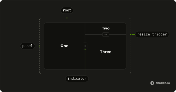
Resizable
├── ResizablePanel
└── ResizableResizeTrigger
    └── ResizableResizeTriggerIndicator
Usage
<script lang="ts">
import {
  Resizable, ResizablePanel, ResizableResizeTrigger,
} from "@/components/ui/resizable";
</script>
<Resizable
  class="max-w-sm rounded-lg border"
  defaultSize={[50, 50]}
  panels={[
    { id: "1", minSize: 10 },
    { id: "2", minSize: 10 },
  ]}
>
  <ResizablePanel id="1">
    <div class="flex h-[200px] items-center justify-center p-6">
      <span class="font-semibold">One</span>
    </div>
  </ResizablePanel>
  <ResizableResizeTrigger id="1:2" withHandle />
  <ResizablePanel id="2">
    <Resizable
      defaultSize={[25, 75]}
      orientation="vertical"
      panels={[
        { id: "3", minSize: 10 },
        { id: "4", minSize: 10 },
      ]}
    >
      <ResizablePanel id="3">
        <div class="flex h-full items-center justify-center p-6">
          <span class="font-semibold">Two</span>
        </div>
      </ResizablePanel>
      <ResizableResizeTrigger id="3:4" withHandle />
      <ResizablePanel id="4">
        <div class="flex h-full items-center justify-center p-6">
          <span class="font-semibold">Three</span>
        </div>
      </ResizablePanel>
    </Resizable>
  </ResizablePanel>
</Resizable>
Accessibility
- Enter
- Activate the focused item.
- Arrow Up
- Move up.
- Arrow Down
- Move down.
- Arrow Left
- Move left.
- Arrow Right
- Move right.
- Home
- Go to the start.
- End
- Go to the end.
- F6
- Handle the F6 key.
Demos
Vertical
Header over content, starting near a quarter and three quarters, with the handle drawn as a line. Set orientation to vertical for a top and bottom split, such as a toolbar over a canvas. The line can still be focused and dragged. Give the group a height, or a vertical split collapses and the handle sits in an empty gap.
Handle
Sidebar and content start near a quarter and three quarters, with withHandle drawing a grip on the trigger. Use the grip when the split is easy to miss, a faint line on a light page. Without it the target is only thinner, which is enough between panels that already have a strong edge. Either way it is one tab stop, and the arrow keys resize once it is focused.
Rtl
The hero's nested split, with Arabic labels and dir set to rtl on the outer group and the inner vertical group. The horizontal handle still divides the columns, and the inner handle divides the stacked panes. The grip should not need a flipped stylesheet if positioning stays logical. Drag it and confirm the panes grow from the correct edge.
FAQ
How do I set Resizable panel sizes with Ark UI?
Give every panel a starting size, then let the drag handle change it. The default orientation is horizontal, so the sizes are widths until you set orientation to vertical.
Pass defaultSize as an array of sizes on Resizable, and list each panel in panels with an id. The resize trigger id joins those two ids with a colon, such as 1:2, or pass size instead of defaultSize to control the layout and read updates from onResize.
How do I stack a Resizable vertically?
Set orientation to vertical on Resizable. The panels stack, and the handle runs across the width. The Vertical demo uses that layout, and a nested group can use a different orientation from its parent. Leave orientation unset, or set it to horizontal, for panels that sit side by side.
How do I show a handle on a Resizable?
Set withHandle on ResizableResizeTrigger to show the grip, as the Handle demo does. Without it, the handle is still a thin line you can drag and focus. The control is a button named Resize, so keyboard users can reach it.
Can I use a Resizable from the keyboard in Svelte?
Yes, focus the resize handle, then use the arrow keys to change the panel sizes. Home and End jump toward the start and end of the range. The handle is one tab stop between the panels. See the Accessibility section for the full key list.
Can I nest a Resizable inside another panel?
Yes, put another Resizable inside a ResizablePanel and give that inner group its own orientation and sizes. The default demo nests a vertical group inside a horizontal one. Each group has its own handles. Sizes on the inner group are relative to that panel, not the page.
How do I style a Resizable?
Edit the resizable file under components/ui. The group sets data-slot to resizable, and the handle sets it to resizable-resize-trigger. Change the line thickness and the grip there. The handle already uses logical positioning, so the Rtl demo does not need a separate layout.
How do I install Resizable in Svelte?
Run the command in the Installation section above. It adds Resizable and its parts to your ui folder. Import from that folder when the command finishes, instead of copying the source by hand, and rerun the command later if you want the latest files. The command uses the shadcn-svelte CLI.
API Reference
Resizable
<div> data-slot="resizable"
panelsPanelData[]
The size constraints of the panels.
defaultSize?PanelSize[]
The initial size of the panels when rendered. Use when you don't need to control the size of the panels.
dir?"ltr" | "rtl"
The document's text/writing direction.
- Type
"ltr" | "rtl"- Default
"ltr"
id?string
The unique identifier of the machine.
ids?object
The ids of the elements in the splitter. Useful for composition.
- Type
{ root?: string; resizeTrigger?: (id: string) → string; label?: (id: string) → string; panel?: (id: string | number) → string }
keyboardResizeBy?number | null
The number of pixels to resize the panel by when the keyboard is used.
- Type
number | null
nonce?string
The nonce for the injected splitter cursor stylesheet.
onCollapse?(details: ExpandCollapseDetails) → void
Function called when a panel is collapsed.
- Type
(details: ExpandCollapseDetails) → void- Parameters
details– { panelId: string; size: number }- Returns
void
onExpand?(details: ExpandCollapseDetails) → void
Function called when a panel is expanded.
- Type
(details: ExpandCollapseDetails) → void- Parameters
details– { panelId: string; size: number }- Returns
void
onResize?(details: ResizeDetails) → void
Function called when the splitter is resized.
- Parameters
details– { size: number[]; resizeTriggerId: string | null; layout: string; expandToSizes: Record<string, number> }- Returns
void
onResizeEnd?(details: ResizeEndDetails) → void
Function called when the splitter resize ends.
- Type
(details: ResizeEndDetails) → void- Parameters
details– { size: number[]; resizeTriggerId: string | null }- Returns
void
onResizeStart?() → void
Function called when the splitter resize starts.
- Returns
void
orientation?"horizontal" | "vertical"
The orientation of the splitter. Can be horizontal or vertical.
- Type
"horizontal" | "vertical"- Default
"horizontal"
registry?SplitterRegistry
The splitter registry to use for multi-drag support. When provided, enables dragging at the intersection of multiple splitters.
size?PanelSize[]
The controlled size data of the panels.
asChild?Snippet<[PropsFn]>
Render your own element: a snippet that gets the part's props to spread on it.
- Type
Snippet<[PropsFn]>
class?string
Merged with the part's classes.
data-dragging?string
Present when in the dragging state.
data-orientation"horizontal" | "vertical"
The orientation of the splitter.
- Type
"horizontal" | "vertical"
ResizablePanel
<div> data-slot="resizable-panel"
idstring
The element's id.
asChild?Snippet<[PropsFn]>
Render your own element: a snippet that gets the part's props to spread on it.
- Type
Snippet<[PropsFn]>
data-dragging?string
Present when in the dragging state.
data-idstring
Mirrors id.
data-indexstring
The index of the item.
data-orientation"horizontal" | "vertical"
The orientation of the panel.
- Type
"horizontal" | "vertical"
data-ownedbystring
Id of the root part.
ResizableResizeTrigger
<button> data-slot="resizable-resize-trigger"
id`${PanelId}:${PanelId}` | `${PanelId}:` | `:${PanelId}`
The element's id.
- Type
`${PanelId}:${PanelId}` | `${PanelId}:` | `:${PanelId}`
disabled?boolean
Whether the resize trigger is disabled.
withHandle?boolean
Whether to show the handle.
- Default
false
asChild?Snippet<[PropsFn]>
Render your own element: a snippet that gets the part's props to spread on it.
- Type
Snippet<[PropsFn]>
class?string
Merged with the part's classes.
data-disabled?string
Present when disabled.
data-dragging?string
Present when in the dragging state.
data-focus?string
Present when focused.
data-idstring
Mirrors id.
data-orientation"horizontal" | "vertical"
The orientation of the resizetrigger.
- Type
"horizontal" | "vertical"
data-ownedbystring
Id of the root part.