shadcn.io is not affiliated with official shadcn/ui
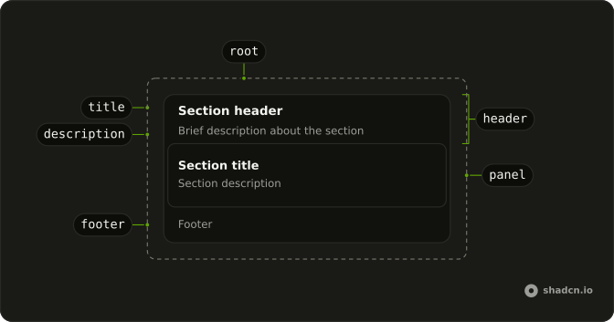
Header and footer sit on a muted shell. Each panel inside is its own bordered block.
Use it when a region holds more than one block. One subject with a single body is a Card. In Svelte, Ark UI is just the shell, and nothing here opens or closes.
Installation
Anatomy
Usage
<script lang="ts">
import {
  Frame, FrameDescription, FrameFooter, FrameHeader, FramePanel,
  FrameTitle,
} from "@/components/ui/frame";
</script>
<Frame class="w-full max-w-md">
  <FrameHeader>
    <FrameTitle>Section header</FrameTitle>
    <FrameDescription>Brief description about the section</FrameDescription>
  </FrameHeader>
  <FramePanel>
    <h2 class="font-semibold text-sm">Section title</h2>
    <p class="text-muted-foreground text-sm">Section description</p>
  </FramePanel>
  <FrameFooter>
    <p class="text-muted-foreground text-sm">Footer</p>
  </FrameFooter>
</Frame>
Demos
Separated Panels
Two FramePanel blocks under one header, and no footer. Adjacent panels pick up a small gap on their own, so you do not add margin between them. Use this when a section has two surfaces, a summary and the details, that should not share one card body. A footer still sits on the shell under both, and one panel plus a footer is enough when nothing must be separated.
FAQ
When should I use a Frame instead of a Card?
Use a Frame to group several related blocks in one muted shell. Each FramePanel is its own bordered surface, and the header and footer sit on that shell rather than inside a panel. Use a Card when the whole region is one subject, with a single header, body, and footer. Frame does not open, close, or hold selection state.
How do I stack more than one panel in a Frame?
Put two or more FramePanel parts inside Frame, as the Separated Panels demo does. Adjacent panels pick up a small gap from the rule on data-slot frame-panel, so you do not add margin yourself. The header stays above the panels and FrameFooter stays below them. A string child of FrameHeader, with no title prop, is rendered as the title.
How do I set a Frame title in Svelte?
Pass title and description to FrameHeader when you do not want to assemble the heading yourself. Those props render FrameTitle and FrameDescription. You can instead put FrameTitle and FrameDescription in the header as children, which is what Usage does. The title is text, not a dialog name, and it is not announced as a window.
How do I restyle a Frame?
Edit the Frame file in your ui folder. The parts expose data-slot values frame, frame-panel, frame-panel-header, frame-panel-title, frame-panel-description, and frame-panel-footer. The shell uses the muted background, and each panel uses the normal background, border, and radius. Override those in that file so every Frame on the site stays consistent.
How do I install Frame in Svelte?
Run the command in the Installation section above. It adds Frame, FramePanel, FrameHeader, FrameTitle, FrameDescription, and FrameFooter to your ui folder. Install from that section rather than pasting a partial tree, because Frame is layout only and does not add a behavior library of its own. The command uses the shadcn-svelte CLI.
Can I use more than one Frame on a page?
Yes, each Frame is an independent group, and nothing about one Frame affects another. Repeat the shell wherever a section needs its own header, panels, and footer. Do not nest a Frame inside FramePanel unless you really want a shell inside a panel. For a single bordered subject, a Card is the smaller choice.
API Reference
Frame
<div> data-slot="frame"
asChild?Snippet<[PropsFn]>
Render your own element: a snippet that gets the part's props to spread on it.
- Type
Snippet<[PropsFn]>
class?string
Merged with the part's classes.
FramePanel
<div> data-slot="frame-panel"
asChild?Snippet<[PropsFn]>
Render your own element: a snippet that gets the part's props to spread on it.
- Type
Snippet<[PropsFn]>
class?string
Merged with the part's classes.
FrameHeader
<header> data-slot="frame-panel-header"
description?string
The description of the dialog.
title?string
The title of the dialog.
asChild?Snippet<[PropsFn]>
Render your own element: a snippet that gets the part's props to spread on it.
- Type
Snippet<[PropsFn]>
class?string
Merged with the part's classes.
FrameTitle
<div> data-slot="frame-panel-title"
asChild?Snippet<[PropsFn]>
Render your own element: a snippet that gets the part's props to spread on it.
- Type
Snippet<[PropsFn]>
class?string
Merged with the part's classes.
FrameDescription
<div> data-slot="frame-panel-description"
asChild?Snippet<[PropsFn]>
Render your own element: a snippet that gets the part's props to spread on it.
- Type
Snippet<[PropsFn]>
class?string
Merged with the part's classes.
FrameFooter
<footer> data-slot="frame-panel-footer"
asChild?Snippet<[PropsFn]>
Render your own element: a snippet that gets the part's props to spread on it.
- Type
Snippet<[PropsFn]>
class?string
Merged with the part's classes.