shadcn.io is not affiliated with official shadcn/ui
The panel is anchored to one edge of the screen, rather than floating over the center.
Use it when the task needs its own surface and the page underneath should stay in sight. A short confirmation fits better in a Dialog. In Svelte, Ark UI traps focus while the panel is open, and it can sit on any edge, including the bottom on a narrow screen.
Installation
Anatomy
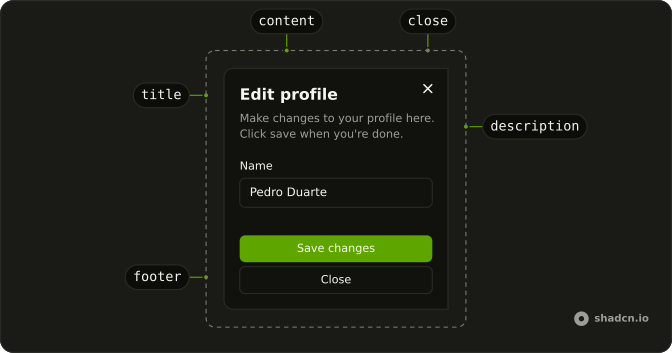
SheetTrigger
SheetOverlay
SheetPositioner
SheetContent
SheetTitle
SheetDescription
SheetClose
Usage
<script lang="ts">
import { Button } from "@/components/ui/button";
import { Field, FieldLabel } from "@/components/ui/field";
import { Input } from "@/components/ui/input";
import {
  Sheet, SheetClose, SheetContent, SheetDescription, SheetFooter,
  SheetHeader, SheetTitle, SheetTrigger,
} from "@/components/ui/sheet";
</script>
<Sheet>
<SheetTrigger>
{#snippet asChild(props)}
<Button {...props()} variant="outline">Open</Button>
{/snippet}
</SheetTrigger>
<SheetContent>
<SheetHeader>
<SheetTitle>Edit profile</SheetTitle>
<SheetDescription>
Make changes to your profile here. Click save when you're done.
</SheetDescription>
</SheetHeader>
<div class="grid flex-1 auto-rows-min gap-6 px-4">
<Field class="grid gap-3">
<FieldLabel>Name</FieldLabel>
<Input defaultValue="Pedro Duarte" type="text" />
</Field>
<Field class="grid gap-3">
<FieldLabel>Username</FieldLabel>
<Input defaultValue="@peduarte" type="text" />
</Field>
</div>
<SheetFooter>
<Button type="submit">Save changes</Button>
<SheetClose>
{#snippet asChild(props)}
<Button {...props()} variant="outline">Close</Button>
{/snippet}
</SheetClose>
</SheetFooter>
</SheetContent>
</Sheet>
Accessibility
- Enter
- Activate the focused control.
- Space
- Activate the focused control.
Demos
Side
side on SheetContent is top, right, bottom, or left, with right as the default. Top and bottom are capped at half the viewport here, so a long form scrolls inside the panel. Use the bottom edge on a phone, and a side edge for an inspector next to a list. The title, the focus trap, and Escape stay the same on every edge.
No Close Button
showCloseButton set to false removes the corner icon. This panel then has a title and a description, and no footer button, so the written hint is to click outside. Hide that icon only when another close control is obvious, usually next to the primary action. Escape still dismisses a modal sheet, and the overlay click is a backup rather than the thing you want people to hunt for.
Rtl
The trigger is Arabic, and the panel opens from the left with dir set to rtl on SheetContent. Title, fields, and footer actions align to the start of the line. Put dir on the content, not only the trigger, because the panel is portaled and can miss the page direction. side is still an explicit edge and does not flip on its own.
FAQ
How do I control whether a Sheet is open in Svelte?
The sheet starts closed and opens from its trigger. Control it when another part of the page must open or close it. Keep that boolean in state and pass it back, or use the default prop for the first state only.
Pass open and read details.open from onOpenChange, and set defaultOpen for the uncontrolled case.
How do I change which edge a Sheet uses?
Set side on SheetContent to top, right, bottom, or left. The default is right, and bottom slides up from the bottom edge, which suits a narrow screen. The Side demo shows all four edges. The sheet still traps focus the same way on every edge.
Why does a Sheet need a SheetTitle?
SheetTitle names the dialog for assistive tech, so always render one. If the design has no visible heading, hide the title with the sr-only utility and keep it in the tree. SheetDescription explains the task and is optional. Escape closes the sheet and returns focus to the trigger.
How do I use a button as the Sheet trigger with Ark UI?
The trigger should look like your button, not like an extra wrapper. Put the visible label on the button so the control has an accessible name. Put one Button inside SheetTrigger and set asChild, so the trigger merges onto that button.
Why is my Sheet behind another layer, or clipping a long form?
Sheet content is portaled and stacked at z-50, so it sits above the page. If another overlay uses the same layer, edit the sheet file under components/ui and raise the overlay and content together. If a long form is clipped, let the body scroll, for example by wrapping it in a Scroll Area.
How do I install Sheet in Svelte?
Run the command in the Installation section above. It adds Sheet and its parts to your ui folder. Import from that folder when the command finishes, instead of copying the source by hand, and rerun the command later if you want the latest files. The command uses the shadcn-svelte CLI.
API Reference
Sheet
data-slot="sheet"
open?boolean
The controlled open state of the dialog.
defaultOpen?boolean
The initial open state of the dialog when rendered. Use when you don't need to control the open state of the dialog.
- Default
false
onOpenChange?(details: OpenChangeDetails) → void
Function to call when the dialog's open state changes.
- Type
(details: OpenChangeDetails) → void- Parameters
details– { open: boolean }- Returns
void
triggerValue?string | null
The controlled active trigger value.
- Type
string | null
defaultTriggerValue?string | null
The initial active trigger value when rendered. Use when you don't need to control the active trigger value.
- Type
string | null
onTriggerValueChange?(details: TriggerValueChangeDetails) → void
Function to call when the active trigger changes.
- Type
(details: TriggerValueChangeDetails) → void- Parameters
details– { value: string | null; triggerElement: HTMLElement | null }- Returns
void
closeOnEscape?boolean
Whether to close the dialog when the escape key is pressed.
- Default
true
closeOnInteractOutside?boolean
Whether to close the dialog when the outside is clicked.
- Default
true
dir?"ltr" | "rtl"
The document's text/writing direction.
- Type
"ltr" | "rtl"- Default
"ltr"
finalFocusEl?() → MaybeElement
Element to receive focus when the dialog is closed.
- Returns
MaybeElement
hideMode?"display-none" | "activity"
How to hide content when mounted but not present.
- display-none: HTML hidden attribute. Effects stay alive.
- activity: React 19 <Activity mode="hidden">. Effects pause. Requires React 19+.
- Type
"display-none" | "activity"- Default
"display-none"
id?string
The unique identifier of the machine.
ids?object
The ids of the elements in the dialog. Useful for composition.
- Type
{ trigger?: string | ((value?: string) → string); positioner?: string; backdrop?: string; content?: string; closeTrigger?: string; title?: string; description?: string }
initialFocusEl?() → MaybeElement | false
Element to receive focus when the dialog is opened.
Return false to skip moving focus, or null to use the default.
- Type
() → MaybeElement | false- Returns
MaybeElement | false
lazyMount?boolean
Whether to enable lazy mounting.
- Default
false
modal?boolean
Whether to prevent pointer interaction outside the element and hide all content below it.
- Default
true
onEscapeKeyDown?(event: KeyboardEvent) → void
Function called when the escape key is pressed.
- Parameters
event– { altKey: boolean; charCode: number; ctrlKey: boolean; code: string; getModifierState: (key: string) → boolean; key: string; keyCode: number; locale: string; location: number; metaKey: boolean; repeat: boolean; shiftKey: boolean; which: number }- Returns
void
onFocusOutside?(event: FocusOutsideEvent) → void
Function called when the focus is moved outside the component.
- Type
(event: FocusOutsideEvent) → void- Parameters
event– FocusOutsideEvent- Returns
void
onInteractOutside?(event: InteractOutsideEvent) → void
Function called when an interaction happens outside the component.
- Type
(event: InteractOutsideEvent) → void- Parameters
event– InteractOutsideEvent- Returns
void
onPointerDownOutside?(event: PointerDownOutsideEvent) → void
Function called when the pointer is pressed down outside the component.
- Type
(event: PointerDownOutsideEvent) → void- Parameters
event– PointerDownOutsideEvent- Returns
void
onRequestDismiss?(event: LayerDismissEvent) → void
Function called when this layer is closed due to a parent layer being closed.
- Type
(event: LayerDismissEvent) → void- Parameters
event– LayerDismissEvent- Returns
void
persistentElements?Array<() → Element | null>
Returns the persistent elements that: - should not have pointer-events disabled - should not trigger the dismiss event
- Type
Array<() → Element | null>
preventScroll?boolean
Whether to prevent scrolling behind the dialog when it's opened.
- Default
true
restoreFocus?boolean
Whether to restore focus to the element that had focus before the dialog was opened.
role?"dialog" | "alertdialog"
The dialog's role.
- Type
"dialog" | "alertdialog"- Default
"dialog"
skipAnimationOnMount?boolean
Whether to allow the initial presence animation.
- Default
false
trapFocus?boolean
Whether to trap focus inside the dialog when it's opened.
- Default
true
unmountOnExit?boolean
Whether to unmount on exit.
- Default
false
asChild?Snippet<[PropsFn]>
Render your own element: a snippet that gets the part's props to spread on it.
- Type
Snippet<[PropsFn]>
SheetTrigger
<button> data-slot="sheet-trigger"
value?string
The value that identifies this specific trigger.
asChild?Snippet<[PropsFn]>
Render your own element: a snippet that gets the part's props to spread on it.
- Type
Snippet<[PropsFn]>
data-current?string
Present when current.
data-state"open" | "closed"
"open" or "closed".
- Type
"open" | "closed"
data-value?string
The value of the item.
SheetOverlay
<div> data-slot="sheet-overlay"
asChild?Snippet<[PropsFn]>
Render your own element: a snippet that gets the part's props to spread on it.
- Type
Snippet<[PropsFn]>
class?string
Merged with the part's classes.
data-has-nested?string
Present when the backdrop has nested dialogs.
data-nested?string
Present when the backdrop is nested within another dialog.
data-state"open" | "closed"
"open" or "closed".
- Type
"open" | "closed"
--insetstring--layer-indexstring
The index of the dismissable in the layer stack.
SheetPositioner
<div> data-slot="sheet-positioner"
placement?SheetSide
Deprecated. Prefer side. Kept for existing callers.
side?SheetSide
Edge of the screen where the sheet appears.
- Default
right]:pt-(--inset) data-[side=right]:pb-(--inset)"
variant?"default" | "inset"
The visual style.
- Type
"default" | "inset"- Default
"default"
asChild?Snippet<[PropsFn]>
Render your own element: a snippet that gets the part's props to spread on it.
- Type
Snippet<[PropsFn]>
class?string
Merged with the part's classes.
data-has-nested?string
Present when the positioner has nested dialogs.
data-nested?string
Present when the positioner is nested within another dialog.
data-placement?string
Mirrors side.
data-side?string
Mirrors side.
data-variant?string
Mirrors variant.
SheetContent
<div> data-slot="sheet-content"
placement?SheetSide
Deprecated. Prefer side. Kept for Sidebar and other callers.
showCloseButton?boolean
Show close button at the top right corner.
- Default
true
side?SheetSide
Edge of the screen where the sheet appears.
- Default
"right"
asChild?Snippet<[PropsFn]>
Render your own element: a snippet that gets the part's props to spread on it.
- Type
Snippet<[PropsFn]>
class?string
Merged with the part's classes.
data-has-nested?string
Present when another dialog is nested inside it.
data-nested?string
Present when it's nested inside another dialog.
data-side?string
Mirrors side.
data-state"open" | "closed"
"open" or "closed".
- Type
"open" | "closed"
--layer-indexstring
The index of the dismissable in the layer stack.
--nested-layer-countstring
The number of nested dialogs.
SheetTitle
<h2> data-slot="sheet-title"
asChild?Snippet<[PropsFn]>
Render your own element: a snippet that gets the part's props to spread on it.
- Type
Snippet<[PropsFn]>
class?string
Merged with the part's classes.
SheetDescription
<div> data-slot="sheet-description"
asChild?Snippet<[PropsFn]>
Render your own element: a snippet that gets the part's props to spread on it.
- Type
Snippet<[PropsFn]>
class?string
Merged with the part's classes.
SheetClose
<button> data-slot="sheet-close"
asChild?Snippet<[PropsFn]>
Render your own element: a snippet that gets the part's props to spread on it.
- Type
Snippet<[PropsFn]>
SheetHeader
<div> data-slot="sheet-header"
description?string
The description of the sheet.
title?string
The title of the sheet.
class?string
Merged with the part's classes.
SheetBody
data-slot="sheet-body"
scrollFade?boolean
Add a fade effect to the scroll area.
- Default
false
asChild?Snippet<[PropsFn]>
Render your own element: a snippet that gets the part's props to spread on it.
- Type
Snippet<[PropsFn]>
class?string
Merged with the part's classes.
SheetFooter
data-slot="sheet-footer"
class?string
Merged with the part's classes.
useSheet
With other components
Button
ButtonsTrigger and footer actions
Field
InputsFields inside the panel
Input
InputsName, username
Label
InputsVisible or screen-reader only
Scroll Area
LayoutLong lists inside
Separator
LayoutSplit the panel
Related
Dialog
OverlaysCenter overlay instead
Alert Dialog
OverlaysYes or no only
Drawer
OverlaysSwipe to dismiss
Sidebar
NavigationPersistent nav
Popover
OverlaysNo focus trap
Floating Panel
OverlaysNot pinned to an edge