shadcn.io is not affiliated with official shadcn/ui
One line for a single value, such as a username, an email, or a search.
Use it on a form when that value should not wrap. If the answer needs more than one line, use a Textarea. In Svelte, Ark UI styles that one-line field.
Installation
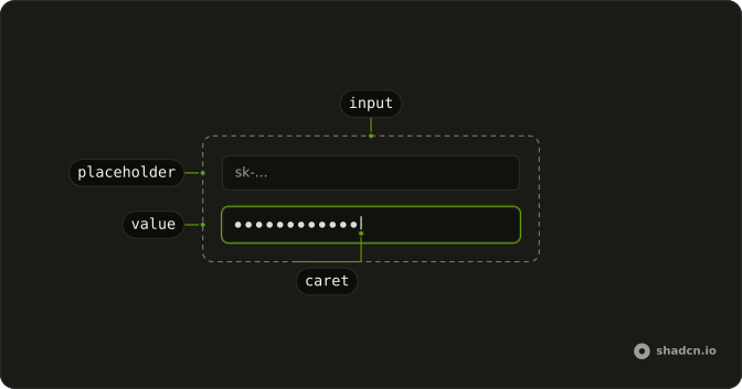
Anatomy
Usage
<script lang="ts">
import {
  Field, FieldDescription, FieldLabel,
} from "@/components/ui/field";
import { Input } from "@/components/ui/input";
</script>
<Field class="max-w-xs">
  <FieldLabel>API Key</FieldLabel>
  <Input placeholder="sk-..." type="password" />
  <FieldDescription>
    Your API key is encrypted and stored securely.
  </FieldDescription>
</Field>
Demos
Basic
A bare field, a placeholder, and no label. Use it when a heading already names the value, or you are about to supply your own label. Set type to the kind of text you expect, here plain text. A placeholder is not a name, so a real form should follow the Field demo instead of this one.
Field
Username, with the label above the field and a short note under it. Field connects that label to the control, and FieldDescription is the extra sentence, the one about choosing something unique. Leave the description off when the label is already clear. Do not make the placeholder do this job.
Field Group
Name, then email with a note about where updates go, then Reset and Submit on one row. FieldGroup is the gap between those blocks, so each field is not inventing its own margin. The button row sets orientation to horizontal. Reach for this when two or three fields share a submit and you do not need a select yet.
Disabled
The email cannot be edited, and the label and the note are muted with it. Set disabled on the input and on the Field. Skipping it on the field leaves the surrounding text at full strength, which looks like the box is still fair game. Use this for a value this screen should show but not change.
Invalid
The box, the label, and the note all pick up the error treatment together. invalid on Field styles the group, and aria-invalid on the input is what assistive tech hears. Put the reason in FieldDescription, in this case that the value failed validation. This stays on the page until the value is fixed.
File
A native file button labeled Picture, with a note to select a picture. type set to file is enough for one file and the browser picker. The label still matters, because the button's own text is generic. When people should drag files in, or you need a list of uploads, use File Upload.
Inline
A search field and a Search button on the same row. orientation set to horizontal on Field is what lines them up, and the button stays a sibling rather than sitting inside the input. Use it for a compact filter in a toolbar. A labeled form field usually wants the label above the control, which this layout gives up.
Grid
First name and last name, each with a label, in two columns. The grid is on FieldGroup, so the pair shares one row when the screen has room. Keep it to short values. On a narrow layout those columns get cramped, and a stacked group is the better shape.
Required
The label shows an asterisk, and the input sets required, so an empty submit is blocked by the browser. The star is only visual. The attribute is what actually enforces it. Use the description to say why the value is mandatory when that is not obvious from the label.
Badge
Webhook URL, with a Beta badge at the end of the label line. A Badge fits when the field is new or recommended and a second sentence would be too much. The input is a normal url field underneath. Keep the badge in the label, not inside the control, so the value itself stays clean.
Input Group
The website field shows https:// at the start and an info icon at the end, inside the same control. That composition is Input Group, using InputGroupInput for the part people type. Use it when a prefix, suffix, or icon is part of the value's shape. Do not absolutely position an icon over a plain input.
Button Group
The search text and a Search button share one outer border, so they read as a single control. Button Group is the join. Use it when the button acts on that field, such as search or submit. A prefix or an icon that sits inside the field belongs in an input group instead.
Form
Name, email, phone beside a country Select, an address, then Cancel and Submit. Copy this when several inputs share one submit, not when you have a single field. Phone uses type tel, and email uses email. The country list sits in the same two-column row so the line stays even.
Rtl
The API key field again, with dir set to rtl on the field and the input, and Arabic for the label, placeholder, and note. Logical spacing follows the reading direction, so you do not swap physical margins. Use this when a single field is Arabic or Hebrew inside an otherwise left-to-right page.
FAQ
How do I label an Input in Svelte?
Wrap it in Field with FieldLabel, as the Field demo does, so the label is tied to the control, and put FieldDescription under the field for extra help. If there is no visible label, set aria-label on Input. type defaults to text, so set email, password, search, or file when that is what the field collects.
How do I control an Input's value in Svelte?
Input is uncontrolled until you pass value, and defaultValue is only a starting value. The disabled and invalid demos show the other common states: disabled on both Field and Input, and invalid on Field plus aria-invalid on Input. required marks the field required, as the Required demo does.
Update it from onChange, and read the next text from the change event.
When should I use Input instead of File Upload or Textarea?
Use Input for a single line of text, and set type to file for a native file button, as the File demo does. Use File Upload when people drag files or you need a list of uploads, and use Textarea for more than one line. Use Password Input when the field needs a visibility toggle, or type password for a plain secret.
How do I change the height of an Input with Ark UI?
The field stretches to the width of its container, and disabled fields also set disabled on Field so the label and description pick up the muted state. Invalid fields set invalid on Field so the message and the control share one error treatment, as the Invalid demo does.
Pass size as sm, md, or lg, and the element sets data-size to match.
How do I put an icon or a button inside an Input?
Do not absolutely position an icon over Input. Use Input Group when the icon, text, or button sits in the field, and Button Group when you are joining buttons to the field. The Input Group and Button Group demos on this page show both. Input itself stays a single native control.
How do I restyle an Input?
Edit the Input file in your ui folder, which sets data-slot to input and uses the shared input styles, including placeholder, file button, and disabled opacity. Prefer those tokens over one-off colors, and keep logical styles so the Rtl demo still follows document direction. placeholder is the grey hint, not a label.
How do I install Input?
Run the command in the Installation section above. It adds Input to your ui folder as one control, and the shared field styles come with it. Pair it with Field on the page, and you do not install a separate label component for the Field demo. The command uses the shadcn-svelte CLI.
API Reference
Input
data-slot="input"
size?"lg" | "md" | "sm"
The size.
- Type
"lg" | "md" | "sm"- Default
"md"
asChild?Snippet<[PropsFn]>
Render your own element: a snippet that gets the part's props to spread on it.
- Type
Snippet<[PropsFn]>
class?string
Merged with the part's classes.
data-size?string
Mirrors size.
With other components
Field
InputsLabel, hint, and error
Label
InputsName the box
Input Group
InputsPrefix inside the field
Button Group
ButtonsAction beside the field
Badge
FeedbackFlag in the label
Button
ButtonsSubmit beside the field
Related
Textarea
InputsMore than one line
Input OTP
InputsShort codes
Select
SelectionPick from a list
Native Select
SelectionBrowser dropdown
Checkbox
SelectionYes or no
Password Input
InputsA secret, with a reveal