shadcn.io is not affiliated with official shadcn/ui
Separate slots for a one-time code, one character in each.
Use it when the code has a fixed length and a stray character should be refused. An arbitrary string from a password manager fits a single Input. In Svelte, Ark UI moves focus between the slots and fills them on paste.
Installation
Anatomy
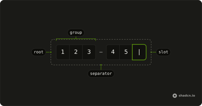
InputOTP
├── InputOTPGroup
│   ├── InputOTPSlot
│   └── InputOTPSlot
├── InputOTPSeparator
└── InputOTPGroup
    ├── InputOTPSlot
    └── InputOTPSlot
Usage
<script lang="ts">
import {
  InputOTP, InputOTPGroup, InputOTPSlot,
} from "@/components/ui/input-otp";
</script>
<InputOTP defaultValue={["1", "2", "3", "4", "5", "6"]}>
  <InputOTPGroup>
    <InputOTPSlot index={0} />
    <InputOTPSlot index={1} />
    <InputOTPSlot index={2} />
    <InputOTPSlot index={3} />
    <InputOTPSlot index={4} />
    <InputOTPSlot index={5} />
  </InputOTPGroup>
</InputOTP>
Accessibility
- Arrow Left
- Moves focus to the previous input.
- Arrow Right
- Moves focus to the next input.
- Backspace
- Deletes the value in the current input and moves focus to the previous input.
- Delete
- Deletes the value in the current input.
- Ctrl+V
- Pastes the value into the input fields.
- Enter
- Activate the focused item.
- Home
- Go to the start.
- End
- Go to the end.
Demos
Pattern
Letters are refused, which is what an SMS code wants. Paste still fills from the slot that has focus, and the label says the field is digits only. Use a digit restriction for any code that cannot contain a letter. Switch to alphanumeric when the issuer mixes letters and numbers, or the person will be stuck on the first character.
Separator
The six slots are split into pairs, with a visual minus between the groups. The separator is not an extra character, and the indexes keep counting straight through, from 0 to 5. Use the break when the code is printed in groups, such as 12 34 56, so the screen matches the message. A single group is clearer when the code has no grouping.
Disabled
The code is already filled, and disabled stops further edits while leaving the digits readable. Use that for a verified value, a backup code, or a field that unlocks only after another step. Do not disable the slots to express an error. People need to correct a wrong code, not stare at a faded one.
Controlled
Whatever is typed shows up again under the slots, empty state included, so you can see the value your state is holding. Keep the code in state when you check it as the person types, enable a button at the right length, or clear it after a failed attempt. If you only read the code on submit, you do not need to control it.
Invalid
Every slot is marked aria-invalid, and the code starts as zeros so the error styling is obvious before anyone types. Put the reason in text next to the field. Color on the boxes is not enough, especially for a code the person just copied. Use this after a rejected attempt, and clear it once the next code is accepted.
Four Digits
Four slots, digits only and no separator, fit a PIN or a short authenticator prompt rather than a six-digit email code. Use the shorter length when the issuer really sends four characters. Adding two empty slots just in case makes people wonder if the code was cut off. The indexes are still 0 through 3.
Alphanumeric
Letters and digits are both accepted, and a separator splits the six slots into two groups of three. Use this when the code from the email or the authenticator app actually contains letters. A digits-only field will reject the first letter and look broken. Keep the separator only if the code is shown to people in those groups.
Form
The code sits in a verification card addressed to a specific email, with a label, a resend button, and a full-width verify button. Resend is type button so it does not submit the step. required is on the field for when this card is a real form. Use the whole card when checking the code is the entire screen, not one line among many.
Rtl
The label is Arabic and the field direction is right to left, but the slots themselves stay left to right. A one-time code is a sequence of characters, not a sentence, and reversing the boxes would make the pasted code land in the wrong order. Set dir on the field for the label, and ltr on the control. Do the same for a PIN.
FAQ
How do I control an Input OTP value in Svelte?
Give every InputOTPSlot an index, starting at 0, in order, inside one or more InputOTPGroup parts, and hold the code in state when you need to check it as the user types. Use defaultValue for a prefilled code you do not control, and the slots stay in that index order across separators.
value is an array of strings, one entry per slot, and onValueChange receives details.value.
How do I accept only digits in an Input OTP with Ark UI?
Restrict the characters so a one-time code cannot contain the wrong ones, and paste still fills the slots from the focused position. Backspace clears the current slot and moves back, and Delete clears it without moving, as the Accessibility section describes, which is the same idea as the Four Digits demo with fewer slots.
Set type to numeric, alphanumeric, or alphabetic, and numeric is the default.
How do I show a separator in an Input OTP?
Put InputOTPSeparator between InputOTPGroup parts, as the Separator demo does. The separator is a visual minus, with role separator, and it is not an extra slot. index keeps counting across the whole code, so a group of three, a separator, and a group of three is still indexes 0 through 5, and you do not reset the index inside each group.
How do I mark an Input OTP as invalid?
Set aria-invalid on each InputOTPSlot, as the Invalid demo does, and put the error in text next to the field so it is not only color. disabled blocks editing and fades the control, and the Disabled demo prefills a value so the code stays visible.
You can also set invalid on InputOTP, which sets data-invalid on the root.
How do I submit an Input OTP with a form?
Set name and required on InputOTP so the code is included when the form submits. The Form demo pairs it with Field and FieldLabel, and the label's htmlFor matches the id on InputOTP. Keep a resend button as type button so it does not submit. The component writes the code into one field under that name.
How do I use Input OTP on a right-to-left page?
Keep the code left to right. The Rtl demo sets dir to ltr on InputOTP and lets the Field label follow the page direction. The slot row also forces left-to-right direction, so a pasted code is not reversed, and you do not flip the indexes, because index 0 stays the first digit on the left.
Which keys move through an Input OTP?
Arrow keys move between Input OTP slots, Backspace deletes the current slot and moves to the previous one, and Delete clears the current slot and stays there. Paste fills from the focused slot, and the pattern, when you set one, still applies to that paste. The Accessibility section also lists Home and End, and disabled slots are not editable.
How do I install Input OTP in Svelte?
Run the command in the Installation section above. It adds InputOTP, InputOTPGroup, InputOTPSlot, and InputOTPSeparator to your ui folder, so the group, the slots, and the separator stay together. Install from that section rather than copying those parts by hand. The command uses the shadcn-svelte CLI.
API Reference
InputOTP
<div> data-slot="input-otp"
value?string[]
The controlled value of the the pin input.
defaultValue?string[]
The initial value of the the pin input when rendered. Use when you don't need to control the value of the pin input.
onValueChange?(details: ValueChangeDetails) → void
Function called on input change.
- Type
(details: ValueChangeDetails) → void- Parameters
details– { value: string[]; valueAsString: string }- Returns
void
autoFocus?boolean
Whether to auto-focus the first input.
autoSubmit?boolean
Whether to auto-submit the owning form when all inputs are filled.
blurOnComplete?boolean
Whether to blur the input when the value is complete.
count?number
The number of inputs to render to improve SSR aria attributes. This will be required in next major version.
dir?"ltr" | "rtl"
The document's text/writing direction.
- Type
"ltr" | "rtl"- Default
"ltr"
disabled?boolean
Whether the inputs are disabled.
form?string
The associate form of the underlying input element.
id?string
The unique identifier of the machine.
ids?object
The ids of the elements in the pin input. Useful for composition.
- Type
{ root?: string; hiddenInput?: string; label?: string; control?: string; input?: (id: string) → string }
invalid?boolean
Whether the pin input is in the invalid state.
mask?boolean
If true, the input's value will be masked just like type=password.
name?string
The name of the input element. Useful for form submission.
onValueComplete?(details: ValueChangeDetails) → void
Function called when all inputs have valid values.
- Type
(details: ValueChangeDetails) → void- Parameters
details– { value: string[]; valueAsString: string }- Returns
void
onValueInvalid?(details: ValueInvalidDetails) → void
Function called when an invalid value is entered.
- Type
(details: ValueInvalidDetails) → void- Parameters
details– { value: string; index: number }- Returns
void
otp?boolean
If true, the pin input component signals to its fields that they should
use autocomplete="one-time-code".
- Default
true
pattern?string
The regular expression that the user-entered input value is checked against.
placeholder?string
The placeholder text for the input. Ark default: ○.
- Default
""
readOnly?boolean
Whether the pin input is in the valid state.
required?boolean
Whether the pin input is required.
sanitizeValue?(value: string) → string
Function to sanitize pasted values before validation. Useful for stripping dashes, spaces, or other formatting.
- Parameters
value– string- Returns
string
selectOnFocus?boolean
Whether to select input value when input is focused.
translations?object
Specifies the localized strings that identifies the accessibility elements and their states.
- Type
{ inputLabel?: (index: number, length: number) → string }
type?"alphanumeric" | "numeric" | "alphabetic"
The type of value the pin-input should allow.
- Type
"alphanumeric" | "numeric" | "alphabetic"- Default
"numeric"
asChild?Snippet<[PropsFn]>
Render your own element: a snippet that gets the part's props to spread on it.
- Type
Snippet<[PropsFn]>
class?string
Merged with the part's classes.
data-complete?string
Present when the pin-input value is complete.
data-disabled?string
Present when disabled.
data-invalid?string
Present when invalid.
data-readonly?string
Present when read-only.
InputOTPSlot
<input> data-slot="input-otp-input"
indexnumber
The slot's position in its list.
asChild?Snippet<[PropsFn]>
Render your own element: a snippet that gets the part's props to spread on it.
- Type
Snippet<[PropsFn]>
class?string
Merged with the part's classes.
data-complete?string
Present when the input value is complete.
data-disabled?string
Present when disabled.
data-filled?string
Present when filled.
data-indexstring
The index of the item.
data-invalid?string
Present when invalid.
data-ownedbystring
Id of the root part.
InputOtpControl
<div> data-slot="input-otp-control"
asChild?Snippet<[PropsFn]>
Render your own element: a snippet that gets the part's props to spread on it.
- Type
Snippet<[PropsFn]>
InputOTPGroup
<div> data-slot="input-otp-group"
class?string
Merged with the part's classes.
InputOTPSeparator
<div> data-slot="input-otp-separator"
class?string
Merged with the part's classes.
With other components
Field
InputsLabel the code
Button
ButtonsResend the code
Dialog
OverlaysVerify in a modal
Card
LayoutFrame the sign-in
Input
InputsEmail before the code
Label
InputsName the code
Related
Input Group
InputsAddons around text
Textarea
InputsLonger than a code
Native Select
SelectionCountry then phone
Checkbox
SelectionRemember this device
Kbd
TypographyDigit hint
Password Input
InputsOne field, hidden text