shadcn.io is not affiliated with official shadcn/ui
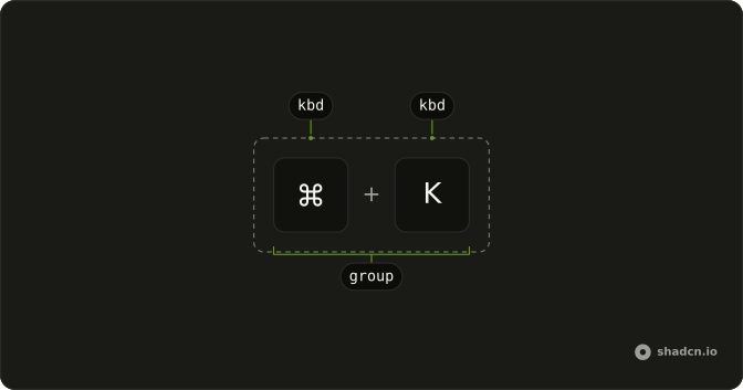
A small key cap next to a label, so the shortcut is visible.
Use it on a button or a search field so people can see the shortcut. If the cap would crowd the label, put it in a Tooltip. It only draws the key, so in Svelte, Ark UI does not listen for the shortcut.
Installation
Anatomy
Usage
<script lang="ts">
import { Kbd, KbdGroup } from "@/components/ui/kbd";
</script>
<div class="flex flex-col items-center gap-4">
  <KbdGroup>
    <Kbd>⌘</Kbd>
    <Kbd>⇧</Kbd>
    <Kbd>⌥</Kbd>
    <Kbd>⌃</Kbd>
  </KbdGroup>
  <KbdGroup>
    <Kbd>Ctrl</Kbd>
    <span>+</span>
    <Kbd>B</Kbd>
  </KbdGroup>
</div>
Demos
Group
The sentence names two shortcuts for a command palette, and KbdGroup keeps Ctrl + B and Ctrl + K on one line. Use a group when several chords belong to the same phrase and should not wrap apart. Each cap is still its own Kbd, and a plus between separate caps is the other way to spell a chord. Write the key name when a symbol would be ambiguous.
Button
The outline button says Accept, and a return-key cap sits at the end of the label. Put Kbd inside a Button when that button is what the shortcut runs, so the hint is on the control. The cap does not take the click: pointer events are off, and the button receives them. Do not use the key as the only name unless the key is the action.
Tooltip
Save and Print are ordinary buttons, and the shortcut lives in the tooltip: a single S, and Ctrl P as a KbdGroup. Move the cap into a Tooltip when the label is already long, or when only people looking for the shortcut should see it. The listener is still the button, not the cap. Lead with the action name, then the key, so the name is read first.
Input Group
A search field has a magnifying glass at the start and a command-K cap in an InputGroupAddon at the inline end. Use that slot when the shortcut focuses or opens the field, the usual command palette and search pattern. Do not put the shortcut in the placeholder. It disappears on the first keystroke, and the addon stays visible beside the text.
Rtl
dir is rtl on the row, so the modifier caps and the Ctrl + B chord follow the inline direction instead of sticking to the left. Use this when the surrounding text is right-to-left. Direction changes the order of the row, not the letters inside a cap. Match the page direction instead of flipping each symbol by hand.
FAQ
Does Kbd listen for the shortcut it shows?
No, Kbd only draws the key, and it does not register a keyboard listener. It is pointer-events-none, so it will not steal a click from a parent button, and the real shortcut belongs on the button or the page. The Button, Tooltip, and Input Group demos show Kbd as a label inside those controls, not as the control itself.
How do I show a chord with Kbd?
Wrap the keys in KbdGroup so they sit on one line, as the Group demo does with two chords side by side, or put a plus between keys, as Usage does with Ctrl and B. Each key is its own Kbd, and the group is presentational. Screen readers still read the text inside the keys, so write the key name, not only a symbol, when the symbol is unclear.
How do I add a border to Kbd with Ark UI?
Kbd is an inline key cap using data-slot kbd, KbdGroup uses data-slot kbd-group, and both live in the Kbd file where the cap's background and type size are set. The cap does not stretch to fill a button, so keep it on the line with the label.
Pass variant as default or outline, and outline draws a border around the cap.
Where should I put a Kbd?
Put it in a Button when the shortcut activates that button, in a Tooltip when the hint would crowd the label, or in an Input Group addon when the field has a shortcut. Those are the Button, Tooltip, and Input Group demos. Do not use Kbd as a button. It cannot be focused.
How do I restyle Kbd?
Edit the Kbd file in your ui folder, where the cap uses data-slot kbd and the group uses kbd-group. The text is not selectable, and pointer events are off, so a parent button still receives the click. Change the cap there if every shortcut on the site should match, and the Rtl demo follows the page direction for the row of keys.
How do I install Kbd in Svelte?
Run the command in the Installation section above. It adds Kbd and KbdGroup to your ui folder, and the key cap styles come with them. Kbd is typography, so it does not install a hotkey library, and you still write the listener yourself. The command uses the shadcn-svelte CLI.
Should Kbd show symbols or key names?
Use the name people need to find on the keyboard, and Usage shows both symbol modifiers and the words Ctrl and B. Symbols such as the command mark are fine when your audience knows them, but a name is clearer for everyone else. Kbd does not translate Mac and Windows keys for you, so pick the label for the platform you are describing.
API Reference
Kbd
<kbd> data-slot="kbd"
variant?"default" | "outline"
The visual style.
- Type
"default" | "outline"- Default
"default"
asChild?Snippet<[PropsFn]>
Render your own element: a snippet that gets the part's props to spread on it.
- Type
Snippet<[PropsFn]>
class?string
Merged with the part's classes.
KbdGroup
<kbd> data-slot="kbd-group"
asChild?Snippet<[PropsFn]>
Render your own element: a snippet that gets the part's props to spread on it.
- Type
Snippet<[PropsFn]>
class?string
Merged with the part's classes.
With other components
Button
ButtonsShortcut on the label
Tooltip
OverlaysKey on inverted hover
Input Group
InputsSearch field hint
Command
OverlaysRow end hint
Dropdown Menu
MenusMenu item shortcut
Button Group
ButtonsShared toolbar keys
Related
Menubar
MenusBar item shortcuts
Context Menu
MenusRight-click keys
Sidebar
NavigationNav with hotkeys
Item
LayoutAction plus keycap
Input
InputsFocus shortcut badge
Keyboard Table
DocsThe whole shortcut list