shadcn.io is not affiliated with official shadcn/ui
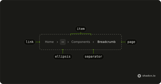
Links for the parent pages, with this page at the end.
Use it when the screen has a parent worth returning to, such as a product inside a category. A Navigation Menu is the site-wide nav, not this path. In Svelte, Ark UI marks the current page so the last item is text, not a link.
Installation
Anatomy
Usage
<script lang="ts">
import {
  Breadcrumb, BreadcrumbEllipsis, BreadcrumbItem, BreadcrumbLink,
  BreadcrumbList, BreadcrumbPage, BreadcrumbSeparator,
} from "@/components/ui/breadcrumb";
import { Button } from "@/components/ui/button";
import {
  Menu, MenuContent, MenuGroup, MenuItem, MenuTrigger,
} from "@/components/ui/menu";
</script>
<Breadcrumb>
  <BreadcrumbList>
    <BreadcrumbItem>
      <BreadcrumbLink>
        {#snippet asChild(props)}
          <a {...props()} href="#">Home</a>
        {/snippet}
      </BreadcrumbLink>
    </BreadcrumbItem>
    <BreadcrumbSeparator />
    <BreadcrumbItem>
      <Menu positioning={{ placement: "bottom-start" }}>
        <MenuTrigger>
          {#snippet asChild(props)}
            <Button {...props()} size="icon-sm" variant="ghost">
              <BreadcrumbEllipsis />
              <span class="sr-only">Toggle menu</span>
            </Button>
          {/snippet}
        </MenuTrigger>
        <MenuContent>
          <MenuGroup>
            <MenuItem value="documentation">Documentation</MenuItem>
            <MenuItem value="themes">Themes</MenuItem>
            <MenuItem value="github">GitHub</MenuItem>
          </MenuGroup>
        </MenuContent>
      </Menu>
    </BreadcrumbItem>
    <BreadcrumbSeparator />
    <BreadcrumbItem>
      <BreadcrumbLink>
        {#snippet asChild(props)}
          <a {...props()} href="#">Components</a>
        {/snippet}
      </BreadcrumbLink>
    </BreadcrumbItem>
    <BreadcrumbSeparator />
    <BreadcrumbItem>
      <BreadcrumbPage>Breadcrumb</BreadcrumbPage>
    </BreadcrumbItem>
  </BreadcrumbList>
</Breadcrumb>
Accessibility
- Enter
- Activate the focused control.
- Space
- Activate the focused control.
- Arrow Down
- Move down.
- Arrow Up
- Move up.
- Arrow Left
- Move left.
- Arrow Right
- Move right.
- Home
- Go to the start.
- End
- Go to the end.
Demos
Basic
Home, Components, and the current page sit in a row with the default separator, and the first two are links. The last is BreadcrumbPage, so it is text with the current-page state and not something you can activate. Use this shape whenever the trail is short enough to show in full. The ellipsis and the dropdown are for trails that do not fit.
Separator
A dot replaces the default chevron between crumbs. The icon is the separator's child, and it is hidden from assistive tech because the list already conveys the order. Swap the mark when the product has its own trail glyph. Use one style for the whole site, or the path starts to look assembled from different kits.
Dropdown
Components is a button that opens a menu of Documentation, Themes, and GitHub, sitting between Home and the current page. The menu is an ordinary menu inside a breadcrumb item, not a special breadcrumb part. Use it when a middle level has siblings the person might jump to, such as other sections under the same parent. If there is only one place to go, a plain link is enough.
Ellipsis
The middle of a long trail collapses to a horizontal ellipsis between Home and Components. It is a visual stand-in, not a control, so nothing opens when it is activated. Use it when you must show the start and the end but the middle levels do not fit. If those middle levels matter, put them in a menu on the ellipsis instead of leaving a dead mark.
Link
The crumbs are the router's link, so client navigation stays inside the app instead of a full load. Home and Components both point at real routes. Do this on any trail in an app with its own router. A plain anchor is fine when a full page load is acceptable, and the current page stays text either way.
Rtl
The trail is Arabic: a home link, a middle item, and the current page, with dots between them. The middle item opens a menu of sibling pages, aligned to the end of the line. dir on the breadcrumb is what reverses the order. The current page stays plain text, same as in the other trails.
FAQ
How do I mark the current page in a Breadcrumb?
End the trail with BreadcrumbPage instead of a link: it renders plain text with aria-current="page", so screen readers announce where you are. A link to the page you're already on adds nothing.
How do I use a Breadcrumb with Next.js Link or my router in Svelte?
Pass asChild to BreadcrumbLink and spread the props it gives you on your link.
How do I change the Breadcrumb separator to a slash?
Put your own content inside BreadcrumbSeparator, such as a slash or a dot icon; it shows a chevron when empty. The Separator demo uses a slash.
How do I shorten a long Breadcrumb on mobile?
Collapse the middle items into a BreadcrumbEllipsis, or into a Dropdown Menu of the hidden levels, and keep the first item and the current page visible. The Ellipsis and Dropdown demos show both.
Does the Ark UI Breadcrumb support right-to-left languages?
Yes. In a right-to-left layout the trail reads from the right, as the RTL demo shows. Check that your separator points the way the trail reads; a slash reads the same in both directions.
API Reference
Breadcrumb
<nav> data-slot="breadcrumb"
asChild?Snippet<[PropsFn]>
Render your own element: a snippet that gets the part's props to spread on it.
- Type
Snippet<[PropsFn]>
class?string
Merged with the part's classes.
BreadcrumbList
<ol> data-slot="breadcrumb-list"
asChild?Snippet<[PropsFn]>
Render your own element: a snippet that gets the part's props to spread on it.
- Type
Snippet<[PropsFn]>
class?string
Merged with the part's classes.
BreadcrumbItem
<li> data-slot="breadcrumb-item"
asChild?Snippet<[PropsFn]>
Render your own element: a snippet that gets the part's props to spread on it.
- Type
Snippet<[PropsFn]>
class?string
Merged with the part's classes.
BreadcrumbLink
<a> data-slot="breadcrumb-link"
asChild?Snippet<[PropsFn]>
Render your own element: a snippet that gets the part's props to spread on it.
- Type
Snippet<[PropsFn]>
class?string
Merged with the part's classes.
BreadcrumbPage
<span> data-slot="breadcrumb-page"
asChild?Snippet<[PropsFn]>
Render your own element: a snippet that gets the part's props to spread on it.
- Type
Snippet<[PropsFn]>
class?string
Merged with the part's classes.
BreadcrumbSeparator
<li> data-slot="breadcrumb-separator"
asChild?Snippet<[PropsFn]>
Render your own element: a snippet that gets the part's props to spread on it.
- Type
Snippet<[PropsFn]>
class?string
Merged with the part's classes.
BreadcrumbEllipsis
<span> data-slot="breadcrumb-ellipsis"
asChild?Snippet<[PropsFn]>
Render your own element: a snippet that gets the part's props to spread on it.
- Type
Snippet<[PropsFn]>
class?string
Merged with the part's classes.
With other components
Dropdown Menu
MenusHidden ancestors in a menu
Button
ButtonsGhost trigger for ellipsis
Pagination
NavigationSiblings, not ancestors
Navigation Menu
NavigationThe site header
Sidebar
NavigationVertical docs tree
Sheet
OverlaysFull trail on phones