shadcn.io is not affiliated with official shadcn/ui
Put a colored dot beside a label such as Online, Busy, or Failed. The label says what the color means.
Use it when people should scan the state and the label already names it. If the label is the whole message, such as a tag or a count, use a Badge. In Svelte, Ark UI hides the dot from assistive tech, so keep the text.
Installation
Anatomy
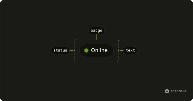
Usage
<script lang="ts">
import { Status } from "@/components/ui/status";
</script>
<div class="flex gap-4">
  <Status />
  <Status variant="success" />
  <Status variant="info" />
  <Status variant="warning" />
  <Status variant="destructive" />
</div>
Demos
Custom Color
Pass a background class when none of the five variants matches the color your status key already uses. Amber, teal, and purple stand in for a presence color or a brand state that is not success, warning, or failure. The class replaces the variant fill, while size and the round shape stay. Keep variant at default so two colors are not fighting, and still label the dot.
Custom Size
size only offers small, medium, and large. A utility such as size-4, size-6, or size-8 covers the gap when the dot must match a row height or sit beside an avatar. The ring around it still separates the dot from the page. Prefer the size prop when a preset is close, and a utility only when the presets look wrong next to the type.
Size Lg
size set to lg is the largest preset dot, shown here in the info color. Use it beside a title or in a sparse header, where a smaller dot disappears into the type. In a dense table it reads as a bullet that is too heavy for the row. It is still decorative, so the word next to it has to carry the meaning.
Size Md
size set to md is the default, worth writing down only when the markup should show the choice. At that size the info dot sits beside body text and inside an outline badge without crowding the line. Use it for lists, table cells, and account rows. Drop to small when several dots share a cramped line, and save large for headings.
Size Sm
size set to sm is the tight dot for a badge or a dense list, where a larger one would change the line height. Small is easy to miss on an open page, so do not let it be the only signal there. The ring still lifts it off the background, and medium is the safer preset when someone has to spot the dot at a glance.
Variant Default
variant set to default uses the foreground color, not a status hue, so it reads as present or neutral. Reach for it when success green would overclaim: a draft, an idle member, a feature that is on but neither healthy nor broken. The dot is alone here. Next to real copy, default is also the variant you keep when a custom background class replaces the fill.
Variant Destructive
variant set to destructive is the failure color: offline, a failed build, a payment that did not clear. People already read that hue as stop, so a mild delay should not spend it. The dot is hidden from assistive tech, which means the label has to say Failed or Offline. If the news needs a sentence and a next step, use an alert instead of a dot in a column.
Variant Info
variant set to info is for work that is underway, not finished and not broken: a sync, an open review, a deploy that is still running. The dot should not look like a control. This sample is one info dot at the default size. Use it when that hue already means informational elsewhere in the product, and switch to warning when someone has to act.
Variant Success
variant set to success is the healthy state people scan for: online, a check that passed, a service that is up. Do not spend it on a selected row or a marketing highlight, or the status column stops meaning anything. The dot stands alone here, and beside the word Online, or inside an outline badge, it is enough. A paragraph of good news belongs in an alert.
Variant Warning
variant set to warning covers the gap between fine and failed: pending review, a quota getting close, a service that is degraded. It asks for a look, and it stops meaning that if every mild note uses it. Pair the dot with a word such as Pending, and switch to destructive once something has actually failed.
With Badge
A dot inside an outline badge is the unit for a chip or a table cell: Online, In progress, Pending, Offline. size set to sm keeps the dot from stretching the badge, and each badge picks a different status variant while the badge itself stays outline. The color then comes from the dot rather than from two fills at once.
With Icon
A large status can hold an icon, here a plus, and the glyph scales with size. The dot is aria-hidden, so the icon is hidden with it, which is fine beside a label and wrong when the icon is the only name of the state. Do not hang a click on the status to fake a button. lg fits a glyph, and the smaller presets squash it.
FAQ
What is the Status component used for?
It is a small colored dot that shows the state of something: online or offline, a build passing or failing, a service up or down. Put it next to the text that names the state, or inside a Badge, as the With Badge demo does.
What color variants does the Status dot have?
Five, set with variant: default, success, info, warning and destructive. Each maps to a theme color, so the dots follow your light and dark themes.
How do I give the Status dot a custom color?
Pass a background class, for example bg-amber-500 or bg-teal-500, as the Custom Color demo does. The class replaces the variant's color; the size and shape stay the same.
How do I change the size of the Status dot in Svelte?
Set size to sm, md (the default) or lg. For any other size, pass a size class such as size-4, as the Custom Size demo does; an icon inside it scales with it.
Is the Status dot accessible to screen readers?
The dot is decorative: it renders with aria-hidden="true", so screen readers skip it. Always pair it with text that says the state, like "Online", so the meaning is not carried by color alone.
Should I use a Status dot or a Badge?
Use a Status dot when the state needs to be glanceable and the text sits next to it. Use a Badge when the label itself is the content, like a tag or a count. They combine well: a dot inside a Badge.
API Reference
Status
<span> data-slot="status-indicator"
size?"lg" | "md" | "sm"
The size.
- Type
"lg" | "md" | "sm"- Default
"md"
variant?"default" | "destructive" | "info" | "success" | "warning"
The visual style.
- Type
"default" | "destructive" | "info" | "success" | "warning"- Default
"default"
asChild?Snippet<[PropsFn]>
Render your own element: a snippet that gets the part's props to spread on it.
- Type
Snippet<[PropsFn]>
class?string
Merged with the part's classes.
data-size?string
Mirrors size.