shadcn.io is not affiliated with official shadcn/ui
A ringed giant seen from close by: the planet's limb rises from the bottom of the box as a wide horizon, banded and lit from one side, with a soft haze of atmosphere along it. Its rings sweep across the sky above and dip behind the planet, a bright broad ring, a dark gap and fainter rings beyond, with glints and soft spokes travelling along them, and stars twinkle overhead. The planet, haze and rings are CSS gradients painted once and sized from the container, so the scene fills a card, a banner or a full page; only the glints and the stars move, with transforms and opacity the browser composites without repainting.
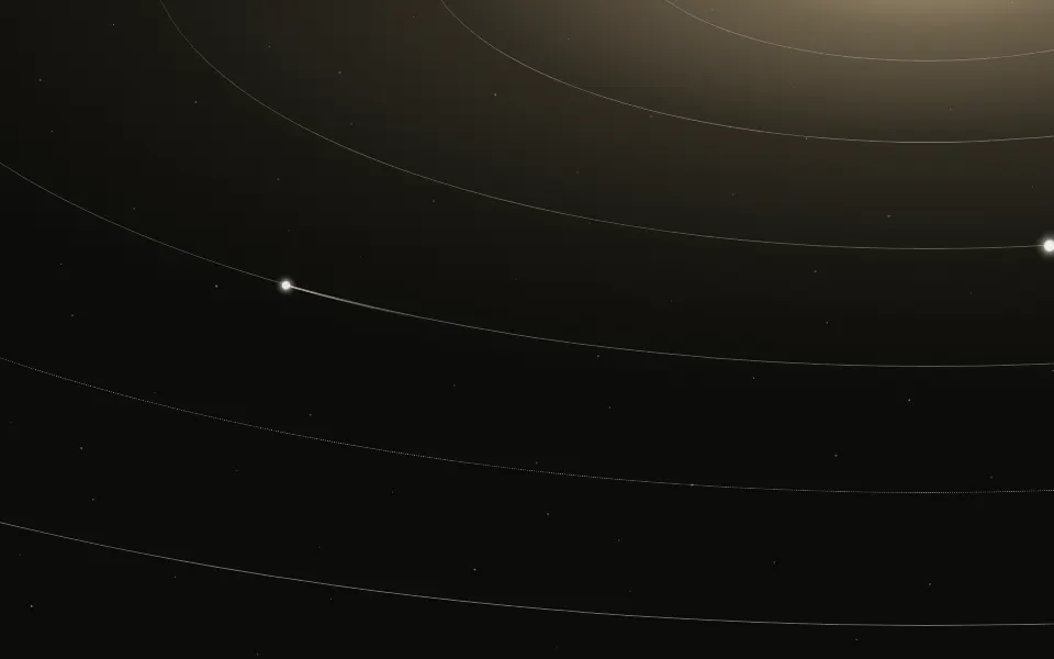
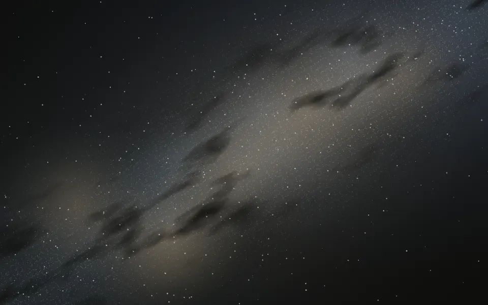
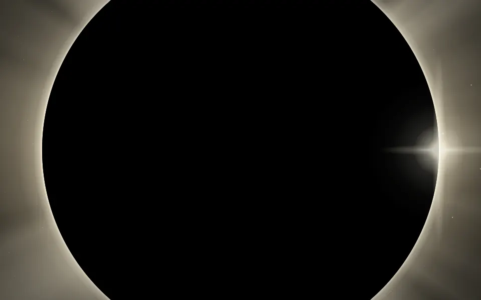
Put the headline in the sky, above the rings. For flat orbits with travelling bodies, use Orbits; for the Milky Way across the whole sky, Galaxy; for a moon framed by its corona, Eclipse.
Installation
Usage
import { Saturn } from "@/components/ui/saturn";<Saturn className="flex min-h-[460px] flex-col items-center justify-start pt-20">
<h1 className="text-5xl font-semibold">Mission to the rings</h1>
<p>Seven years of flybys, now open as one public data set.</p>
</Saturn>Saturn is a container: whatever you put inside sits on top of the scene, in normal flow. The planet fills the bottom third of the box and the rings cross just above it, so keep your copy in the top half. Give the container a height or content. For the whole page, render it empty with className="fixed inset-0 -z-10". On a light page it's a pale daylight scene, a soft blue sky over a sandy planet; on a dark page, deep space.
Demos
Tilt
tilt tips the rings, in degrees: positive raises them on the start side, negative on the end side, 0 keeps them level with the horizon. Here tilt={-14} with stars={60}, in a card.
Ice giant
planetColor sets the planet, and its bands, shadow and haze are mixed from it; ringColor sets the rings and their glints. The container's dark class and bg-background keep this scene in deep space in both colour schemes.
Accessibility
The scene is decorative: it's hidden from screen readers and never takes the pointer, and your content stays on top in normal flow. With reduced motion the glints and the stars hold still, and the planet and rings stay as a still picture. Nothing flashes; the stars fade in and out over two seconds or more.
Keep text in the sky, in your foreground colour (text-foreground): the sky is your page's background lightly tinted, so it reads as it does anywhere else. The bright ring and the lit planet are mid-tones in both colour schemes, so keep text off them.
FAQ
Where does the planet sit?
Its limb rises from the bottom edge: the planet's radius is 130% of the container's width and its top sits about 70% down the box, so you see a wide, gently curved horizon at any size, never a small planet in the middle. The rings follow the same centre.
How do I tip the rings?
Pass tilt in degrees: 7 by default, which raises them on the start side; a negative value raises the end side, and 0 levels them. You can also set --saturn-tilt (a number of degrees) in your CSS.
How do I recolour it?
planetColor sets the planet, and its bands, shadow and haze are mixed from it; ringColor sets the rings, whose fainter parts and glints are mixed from it. Both take any CSS colour, or set --saturn-planet and --saturn-ring in your CSS.
What moves?
Glints and soft spokes of light travel along the rings, one box width every two minutes, and two thirds of the stars twinkle. The planet and the rings are painted once. speed scales it all.
Will it slow my page down?
No. It's gradients and CSS keyframes, with no canvas and no script: the glints slide with translate under a mask of the rings and the stars fade with opacity, which the browser composites without repainting.
API Reference
Saturn
<div> data-slot="saturn"
planetColor?string
The planet's colour, any CSS colour: its bands, shadow and haze are mixed from it. By default a pale butterscotch.
ringColor?string
The rings' colour, any CSS colour: the bright ring, the fainter ones and the glints are mixed from it. By default a warm cream, tan on a light page.
speed?number
How fast the glints travel round the rings and the stars twinkle: 2 is twice as fast, 0.5 half as fast.
- Default
1
stars?number
How many stars fill the sky, from 0 to 300; two in three twinkle.
- Default
120
tilt?number
How far the rings tip, in degrees: positive raises them on the start side (the left, or the right on a right-to-left page), 0 keeps them level with the horizon.
- Default
7
render?ReactElement | ((props: object, state: object) => ReactElement)
Replace the host element or compose it with another component.
- Type
ReactElement | ((props: object, state: object) => ReactElement)
className?string
Merged with the part's classes.
--saturn-planetstring
The planet's colour (butterscotch).
--saturn-ringstring
The rings' colour (warm cream; tan in light mode).
--saturn-skystring--saturn-speedstring
How fast the glints and stars move (1).
--saturn-tiltstring
How far the rings tip, in degrees (7).
Related
- Pro
Orbits Background
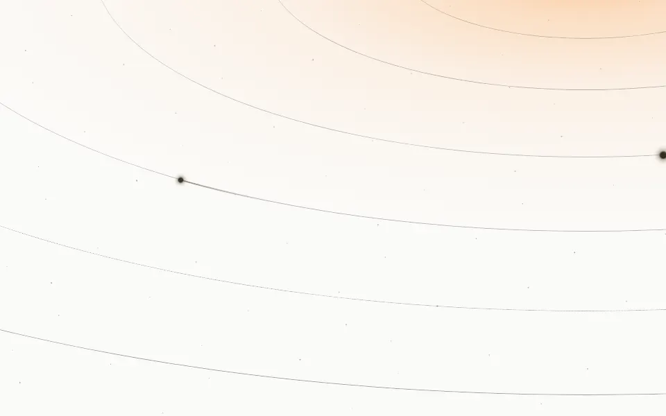
SpaceOrbits seen from low down, with travelling bodies
- Pro
Galaxy Background
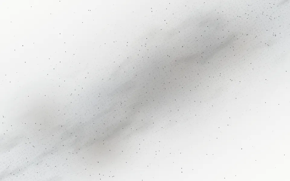
SpaceThe Milky Way across the whole sky
- Pro
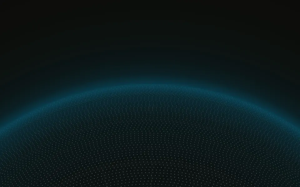
Sphere Background
GenerativeA huge dotted globe as a horizon
- Pro
Eclipse Background
SpaceA moon framed by its corona, instead of rings
- Pro
Portal Background
LightGlowing rings receding into a tunnel
- Pro
Nebula Background
SpaceJust the sky, clouds and stars without a planet