shadcn.io is not affiliated with official shadcn/ui
Fluted Glass Shader drifts three soft color fields, coral, violet and a peach glow, behind a panel of vertical reeded glass. Each rib is a small cylinder lens: it squeezes a wide slice of the color beneath it into its own width and flips it toward its edges, so a smooth gradient breaks into ribbed bands. A soft groove shadow sits between the ribs and a thin highlight runs down each one. A WGSL fragment shader on WebGPU draws every pixel each frame: the colors blend in OKLab, so their mixes stay bright rather than muddy, and red, green and blue bend by slightly different amounts, which fringes the rib edges.
Use it behind a SaaS hero, a launch page or a pricing card, and pass your brand's colors. For clear drops that bend a ruled page instead, use Liquid Glass Shader; for the bare color fields with no glass, in plain CSS, the Mesh Gradient background. It runs only while it's on screen, holds a still frame with reduced motion, and shows the same colors behind a CSS rib pattern in browsers without WebGPU.
Installation
Usage
import { FlutedGlassShader } from "@/components/ui/fluted-glass-shader";<FlutedGlassShader className="flex min-h-[32rem] items-center justify-center">
<h1 className="text-5xl font-semibold text-white">Ship faster</h1>
</FlutedGlassShader>Fluted Glass Shader is a container: your content sits on top of the glass, in normal flow. It fills its own box, so give it a height or content. For a backdrop behind the whole page, render it empty with className="fixed inset-0 -z-10".
On the default dark ground, use white text. It reads at 10:1 on half the frame, but the peach and coral glows are bright: over them white falls to about 2:1, so keep white for large headlines there, or set the copy on a panel. In the lower 40% of the box, white keeps about 4.5:1 or better on 99% of pixels. On a light backgroundColor, use dark text.
Demos
In a card
colors takes your theme's variables, here var(--chart-1), var(--chart-3) and var(--chart-5), and the glass follows a theme switch. ribs={16} sets wider ribs for a small surface; the ribs are counted across the box, so they keep their number at any size.
Horizontal, on light
angle={90} turns the ribs horizontal, like a frosted partition, and backgroundColor="#f6f1ea" sets the colors on warm paper. The fields blend over the ground in OKLab, so the light version stays clean and pastel.
Performance
About 0.2 ms of GPU time a frame at 1280×720 on an M2 Max laptop; slower GPUs take several times longer. The rib edges are crisp, so it renders at full resolution; quality={0.5} softens them. The animation stops when the shader scrolls out of view, and the browser pauses it in a hidden tab. Every shader on a page shares one GPU device and one frame loop, and vgpu (about 50 KB gzipped) loads only when the first one mounts.
Browser support
The shader needs WebGPU: Chrome and Edge, Safari 26 and later, and Firefox on Windows and macOS. Elsewhere, and until the first frame, the box shows a CSS gradient of the same colors behind vertical ribs, so the layout never jumps. data-state on the root reads unsupported there, if you want to style around it. See Shader Canvas.
Accessibility
The glass is decoration: it's hidden from assistive tech and lets every click through to your content. With reduced motion it draws one still frame and stops. Nothing flashes: the colors drift across the ribs over tens of seconds. For text contrast, see Usage: white text reads on the dark ground and the violet, less so on the coral and peach glows.
FAQ
Can I use my brand colors?
Yes. colors takes up to three CSS colors, theme variables included, such as ["var(--primary)", "var(--chart-2)", "#ffc48a"]; with fewer, they repeat. backgroundColor sets the ground, and intensity the saturation, from 0 (grey) to 2. Theme variables follow a theme switch.
How do I change the ribs?
ribs sets how many fit across the box, from 8 (wide flutes) to 96 (fine reeding), and angle their direction in degrees, 0 vertical and 90 horizontal. refraction sets how hard each rib bends the color, from 0 (flat glass, just grooves) to 2.
What do frost and dispersion do?
frost scatters each pixel's view a little, which gives the glass a fine frosted grain, from 0 (clear) to 1. dispersion bends red, green and blue by slightly different amounts, which puts thin rainbow fringes on the rib edges, from 0 to 1.
Can the ribs refract my page content?
No. The shader draws its own color fields and bends those: WebGPU can't read the HTML behind the canvas. For a fluted panel over real content, CSS backdrop-filter with a repeating gradient mask is the closest you'll get.
API Reference
FlutedGlassShader
data-slot="fluted-glass-shader"
angle?number
The direction of the ribs in degrees, from -90 to 90: 0 is vertical, 90 horizontal. @default 0.
- Default
0
backgroundColor?string
The ground behind the colour. Any CSS colour. @default "#120f1a".
- Default
"#120f1a"
colors?string[]
The three colour fields behind the glass, any CSS colours; fewer repeat. @default ["#ff6a3d", "#7c5cff", "#ffc48a"].
- Default
COLORS
dispersion?number
The rainbow split at each rib's edges, from 0 (none) to 1. @default 0.25.
- Default
0.25
fallback?string
What shows until the first frame and in browsers without WebGPU: a CSS
background value (gradients, sizes, a colour) that looks like the
shader. It can use the colour props' --shader-<field> variables.
frost?number
A frosted grain in the glass, from 0 (clear) to 1. @default 0.2.
- Default
0.2
intensity?number
Colour saturation, from 0 (grey) to 2 (vivid). @default 1.
- Default
1
interactive?boolean
Whether u.pointer follows the pointer. @default false.
paused?boolean
Holds the current frame. @default false.
quality?number
Render scale, from 0.25 to 1, of the screen's pixels (capped at 2×). @default 1.
refraction?number
How strongly each rib squeezes and mirrors the colour, from 0 (flat) to 2. @default 1.
- Default
1
ribs?number
How many ribs fit across the box, from 8 to 96. @default 32.
- Default
32
speed?number
Animation speed: 1 is normal, 0 holds the frame. @default 1.
time?number
A fixed moment, in seconds: draws it and doesn't animate.
render?ReactElement | ((props: object, state: object) => ReactElement)
Replace the host element or compose it with another component.
- Type
ReactElement | ((props: object, state: object) => ReactElement)
className?string
Forwarded to the part.
Related
- Pro
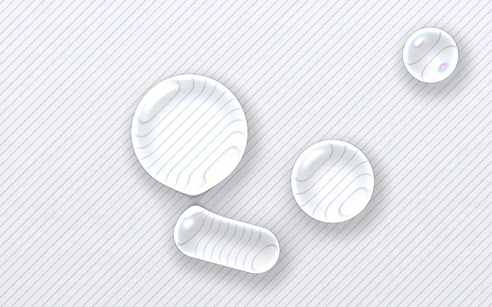
Liquid Glass Shader
Light & glassClear drops that bend a ruled page
- Pro
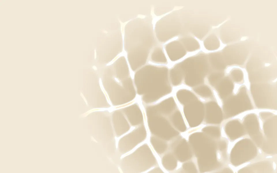
Glass Caustics Shader
Light & glassThe light a glass throws on a table
Gradient Mesh Shader
Flow & gradientsThe color with no glass, bolder, free
Orb Grid Shader
GeometrySoft color under a hairline grid, free and lighter
Dither Gradient Shader
Digital & retroSoft orbs as 1-bit dither, free
Hologram Shader
Light & glassDiagonal bands of blue and violet, free