shadcn.io is not affiliated with official shadcn/ui
Backgrounds
FreeMesh Gradient Background for React
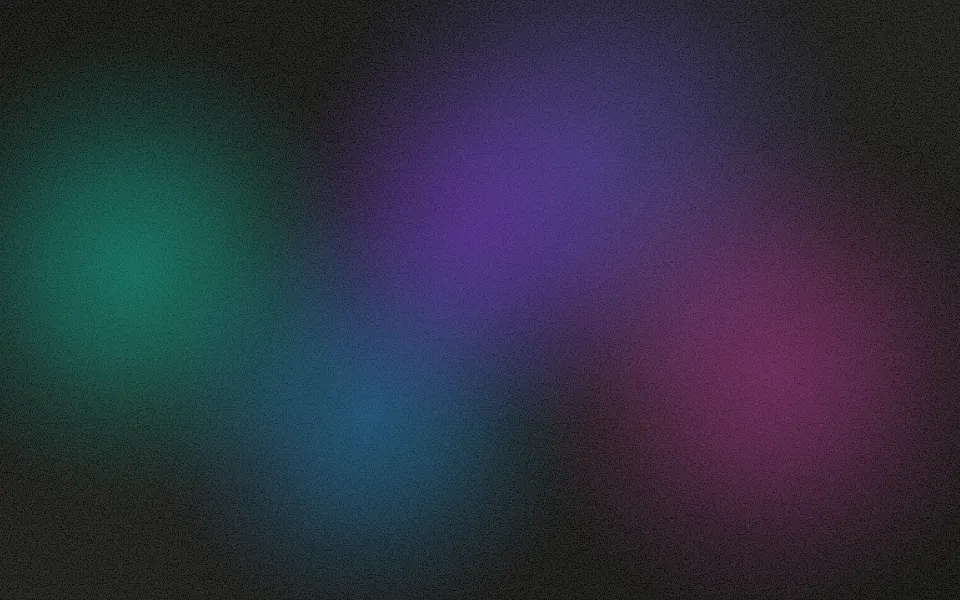
Four large color orbs, one in each corner, that blend into one continuous mesh and drift so slowly you barely see them move. For React with Base UI, when a landing page or a product section needs soft color behind its copy without anything competing with it.
Four large color orbs sit under your content, one held in each corner, each a little larger than the box, so they overlap into one continuous mesh: color in the corners and a calm blend of all four in the middle, where your copy goes. They shift and breathe so slowly you barely see them move, the soft gradient look of many product pages. Each orb is a radial gradient whose stops ease out to transparent, so it looks blurred without a blur filter, and CSS keyframes move and scale it along its own short path with transforms, which the browser composites without repainting. On a dark surface the orbs are stronger and lifted toward white, so the hues stay distinct on near-black instead of turning murky. A fine, still grain hides the color banding soft gradients show on dark screens. There's no script.
It's the safe default behind a hero or a pricing section. For bolder blobs that roam the whole box, use Gradient; for very large fields that orbit and blend into new hues, Gradient Animation; for color in drifting bands, Aurora; for grey mist instead of color, Fog. With reduced motion the orbs rest where they start.
Installation
Usage
import { MeshGradient } from "@/components/ui/mesh-gradient";<MeshGradient className="flex min-h-[32rem] items-center justify-center">
<h1 className="text-5xl font-semibold">Ship the product page</h1>
</MeshGradient>Mesh Gradient is a container: whatever you put inside sits on top of the color, in normal flow. It fills its own box, so give it a height or content. For a backdrop behind the whole page, render it empty with className="fixed inset-0 -z-10".
Demos
Midnight
The surface is the root's own background, bg-background by default, and nothing in the orbs depends on it: className="bg-[#030014]" gives the deep indigo look. The orbs have their own dark tuning, stronger and a little lighter, where the same color would read faint and murky; the dark class here keeps that tuning and light text in both color schemes.
Colors
colors takes up to four CSS colors, one per corner from the top left, clockwise, repeated when there are fewer; here rose, amber, orange and pink. Theme variables such as var(--chart-1) make the orbs follow your theme. The orbs are sized in shares of the box, so a card gets the same composition as a full page.
Accessibility
The orbs are decoration: they're hidden from assistive tech and let every click through to your content. With reduced motion they stop where they start, and the soft color field stays. Nothing flashes.
Put copy over it in your foreground color (text-foreground). At the default intensity it stays above 6:1 on a light surface and above 4.5:1 on a dark one, at the worst moment and at any size of box; a muted color drops to about 2.5:1 over the orbs, which is too low for small text, and intensity="strong" brings everything lower.
FAQ
How do I change the colors?
Pass up to four CSS colors to colors, in any format: hex, rgb(), oklch() or a theme variable such as var(--primary). Fewer are repeated. You can also set --mesh-gradient-color-1 to --mesh-gradient-color-4 in your CSS.
Why does it move so little?
Each orb takes 60 to 90 seconds per loop and strays only a few percent from its corner, so the page feels alive without the motion pulling at the eye, and no corner ever empties. speed makes it faster: 2 is twice as fast.
Is it heavy?
No. Four gradient elements move with translate and scale, which the browser composites without repainting; there's no blur filter and no JavaScript.
Does it work in light and dark mode?
Yes, with a tuning for each. Over a light surface the colors are a soft pastel mesh; over a dark one they're stronger and lifted toward white, so violet, blue and cyan stay distinct instead of sinking into the black. intensity makes them fainter or stronger in both.
How do I get the dark indigo look?
Set the root's background, for example className="bg-[#030014]", and use white text. intensity="strong" brings the orbs out on it.
API Reference
MeshGradient
<div> data-slot="mesh-gradient"
colors?string[]
Up to four CSS colors for the orbs, one per corner from the top left,
clockwise, repeated when there are fewer. By default violet, blue,
cyan and violet; pass theme variables such as var(--chart-1) to
follow your theme.
grain?boolean
A fine, still grain over the colors, which hides the banding faint gradients show on dark screens.
- Default
true
intensity?"subtle" | "medium" | "strong"
How strongly the orbs show over the surface.
- Type
"subtle" | "medium" | "strong"- Default
"medium"
speed?number
How fast the orbs drift: 2 is twice as fast, 0.5 half as fast.
- Default
1
render?ReactElement | ((props: object, state: object) => ReactElement)
Replace the host element or compose it with another component.
- Type
ReactElement | ((props: object, state: object) => ReactElement)
className?string
Merged with the part's classes.
--mesh-gradient-color-1string
The top-left orb (violet).
--mesh-gradient-color-2string
The top-right orb (blue).
--mesh-gradient-color-3string
The bottom-right orb (cyan).
--mesh-gradient-color-4string
The bottom-left orb (light violet).
--mesh-gradient-speedstring
The drift's speed, a multiplier (1).
--mesh-gradient-strengthstring
The orbs' strength, a multiplier of their alpha (1).
Related
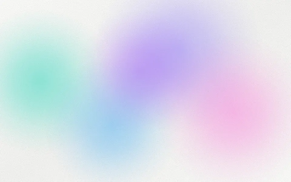
Gradient Background
GradientsBolder, roaming blobs with film grain
- Pro
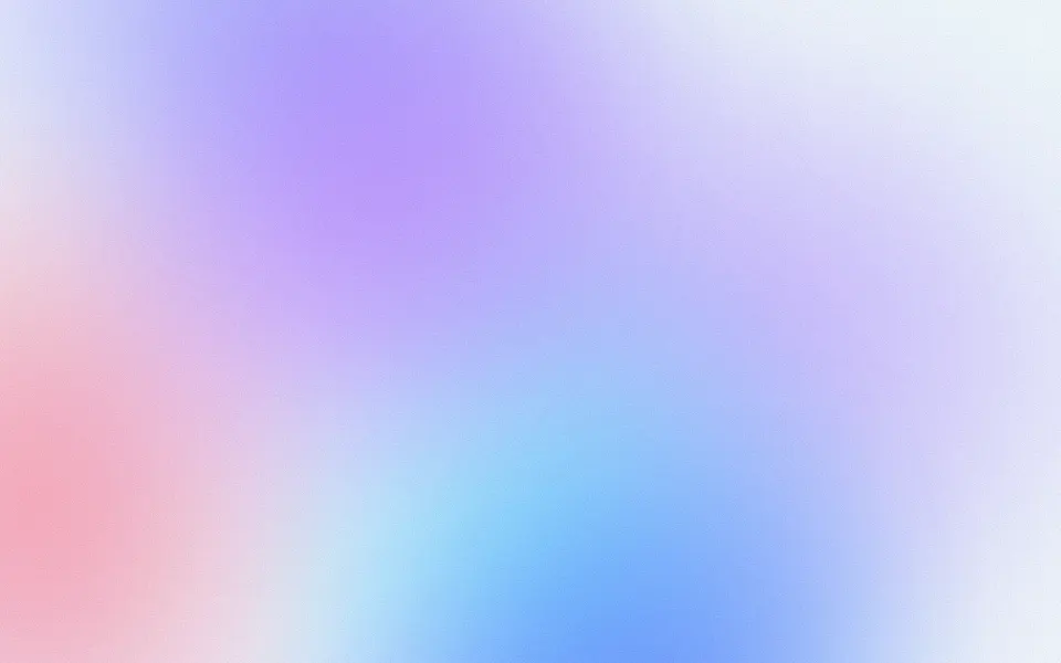
Gradient Animation Background
GradientsVery large fields that orbit and blend into new hues
Aurora Background
SpaceColour in bands instead of orbs, free
Fog Background
WeatherGrey mist instead of colour
- Pro
Grain Background
TextureAnimated film grain to layer on top
- Pro
Silk Background
GradientsFlowing satin colour