Xbox Design System
Xbox.com's design system as a DESIGN.md file. Heritage green #107c10, Game Pass lime #9bf00b, 27 colors, 18 components. For React, Next.js, AI tools.
Add shadcn.io to your AI agent. · Pro It installs blocks, icons and templates in your design system from a prompt, with Pro.
Set up MCP- Primary
- #107c10
- Typeface
- Segoe UI
- Shape
- Sharp
- Base radius
- 0px
- Colors
- 27
- Type tokens
- 12
- Components
- 18
- Spacing values
- 9
About
About Xbox DESIGN.md
Curated by Dov Azencot · Updated May 13, 2026 · Source xbox.com (opens in a new tab)
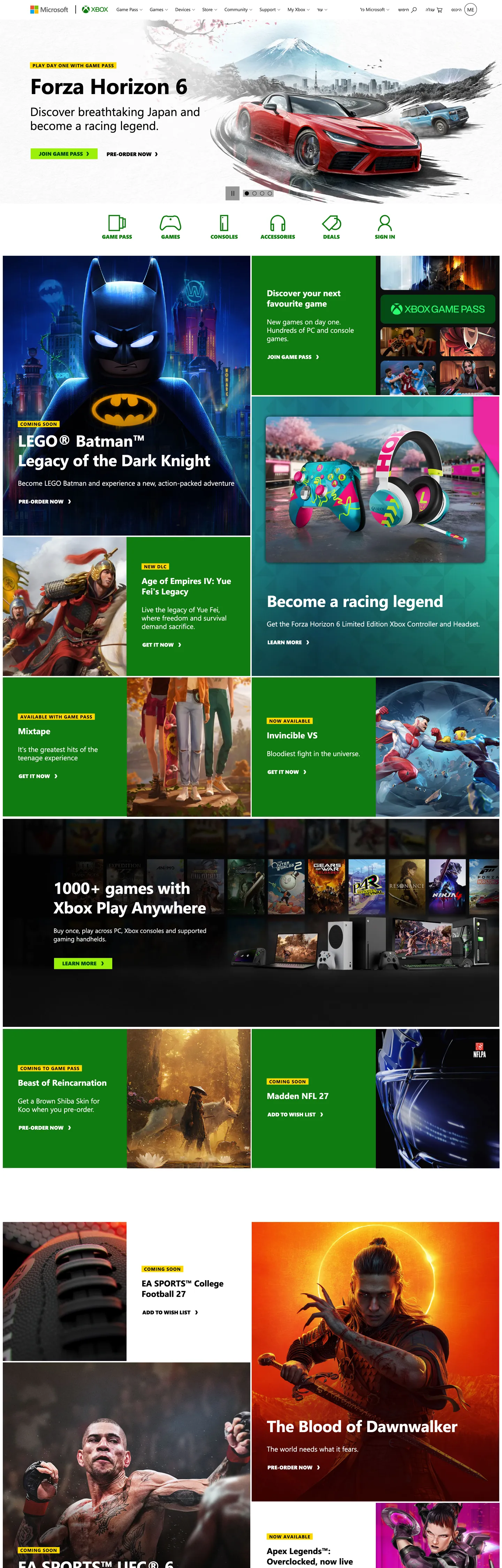
Xbox.com is what a console brand looks like when it commits to the color-block tile as the page's atomic unit. The home surface stacks a near-black "#171717" hero band over a vertical mosaic of large rectangular tiles — green Game Pass slabs, yellow ad alerts, red game-art panels, black product cards — each one capped in a 13px uppercase SegoeProBlack eyebrow ("XBOX GAME PASS", "GAMES", "ACCESSORIES") and titled at 24px weight 700 Segoe UI. Where PlayStation runs a three-canvas chapter rhythm and Nintendo runs a 12px-radius catalog grid on white, Xbox runs a hard-edged tile collage: every surface is a rectangle, every corner is 0px, and the tile fill colors do the structural work that hairlines and shadows would do elsewhere.
This file packages the chrome as a Google Labs DESIGN.md spec. Inside: 27 colors tokens covering the two-green voltage (heritage "#107c10" and Game Pass lime "#9bf00b"), the dark canvas ladder ("#000000" / "#171717" / "#262626"), the gray ink ladder ("#616161" workhorse, "#333333" deep, "#505050" mid), the yellow alert "#ffd800", the Bootstrap-derived semantic palette (--blue "#0067b8", --red "#dc3545", --orange "#d83b01", --purple "#8661c5", --teal "#008575", --cyan "#30e5d0", --pink "#e83e8c", --indigo "#243a5e") declared as tokens but at 0 page uses; 12 typography roles split across Segoe UI body and SegoeProBlack display/CTA; a 4-step radius scale where 0px carries every surface and 50% appears only on circular feature icons; an 8-step spacing rhythm extracted from the page's actual padding values (2px, 4px, 5px, 8px, 16px, 24px, 36px, 43.2px, 72px); and 18 components recipes covering the JOIN GAME PASS lime button, the dark hero band, the color-block tile family, the yellow alert ribbon, and the SegoeProBlack uppercase eyebrow label.
Feed the file to Claude, Cursor, or GitHub Copilot and the agent will produce React components that match Xbox's actual chrome — lime CTAs on dark text, SegoeProBlack uppercase eyebrows, sharp 0px tiles on a dark canvas, and the yellow alert ribbon. Or reference the tokens directly when building any storefront where the product mosaic is the hero. The system's value as a study is that it proves a console brand can refuse Nintendo's white-canvas catalog AND PlayStation's chapter rhythm — the tile collage is its own grammar, and the two-green split (heritage versus Game Pass) is the named voltage move worth stealing.
What makes it distinct
5
- Two-green voltage systemheritage Xbox green '#107c10' for trust slots, Game Pass lime '#9bf00b' for the load-bearing CTA fill on dark '#054b16' ink
- SegoeProBlack at weight 900every CTA renders in proprietary uppercase 15px black with no tracking softening, the brand's typographic muscle move
- Sharp 0px corners on every chrome surfaceonly '50%' radius appears (circular feature icons), no card-radius rhythm at all
- Yellow alert eyebrow '#ffd800' on black inkthe persistent badge format that lets each color-block tile shout its product category
- Bootstrap semantic palette tokenized but unused on chrome'--blue', '--red', '--orange', '--purple', '--teal' all declared at 0 page uses, scoped to error/dev surfaces only
xbox.com
Live at xbox.com
A snapshot of the brand in production. Scroll the frame to see the whole page.
Colors
27 colors
Xbox's system runs on #107c10 as its primary voltage, used in 5 of 18 components. Type is set in Segoe UI across 12 tokens from 11px to 62px, weights 400–900. Shape language is sharp — components average 0px corner radius, favoring crisp rectangles.
Brand & Accent
Sparing, CTA-only voltage · 2
Surface
Page and card backgrounds · 5
Text
Headlines, body, captions · 8
Borders & Hairlines
Dividers, outlines, rules · 1
Semantic
Status, errors, success, links · 1
Other
Specialty colors · 10
Typography
12 type tokens
Set in Segoe UI across 12 tokens, from 11px to 62px, weights 400–900. Shown in its own stack: where the font isn't installed, the fallback the file names stands in.
- display-xl62px · weight 700 · lh 72px · tracking -0.62pxThe quick brown fox jumps over the lazy dog
- display-lg46px · weight 700 · lh 56px · tracking -0.46pxThe quick brown fox jumps over the lazy dog
- display-md34px · weight 400 · lh 40px · tracking 0pxThe quick brown fox jumps over the lazy dog
- heading-lg24px · weight 700 · lh 30px · tracking 0pxThe quick brown fox jumps over the lazy dog
- body-lg20px · weight 400 · lh 24px · tracking 0pxThe quick brown fox jumps over the lazy dog
- body-md18px · weight 400 · lh 24px · tracking 0pxThe quick brown fox jumps over the lazy dog
- body-sm15px · weight 400 · lh 20px · tracking 0pxThe quick brown fox jumps over the lazy dog
- body-xs13px · weight 400 · lh 19.5px · tracking 0pxThe quick brown fox jumps over the lazy dog
- meta-xs11px · weight 400 · lh 16px · tracking 0pxThe quick brown fox jumps over the lazy dog
- eyebrow-bold13px · weight 700 · lh 16px · tracking 0.975pxThe quick brown fox jumps over the lazy dog
- cta-black15px · weight 900 · lh 18.5px · tracking 0pxThe quick brown fox jumps over the lazy dog
- eyebrow-black15px · weight 600 · lh 23px · tracking 0pxThe quick brown fox jumps over the lazy dog
Layout
Radii and spacing
4 corner radii and 9 spacing values. Shape language: sharp.
Radii
- none0px
- sm0px
- md0px
- full50%
Spacing
- xxs2px
- xs4px
- sm5px
- md8px
- base16px
- lg24px
- xl36px
- 2xl43.2px
- 3xl72px
Components
18 components
Each rendered from its tokens (color, type, radius, padding) on Xbox's own canvas.
- Top Navtop-navTop Nav
- Nav Linknav-linkNav Link
- Button Primarybutton-primaryButton Primary
- Button Primary Hoverbutton-primary-hoverButton Primary Hover
- Button Secondarybutton-secondaryButton Secondary
- Button Tertiarybutton-tertiaryButton Tertiary
- Hero Bandhero-bandHero Band
- Tile Game Passtile-game-passTile Game Pass
- Tile Producttile-productTile Product
- Tile Featuretile-featureTile Feature
- Alert Ribbonalert-ribbonAlert Ribbon
- Eyebrow Tageyebrow-tagEyebrow Tag
- Feature Iconfeature-iconFeature Icon
- Checklist Iconchecklist-iconChecklist Icon
- Video Fragment Btnvideo-fragment-btnVideo Fragment Btn
- Type here…text-inputText Input
- Footer Bandfooter-bandFooter Band
- Body Paragraphbody-paragraphBody Paragraph
In use
The system, in use
Xbox's tokens on the kind of product it builds.
Build something people actually use.
A short paragraph of marketing copy that previews how the brand's display tier and body tier read together. Two sentences is usually enough.
FAQ
Xbox design system FAQ
Common questions about Xbox's tokens, components, and how to use this DESIGN.md in your project.
Read next
Related reading
Specs, directories, and component libraries that pair with this design system.
- Browse all design systemsThe full directory of DESIGN.md files on shadcn.io, with live mockups for each.shadcn.io
- Xbox — official siteThe live source of this design system.xbox.com (opens in a new tab)
- The DESIGN.md specificationGoogle Labs' open spec for machine-readable design system files.github.com (opens in a new tab)
Use it
Use Xbox in your project
One machine-readable file. Drop it into Claude, Cursor, or any AI tool that reads DESIGN.md.
Download the DESIGN.md
One machine-readable file: every color, type, radius, spacing, and component token of Xbox.
Feed it to your AI tool
Drop it into Claude, Cursor, or GitHub Copilot. The agent writes React components and Tailwind classes that match Xbox's visual language.
Reference the tokens directly
Or paste the values into your Tailwind config, CSS variables, or component library: every color, size and radius is a quoted, ready-to-copy value.
Read the full DESIGN.md: overview, rationale, do’s and don’ts
Overview
Xbox.com's chrome is a hard-edged tile mosaic on a near-black canvas — what happens when a console brand commits to color-block rectangles as the page's atomic unit and refuses radius entirely. The home page stacks a {colors.canvas-dark} ("#171717") hero band over a vertical mosaic of large rectangular tiles: a green {components.tile-game-pass} slab calling out Game Pass, a yellow {components.alert-ribbon} ribbon at "#ffd800" flagging promotions, a red game-art panel for Forza Horizon 6, and a stack of {components.tile-product} cards for accessories and console SKUs. Each tile carries a 13px uppercase SegoeProBlack eyebrow ("XBOX GAME PASS", "GAMES", "ACCESSORIES") with 0.975px letter-spacing, a 24px / weight 700 Segoe UI title, a 20px body paragraph, and a {components.button-primary} at the bottom — same recipe, fifteen variants down the page.
Two-green voltage: Xbox runs a deliberate split between heritage Xbox green {colors.primary} ("#107c10") — the trust slot, owning --primary, --success, --green, the checklist icons, and the heritage logo — and Game Pass lime {colors.game-pass} ("#9bf00b"), which is the load-bearing CTA fill. The lime never appears on chrome decoration; it is reserved exclusively for the JOIN GAME PASS button family, rendered as a sharp 32px-tall rectangle with {colors.on-game-pass} ("#054b16") deep-green text in SegoeProBlack 900. The two greens never sit on the same surface — heritage green is the brand stamp, lime is the action voltage. Where PlayStation runs one blue and Nintendo runs one red, Xbox runs two greens with a strict role split.
Sharp-edge discipline: Every chrome surface lands at {rounded.none} ("0px"). The only non-zero radius declared on the captured page is "50%" ({rounded.full}) for the circular {components.feature-icon} and {components.video-fragment-btn} — and even the round buttons are a Bootstrap-derived pattern, not a card-radius. Unlike Nintendo's 12px catalog grid or PlayStation's 9999px pill CTAs, Xbox refuses radius entirely and lets the tile fill colors do the visual separation work that hairlines and shadows would do elsewhere. The result reads as industrial console UI rendered on the web — chunky, blocky, no softening.
Key Characteristics:
- Two-green voltage split: heritage
{colors.primary}("#107c10") for trust/badge moments,{colors.game-pass}("#9bf00b") for the load-bearing CTA fill on{colors.on-game-pass}("#054b16") deep-green text - Sharp 0px corners on every surface (
{rounded.none}); the only non-zero radius is"50%"for circular feature icons - SegoeProBlack at weight 900 carries every CTA label and uppercase eyebrow tag — proprietary type doing the typographic muscle work
- Yellow alert ribbon
{colors.alert-bg}("#ffd800") on{colors.alert-text}("#000000") black ink — the eyebrow-tag format that lets each tile shout its product - Dark canvas commitment:
{colors.canvas-dark}("#171717") hero,{colors.canvas-black}("#000000") deep ink,{colors.ink-muted}("#616161") workhorse gray - Bootstrap-derived semantic palette tokenized but unused on chrome —
--blue"#0067b8",--red"#dc3545",--orange"#d83b01",--purple"#8661c5",--teal"#008575",--cyan"#30e5d0",--pink"#e83e8c",--indigo"#243a5e"are declared at:rootwith 0 page uses
Colors
Xbox's palette is structurally three-tier: two greens carrying the brand voltage, a six-step dark canvas + ink ladder doing the structural work, and a single yellow alert tone scoped to ribbons. A Bootstrap-derived semantic ramp sits in the tokens but never reaches chrome.
- Xbox Green (
"#107c10") — frequency 20. Used as text (6), bg (8), border (6). The heritage brand voltage; owns--primary,--success,--green,--pd-hero-checklist-icon. Reserved for the trust slot — checklist icons, status pills, the heritage logo green, the{components.tile-game-pass}interior fill. Rare by count, load-bearing by meaning. - Game Pass Lime (
"#9bf00b") — frequency 3. Used as bg (3). The load-bearing primary-CTA fill: the JOIN GAME PASS button renders at 191px-wide lime with"#054b16"deep-green SegoeProBlack 900 text. Layer is marked "brand" by extraction despite the low count — its semantic weight is far higher than its raw frequency. - Black Canvas (
"#000000") — frequency 329. Used as text (171), border (156), bg (2). The dominant page voltage by count; owns--dark,--secondary,--pd-hero-alert-text,--video-fragment-btn-bg. Carries the deep-ink layer for body copy on light tiles and the dark border meshwork. - On-Dark White (
"#ffffff") — frequency 182. Used as text (95), border (85), bg (2). Owns--white,--light,--pd-hero-text,--video-fragment-btn-color. The on-dark text color and the hairline meshwork on the black footer. - Workhorse Gray (
"#616161") — frequency 144. Used as text (72), border (72). The nav-link color and meta caption ink — the structural ladder middle. Carries every footer link and breadcrumb on the page. - Surface Dark Soft (
"#262626") — frequency 148. Used as text (74), border (74). The deep-ink-on-dark variant; sits one step lighter than"#000000"for headings layered over photography. - Hero Canvas (
"#171717") — frequency 0 raw, declared via--pd-hero-bg. The named hero band background — appears as the top viewport fill above the tile mosaic. - Deep Green Ink (
"#054b16") — frequency 9. Used as text (6), border (3). The on-Game-Pass text color and the deep-shadow green for the lime CTA. Reserved for use on"#9bf00b"fill — never lands on a light or dark canvas directly. - Alert Yellow (
"#ffd800") — frequency 10. Used as bg (10). Owns--pd-hero-alert-bg. The eyebrow ribbon background and tag-tile fill — every promotional callout uses this one yellow on"#000000"ink. - Bootstrap Yellow (
"#ffb900") — frequency 0. Declared as--yellow/--warning. The semantic warning color; never reaches chrome on the captured page but reserved for form validation.
Tokenized-but-unused Bootstrap palette: A full Bootstrap-derived semantic ramp sits at :root — --blue "#0067b8", --red "#dc3545", --orange "#d83b01", --purple "#8661c5", --teal "#008575", --cyan "#30e5d0", --pink "#e83e8c", --indigo "#243a5e", --info "#d2d2d2", --gray-dark "#333333". Every one of these renders at 0 occurrences on the captured marketing page. The system carries them for error states, dev-tool surfaces, and form validation, but the chrome refuses to use them — discipline as voltage scarcity.
Typography
The system runs on two typefaces working in tension. Segoe UI is the Microsoft brand sans-serif covering display and body — declared as --font-family-sans-serif: "Segoe UI", SegoeUI, "Helvetica Neue", Helvetica, Arial, sans-serif and --uhf-font-family. SegoeProBlack is the proprietary uppercase display face — declared inline on CTAs and tile eyebrows, carrying every action label and product-category tag.
The display tier sets at 62px / weight 700 / lineHeight 72px / letter-spacing "-0.62px" on the hero H2 ("Forza Horizon 6"), drops to 46px / weight 700 / lineHeight 56px / letter-spacing "-0.46px" on secondary H2 (count 6 across the page), and again to 24px / weight 700 / 30px lineHeight on tile titles (count 8). Body paragraphs render at 20px / weight 400 / 24px lineHeight (count 11), the body-md tier sits at 18px / weight 400, body-sm at 15px / weight 400, body-xs at 13px / weight 400 / 19.5px lineHeight (count 12 on buttons and span helpers), and the chrome meta-xs at 11px / weight 400 / 16px lineHeight (count 14 on footer links). An eyebrow-bold variant at 13px / weight 700 / 0.975px letter-spacing (count 10) handles section-header tags.
SegoeProBlack as typographic muscle: The CTA-black tier renders at 15px / weight 900 / lineHeight 18.5px on SegoeProBlack, "Segoe UI" fallback (count 16, the most-used display signature on the page). Where Nintendo binds itself to weight 300/600 only and PlayStation commits to weight 300 across display, Xbox reaches for weight 900 on every button — the brand says volume by typographic mass rather than tracking softening or weight restraint. The eyebrow-black variant at 15px / weight 600 / 23px lineHeight handles the secondary uppercase tag-tile callouts. No italics, no medium weights, no condensed widths — the system jumps from regular 400 body to black 900 CTAs with nothing in between.
Layout
The page is a one-column vertical stack capped at a --breakpoint-xl: 1400px desktop max. Within each section, a 2- and 4-column tile mosaic carries the color-block product cards separated by tight 4-8px gutters. The captured spacing scale is built from the page's actual padding values: "2px" (count 17, micro-padding), "4px" (count 11, tight gutters), "5px" (count 10, button padding), "8px" (count 9, small-gap stacking), "16px" and "24px" (the body-rhythm baseline), "36px" (tile inner padding), "43.2px" (count 8, the section side margin — derived from a 2.7rem token), and "72px" (count 6, the section vertical rhythm).
The Bootstrap breakpoint ladder is declared at :root: --breakpoint-xs: 0, --breakpoint-sm: 540px, --breakpoint-md: 860px, --breakpoint-lg: 1084px, --breakpoint-xl: 1400px. The hero pad-pattern "10px 3px 7px 0px" (count 12) shows up as the standard heading drop-shadow offset and the nav-item inner padding. The "24px 0px 4px" value (count 11) carries section-title vertical rhythm. The page does not use a consistent 8px subgrid the way Nintendo does — it uses purpose-built padding values per component, including the unusual "16px 12px 16px 43.2px" (count 4) and "6px 0px 2px" (count 8) recipes that show the chrome was hand-tuned per tile rather than driven by a strict scale.
Elevation & Depth
Xbox's depth model is tile-fill-as-divider — the page has effectively no shadows. The --tw-shadow, --tw-ring-shadow, and --tw-ring-offset-shadow tokens are all zeroed out, meaning the Tailwind ring + shadow stack is initialized to nothing. The shadow column in the extracted color data is 0 across every hex on the page. Cards lift from canvas only by virtue of their fill color differing from the neighboring tile — a black tile sits next to a green tile sits next to a yellow ribbon, and the surface change IS the elevation cue. The only true overlay is the video-fragment button background at rgba(0,0,0,0.6) (--video-fragment-btn-bg) with a hover state at rgba(0,0,0,0.8). Where Nintendo lifts cards with a 1px hairline border and PlayStation uses 8px-radius cards with no shadow, Xbox refuses both — the tile-fill collage is the entire depth system.
Shapes
The radius system is binary: "0px" on every chrome surface, "50%" on circular feature icons. The only captured non-zero radius value on the page is "50%" (count 1), which lives on small decorative icon rings and the video-player play button. Every button, tile, card, alert ribbon, hero band, input, and footer surface renders at exactly 0px corners. There is no 4px, 8px, 12px, or 16px tier — the system genuinely has no card-radius rhythm. This is the system's most opinionated move: every chrome surface is a rectangle with right angles, which makes the chunky SegoeProBlack CTAs read as continuous with the rectangular tile collage rather than as separate floating actions. The hard-edge commitment IS the brand position.
Components
The component recipes mirror the keys in the frontmatter components: block. Every recipe references declared tokens via {colors.x}, {typography.x}, {rounded.x}, {spacing.x}.
{components.top-nav}— black canvas, white-on-dark text,meta-xs11px / weight 400, 48px height, 0px corners. The persistent strip running across the top of every page.{components.nav-link}— transparent background,"#616161"workhorse-gray text,meta-xs11px type, no underline. 69px-wide observed width for "Xbox consoles" link.{components.button-primary}— lime"#9bf00b"fill, deep-green"#054b16"text,cta-blackSegoeProBlack 15px / weight 900, 0px corners,"5px 20px 5px 22px"asymmetric padding, 32px height. The 191px-wide JOIN GAME PASS anchor — the load-bearing CTA on every Game Pass slot.{components.button-primary-hover}— drops to heritage"#107c10"green with white text; the lime-to-heritage swap is the rare moment the two greens touch.{components.button-secondary}— transparent background, white text, 1px white border. The outline variant for "Learn more" placements layered over photography.{components.button-tertiary}— heritage green"#107c10"fill, white text. Used inside{components.tile-game-pass}slabs where a lime button would visually compete with the surrounding green fill.{components.hero-band}—"#171717"canvas, white text,display-xl62px / weight 700, 0px corners,"72px 43.2px"padding. The full-bleed top band carrying the rotating game-art hero.{components.tile-game-pass}— heritage"#107c10"green fill, white text,heading-lg24px / weight 700 title, 0px corners,"24px 36px"padding. The Game Pass marketing tile family — uses the heritage green for the trust signal and pairs with abutton-tertiaryrather than abutton-primarylime CTA inside the tile.{components.tile-product}— black"#000000"canvas tile fill, white text,heading-lgtitle, 0px corners. The deep-canvas card for product SKUs, accessories, and console listings.{components.tile-feature}—"#262626"soft-dark fill, white text,heading-lgtitle. The mid-step elevated tile that sits one stop lighter thantile-productfor grouped product callouts.{components.alert-ribbon}— yellow"#ffd800"fill, black"#000000"ink,eyebrow-bold13px / weight 700 /0.975pxletter-spacing. The promotional ribbon shouting "AVAILABLE NOW" / "PRE-ORDER" across the top of a tile.{components.eyebrow-tag}— yellow"#ffd800"fill, black ink,eyebrow-blackSegoeProBlack 15px / weight 600. The persistent tag carrying product category labels above each tile title.{components.feature-icon}— green"#107c10"fill, white glyph,"50%"radius, 48px square. The circular icon used on the hero benefits list — the rare moment a curve appears on chrome.{components.checklist-icon}— transparent background, green"#107c10"glyph,"50%"radius, 16px square. The check-mark icon on the hero benefits list (--pd-hero-checklist-icon).{components.video-fragment-btn}—rgba(0,0,0,0.6)background, white text and 1px white border,"50%"radius, 40px square. The circular play button for video tiles.{components.text-input}— white canvas, black ink,body-sm15px / weight 400 type, 0px corners, 32px height, 1px"#616161"border. The Bootstrap-derived search field — Xbox keeps it sharp-edged rather than pilling it.{components.footer-band}— black"#000000"canvas,"#616161"workhorse-gray text,meta-xs11px type, 0px corners,"36px 43.2px"padding. The persistent footer mat closing every page.{components.body-paragraph}— transparent background, white text on dark,body-lg20px / weight 400 / 24px lineHeight. The standard prose paragraph inside hero bands and tile bodies.
Do's and Don'ts
- Do reserve
{colors.game-pass}("#9bf00b") for the JOIN GAME PASS button family only. Heritage green{colors.primary}("#107c10") carries the trust slot (checklist icons, status, logo); the lime is the marketing voltage. If you find lime on a chart, a hairline, or a tile-interior fill, you are breaking the two-green split. - Do put every chrome surface at
{rounded.none}("0px"). The only allowed non-zero radius is"50%"on circular icons. A 4px or 8px card radius will read as a generic Bootstrap dashboard, not Xbox. - Do render every CTA in
{typography.cta-black}(SegoeProBlack 15px / weight 900). Dropping the button label to Segoe UI weight 700 will read as off-brand — the proprietary black face is the action voice. - Don't use the Bootstrap-derived
--blue"#0067b8",--red"#dc3545",--orange"#d83b01",--purple"#8661c5", or--teal"#008575"as chrome colors. They are declared at:rootfor form validation and error states only — every one renders at 0 occurrences on the marketing page. Painting a CTA in--bluewill read as a Microsoft 365 surface, not Xbox. - Don't lift product tiles with
box-shadowor hairline borders — Xbox's depth model is tile-fill-as-divider. The--tw-shadowtoken is zeroed out at:root; adding shadows on tiles breaks the rectangular collage composition that defines the home grid. - Don't drop the canvas to a white page — every captured surface sits on
{colors.canvas-dark}("#171717") or{colors.canvas-black}("#000000"). The yellow alert ribbon and green Game Pass tile are scoped per-tile, not a light-theme switch. A white page with green CTAs will read as Microsoft 365 marketing, not Xbox. - Don't pair
{colors.game-pass}lime with{colors.on-dark}white text — the WCAG contrast collapses. The deep-green{colors.on-game-pass}("#054b16") is the only ink color allowed on the lime fill; black would technically work but never appears on the captured chrome. - Don't use the eyebrow yellow
"#ffd800"as a hairline, divider, or text color. It is a ribbon-fill-only token — 10 captured uses, all asbackgroundColor. Using it as a text accent will read as a system warning, not a product tag.
Known Gaps
- Store flow not captured — PDP, cart, checkout, and Xbox account sign-in surfaces use a denser data layout that this homepage extraction does not cover.
- Cloud-gaming and Game Bar chrome — the Xbox Cloud Gaming player UI, the in-OS Game Bar overlay, and the console dashboard chrome are out of scope. Those run a different shape vocabulary (rounded corners, translucent panels) closer to the Fluent Design system than to the marketing chrome captured here.
- Per-game theming — first-party launches (Forza, Halo, Gears) often pull in per-title brand colors that vary outside the documented system; the Forza red panel observed on the captured home is one example of imagery-as-color rather than token usage.
- Bootstrap semantic palette unused —
--blue,--red,--orange,--purple,--teal,--cyan,--pink,--indigo, and--infoare declared at:rootbut used at 0 occurrences on the captured page. Their real usage likely lives on error pages, dev-tool surfaces, and form-validation paths not exercised by the marketing extraction. - Cookie banner not dismissed during capture — the bottom of the captured screenshot may include the consent chrome rather than the live news strip; the JSON token extraction is unaffected.
- Mobile responsive screenshots not captured directly — responsive behavior synthesizes from the Bootstrap breakpoint ladder (
--breakpoint-sm: 540px,--breakpoint-md: 860px,--breakpoint-lg: 1084px,--breakpoint-xl: 1400px) rather than from a separate mobile capture. - Motion captured implicitly, not narrated — the hero carousel rotation, the tile hover lifts, and the video-fragment-button background transition from
rgba(0,0,0,0.6)torgba(0,0,0,0.8)define the system's motion vocabulary but the actual interactions are not described here. - Dark mode is single-canvas, not toggled — the entire system commits to a dark canvas; if a light-mode Xbox account or support page exists, it is not in scope.
Gaming & Entertainment
More systems like this
More DESIGN.md files in Gaming & Entertainment.
Pricing
Build it with Pro
The DESIGN.md files are free. Pro adds 6,000+ blocks, premium templates and the MCP server, so your AI editor builds in your system for you.
4.9/5 out of 5 · 150+ reviewsfrom 150+ founders and developers.
Billing
Billed once a year in USD. Cancel anytime.
- How many people can use the license.
- Client work, SaaS products and anything you charge for.
- Production-ready React sections: hero, pricing, features, dashboards and more.
- Complete multi-page sites you can ship as they are.
- React icons from every major library, installable with one command.
- Presets that restyle every block, in light and dark.
- Lets your AI editor search, preview and install blocks for you.
- Priority requests are answered first.
Individual
For personal projects & open source
$32instead of $49/mo
$389 billed yearly
- Seats: 1 seat
- Commercial use: Personal & open source only
- Pro blocks: 6,000+ blocks
- Templates: All 14 templates
- React icons: 294k+ icons
- Themes: All 59 themes
- MCP server: Basic usage
- Support: Standard
Team
Most popularFor freelancers, agencies & startups
$66instead of $99/mo
$789 billed yearly · ≈ $13/dev/mo
- Seats: Up to 5 seats
- Commercial use: Included
- Pro blocks: 6,000+ blocks
- Templates: All 14 templates
- React icons: 294k+ icons
- Themes: All 59 themes
- MCP server: High usage
- Support: Priority
Organization
For companies with larger teams
$132instead of $199/mo
$1,589 billed yearly
- Seats: Unlimited seats
- Commercial use: Included
- Pro blocks: 6,000+ blocks
- Templates: All 14 templates
- React icons: 294k+ icons
- Themes: All 59 themes
- MCP server: Unlimited usage
- Support: Priority
Billed once a year in USD. Cancel anytime.
Individual
For personal projects & open source
$32instead of $49/mo
$389 billed yearly
- How many people can use the license.Seats: 1 seat
- Client work, SaaS products and anything you charge for.Commercial use: Personal & open source only
- Production-ready React sections: hero, pricing, features, dashboards and more.Pro blocks: 6,000+ blocks
- Complete multi-page sites you can ship as they are.Templates: All 14 templates
- React icons from every major library, installable with one command.React icons: 294k+ icons
- Presets that restyle every block, in light and dark.Themes: All 59 themes
- Lets your AI editor search, preview and install blocks for you.MCP server: Basic usage
- Priority requests are answered first.Support: Standard
Team
Most popularFor freelancers, agencies & startups
$66instead of $99/mo
$789 billed yearly · ≈ $13/dev/mo
Everything in Individual, plus
- How many people can use the license.Seats: Up to 5 seats
- Client work, SaaS products and anything you charge for.Commercial use: Included
- Lets your AI editor search, preview and install blocks for you.MCP server: High usage
- Priority requests are answered first.Support: Priority
Organization
For companies with larger teams
$132instead of $199/mo
$1,589 billed yearly
Everything in Team, plus
- How many people can use the license.Seats: Unlimited seats
- Lets your AI editor search, preview and install blocks for you.MCP server: Unlimited usage
- Secure checkout via Stripe
- Code lives in your repo
- Keep what you've shipped if you cancel
- License terms
Your system, built for you
Every block, template and icon, installed by your AI agent in your design system. The DESIGN.md files stay free.