Minecraft Design System
Minecraft's design system as a DESIGN.md file. Vanilla green #6cc349, MinecraftTenv2 pixel display, 22 colors, 23 components. For React, Next.js, and AI tools.
Add shadcn.io to your AI agent. · Pro It installs blocks, icons and templates in your design system from a prompt, with Pro.
Set up MCP- Primary
- #a0e081
- Typeface
- Noto Sans
- Shape
- Sharp
- Base radius
- 3px
- Colors
- 22
- Type tokens
- 12
- Components
- 23
- Spacing values
- 8
About
About Minecraft DESIGN.md
Curated by Dov Azencot · Updated May 13, 2026 · Source minecraft.net (opens in a new tab)
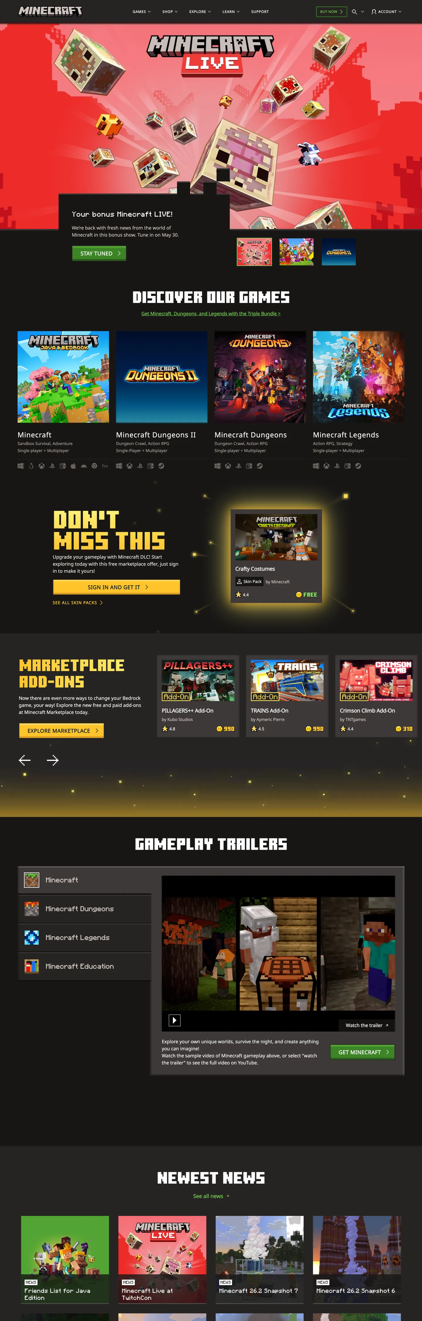
Minecraft.net is what a gaming brand looks like when it refuses to borrow cinema's typographic vocabulary. Where PlayStation runs editorial light-weight display sans, where Xbox commits to angular geometric type, Minecraft picks a literal pixel font — MinecraftTenv2, a chunky bitmap face whose letterforms echo the game's voxel blocks. The display sets at 85px with lineHeight 0.85 and negative letter-spacing, so the blocks interlock rather than separate. Combined with sharp 0px corners on every surface, the chrome reads as continuous with the game world, not as marketing above it.
The system also carries an unusual feature for a gaming brand: per-product color territory. Minecraft Vanilla owns the iconic grass-green ramp (`#6cc349` → `#3c8527` in six steps under `--mc-vanilla-green-*`), Minecraft Dungeons owns an orange/red ramp (`#ffc42b` headlines, deep reds for CTAs), Minecraft Marketplace owns a gold ramp (`#fff27a`), and Legends + Education each have their own. Every sub-brand inherits the structural chrome but paints its own voltage. This DESIGN.md packages all six product palettes — 22 colors tokens, 13 typography levels split across three custom typefaces (MinecraftTenv2, MinecraftSeven-v2, Noto Sans), the 4-step radius scale that's mostly just 0px, an 8-step spacing rhythm, and 23 components definitions covering buttons, game tiles, navigation, and the dark-canvas-with-bright-tile composition that paces every page.
Feed the file to Claude, Cursor, or Copilot and the agent reproduces the blocky-chrome voice — pixel-font headlines, sharp green CTAs, dark canvas, white game tiles — rather than a generic gaming theme. Or use it as a reference for any product where the chrome should feel continuous with the game world rather than positioned above it.
What makes it distinct
5
- Per-product color territoryVanilla green #6cc349 for Minecraft, Dungeons orange #ffc42b for the spinoff, Marketplace gold #fff27a for add-ons; every Mojang sub-brand gets its own 4-6 step ramp under namespaced CSS vars
- Sharp 0px corners on every component including inputsthe voxel aesthetic enforced typographically rather than illustrated
- Pixel-font display at 85px / lineHeight 0.85MinecraftTenv2 chunks interlock with deliberately tight leading, the brand's most distinctive typographic move
- Three-face stackMinecraftTenv2 for hero displays, MinecraftSeven-v2 uppercase for eyebrow labels, Noto Sans 400/700 for body and CTAs
- Dark #313131 canvas with white-tile game cardsthe page reads as a curated games library, not a marketing site
minecraft.net
Live at minecraft.net
A snapshot of the brand in production. Scroll the frame to see the whole page.
Colors
22 colors
Minecraft's system anchors on #a0e081 (vanilla-green-1) as its primary color. Type is set in Noto Sans across 12 tokens from 12px to 85px, weights 400–800. Shape language is sharp — components average 0px corner radius, favoring crisp rectangles.
Surface
Page and card backgrounds · 4
Semantic
Status, errors, success, links · 1
Other
Specialty colors · 17
Typography
12 type tokens
Set in Noto Sans across 12 tokens, from 12px to 85px, weights 400–800. Shown in its own stack: where the font isn't installed, the fallback the file names stands in.
- display-hero85px · weight 400 · lh 0.85 · tracking -1.275pxThe quick brown fox jumps over the lazy dog
- display-md48px · weight 400 · lh 0.9 · tracking -0.5pxThe quick brown fox jumps over the lazy dog
- eyebrow-lg20px · weight 400 · lh 1.2 · tracking 0.6pxThe quick brown fox jumps over the lazy dog
- eyebrow-md16px · weight 400 · lh 1.5The quick brown fox jumps over the lazy dog
- eyebrow-sm14px · weight 400 · lh 1.3 · tracking 0.56pxThe quick brown fox jumps over the lazy dog
- heading-md24px · weight 400 · lh 1.02 · tracking 0.96pxThe quick brown fox jumps over the lazy dog
- heading-sm18px · weight 700 · lh 1.36 · tracking -0.27pxThe quick brown fox jumps over the lazy dog
- body-md16px · weight 400 · lh 1.5The quick brown fox jumps over the lazy dog
- body-sm14px · weight 400 · lh 1.43The quick brown fox jumps over the lazy dog
- caption12px · weight 400 · lh 1.5The quick brown fox jumps over the lazy dog
- nav-link12px · weight 700 · lh 1.5 · tracking 0.96pxThe quick brown fox jumps over the lazy dog
- button18px · weight 800 · lh 1.11 · tracking 0.54pxThe quick brown fox jumps over the lazy dog
Layout
Radii and spacing
2 corner radii and 8 spacing values. Shape language: sharp.
Radii
- none0px
- sm3px
Spacing
- xs4px
- sm8px
- md12px
- base16px
- lg24px
- xl32px
- 2xl48px
- 3xl64px
Components
23 components
Each rendered from its tokens (color, type, radius, padding) on Minecraft's own canvas.
- Top Navtop-navTop Nav
- Nav Linknav-linkNav Link
- Nav Link Hovernav-link-hoverNav Link Hover
- Button Primarybutton-primaryButton Primary
- Button Primary Hoverbutton-primary-hoverButton Primary Hover
- Button Secondarybutton-secondaryButton Secondary
- Button Tertiarybutton-tertiaryButton Tertiary
- Card Gamecard-gameCard Game
- Card Newscard-newsCard News
- Card Marketplacecard-marketplaceCard Marketplace
- Hero Band Darkhero-band-darkHero Band Dark
- Hero Band Photohero-band-photoHero Band Photo
- Hero Headinghero-headingHero Heading
- Section Eyebrowsection-eyebrowSection Eyebrow
- Body Prosebody-proseBody Prose
- Type here…text-inputText Input
- Type here…text-input-focusText Input Focus
- DividerdividerDivider
- Pixel Eyebrowpixel-eyebrowPixel Eyebrow
- Footer Bandfooter-bandFooter Band
- Badge Warningbadge-warningBadge Warning
- Game Tile Minecraftgame-tile-minecraftGame Tile Minecraft
- Game Tile Dungeonsgame-tile-dungeonsGame Tile Dungeons
In use
The system, in use
Minecraft's tokens on the kind of product it builds.
Build something people actually use.
A short paragraph of marketing copy that previews how the brand's display tier and body tier read together. Two sentences is usually enough.
FAQ
Minecraft design system FAQ
Common questions about Minecraft's tokens, components, and how to use this DESIGN.md in your project.
Read next
Related reading
Specs, directories, and component libraries that pair with this design system.
- Browse all design systemsThe full directory of DESIGN.md files on shadcn.io.shadcn.io
- Minecraft — official siteThe live source of this design system.minecraft.net (opens in a new tab)
- The DESIGN.md specificationGoogle Labs' open spec for machine-readable design system files.github.com (opens in a new tab)
Use it
Use Minecraft in your project
One machine-readable file. Drop it into Claude, Cursor, or any AI tool that reads DESIGN.md.
Download the DESIGN.md
One machine-readable file: every color, type, radius, spacing, and component token of Minecraft.
Feed it to your AI tool
Drop it into Claude, Cursor, or GitHub Copilot. The agent writes React components and Tailwind classes that match Minecraft's visual language.
Reference the tokens directly
Or paste the values into your Tailwind config, CSS variables, or component library: every color, size and radius is a quoted, ready-to-copy value.
Read the full DESIGN.md: overview, rationale, do’s and don’ts
Overview
Minecraft.net runs on voxel-as-chrome — every UI surface mirrors the game's cubic-block world. Sharp 0px corners on every button, card, input, and modal. Pixel-font display at 85px with lineHeight 0.85 so the chunky letterforms interlock rather than separate. A dark #313131 canvas plays host to brightly-colored game tiles, each carrying its product's own palette. Where PlayStation borrows cinema's editorial typography and where Xbox commits to angular geometric display sans, Minecraft refuses cinema entirely — the chrome reads as continuous with the game world, not as marketing above it.
The system's second distinctive feature is per-product color territory. Each Mojang product owns its own CSS-variable-namespaced ramp on :root: --mc-vanilla-green-* for the main game (6 steps from #a0e081 to #2a641c), --mc-dungeons-orange-* for the dungeon-crawler spinoff (#ffc42b and warmer reds), --mc-marketplace-gold-* for add-ons (#fff27a), plus Legends and Education ramps. Where most multi-product brands lean on a single color voltage that all sub-brands share, Mojang gives each game its own chromatic identity. The structural chrome (neutrals, surfaces, typography) is shared; the voltage is sub-brand-specific.
The third move is the three-face typographic stack. MinecraftTenv2 (the chunky pixel font) handles 85px hero displays. MinecraftSeven-v2 (a tighter pixel face) handles uppercase eyebrow labels at 14-20px with arcade-game letter-spacing — they look like 80s game-cabinet UI text. Noto Sans carries everything else: body at 14-16px, h3 headings at weight 700, CTA buttons at weight 800 uppercase. The pixel faces are the brand voice; Noto is the workhorse that keeps the chrome readable on long-form pages.
Colors
The system declares 25+ tokens organised into product territories. Each product owns a 4-6 step ramp; structural neutrals are shared.
Minecraft Vanilla — the main game's voltage
- Vanilla Green 3 (
#6cc349) — frequency 309. Used as text (157), border (152), background (0). The brand's load-bearing voltage: every CTA accent, every grass-green link, every active state. Mapped as--mc-vanilla-green-3. The most-used hex on the entire site by 2× the runner-up. - Vanilla Green 5 (
#3c8527) — frequency 3. The primary CTA button fill. Darker than the accent green for contrast against white text.--mc-vanilla-green-5. - Vanilla Green 1 (
#a0e081) — frequency 40. Bright tint, used for hover states and decorative highlights.--mc-core-green-1. - Vanilla Green 2 (
#86d562) —--mc-core-green-2. Secondary tint. - Vanilla Green 4 (
#52a535) —--mc-vanilla-green-4. Mid-tone for secondary surfaces. - Vanilla Green 6 (
#2a641c) —--mc-vanilla-green-6. Deepest green, for high-contrast text on lighter green fills.
Minecraft Dungeons, Marketplace, Legends — sub-brand voltages
- Dungeons Orange (
#ffc42b) — frequency 58. The gold-orange that carries Dungeons headlines, "Don't Miss This" callouts, and dungeon-crawler product tiles.--mc-dungeons-orange-3. - Marketplace Gold (
#fff27a) — frequency 3. Brighter yellow for Marketplace add-on tiles.--mc-marketplace-gold-1.
Structural neutrals — shared across all products
- Off-white (
#ffffff) — frequency 790. Game-card backgrounds, primary text-on-dark. The brightest pixel on every viewport.--mc-core-off-white. - Cold-grey-6 / Canvas (
#313131) — frequency 513. The dark page canvas.--mc-vanilla-coldgrey-6. - Rich black (
#000000) — frequency 97. Full-bleed hero bands and footer.--mc-core-rich-black. - Off-black (
#171615) — frequency 39. Mid-tone surface, slightly warmer than rich-black.--mc-core-off-black. - Marketplace grey-6 (
#1d1e1e) — frequency 36. Card backgrounds in the Marketplace section.--mc-marketplace-grey-6. - Core grey-5 (
#3d3938) — frequency 29. Mid-elevation surface.--mc-core-grey-5. - Marketplace grey-2 (
#d0c5c0) — frequency 74. Secondary body text on dark backgrounds.--mc-marketplace-grey-2. - Vanilla grey-1 (
#ede5e2) — frequency 56. Light surface tint and form-input text color.--mc-vanilla-grey-1. - Core grey-3 (
#aba09c) — frequency 15. Disabled-state text.--mc-core-grey-3.
Semantic — focus, warning
- Focus blue (
#1157be) —--mc-default-focus. Browser focus-ring + form-input focused border. - Warning red (
#ff605e) — frequency 6. Error toasts and warning callouts.--mc-default-warning-2.
Typography
Three typefaces, each scoped to a strict role.
MinecraftTenv2 is the brand voice. It handles 85px hero displays ("Don't Miss This", section titles like "Discover Our Games") at weight 400 with lineHeight 0.85 and -1.275px letter-spacing. The tight leading is the typographic signature — pixel-font glyphs are already chunky, and the negative leading makes them interlock vertically. Substitute Press Start 2P (Google Fonts) for a free near-equivalent.
MinecraftSeven-v2 is the eyebrow voice. Used for uppercase section labels (16px / 0.96px tracking) and small all-caps labels (14px / 0.56px tracking) — the arcade-game letter-spacing is what gives the chrome its 80s console-cabinet feel. Substitute Press Start 2P or VT323.
Noto Sans is the workhorse. Body at 14-16px weight 400, h3 headings at 18px weight 700 with -0.27px tracking, CTA buttons at 18px weight 800 with 0.54px tracking. Noto's broad Unicode coverage handles the site's localized variants (/en-us, /ja-jp, /zh-hans) without font swap. Fallback stack: Helvetica Neue, Helvetica, Arial, sans-serif.
The 800-weight CTA tracking + uppercase casing is the bridge between Noto Sans's neutrality and the pixel fonts' chunky voice — the buttons read as game-UI elements even though they're set in a humanist sans.
Layout
The system runs on a 4px scale: 4, 8, 12, 16, 24, 32, 48, 64. The 16px value is the dominant gutter (64 uses); the 4px micro-step appears on tight pixel-aligned layouts (51 uses).
Pages alternate dark and lighter dark surfaces section-by-section: hero photography bands sit on #000000 rich-black, content sections on #313131 canvas-dark, marketplace strips on #1d1e1e slightly-warmer surface-dark. The container caps at a wide 1440px content grid; game tiles use a strict 4-up horizontal row that collapses to 2-up at smaller breakpoints.
Elevation & Depth
The system uses minimal box-shadows. Depth comes from surface-color stratification — every section sits on its own grade of dark (#000000 → #171615 → #1d1e1e → #313131 → #3d3938), and the layer changes signal section breaks. The only shadow that consistently appears is a faint 0px 0px 3px below game-card thumbnails to lift them off the canvas. Bright-colored game tiles (Vanilla green, Dungeons orange, Marketplace gold) provide the page's color-pop depth signal — the eye reads color contrast as elevation more than shadow.
Shapes
0px corners on every component. Buttons, cards, inputs, modals, the search field, the nav strip — every interactive surface renders at borderRadius: 0. The voxel aesthetic enforced typographically. The only exception is a 3px radius on certain slider knobs and pixel-art-style decorative elements, used sparingly.
Combined with 2px borders on primary CTAs (#262423 near-black border outside #3c8527 vanilla-green-5 fill), the buttons read as inset blocks rather than rounded chrome — they feel like they could be placed into Minecraft's inventory grid.
Components
The component vocabulary covers the entire marketing surface. Three button variants (primary green-fill-with-dark-border, secondary outline-on-dark, tertiary transparent-green-text) cover every CTA. Three card variants distinguish white game tiles (card-game), dark news tiles (card-news), and marketplace add-on tiles (card-marketplace) — all 0px radius, 0px padding (image-bleed-to-edge). Two hero bands alternate dark-on-dark photography bands with the slightly-lighter canvas-dark sections.
Notable: the game tile variants are per-product (game-tile-minecraft carries vanilla-green-5 fill, game-tile-dungeons carries dungeons-orange-3). When composing a new game card, pull the tile variant matching that product's territory. The pixel eyebrow label (pixel-eyebrow) uses MinecraftSeven-v2 at the section-label scale — used for "DISCOVER OUR GAMES", "DON'T MISS THIS", "MARKETPLACE ADD-ONS", "GAMEPLAY TRAILERS", "NEWEST NEWS".
Do's and Don'ts
- Do hold every component at
rounded: 0px— the sharp-corner doctrine is the brand's most enforceable rule. A single 8px-radius button breaks the entire voxel illusion. - Don't soften pixel-font headlines with
fontSmoothing: antialiased. The pixel-font is supposed to read as crunchy, blocky, low-resolution. Anti-aliasing it makes it look like a stretched Comic Sans. - Do use the per-product color territory when rendering a sub-brand. A Dungeons card with vanilla-green CTAs reads as a UI bug; use
--mc-dungeons-orange-*ramp on dungeons-related surfaces. - Don't mix product palettes within a single component. A button that uses Marketplace gold for fill and Vanilla green for border doesn't carry brand meaning — it reads as accidental.
- Do set heading lineHeight to 0.85-0.9 when using MinecraftTenv2. Wider leading separates the chunky blocks visually and breaks the interlocking glyph effect.
- Don't render body copy in MinecraftTenv2 or Seven. Pixel fonts are illegible at 14-16px running prose — Noto Sans handles body, the pixel faces handle display + eyebrow only.
- Do use the warm-grey ladder (
#d0c5c0,#ede5e2,#aba09c) for secondary text on dark backgrounds — not pure 60% white. The warm-grey reads as part of the system rather than as transparent overlay. - Don't use
border-radius: 9999pxpills anywhere. Pill geometry is the antithesis of voxel chrome; even circular avatars on the news cards render as 0-radius squares.
Known Gaps
Several things aren't captured. MinecraftTenv2 and MinecraftSeven-v2 are proprietary Mojang typefaces with no public web fonts — Press Start 2P or VT323 substitute reasonably but lose brand exactness. Motion (the MINECRAFT LIVE marquee animation, the game-tile pop-hover transitions, the pixel-card cycle reveals) is not captured. The full Minecraft Legends and Education color ramps are only partially extracted — those product surfaces aren't fully reachable from the homepage. Form validation beyond focus, the in-game UI chrome (inventory grids, hot-bar, crafting tables, achievement toasts), and the localized variants' typographic adjustments (Japanese/Chinese pixel-font fallbacks) are out of scope. The Mojang Studios sub-brand identity and the Marketplace creator-spotlight layouts aren't covered here either — this captures the consumer-facing minecraft.net marketing surface specifically.
Gaming & Entertainment
More systems like this
More DESIGN.md files in Gaming & Entertainment.
Pricing
Build it with Pro
The DESIGN.md files are free. Pro adds 6,000+ blocks, premium templates and the MCP server, so your AI editor builds in your system for you.
4.9/5 out of 5 · 150+ reviewsfrom 150+ founders and developers.
Billing
Billed once a year in USD. Cancel anytime.
- How many people can use the license.
- Client work, SaaS products and anything you charge for.
- Production-ready React sections: hero, pricing, features, dashboards and more.
- Complete multi-page sites you can ship as they are.
- React icons from every major library, installable with one command.
- Presets that restyle every block, in light and dark.
- Lets your AI editor search, preview and install blocks for you.
- Priority requests are answered first.
Individual
For personal projects & open source
$32instead of $49/mo
$389 billed yearly
- Seats: 1 seat
- Commercial use: Personal & open source only
- Pro blocks: 6,000+ blocks
- Templates: All 14 templates
- React icons: 294k+ icons
- Themes: All 59 themes
- MCP server: Basic usage
- Support: Standard
Team
Most popularFor freelancers, agencies & startups
$66instead of $99/mo
$789 billed yearly · ≈ $13/dev/mo
- Seats: Up to 5 seats
- Commercial use: Included
- Pro blocks: 6,000+ blocks
- Templates: All 14 templates
- React icons: 294k+ icons
- Themes: All 59 themes
- MCP server: High usage
- Support: Priority
Organization
For companies with larger teams
$132instead of $199/mo
$1,589 billed yearly
- Seats: Unlimited seats
- Commercial use: Included
- Pro blocks: 6,000+ blocks
- Templates: All 14 templates
- React icons: 294k+ icons
- Themes: All 59 themes
- MCP server: Unlimited usage
- Support: Priority
Billed once a year in USD. Cancel anytime.
Individual
For personal projects & open source
$32instead of $49/mo
$389 billed yearly
- How many people can use the license.Seats: 1 seat
- Client work, SaaS products and anything you charge for.Commercial use: Personal & open source only
- Production-ready React sections: hero, pricing, features, dashboards and more.Pro blocks: 6,000+ blocks
- Complete multi-page sites you can ship as they are.Templates: All 14 templates
- React icons from every major library, installable with one command.React icons: 294k+ icons
- Presets that restyle every block, in light and dark.Themes: All 59 themes
- Lets your AI editor search, preview and install blocks for you.MCP server: Basic usage
- Priority requests are answered first.Support: Standard
Team
Most popularFor freelancers, agencies & startups
$66instead of $99/mo
$789 billed yearly · ≈ $13/dev/mo
Everything in Individual, plus
- How many people can use the license.Seats: Up to 5 seats
- Client work, SaaS products and anything you charge for.Commercial use: Included
- Lets your AI editor search, preview and install blocks for you.MCP server: High usage
- Priority requests are answered first.Support: Priority
Organization
For companies with larger teams
$132instead of $199/mo
$1,589 billed yearly
Everything in Team, plus
- How many people can use the license.Seats: Unlimited seats
- Lets your AI editor search, preview and install blocks for you.MCP server: Unlimited usage
- Secure checkout via Stripe
- Code lives in your repo
- Keep what you've shipped if you cancel
- License terms
Your system, built for you
Every block, template and icon, installed by your AI agent in your design system. The DESIGN.md files stay free.