Pixar Design System
Pixar's marketing system is monochrome chrome wrapped around full-color film posters — Proxima Nova at weight 300, single 5px radius, ink-on-white tiles. Tokens for React, Next.js, and AI tools.
Add shadcn.io to your AI agent. · Pro It installs blocks, icons and templates in your design system from a prompt, with Pro.
Set up MCP- Primary
- #001842
- Typeface
- proxima-nova
- Shape
- Sharp
- Base radius
- 5px
- Colors
- 6
- Type tokens
- 11
- Components
- 14
- Spacing values
- 7
About
About Pixar DESIGN.md
Curated by Dov Azencot · Updated May 18, 2026 · Source pixar.com (opens in a new tab)
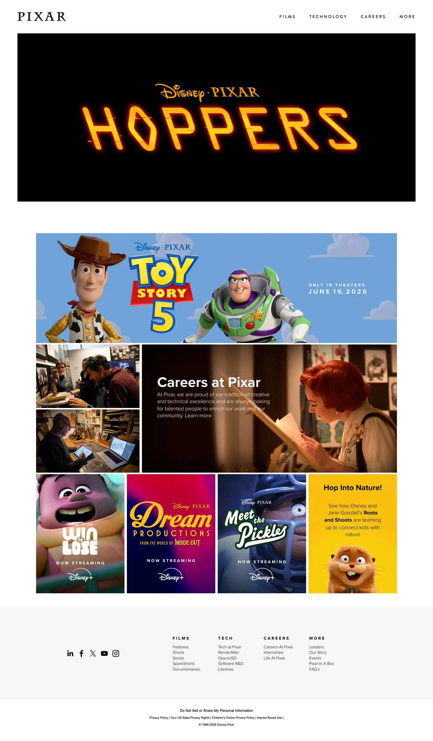
Pixar's marketing site does what almost no other entertainment brand does: it has no brand color. The wordmark at the top-left is pure ink-black on white. The navigation links (Films, Technology, Careers, More) are ink-black on white. The "Careers at Pixar" hero copy is ink-black on white. The footer category labels are ink-black on white. The chromatic moments above the fold belong entirely to the film artwork — the saffron Hoppers title treatment sitting on a black promo block, the Toy Story 5 promo with its sky-blue background and Woody / Buzz cutouts, the four-up film thumbnail grid (Win or Lose purple, Dream Productions magenta, Meet the Pickles teal, and a yellow Hop Into Nature tile). Where Netflix runs scarlet against black and HBO runs deep crimson, Pixar's marketing canvas is built to disappear so the work can speak.
The DESIGN.md file packages the system into a machine-readable spec for React tooling. Inside: 6 colors tokens, all structural — an ink black carrying 702 captured occurrences, a pure white carrying 79, a mid-gray for hairlines and a deep navy declared but absent from the rendered chrome. Eleven typography tokens running Proxima Nova at weight 300 (the body face) and 700 (inline emphasis), with Brandon Grotesque at weight 500 carrying the uppercase small-caps labels with 3.22px letter-spacing, and a single Aktiv Grotesk button face. One rounded token: 5px, used on the rare button surface. Fourteen component definitions covering the ink wordmark nav, the black film-promo block, the white film tile, the uppercase section label, and the ink-on-white footer.
Feed this file to Claude or Cursor and it reproduces Pixar's specific moves: monochrome chrome that frames colored content rather than competing with it, Proxima Nova at light weight 300 as the dominant face, a single corner-radius tier, and uppercase Brandon Grotesque labels with wide tracking for the rare small-caps moment. The one move worth borrowing only if your product IS the artwork is the chromatic restraint: Pixar gets away with monochrome chrome because Hoppers and Toy Story 5 supply the color. A SaaS dashboard built this way would feel anemic. A media surface built this way disappears.
What makes it distinct
5
- Monochrome chromeblack and white carry 781 of the 783 captured rendered occurrences; the marketing surface is built so it can host any film palette
- Film posters as chromatic momentsthe only color above the fold belongs to the Hoppers title-treatment artwork, the Toy Story 5 promo, and the four-up film thumbnails
- Proxima Nova 300 across every tierdisplay, body, label, footer share one face at one light weight, with 700 reserved for inline emphasis
- Single 5px radiusevery rounded surface uses the same 5px corner; there is no scale, no pill, no full-circle treatment outside film posters
- Brandon Grotesque uppercase labelssmall-caps section labels run at 3.22px letter-spacing in weight 500, the only typographic second voice
pixar.com
Live at pixar.com
A snapshot of the brand in production. Scroll the frame to see the whole page.
Colors
6 colors
Pixar's system anchors on #001842 (navy) as its primary color. Type is set in proxima-nova across 11 tokens from 12px to 48px, weights 300–700. Shape language is sharp — components average 2px corner radius, favoring crisp rectangles.
Surface
Page and card backgrounds · 2
Text
Headlines, body, captions · 2
Borders & Hairlines
Dividers, outlines, rules · 1
Other
Specialty colors · 1
Typography
11 type tokens
Set in proxima-nova across 11 tokens, from 12px to 48px, weights 300–700. Shown in its own stack: where the font isn't installed, the fallback the file names stands in.
- display-xl48px · weight 300 · lh 48pxThe quick brown fox jumps over the lazy dog
- display-md27px · weight 300 · lh 28pxThe quick brown fox jumps over the lazy dog
- body-lg18px · weight 300 · lh 23.4pxThe quick brown fox jumps over the lazy dog
- body-md16px · weight 300 · lh 20.8pxThe quick brown fox jumps over the lazy dog
- body-sm14px · weight 300 · lh 18.42pxThe quick brown fox jumps over the lazy dog
- emphasis-md14px · weight 700 · lh 18.42pxThe quick brown fox jumps over the lazy dog
- caption12px · weight 400 · lh 16pxThe quick brown fox jumps over the lazy dog
- label-caps14px · weight 500 · lh 44.8px · tracking 3.22pxThe quick brown fox jumps over the lazy dog
- button-md18px · weight 500 · lh 18px · tracking 0.36pxThe quick brown fox jumps over the lazy dog
- nav-link14px · weight 300 · lh 18.42pxThe quick brown fox jumps over the lazy dog
- wordmark21.4px · weight 700 · lh 21.4pxThe quick brown fox jumps over the lazy dog
Layout
Radii and spacing
2 corner radii and 7 spacing values. Shape language: sharp.
Radii
- none0px
- sm5px
Spacing
- xs8px
- sm11px
- md16px
- base24px
- lg32px
- xl48px
- 2xl58px
Components
14 components
Each rendered from its tokens (color, type, radius, padding) on Pixar's own canvas.
- Button Primarybutton-primaryButton Primary
- Button Secondarybutton-secondaryButton Secondary
- Top Navtop-navTop Nav
- Nav Linknav-linkNav Link
- WordmarkwordmarkWordmark
- Hero Headinghero-headingHero Heading
- Hero Heading Inversehero-heading-inverseHero Heading Inverse
- Section Headingsection-headingSection Heading
- Body Paragraphbody-paragraphBody Paragraph
- Film Promo Blockfilm-promo-blockFilm Promo Block
- Film Tilefilm-tileFilm Tile
- Career Tilecareer-tileCareer Tile
- Uppercase Labeluppercase-labelUppercase Label
- FooterfooterFooter
In use
The system, in use
Pixar's tokens on the kind of product it builds.
Build something people actually use.
A short paragraph of marketing copy that previews how the brand's display tier and body tier read together. Two sentences is usually enough.
FAQ
Pixar design system FAQ
Common questions about Pixar's tokens, components, and how to use this DESIGN.md in your project.
Read next
Related reading
Specs, directories, and component libraries that pair with this design system.
- Browse all design systemsThe full directory of DESIGN.md files on shadcn.io, with live mockups for each.shadcn.io
- Pixar — official sitePixar's public marketing site — the source of truth for the live tokens captured in this file.pixar.com (opens in a new tab)
- The DESIGN.md specificationGoogle Labs' open spec for machine-readable design system files — the format this page is built on.github.com (opens in a new tab)
Use it
Use Pixar in your project
One machine-readable file. Drop it into Claude, Cursor, or any AI tool that reads DESIGN.md.
Download the DESIGN.md
One machine-readable file: every color, type, radius, spacing, and component token of Pixar.
Feed it to your AI tool
Drop it into Claude, Cursor, or GitHub Copilot. The agent writes React components and Tailwind classes that match Pixar's visual language.
Reference the tokens directly
Or paste the values into your Tailwind config, CSS variables, or component library: every color, size and radius is a quoted, ready-to-copy value.
Read the full DESIGN.md: overview, rationale, do’s and don’ts
Overview
Pixar's marketing site does what almost no other entertainment brand does. Monochrome chrome as host. The wordmark at the top-left is pure ink-black on white. The navigation links (Films, Technology, Careers, More) are ink-black on white. The "Careers at Pixar" hero copy is ink-black on white. The footer category labels are ink-black on white. The chromatic moments above the fold belong entirely to the film artwork — the saffron Hoppers title treatment sitting on a black promo block, the Toy Story 5 promo with its sky-blue background and Woody / Buzz cutouts, the four-up film thumbnail grid (Win or Lose purple, Dream Productions magenta, Meet the Pickles teal, Hop Into Nature yellow). Where Netflix runs scarlet against black, HBO runs deep crimson, and Disney+ leans on a navy gradient, Pixar's marketing canvas is built to disappear so the work can speak.
The chromatic restraint is structural, not editorial. The captured page renders {colors.ink} 702 times — 350 as text, 1 as background, 351 as border — and {colors.canvas} 79 times. Those two tones carry 781 of the 783 rendered color occurrences in the entire chrome. A single deep navy {colors.navy} is declared as a brand-layer variable but renders 0 times above the fold. There is no second accent, no held-in-reserve voltage, no semantic-color tier. This is the inverse of single-voltage discipline at Cloudflare or Airbnb — instead of holding one accent in reserve, Pixar holds nothing in reserve and asks the film artwork inside each tile to do every chromatic job.
Typography reinforces the disappearing-chrome move. Proxima Nova at weight 300 — the lightest weight in the system — carries the 48px display heading, the 18px body, the 14px nav-link, and the footer labels at the same weight. There is no weight contrast across the hierarchy; emphasis is delivered by inline weight 700 inside body copy, never by a heading-weight bump. The single exception is Brandon Grotesque at weight 500 with 3.22px letter-spacing — the uppercase small-caps label that appears 4 times in the captured page, used as a section header on the film catalog band.
Key Characteristics:
- Monochrome chrome —
{colors.ink}(702 occurrences) +{colors.canvas}(79) carry 781 of the 783 captured rendered tones. - Film artwork is the only chromatic moment — the Hoppers saffron title treatment, the Toy Story 5 sky-blue promo, and the four-up film thumbnails supply all on-page color.
- Proxima Nova at weight 300 across every spoken tier — display, body, label, footer, nav share the lightest weight in the family.
- Single 5px corner-radius (
{rounded.sm}) on the rare button surface; every other element is{rounded.none}(0px) — square corners everywhere. - Brandon Grotesque uppercase labels at 3.22px letter-spacing (
{typography.label-caps}) — the only second-voice moment, used for the catalog section header. - Black film-promo block (
{component.film-promo-block}) — the only inverted surface on the page, used to frame the Hoppers title treatment so the saffron reads off-the-screen. - No CTA pill voltage — the only button on the page is a "Skip to Content" accessibility link styled as a system button.
- Single hairline tone
{colors.hairline}for the rare divider; the system is mono-hairline.
Colors
Brand
The brand tier is empty by design. The only declared brand-layer variable is {colors.navy} (a deep navy) and it renders 0 times in the captured chrome. There is no held-in-reserve voltage on this marketing surface; every chromatic moment belongs to film artwork sitting inside an otherwise-monochrome tile.
- Navy (
{colors.navy}): declared as a brand-layer variable but absent from the rendered marketing chrome. Reserved for sub-brand product pages and the Pixar Education sub-surface; the corporate marketing front does not expose it.
Text
- Ink (
{colors.ink}): frequency 702 — 350 as text, 1 as background, 351 as border. The single dominant tone in the entire system. Carries every body paragraph, every heading, every nav link, every footer label, and every dark-promo-block fill. Wired across hundreds of Squarespace--tweak-*and--*-colorvariables. Pure black, never softened to a near-black. - Ink Soft (
{colors.ink-soft}): a 47.45% mid-gray declared as--darkAccent-hsl. Used as the secondary--course-item-nav-border-colortier with 25% opacity; absent from rendered chrome above the fold on the captured marketing page.
Surface
- Canvas (
{colors.canvas}): frequency 79 — 37 as text (inside black promo blocks), 7 as background (the page floor), 35 as border (white-on-black outlines inside film tiles). The page floor, the nav surface, every film-tile fill, and the footer surface. Wired as--siteBackgroundColorand dozens of--*-background-colorvariables. - Surface-1 (
{colors.surface-1}): a barely-warmer near-white (96.08% lightness) wired as--tweak-summary-block-background-colorand--tweak-form-block-background-color. Used inside form-block surfaces and the summary-tier cards.
Hairline
- Hairline (
{colors.hairline}): frequency 2 (1 background, 1 border). A 50% mid-gray. The single divider tone in the system, used at low opacity (25%) on the course-nav border. The system is mono-hairline; there is no second divider tone.
Typography
Font Families
The system runs three sans-serifs but uses one of them (proxima-nova) for essentially every spoken surface. Proxima Nova carries display, body, label, nav, footer, and wordmark — always at weight 300 (light) for running text and weight 700 (bold) for inline emphasis only. Brandon Grotesque carries the single uppercase small-caps label tier at weight 500 with 3.22px letter-spacing — the only second-voice moment in the system. Aktiv Grotesk carries a single system-button face (the "Skip to Content" accessibility button) at weight 500.
Fallbacks walk 'Helvetica Neue', Helvetica, Arial, sans-serif. There is no monospace surface and no serif tier.
Hierarchy
| Token | Size | Weight | Line Height | Letter Spacing | Use |
|---|---|---|---|---|---|
{typography.display-xl} | 48px | 300 | 48px | 0 | Hero h1 ("Careers at Pixar"), section h1 |
{typography.display-md} | 27px | 300 | 28px | 0 | Lead paragraph / h2 ("Hop Into Nature!") |
{typography.body-lg} | 18px | 300 | 23.4px | 0 | Default running text |
{typography.body-md} | 16px | 300 | 20.8px | 0 | Secondary body |
{typography.body-sm} | 14px | 300 | 18.42px | 0 | Caption rows, nav links, footer text |
{typography.emphasis-md} | 14px | 700 | 18.42px | 0 | Inline emphasis inside body copy |
{typography.caption} | 12px | 400 | 16px | 0 | Smallest legal / footnote tier |
{typography.label-caps} | 14px | 500 | 44.8px | 3.22px | Uppercase section header (Brandon Grotesque) |
{typography.button-md} | 18px | 500 | 18px | 0.36px | System button label (Aktiv Grotesk) |
{typography.nav-link} | 14px | 300 | 18.42px | 0 | Top-nav link labels |
{typography.wordmark} | 21.4px | 700 | 21.4px | 0 | Pixar wordmark glyph |
Principles
The system runs on weight uniformity rather than weight contrast. Proxima Nova at weight 300 — the lightest weight in the family — carries display headlines, body copy, and footer labels at the same weight. The 48px display heading at weight 300 reads as an editorial display rather than a SaaS hero; the 14px nav link at weight 300 reads as a quiet rail rather than a tabbed product surface. Inline weight 700 is the only emphasis treatment; there is no separate semibold tier and no weight-500 heading.
The Brandon Grotesque uppercase label at 3.22px letter-spacing is the system's single typographic surprise — it appears only 4 times in the captured page, all as section headers on the film catalog band. The wide tracking and the second-voice family make it read as a magazine kicker rather than a UI label.
Note on Font Substitutes
Proxima Nova is licensed through Mark Simonson Studio. Inter at weight 300 is the closest open-source substitute and transfers proportions well at every size. Source Sans 3 at weight 300 is slightly narrower but renders similarly at display sizes. For the Brandon Grotesque uppercase label, DM Sans at weight 500 with 3.2px letter-spacing or Inter at weight 600 with 3px letter-spacing both approximate the tracked-caps feel. The system fallback (Helvetica Neue, Helvetica, Arial) is what Squarespace ships as the no-font-load fallback.
Layout
Spacing System
- Base unit: 8px — the dominant gap value.
- Tokens:
{spacing.xs}8px ·{spacing.sm}11px ·{spacing.md}16px ·{spacing.base}24px ·{spacing.lg}32px ·{spacing.xl}48px ·{spacing.2xl}58px. - Section padding (vertical): ~48px between major bands on the white canvas; the Hoppers promo block sits at 47.52px (1.4 line-heights of 28px) — derived from Squarespace's section-padding token rather than a round number.
- Card internal padding:
{spacing.lg}32px on the Toy Story 5 promo;{spacing.xl}48px on the career tile; 0px on film thumbnails (artwork fills edge-to-edge). - Nav padding:
{spacing.lg}(32px) vertical,{spacing.xl}(48px) horizontal.
Grid & Container
- Max content width: ~1080px on the body bands, ~1280px on the film-thumbnail grid.
- Hero (black promo block): full-bleed black surface, Hoppers title artwork centered horizontally at ~400px wide.
- Career band: 2-column 50/50 grid pairing the Pixar workplace photograph (left) with the career-callout text tile (right).
- Film thumbnail grid: 4-column at desktop showing the current film slate (Win or Lose, Dream Productions, Meet the Pickles, Hop Into Nature), collapsing to 2-column on tablet.
- Footer: 4-column category grid (Films, Tech, Careers, More) with the Pixar wordmark and social-link rail above.
Rhythm
The page alternates between black promo blocks (the Hoppers hero, the Toy Story 5 marketing tile) and white editorial bands (the career callout, the film thumbnail grid, the footer). The black-on-white inversion happens at the band level rather than the element level — there are no half-and-half splits, no gradient transitions, no soft-shadow lifts between the two surface tones. Each band terminates cleanly at the white canvas before the next inverted block begins.
Elevation
The system has essentially no shadow tier. The captured page renders 0 shadow occurrences on the entire surface — no card lift, no nav drop-shadow, no hover elevation. Depth comes entirely from the black-on-white surface inversion at the band level: the Hoppers promo and the dark-band moments sit as ink-filled rectangles on the white floor, with no soft transition between them.
- Flat (no shadow): body, hero, film thumbnails, footer — 100% of surfaces.
- Tonal contrast:
{colors.ink}promo blocks on{colors.canvas}page floor — the ink-on-white inversion is the only depth-signaling mechanism on the page. - Hairline outlines: none in chrome; the rare divider tone (
{colors.hairline}at 25% opacity) is wired into deeper Squarespace component variables (course nav, etc.) but does not render above the fold.
Shapes
The radius scale is binary at the smallest tier: {rounded.none} 0px and {rounded.sm} 5px. There is no scale, no pill, no large-card rounding, no circular avatars in the chrome.
- Sharp (0px): every chrome surface — nav, wordmark, promo blocks, film tiles, footer. The square-cornered identity reads as poster-on-a-wall.
- Soft (5px): the single rounded surface — a system "Skip to Content" accessibility button. Inherited from the Squarespace template default rather than asserted as a brand choice.
- Film posters: the rounded-corner treatment some thumbnails carry (the four-up film grid) lives inside the artwork itself, not as a chrome-layer treatment.
The square-cornered chrome reinforces the editorial / catalog feel: the film tiles read as posters mounted on a wall rather than as soft cards in a dashboard.
Components
button-primary — The only conventional button surface in the captured chrome: the "Skip to Content" accessibility link styled as a system button. Ink fill, white text, {typography.button-md} (Aktiv Grotesk 18px / 500), {rounded.sm} 5px radius, 32×0 padding, 87px height. Not a marketing CTA — the page has no marketing CTA in the conventional sense.
button-secondary — Transparent fill with an ink-toned 1px border, ink text, {rounded.sm} radius. Used sparingly inside form blocks and the careers sub-page.
top-nav — White {colors.canvas} surface, ink wordmark flush left (Pixar in the proprietary 21.4px / 700 Proxima Nova treatment), ink nav links (Films, Technology, Careers, More) flush right. 96px height, 32×48 padding. No shadow, no bottom-hairline rule.
nav-link — Transparent background, ink text at {typography.nav-link} (14px / 300), 0×16 padding. No hover background; the link state is text-color shift only.
wordmark — Ink text in the Pixar lockup at {typography.wordmark} (21.4px / 700). The brand glyph; the only typographic moment in the captured chrome that uses weight 700 as the primary tier rather than as inline emphasis.
hero-heading — Ink text on the white canvas, {typography.display-xl} (48px / 300). Used for the "Careers at Pixar" treatment in the career tile. Weight 300 at 48px is the loudest typographic moment on the white canvas.
hero-heading-inverse — White text on the ink-filled promo block, same {typography.display-xl} size and weight. Used for the Hoppers title-treatment context (though the actual Hoppers wordmark above is custom artwork, not the system font).
section-heading — Ink text on the white canvas, {typography.display-md} (27px / 300). Used for film catalog band sub-headers ("Hop Into Nature!", "Careers at Pixar").
body-paragraph — Ink text on the white canvas at {typography.body-lg} (18px / 300). The default running-text tier; reads as quiet editorial copy rather than as marketing voice.
film-promo-block — Ink {colors.ink} fill, white text and white-bordered outlines for nested elements, {rounded.none} 0px corners, 47.52×0 padding. The Hoppers promo block at the top of the captured page; full-bleed ink rectangle with the saffron-orange Hoppers title artwork sitting centered. The only inverted surface above the fold.
film-tile — White {colors.canvas} fill, square corners, 0 padding (film poster artwork fills the tile edge-to-edge). The four-up film thumbnail grid (Win or Lose, Dream Productions, Meet the Pickles) uses this pattern; each tile carries its own film's chromatic identity inside the artwork.
career-tile — White fill, ink text, {rounded.none} 0px corners, 31.68×57.6 padding (Squarespace-derived asymmetric padding). Wraps the "Careers at Pixar" callout that sits opposite the workplace photograph in the career band.
uppercase-label — Brandon Grotesque uppercase at {typography.label-caps} (14px / 500, 3.22px letter-spacing). The only second-voice typographic moment in the system; appears as a section header above the film catalog band.
footer — White canvas, ink text, 47.52×48 padding. Houses the Pixar wordmark, the social-link rail (LinkedIn, Facebook, X, YouTube, Instagram), and the 4-column category grid (Films, Tech, Careers, More).
Do's and Don'ts
Do keep the marketing chrome monochrome. The brand identity of this surface is the absence of a brand color — adding any held-in-reserve accent (a Pixar-blue inline link, a Pixar-yellow CTA) would force every film thumbnail to negotiate with that voltage and destroy the figure-ground inversion the system depends on.
Do let film artwork supply every chromatic moment. The Hoppers saffron title treatment, the Toy Story 5 sky-blue promo, the four-up film thumbnail colors — all of these live inside the artwork, not in the chrome. Reaching for a brand-color highlight strip beside them would compete with the work.
Do run Proxima Nova at weight 300 across every typographic tier. The system's weight-uniformity rhythm depends on it; bumping the display to weight 700 turns the editorial chrome into a Hollywood-studio marquee and loses the "quiet host" identity.
Do reserve the Brandon Grotesque uppercase label ({typography.label-caps}) for section headers on the catalog band. It is the single second-voice typographic moment in the system; multiplying it into nav labels or footnote chrome dilutes the magazine-kicker effect.
Don't introduce a CTA pill voltage. The page has no marketing CTA above the fold — film thumbnails ARE the CTAs and they self-color via the artwork. Adding a "Watch Now" pill in a brand color would force a voltage where none exists.
Don't invert the wordmark or nav to a colored fill. The wordmark is always ink-black on white; rendering it on a film-colored surface (saffron, magenta, teal) breaks the disappearing-chrome contract.
Don't introduce a rounded-card radius tier. The system is binary — 0px on every surface, 5px on the single accessibility button. Adding a 12 / 16 / 20px tier softens the poster-on-a-wall identity and pushes the page toward a dashboard aesthetic.
Don't add a tinted shadow layer. The system has zero shadow occurrences in chrome; depth comes from band-level black-on-white inversion. Tinting a soft shadow (saffron-on-black for the Hoppers block) would feel decorative rather than structural and break the editorial restraint.
Known Gaps
- Hover and focus states: the captured page exposes only resting states; nav-link hover, button hover, film-tile hover (which carries a subtle scale transition in the live runtime) are not represented as discrete tokens.
- Dark mode: the captured marketing surface is light-only (white canvas with black promo blocks as accents). There is no documented dark variant.
- Form input states: the corporate marketing surface does not expose a primary text-input field above the fold; subscription / contact forms live on sub-pages with separate styling.
- Motion: the film thumbnails carry hover-scale transitions and the Hoppers promo block carries a subtle parallax in the live runtime. End-state values only are captured; timing and easing live in the Squarespace runtime.
- Product surfaces: this DESIGN.md captures the corporate marketing site (
pixar.com) only. Pixar's RenderMan documentation site, the educational sub-site, and the Pixar in a Box surface carry their own token systems that are not represented here. - Squarespace inheritance: many of the declared CSS variables (the
--tweak-*,--list-section-*,--portfolio-*families) are inherited from the Squarespace platform rather than asserted by the brand. The captured tokens are those that render in chrome above the fold; the deeper Squarespace token tree is intentionally unrepresented. - Film-poster typography: the title-treatment artwork on each promo (Hoppers, Toy Story 5, etc.) uses custom hand-drawn or proprietary display faces that are not part of the chrome typography system and not captured here.
Gaming & Entertainment
More systems like this
More DESIGN.md files in Gaming & Entertainment.
Pricing
Build it with Pro
The DESIGN.md files are free. Pro adds 6,000+ blocks, premium templates and the MCP server, so your AI editor builds in your system for you.
4.9/5 out of 5 · 150+ reviewsfrom 150+ founders and developers.
Billing
Billed once a year in USD. Cancel anytime.
- How many people can use the license.
- Client work, SaaS products and anything you charge for.
- Production-ready React sections: hero, pricing, features, dashboards and more.
- Complete multi-page sites you can ship as they are.
- React icons from every major library, installable with one command.
- Presets that restyle every block, in light and dark.
- Lets your AI editor search, preview and install blocks for you.
- Priority requests are answered first.
Individual
For personal projects & open source
$32instead of $49/mo
$389 billed yearly
- Seats: 1 seat
- Commercial use: Personal & open source only
- Pro blocks: 6,000+ blocks
- Templates: All 14 templates
- React icons: 294k+ icons
- Themes: All 59 themes
- MCP server: Basic usage
- Support: Standard
Team
Most popularFor freelancers, agencies & startups
$66instead of $99/mo
$789 billed yearly · ≈ $13/dev/mo
- Seats: Up to 5 seats
- Commercial use: Included
- Pro blocks: 6,000+ blocks
- Templates: All 14 templates
- React icons: 294k+ icons
- Themes: All 59 themes
- MCP server: High usage
- Support: Priority
Organization
For companies with larger teams
$132instead of $199/mo
$1,589 billed yearly
- Seats: Unlimited seats
- Commercial use: Included
- Pro blocks: 6,000+ blocks
- Templates: All 14 templates
- React icons: 294k+ icons
- Themes: All 59 themes
- MCP server: Unlimited usage
- Support: Priority
Billed once a year in USD. Cancel anytime.
Individual
For personal projects & open source
$32instead of $49/mo
$389 billed yearly
- How many people can use the license.Seats: 1 seat
- Client work, SaaS products and anything you charge for.Commercial use: Personal & open source only
- Production-ready React sections: hero, pricing, features, dashboards and more.Pro blocks: 6,000+ blocks
- Complete multi-page sites you can ship as they are.Templates: All 14 templates
- React icons from every major library, installable with one command.React icons: 294k+ icons
- Presets that restyle every block, in light and dark.Themes: All 59 themes
- Lets your AI editor search, preview and install blocks for you.MCP server: Basic usage
- Priority requests are answered first.Support: Standard
Team
Most popularFor freelancers, agencies & startups
$66instead of $99/mo
$789 billed yearly · ≈ $13/dev/mo
Everything in Individual, plus
- How many people can use the license.Seats: Up to 5 seats
- Client work, SaaS products and anything you charge for.Commercial use: Included
- Lets your AI editor search, preview and install blocks for you.MCP server: High usage
- Priority requests are answered first.Support: Priority
Organization
For companies with larger teams
$132instead of $199/mo
$1,589 billed yearly
Everything in Team, plus
- How many people can use the license.Seats: Unlimited seats
- Lets your AI editor search, preview and install blocks for you.MCP server: Unlimited usage
- Secure checkout via Stripe
- Code lives in your repo
- Keep what you've shipped if you cancel
- License terms
Your system, built for you
Every block, template and icon, installed by your AI agent in your design system. The DESIGN.md files stay free.