Analogue Design System
Analogue's marketing site pairs circularXx at tight negative tracking with a pure-black canvas and white-only text — hardware photography carries all color. Tokens for React, Next.js, and AI coding tools.
Add shadcn.io to your AI agent. · Pro It installs blocks, icons and templates in your design system from a prompt, with Pro.
Set up MCP- Primary
- #aeaeae
- Typeface
- circularXx
- Shape
- Mixed
- Base radius
- 18px
- Colors
- 9
- Type tokens
- 12
- Components
- 15
- Spacing values
- 8
About
About Analogue DESIGN.md
Curated by Dov Azencot · Updated May 19, 2026 · Source analogue.co (opens in a new tab)
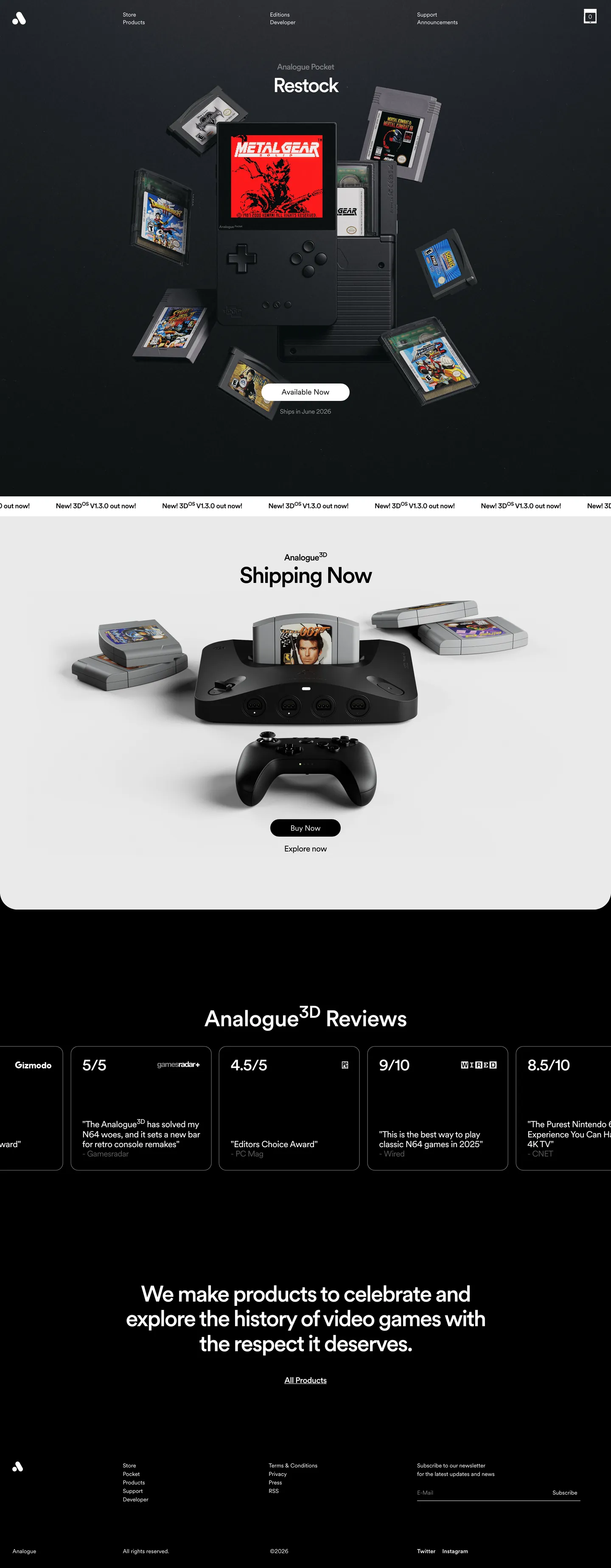
Analogue's marketing site is essentially a product brochure from a company that doesn't believe brochures need color. The hero is a dark stage — pure black — with a three-dimensional render of the Analogue Pocket handheld hovering at center, surrounded by floating game cartridges whose original artwork (Metal Gear's box art, classic platform-game covers) supplies every chromatic moment on the page. Below the fold, a matte-black Analogue 3D console sits on a warm grey surface next to cartridges and a controller. The page never introduces a brand color. The interface is white type on black, or black type on warm grey, and nothing else.
The DESIGN.md file captures this system: 9 colors tokens covering a pure-black canvas, a warm off-white card surface, white as the sole text color, and four grey steps for secondary hierarchy. Thirteen typography tokens run circularXx — a single-family system with an unusually precise weight ladder (400, 450, 500) and letter-spacing values that go negative at display sizes, reaching -2.64px at the 53px h1. The radius system shows 18px as the dominant card rounding (captured from the hardware cards), with a pill token for the newsletter input. Spacing derives from viewport-width units. Fifteen component definitions cover the nav, hero, cards, the newsletter form, and review-score tiles.
Feed this file to an AI coding tool and it reproduces Analogue's particular moves: pure-black canvas with no supplemental dark-grey intermediate, negative-tracking circularXx headlines at weight 500 only, white as the single text color on dark surfaces, and zero brand chrome competing with the hardware photography. The one thing worth studying here independently of implementation: the brand is so confident in its objects that it has nothing to say about itself — the website's job is to hold a clean space around the products, not to perform.
What makes it distinct
5
- Negative tracking as brand signaturedisplay headings run at -2.64px letter-spacing, tightening circularXx until characters nearly touch, an editorial compression absent from the competition
- Chromatic monochromethe entire marketing interface palette is black and white; no accent color appears in any button, border, or heading
- circularXx book weight (450)the body tier uses a 450-weight between regular and medium, a precision not available in most typeface systems
- Fluid vw spacingevery padding, margin, and radius derives from viewport-width units rather than fixed px breakpoints
- Hardware photography as decorationthe hero is a 3D render of the Analogue Pocket surrounded by floating game cartridges; the interface chrome adds nothing chromatic
analogue.co
Live at analogue.co
A snapshot of the brand in production. Scroll the frame to see the whole page.
Colors
9 colors
Analogue's system runs on #aeaeae as its primary voltage, used in 1 of 15 components. Type is set in circularXx across 12 tokens from 13px to 53px, weights 400–500. Shape language is mixed across 15 components, blending pills, soft rounds, and squarer corners.
Brand & Accent
Sparing, CTA-only voltage · 2
Surface
Page and card backgrounds · 3
Text
Headlines, body, captions · 3
Borders & Hairlines
Dividers, outlines, rules · 1
Typography
12 type tokens
Set in circularXx across 12 tokens, from 13px to 53px, weights 400–500. Shown in its own stack: where the font isn't installed, the fallback the file names stands in.
- display-xl53px · weight 500 · lh 59px · tracking -2.64pxThe quick brown fox jumps over the lazy dog
- display-lg47px · weight 500 · lh 47px · tracking -2.82pxThe quick brown fox jumps over the lazy dog
- display-md35px · weight 500 · lh 35px · tracking -1.18pxThe quick brown fox jumps over the lazy dog
- heading-md21px · weight 500 · lh 23px · tracking -1.03pxThe quick brown fox jumps over the lazy dog
- heading-sm16px · weight 500 · lh 21px · tracking -0.44pxThe quick brown fox jumps over the lazy dog
- body-lg19px · weight 450 · lh 23px · tracking -0.57pxThe quick brown fox jumps over the lazy dog
- body-md19px · weight 400 · lh 23px · tracking -0.57pxThe quick brown fox jumps over the lazy dog
- body-sm14px · weight 400 · lh 18px · tracking -0.29pxThe quick brown fox jumps over the lazy dog
- label-md13px · weight 500 · lh 20pxThe quick brown fox jumps over the lazy dog
- caption13px · weight 400 · lh 20pxThe quick brown fox jumps over the lazy dog
- nav-link13px · weight 400 · lh 15pxThe quick brown fox jumps over the lazy dog
- button-md18px · weight 400 · lh 18pxThe quick brown fox jumps over the lazy dog
Layout
Radii and spacing
3 corner radii and 8 spacing values. Shape language: mixed.
Radii
- none0px
- md18px
- pill9999px
Spacing
- xs3px
- sm6px
- md12px
- base18px
- lg26px
- xl35px
- 2xl62px
- section109px
Components
15 components
Each rendered from its tokens (color, type, radius, padding) on Analogue's own canvas.
- Button Primarybutton-primaryButton Primary
- Button Secondarybutton-secondaryButton Secondary
- Top Navtop-navTop Nav
- Nav Linknav-linkNav Link
- Hero Headinghero-headingHero Heading
- Body Paragraphbody-paragraphBody Paragraph
- Body Paragraph Mutedbody-paragraph-mutedBody Paragraph Muted
- CardcardCard
- Review Tilereview-tileReview Tile
- Product Heroproduct-heroProduct Hero
- Type here…text-inputText Input
- Newsletter Inputnewsletter-inputNewsletter Input
- FooterfooterFooter
- Section Headingsection-headingSection Heading
- SubheadingsubheadingSubheading
In use
The system, in use
Analogue's tokens on the kind of product it builds.
Build something people actually use.
A short paragraph of marketing copy that previews how the brand's display tier and body tier read together. Two sentences is usually enough.
FAQ
Analogue design system FAQ
Common questions about Analogue's tokens, components, and how to use this DESIGN.md in your project.
Read next
Related reading
Specs, directories, and component libraries that pair with this design system.
- Browse all design systemsThe full directory of DESIGN.md files on shadcn.io, with live mockups for each.shadcn.io
- Analogue — official siteAnalogue's public marketing and store site — the source of truth for the live tokens captured in this file.analogue.co (opens in a new tab)
- The DESIGN.md specificationGoogle Labs' open spec for machine-readable design system files — the format this page is built on.github.com (opens in a new tab)
Use it
Use Analogue in your project
One machine-readable file. Drop it into Claude, Cursor, or any AI tool that reads DESIGN.md.
Download the DESIGN.md
One machine-readable file: every color, type, radius, spacing, and component token of Analogue.
Feed it to your AI tool
Drop it into Claude, Cursor, or GitHub Copilot. The agent writes React components and Tailwind classes that match Analogue's visual language.
Reference the tokens directly
Or paste the values into your Tailwind config, CSS variables, or component library: every color, size and radius is a quoted, ready-to-copy value.
Read the full DESIGN.md: overview, rationale, do’s and don’ts
Overview
Analogue makes hardware that plays original game cartridges with cycle-accurate accuracy, and its marketing site operates on the same philosophy — nothing added that wasn't already there. Editorial compression. Where Nintendo saturates its pages with franchise red and product-colored gradients, and where Sony layers blue lighting effects over lifestyle photography, Analogue presents a pure-black stage and trusts the objects to be interesting enough on their own. The hero deploys a 3D render of the Analogue Pocket surrounded by floating game cartridges — each carrying original box art in full color — and adds no brand color of its own.
The typography is the system's one decisive design statement. circularXx at negative letter-spacing — -2.64px at the 53px display tier — compresses headlines until the characters are nearly touching. This is not a readability optimization; it is an editorial choice borrowed from print design, where tight-tracked display type signals authority. The body tier uses weight 450, a precision between regular (400) and medium (500) that most typeface systems don't offer. No weight above 500 appears on the page.
Everything else is stripped away. The eight-color palette is black, white, and greys. The card surfaces are light grey on the dark sections, dark canvas on the white sections. There are no gradients, no shadows on the hero, no decorative icons. The review-score tiles from Gamespot, GameReview, IGN, and Digital Foundry appear as white chips on a black band — the scores themselves (5/5, 4.5/5, 9/10, 8.5/10) are the decoration.
Key Characteristics:
- Pure-black canvas (#000000) with no supplemental dark-grey intermediate — a single canvas value for the entire dark surface.
- circularXx with negative letter-spacing at display (-2.64px at 53px) — the tracking is the brand's most visible typographic signature.
- Weight 450 (book) for body text — an unusual precision tier between regular and medium.
- White-only text on dark surfaces; no secondary text colors are rendered in the marketing chrome.
- Zero chromatic brand tokens — the 8-color palette contains no hue except the off-whites and greys.
- 18px card rounding — derived from a vw unit, appearing on hardware spec cards and review tiles.
- Pill geometry (9999px) on the newsletter CTA button and email input.
Colors
Surface
- Canvas (
{colors.canvas}— #000000): frequency 56 total (50 text, 6 bg). The single canvas value for every dark section. Pure black with no blue tint or softening. - Surface-1 (
{colors.surface-1}— #eaeaea): frequency 2 bg. The card background on dark-canvas sections — a neutral off-white used for product spec cards and review tiles. Wired as --color-gray-200. - Surface Card (
{colors.surface-card}— #ffffff): frequency 2 bg. The bright-section surface for the "Shipping Now" light-background product section.
Text
- Ink (
{colors.ink}— #ffffff): frequency 248 total (246 text, 2 bg). The single text color on every dark surface. Pure white — no warmer variant used in the marketing chrome. - Ink Muted (
{colors.ink-muted}— #bfbfbf): frequency 1 text. Used sparingly for secondary metadata labels. - Ink Faint (
{colors.ink-faint}— #999999): frequency 1 text. The faintest visible text tier, used for tertiary captions.
Structure
- Hairline (
{colors.hairline}— #d9d9d9): declared as --color-accent2. Light grey for dividers and card borders. - Accent-1 (
{colors.accent-1}— #aeaeae): declared as --accent-1. Mid-grey for form underlines and secondary borders. - Accent-2 (
{colors.accent-2}— #595959): declared as --accent-2. Dark mid-grey for subtle foreground marks on light surfaces.
Typography
Font Family
The system runs circularXx across every tier — a single-family system with a richer weight ladder than most: 400 (regular), 450 (book), and 500 (medium). The fallback is the auto-generated "circularXx Fallback" string that Tailwind/Next.js generates for local fonts; no system-ui fallback is declared, suggesting the font is loaded via @font-face in all deployment environments.
Hierarchy
| Token | Size | Weight | Tracking | Use |
|---|---|---|---|---|
{typography.display-xl} | 53px | 500 | -2.64px | Hero h1 ("Shipping Now", product name) |
{typography.display-lg} | 47px | 500 | -2.82px | Alternate hero display, h1 variants |
{typography.display-md} | 35px | 500 | -1.18px | Section headings (product categories) |
{typography.heading-md} | 21px | 500 | -1.03px | Sub-section titles |
{typography.heading-sm} | 16px | 500 | -0.44px | Card titles, label headings |
{typography.body-lg} | 19px | 450 | -0.57px | Lead body text |
{typography.body-md} | 19px | 400 | -0.57px | Standard body paragraphs |
{typography.body-sm} | 14px | 400 | -0.29px | Supporting body text |
{typography.label-md} | 13px | 500 | 0 | Active nav links, UI labels |
{typography.caption} | 13px | 400 | 0 | Metadata, review subtitles |
{typography.nav-link} | 13px | 400 | 0 | Top navigation items |
{typography.button-md} | 18px | 400 | 0 | CTA button labels |
Principles
The tracking system is the brand's clearest typographic statement: display sizes compress to -2.64px and -2.82px, while body text is tracked at -0.29px to -0.57px — only captions and nav links sit at 0 (normal). The negative tracking at large sizes is borrowed from print editorial conventions; it signals that Analogue is positioning its hardware as collectible objects rather than consumer gadgets. Weight tops out at 500 — medium, never bold.
Note on Font Substitutes
circularXx is a Lineto custom font not available on public CDNs. Circular Std from Lineto is the commercial parent. For open alternatives, Plus Jakarta Sans has comparable proportions at weight 500; its default tracking is looser and must be set to -0.05em or tighter to approximate the display tier. Geist (Vercel's open-source release) has a similar geometric structure and works well at the 400/500 weight range if you don't need the 450 book weight.
Layout
Spacing System
- Base approach: viewport-relative units (vw). The CSS declares named steps like --spacing-f{n} (desktop) and --spacing-fm{n} (mobile).
- Key tokens at ~1128px viewport:
{spacing.xs}3px ·{spacing.sm}6px ·{spacing.md}12px ·{spacing.base}18px ·{spacing.lg}26px ·{spacing.xl}35px ·{spacing.2xl}62px ·{spacing.section}109px. - Card internal padding:
{spacing.lg}(26px) appears 16 times — it is the dominant card rhythm. - Section separators:
{spacing.2xl}(62px) and{spacing.section}(109px) separate the major content bands.
Grid & Container
- Hero: Full-width dark stage with a centered product render. No visible grid — the hardware photography is the layout.
- Review tiles: 4-column horizontal grid of score chips (publication name + score + press-quote excerpt) on a pure-black band.
- Product catalog band: A light-background section ("Shipping Now") with a centered console render and two CTA buttons below.
- Max content width: Implied ~1128px at the design viewport; scales fluidly via vw units.
Rhythm
The page alternates between dark (pure-black) and light (near-white) surface bands. The light section is the "Shipping Now" product section — a deliberate inversion that makes the Analogue 3D feel like a new object on a different stage. There are no gradients between sections; the transitions are hard cuts. The review scores run on pure black between these bands.
Elevation
The system has no rendered shadow tier. Like teenage engineering, Analogue trusts surface-color contrast alone for hierarchy. Dark-canvas sections have light-grey cards ({colors.surface-1}) raised off the floor; light sections have cards on white with no shadow or border. The only depth cue is photography — the 3D renders cast soft shadows within the product image itself, but these are photographic artifacts, not CSS box-shadows.
Shapes
The radius system has two values: 18px for cards and hardware spec tiles, and 9999px (pill) for interactive elements including the newsletter CTA button and email input. The 18px radius is not arbitrary — it is derived from a viewport-relative calculation (--radius-fm5: 1.563vw) that produces approximately 18px at a 1128px viewport. Sharp (0px) surfaces do not appear in the marketing chrome; unlike teenage engineering, Analogue softens its card geometry. This is consistent with the product aesthetic — the Analogue Pocket has rounded corners.
Components
button-primary — White fill, black text, pill radius (9999px), 12x47 padding, 44px height. "Available Now" is the canonical instance — a white pill on a black canvas. There is no brand-colored button; the contrast between white and black IS the brand's CTA gesture.
button-secondary — Transparent fill with a white border and white text, pill radius. "Explore now" below the Analogue 3D render.
top-nav — Pure-black background with white text in circularXx 13px weight 400. The wordmark is an "A" logomark in the upper left corner. Nav items (Store, Products, Editions, Developer, Support, Announcements) are plain text links with no hover backgrounds visible in the capture.
nav-link — Transparent background, white text, 13px/400, no padding.
hero-heading — White text on transparent canvas overlay, {typography.display-xl} at 53px/500/-2.64px. "Shipping Now" and "Analogue Pocket" are the canonical instances.
body-paragraph — White text on the dark canvas, 19px weight 400 at -0.57px tracking. The brand tagline ("We make products to celebrate and explore the history of video games with the respect it deserves") runs in this token.
card — Light-grey (#eaeaea) surface, dark (black) text, 18px radius, 26px internal padding. The hardware spec cards and review-score tiles on dark-canvas sections.
review-tile — Same geometry as card. Carries publication name, score, and a press-quote excerpt. Four appear in a horizontal row below the hero.
section-heading — Used on light-background sections ("Analogue 3D Reviews", "Analogue Shipping Now") where black text renders on the near-white surface. circularXx 35px/500 at -1.18px tracking.
newsletter-input — Transparent background, white text, 13px/400, bottom-only grey underline (#aeaeae), 12px vertical padding.
footer — Black canvas, muted white text, circularXx caption, 62x29 padding. Logo, column links, social icons, and newsletter form.
Do's and Don'ts
Do apply negative letter-spacing at display sizes. The brand's editorial identity lives in the tracking compression — 53px circularXx at 0 tracking would read as a generic geometric headline. Set tracking to -2.64px at display and reduce proportionally as size decreases.
Do use weight 450 for the body lead tier. The distinction between 400 (regular) and 450 (book) is subtle at 19px but real — it adds a slight optical weight that makes running body text feel authoritative without being bold.
Do keep the CTA geometry as a white pill on a black canvas. The system has no colored button; replacing the white fill with a blue or orange would introduce a brand signal that doesn't exist in this vocabulary.
Do trust product photography to carry chromatic identity. The Analogue site has no brand color — game cartridge artwork and console photography supply all visual warmth. If you're implementing this spec for a non-hardware product, you'll need a brand color because your content photos won't carry the chromatic work.
Don't tighten tracking on body text below -0.57px. The -2.64px at display is a typographic statement, not a global setting — body text at -1px or tighter becomes difficult to read at small sizes and loses the measured quality of the body-vs-display contrast.
Don't use #999999 ({colors.ink-faint}) as a foreground text color on the dark canvas. It appears once as a single rendered element; at 13px on pure black it barely passes contrast requirements. For secondary text on dark surfaces, use {colors.ink-muted} (#bfbfbf) instead.
Don't add shadow-based elevation. The spec has no shadow tokens — not because they were omitted, but because the system deliberately avoids depth cues that read as "app UI." Shadows belong to the product photography layer, not the interface chrome.
Don't introduce a second typeface. circularXx carries every tier from 13px caption to 53px display — the system's restraint comes from single-family commitment at varied weights. Adding a serif display font would break the editorial consistency.
Known Gaps
- Button hover and active states: the extraction captures no hover fills or active states on the CTA buttons; the system likely changes opacity or shifts to a dark-fill variant.
- Mobile layout: the vw-based spacing system has --spacing-fm{n} mobile variants but the collapsed navigation and single-column layout are not captured in the static extraction.
- Developer section: the site has a dedicated "Developer" nav section for OS ROM, firmware, and FPGA core documentation whose typography and component patterns are not reflected here.
- Store and checkout: product purchase flow, cart, and checkout UI use a richer component set not exposed in the marketing-surface capture.
- Dark/light mode: the page has explicit dark (canvas black) and light (near-white) section bands but no user-toggleable preference; this is section-scoped theming, not a system-wide color scheme.
- Animation: the hero product render floats with subtle animation; the marquee ticker ("Next 3D V1.5.0 out now! Next 3D V1.5.0 out now!") uses a CSS animation; the accordion components use --animate-accordion-down. None of these are captured in the static token spec.
Consumer Electronics
More systems like this
More DESIGN.md files in Consumer Electronics.
Pricing
Build it with Pro
The DESIGN.md files are free. Pro adds 6,000+ blocks, premium templates and the MCP server, so your AI editor builds in your system for you.
4.9/5 out of 5 · 150+ reviewsfrom 150+ founders and developers.
Billing
Billed once a year in USD. Cancel anytime.
- How many people can use the license.
- Client work, SaaS products and anything you charge for.
- Production-ready React sections: hero, pricing, features, dashboards and more.
- Complete multi-page sites you can ship as they are.
- React icons from every major library, installable with one command.
- Presets that restyle every block, in light and dark.
- Lets your AI editor search, preview and install blocks for you.
- Priority requests are answered first.
Individual
For personal projects & open source
$32instead of $49/mo
$389 billed yearly
- Seats: 1 seat
- Commercial use: Personal & open source only
- Pro blocks: 6,000+ blocks
- Templates: All 14 templates
- React icons: 294k+ icons
- Themes: All 59 themes
- MCP server: Basic usage
- Support: Standard
Team
Most popularFor freelancers, agencies & startups
$66instead of $99/mo
$789 billed yearly · ≈ $13/dev/mo
- Seats: Up to 5 seats
- Commercial use: Included
- Pro blocks: 6,000+ blocks
- Templates: All 14 templates
- React icons: 294k+ icons
- Themes: All 59 themes
- MCP server: High usage
- Support: Priority
Organization
For companies with larger teams
$132instead of $199/mo
$1,589 billed yearly
- Seats: Unlimited seats
- Commercial use: Included
- Pro blocks: 6,000+ blocks
- Templates: All 14 templates
- React icons: 294k+ icons
- Themes: All 59 themes
- MCP server: Unlimited usage
- Support: Priority
Billed once a year in USD. Cancel anytime.
Individual
For personal projects & open source
$32instead of $49/mo
$389 billed yearly
- How many people can use the license.Seats: 1 seat
- Client work, SaaS products and anything you charge for.Commercial use: Personal & open source only
- Production-ready React sections: hero, pricing, features, dashboards and more.Pro blocks: 6,000+ blocks
- Complete multi-page sites you can ship as they are.Templates: All 14 templates
- React icons from every major library, installable with one command.React icons: 294k+ icons
- Presets that restyle every block, in light and dark.Themes: All 59 themes
- Lets your AI editor search, preview and install blocks for you.MCP server: Basic usage
- Priority requests are answered first.Support: Standard
Team
Most popularFor freelancers, agencies & startups
$66instead of $99/mo
$789 billed yearly · ≈ $13/dev/mo
Everything in Individual, plus
- How many people can use the license.Seats: Up to 5 seats
- Client work, SaaS products and anything you charge for.Commercial use: Included
- Lets your AI editor search, preview and install blocks for you.MCP server: High usage
- Priority requests are answered first.Support: Priority
Organization
For companies with larger teams
$132instead of $199/mo
$1,589 billed yearly
Everything in Team, plus
- How many people can use the license.Seats: Unlimited seats
- Lets your AI editor search, preview and install blocks for you.MCP server: Unlimited usage
- Secure checkout via Stripe
- Code lives in your repo
- Keep what you've shipped if you cancel
- License terms
Your system, built for you
Every block, template and icon, installed by your AI agent in your design system. The DESIGN.md files stay free.