AT&T Design System
AT&T's marketing-site design system as DESIGN.md. Deep navy #00388f CTAs, sky-blue hero headline, tight negative tracking on display type, 14 colors tokens. For React, Next.js, and AI tools.
Add shadcn.io to your AI agent. · Pro It installs blocks, icons and templates in your design system from a prompt, with Pro.
Set up MCP- Primary
- #00388f
- Typeface
- font-bold
- Shape
- Soft
- Base radius
- 8px
- Colors
- 14
- Type tokens
- 12
- Components
- 14
- Spacing values
- 7
About
About AT&T DESIGN.md
Curated by Dov Azencot · Updated May 19, 2026 · Source att.com (opens in a new tab)
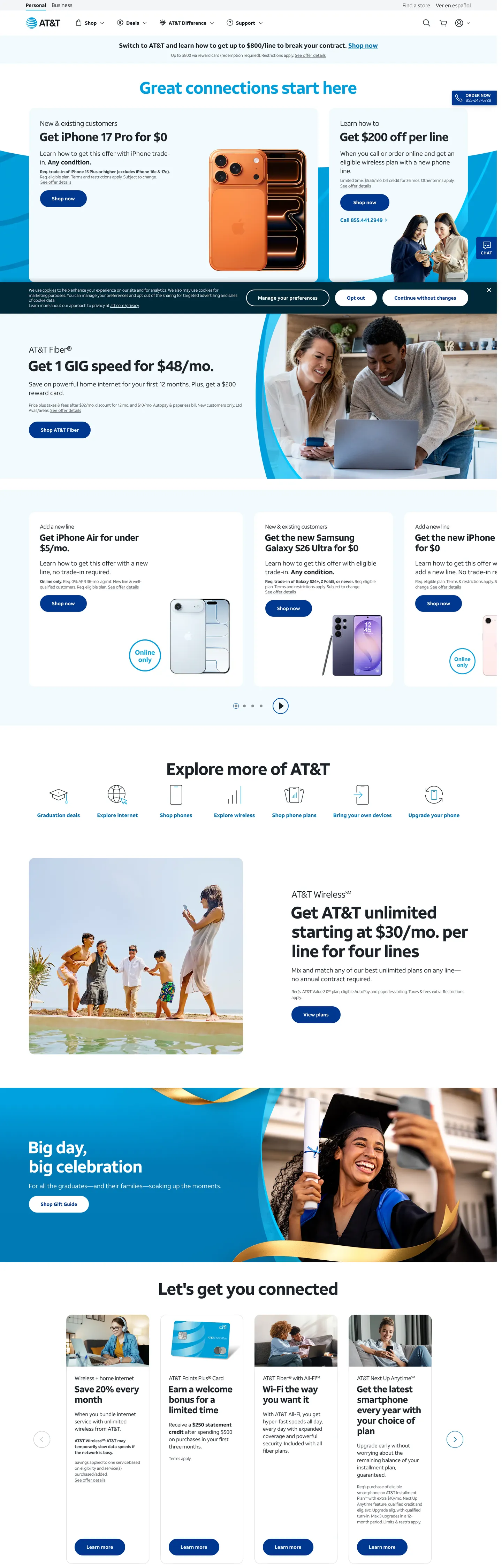
AT&T's marketing site is defined by a two-blue split: deep navy (#00388f) carries the load-bearing brand surface — every primary CTA button, every active state, every "Shop now" pill — while sky blue (#009fdb) handles expressive moments, most notably the hero headline "Great connections start here" rendered at 48px in sky blue on a white ground. The rest of the page is dark charcoal (#1d2329) on white, with hairline-bordered cards and a remarkably sparse use of color for a consumer carrier at this scale. Where Verizon is achromatic with a neon accent and T-Mobile is saturated magenta, AT&T commits to two blues and lets them divide typographic and interactive labor.
This DESIGN.md file captures 14 colors tokens from the system, covering the two-blue primary tier, the charcoal ink ladder (dark charcoal, mid-charcoal, and muted-gray), white canvas and tinted-canvas surfaces, and two shadow tones. Fourteen typography tokens span font-bold and font-regular (AT&T's proprietary families) at sizes from 48px display down to 12px caption, all with the negative letter-spacing AT&T applies at scale. Thirteen components cover the navy pill button, the sky-blue hero heading, hairline-bordered service cards, the deep-dark promotional callout panel, and the white text input with 8px corner radius.
Feed this file to Claude or Cursor and it will reproduce AT&T's disciplined moves: navy-fill pill CTAs instead of colored-canvas heroes, sky-blue reserved for hero headline emphasis only, tight-tracked font-bold at every heading tier, and a card grid that uses 1px cool-gray hairlines for separation without any surface color. The two-blue structure is the system's teaching: color contrast can carry typographic hierarchy without requiring a third accent.
What makes it distinct
5
- Two-blue systemnavy #00388f carries all primary CTAs while sky blue #009fdb carries hero headline text; no tertiary voltage exists
- Display in navy-on-white, not on a tinted canvasthe hero headline floats sky-blue on a white background, inverting the telco-tinted-hero convention
- 28px pill buttonsthe CTA geometry is fully rounded but at 48px height with 32px horizontal padding, making it more substantial than the typical 36px pill
- Tight negative tracking on boldfont-bold runs at -1.44px tracking at 48px display, -0.78px at 26px sub-headings; the tracking tightens at scale
- Dark-charcoal ink (#1d2329)not pure black; a slightly blue-tinted near-black that echoes the navy system and softens the page
att.com
Live at att.com
A snapshot of the brand in production. Scroll the frame to see the whole page.
Colors
14 colors
AT&T's system runs on #00388f as its primary voltage, used in 2 of 14 components. Type is set in font-bold across 12 tokens from 12px to 48px, weights 400–400. Shape language is soft — components average 14px corner radius, with no sharp interactive edges.
Brand & Accent
Sparing, CTA-only voltage · 3
Surface
Page and card backgrounds · 2
Text
Headlines, body, captions · 5
Borders & Hairlines
Dividers, outlines, rules · 2
Other
Specialty colors · 2
Typography
12 type tokens
Set in font-bold across 12 tokens, from 12px to 48px, weights 400–400. Shown in its own stack: where the font isn't installed, the fallback the file names stands in.
- display-xl48px · weight 400 · lh 55.2px · tracking -1.44pxThe quick brown fox jumps over the lazy dog
- display-lg34px · weight 400 · lh 39.1px · tracking -1.02pxThe quick brown fox jumps over the lazy dog
- heading-md26px · weight 400 · lh 29.9px · tracking -0.78pxThe quick brown fox jumps over the lazy dog
- heading-sm20px · weight 400 · lh 23px · tracking -0.6pxThe quick brown fox jumps over the lazy dog
- heading-xs18px · weight 400 · lh 25.2pxThe quick brown fox jumps over the lazy dog
- body-lg18px · weight 400 · lh 25.2pxThe quick brown fox jumps over the lazy dog
- body-md15px · weight 400 · lh 21pxThe quick brown fox jumps over the lazy dog
- body-sm16px · weight 400 · lh 18.4px · tracking -0.48pxThe quick brown fox jumps over the lazy dog
- button-md14px · weight 400 · lh 14pxThe quick brown fox jumps over the lazy dog
- nav-link15px · weight 400 · lh 21pxThe quick brown fox jumps over the lazy dog
- caption12px · weight 400 · lh 16.8pxThe quick brown fox jumps over the lazy dog
- caption-tight12px · weight 400 · lh 14.4px · tracking -0.3pxThe quick brown fox jumps over the lazy dog
Layout
Radii and spacing
7 corner radii and 7 spacing values. Shape language: soft.
Radii
- none0px
- sm4px
- md8px
- lg16px
- xl32px
- pill28px
- full100%
Spacing
- xs4px
- sm8px
- base16px
- lg24px
- xl32px
- 2xl48px
- 3xl64px
Components
14 components
Each rendered from its tokens (color, type, radius, padding) on AT&T's own canvas.
- Button Primarybutton-primaryButton Primary
- Button Secondarybutton-secondaryButton Secondary
- Top Navtop-navTop Nav
- Nav Linknav-linkNav Link
- Hero Headinghero-headingHero Heading
- Hero Sectionhero-sectionHero Section
- Section Headingsection-headingSection Heading
- Body Paragraphbody-paragraphBody Paragraph
- CardcardCard
- Card Darkcard-darkCard Dark
- Category Icon Cellcategory-icon-cellCategory Icon Cell
- Type here…text-inputText Input
- Legal Captionlegal-captionLegal Caption
- Platform Badgeplatform-badgePlatform Badge
In use
The system, in use
AT&T's tokens on the kind of product it builds.
Build something people actually use.
A short paragraph of marketing copy that previews how the brand's display tier and body tier read together. Two sentences is usually enough.
- · 1 project
- · Community support
- · 10k req/mo
- · 10 projects
- · Priority support
- · 1M req/mo
- · Custom domains
- · Unlimited
- · SLA
- · Audit log
- · SSO
FAQ
AT&T design system FAQ
Common questions about AT&T's tokens, components, and how to use this DESIGN.md in your project.
Read next
Related reading
Specs, directories, and component libraries that pair with this design system.
- Browse all design systemsThe full directory of DESIGN.md files on shadcn.io, with live mockups for each.shadcn.io
- AT&T — official siteAT&T's public marketing site — the source of truth for the live tokens captured in this file.att.com (opens in a new tab)
- The DESIGN.md specificationGoogle Labs' open spec for machine-readable design system files — the format this page is built on.github.com (opens in a new tab)
Use it
Use AT&T in your project
One machine-readable file. Drop it into Claude, Cursor, or any AI tool that reads DESIGN.md.
Download the DESIGN.md
One machine-readable file: every color, type, radius, spacing, and component token of AT&T.
Feed it to your AI tool
Drop it into Claude, Cursor, or GitHub Copilot. The agent writes React components and Tailwind classes that match AT&T's visual language.
Reference the tokens directly
Or paste the values into your Tailwind config, CSS variables, or component library: every color, size and radius is a quoted, ready-to-copy value.
Read the full DESIGN.md: overview, rationale, do’s and don’ts
Overview
AT&T's marketing site runs on a two-blue hierarchy — not a gradient, not a spectrum, but a disciplined split. Two-blue authority: deep navy (#00388f) fills every primary CTA button and active card state while sky blue (#009fdb) carries a single expressive role — the hero headline "Great connections start here" in the above-fold panel. The two blues never compete because they never occupy the same visual layer: navy is always an interactive fill and sky blue is always a display-text accent. Where Verizon runs achromatic with a neon deal badge and T-Mobile saturates the hero canvas in magenta, AT&T positions brand color in the button, not the background.
The display type is defined by tight negative tracking: font-bold at 48px sits at -1.44px letter-spacing, pulling the headline characters close without condensing the individual letterforms. This is the system's typographic fingerprint. Smaller headings scale the tracking back in proportion — 26px at -0.78px, 20px at -0.6px — creating a tracking ladder that reads as a coherent system rather than an arbitrary choice. Inter at weight 700 with matched tracking values is the closest open-source analog.
The page canvas is white, and the card grid uses 1px shadow-cast hairlines (#dcdfe3) for separation — no surface color, no depth tinting. The one exception is the full-bleed dark-navy promotional panel (#002837 background) used for the "Get AT&T unlimited" subscription offer, where white text at large display size creates the page's editorial moment.
Key Characteristics:
- Dark charcoal ink (#1d2329) — not pure black; a slightly blue-tinted near-black with 1348 total occurrences (680 text, 665 border).
- Sky-blue (#009fdb) hero headline — appears 3 times total, all in the above-fold display tier; no other surface uses this value.
- Deep-navy (#00388f) fills all 15 of the captured primary button backgrounds — consistent, no hover-override visible in the captured surface.
- 28px pill radius on all CTAs — fully rounded at the button height but not styled as a 9999px semantic pill.
- Tight negative tracking cascade: -1.44px at 48px → -1.02px at 34px → -0.78px at 26px.
- Two proprietary font families (font-bold, font-regular), both loaded at CSS weight 400.
- 16px border-radius on product and service cards with 1px cool-gray hairline borders.
- Dark-navy deep panel (#002837) used as the sole full-bleed non-white section — 2 background occurrences.
Colors
Brand
- Primary Navy (
{colors.primary}— #00388f): frequency 32. Used as background (15), border (15), text (2). The CTA fill — every "Shop now" pill button, every active-state badge. Wired as a brand-layer color with no CSS custom properties exposed in the captured page. - Primary Dark (
{colors.primary-dark}— #002837): frequency 2. Used as background only — the deep promotional band. A deeper, colder navy distinct from the primary CTA blue. Brand layer. - Sky Accent (
{colors.accent-sky}— #009fdb): frequency 3. Used as text (1), background (1), border (1). The hero headline color and inline-link accent. Brand layer.
Surface
- Canvas (
{colors.canvas}— #ffffff): frequency 95. Used as text (38), background (30), border (25). Page floor, button text, card surfaces. - Surface Tinted (
{colors.surface-tinted}— #f3f4f6): frequency 13, all as background. Light background fills for icon-cell rows and alternate-stripe sections.
Text
- Ink (
{colors.ink}— #1d2329): frequency 1348. Used as text (680), border (665), shadow (3). The dominant text and border color — a dark blue-charcoal rather than pure black. 665 border occurrences means it carries the card-hairline system as well as text. - Ink Soft (
{colors.ink-soft}— #454b52): frequency 120. Used as text (60) and border (60). Secondary running text — body copy within cards and promotional descriptions. - Ink Muted (
{colors.ink-muted}— #686e74): frequency 1 text, 1 border. Form input border color in resting state. - Ink Light (
{colors.ink-light}— #878c94): frequency 2. Caption and secondary metadata text.
Hairline
- Hairline (
{colors.hairline}— #dcdfe3): frequency 7, all as shadow. The card-elevation shadow tone — used as box-shadow rather than border, giving cards a 1px cast appearance without a hard border line. - Hairline Light (
{colors.hairline-light}— #bdc2c7): frequency 1 border. Used on less prominent dividers.
Supporting
- Mid Blue (
{colors.mid-blue}— #0072b2): frequency 85. Used as text (42) and border (43). Link text color for inline body links and icon-category labels. A mid-register blue between the navy CTA and the sky-blue accent. - Link Blue (
{colors.link-blue}— #0057b8): frequency 2. Occasional inline link variant.
Typography
Font Families
AT&T's system loads exactly two proprietary families: font-bold for every heading, sub-heading, button label, nav link, and emphasized body element; font-regular for body copy, legal captions, and secondary text. Both files are loaded at CSS font-weight: 400 — the weight is embedded in the font file itself rather than controlled by the CSS weight property. This is not standard CSS behavior; it means that font-weight: 700 does NOT produce the intended bold on a substituted font. When substituting, use Inter at CSS weight 700 for font-bold contexts and Inter at weight 400 for font-regular.
The negative letter-spacing is the system's defining move. AT&T applies tighter tracking than any other telco brand in this directory — -1.44px at 48px is more aggressive than Cloudflare's -1.4px at 56px.
Hierarchy
| Token | Family | Size | Weight | Tracking | Use |
|---|---|---|---|---|---|
{typography.display-xl} | font-bold | 48px | 400 | -1.44px | Hero h2 ("Great connections start here") |
{typography.display-lg} | font-bold | 34px | 400 | -1.02px | Section h3 display |
{typography.heading-md} | font-bold | 26px | 400 | -0.78px | Card and feature headings |
{typography.heading-sm} | font-bold | 20px | 400 | -0.6px | Sub-section titles |
{typography.heading-xs} | font-bold | 18px | 400 | 0 | Feature-item headings |
{typography.body-lg} | font-regular | 18px | 400 | 0 | Section lead copy |
{typography.body-md} | font-regular | 15px | 400 | 0 | Default running text |
{typography.body-sm} | font-regular | 16px | 400 | -0.48px | Body with controlled tracking |
{typography.button-md} | font-bold | 14px | 400 | 0 | CTA button label |
{typography.nav-link} | font-bold | 15px | 400 | 0 | Top-nav link labels |
{typography.caption} | font-regular | 12px | 400 | 0 | Caption rows |
{typography.caption-tight} | font-regular | 12px | 400 | -0.3px | Legal disclaimer captions |
Substitutes
Use Inter 700 for font-bold contexts (apply negative tracking exactly as specified) and Inter 400 for font-regular. The -1.44px tracking at 48px is the most important single value to preserve.
Layout
- Base unit: 16px dominant (67 occurrences). Secondary values: 8px (14), 24px (13), 32px (5).
- Card padding: 24px internal top, 8px bottom (matching the 24×8px vertical rhythm captured in 31 occurrences of the compound spacing token).
- Hero section: white canvas, full-width headline at 48px sky-blue text, below which a 2-up device-panel carousel fills the horizontal.
- Icon grid ("Explore more of AT&T"): 6-column with 16px-radius circular icon frames and 12px caption beneath each icon.
- Dark promo band: full-bleed dark-navy (#002837) with centered heading at 34px font-bold and a pill CTA in navy.
Elevation
The system uses shadow-cast elevation rather than border-only cards. The 7 occurrences of #dcdfe3 are all as shadow fills — used as box-shadow with small x/y offsets to create a lifted-card appearance. The #25303a shadow (3 occurrences) adds a darker second-layer shadow depth to select promo cards. There are no hard 1px black hairline borders in the AT&T card system; the elevation comes from soft shadow casting, distinguishing it from Verizon's hard-edge card treatment.
Shapes
The radius scale is modest-to-pill with no extreme values between:
{rounded.none}0px — hero section, full-bleed bands.{rounded.sm}4px — smallest UI surfaces (1 occurrence).{rounded.md}8px — form inputs, toggle controls (1 occurrence each).{rounded.lg}16px — product and service cards (22 occurrences), the dominant radius.{rounded.xl}32px — large feature tile (1 occurrence).{rounded.pill}28px — all CTA buttons (22 occurrences), the dominant UI-interactive radius.{rounded.full}100% — avatar circles, icon-frame circles (16 occurrences).
Components
button-primary — Deep-navy (#00388f) fill, white text in font-bold at 14px, 28px-radius pill, 0×32px padding, 48px height. The "Shop now" canonical instance.
button-secondary — White fill, navy text, navy border, same pill geometry. Used for secondary and outline actions alongside primary CTAs.
top-nav — White canvas, charcoal ink text, 64px height, AT&T globe wordmark left-aligned. Contains "TV," "Internet," "Wireless" and account/cart icons right-aligned.
nav-link — Transparent background, ink text in font-bold at 15px / 400, 8×16px padding. No hover fill visible in the captured surface.
hero-heading — Sky-blue (#009fdb) text at font-bold 48px / -1.44px tracking. The one expressive color moment in the marketing chrome — appearing on a white canvas ground, not a tinted canvas.
hero-section — White canvas, 48×32px padding around the centered hero headline + CTA stack.
section-heading — Dark-charcoal ink text at font-bold 26px / -0.78px tracking. Used for "Explore more of AT&T," "Let's get you connected," and other section titles.
body-paragraph — Ink-soft (#454b52) text at font-regular 15px / 0 tracking. Secondary body copy within product sections.
card — White surface, charcoal ink text, 16px corner radius, 1px cool-gray shadow-cast, 24px internal padding. Product and service offering cards.
card-dark — Deep-navy (#002837) fill, white text at font-bold display sizes. The full-bleed unlimited-plan promotional section.
category-icon-cell — Transparent background, icon + caption layout, 16×8px padding. Used in the "Explore more" 6-up icon grid (TV, Internet, Wireless, etc.).
text-input — White surface, charcoal ink text at font-regular 16px / -0.48px, 8px border-radius, 0×24px left/right / 0×16px padding compound, 48px height, 1px ink-muted border.
legal-caption — Ink-soft text at font-regular 12px / -0.3px. Pricing-plan disclaimer text beneath promotional CTAs.
platform-badge — White fill, ink text, 28px-radius pill, 8×16px padding, 1px hairline border. Service-tier label chips (e.g., "AT&T Business").
Do's and Don'ts
Do render the hero headline in sky blue (#009fdb) on a white canvas — not on a navy or tinted-canvas background. The system places the expressive accent color against maximum contrast; rendering it on a colored surface reduces both legibility and brand impact.
Do apply the negative tracking cascade exactly. The -1.44px tracking at 48px is not decorative; it is the system's most specific typographic move. Substituting a less tight value (e.g., -0.5px) at 48px display produces a markedly different visual rhythm.
Do use {colors.mid-blue} (#0072b2) for inline body links. This is distinct from both the navy CTA (#00388f) and the sky-blue accent (#009fdb) — using either of those two for inline links blurs the color hierarchy.
Don't fill any heading or display text with the primary navy (#00388f). The navy is an interactive surface color; placing it on static display text blurs the button-versus-content distinction. Sky blue (#009fdb) is the correct hero-headline accent.
Don't use {colors.ink} (#1d2329) for form input borders. The input resting border is {colors.ink-muted} (#686e74) — using the full-weight charcoal ink on inputs creates too much visual weight against the card-shadow system.
Don't add a third accent color. The two-blue architecture (navy CTA + sky-blue headline) is the system's deliberate constraint. Introducing an orange, green, or red accent in the marketing chrome reads as a sub-brand divergence, not a brand extension.
Don't use {rounded.xl} (32px) on standard product cards. The 16px radius is the card convention; 32px reads as a promo-tile or pill that breaks the grid rhythm. One occurrence at 32px was captured — it belongs to a single featured promotional tile, not to the repeating grid.
Known Gaps
- Hover and focus states: the captured primary button shows only the resting state; hover fill changes and focus-ring dimensions are not exposed on the static marketing page.
- Dark mode: the page is light-only in the captured surface. The
#002837deep-navy band is a dark section within a light page, not a system-wide dark mode. - Carousel pagination: the hero device-panel carousel uses dot-indicators for navigation; the active-dot fill color is not captured in the static extraction.
- Motion: the hero carousel auto-advances; timing curves and transition duration are not captured.
- AT&T Business and FirstNet sub-sites carry their own token sets not present in the consumer marketing surface extraction.
- Icon system: AT&T uses a custom icon font for the category icons (TV, Internet, Wireless, Mobile Security); these are not captured as SVG tokens.
Consumer Electronics
More systems like this
More DESIGN.md files in Consumer Electronics.
Pricing
Build it with Pro
The DESIGN.md files are free. Pro adds 6,000+ blocks, premium templates and the MCP server, so your AI editor builds in your system for you.
4.9/5 out of 5 · 150+ reviewsfrom 150+ founders and developers.
Billing
Billed once a year in USD. Cancel anytime.
- How many people can use the license.
- Client work, SaaS products and anything you charge for.
- Production-ready React sections: hero, pricing, features, dashboards and more.
- Complete multi-page sites you can ship as they are.
- React icons from every major library, installable with one command.
- Presets that restyle every block, in light and dark.
- Lets your AI editor search, preview and install blocks for you.
- Priority requests are answered first.
Individual
For personal projects & open source
$32instead of $49/mo
$389 billed yearly
- Seats: 1 seat
- Commercial use: Personal & open source only
- Pro blocks: 6,000+ blocks
- Templates: All 14 templates
- React icons: 294k+ icons
- Themes: All 59 themes
- MCP server: Basic usage
- Support: Standard
Team
Most popularFor freelancers, agencies & startups
$66instead of $99/mo
$789 billed yearly · ≈ $13/dev/mo
- Seats: Up to 5 seats
- Commercial use: Included
- Pro blocks: 6,000+ blocks
- Templates: All 14 templates
- React icons: 294k+ icons
- Themes: All 59 themes
- MCP server: High usage
- Support: Priority
Organization
For companies with larger teams
$132instead of $199/mo
$1,589 billed yearly
- Seats: Unlimited seats
- Commercial use: Included
- Pro blocks: 6,000+ blocks
- Templates: All 14 templates
- React icons: 294k+ icons
- Themes: All 59 themes
- MCP server: Unlimited usage
- Support: Priority
Billed once a year in USD. Cancel anytime.
Individual
For personal projects & open source
$32instead of $49/mo
$389 billed yearly
- How many people can use the license.Seats: 1 seat
- Client work, SaaS products and anything you charge for.Commercial use: Personal & open source only
- Production-ready React sections: hero, pricing, features, dashboards and more.Pro blocks: 6,000+ blocks
- Complete multi-page sites you can ship as they are.Templates: All 14 templates
- React icons from every major library, installable with one command.React icons: 294k+ icons
- Presets that restyle every block, in light and dark.Themes: All 59 themes
- Lets your AI editor search, preview and install blocks for you.MCP server: Basic usage
- Priority requests are answered first.Support: Standard
Team
Most popularFor freelancers, agencies & startups
$66instead of $99/mo
$789 billed yearly · ≈ $13/dev/mo
Everything in Individual, plus
- How many people can use the license.Seats: Up to 5 seats
- Client work, SaaS products and anything you charge for.Commercial use: Included
- Lets your AI editor search, preview and install blocks for you.MCP server: High usage
- Priority requests are answered first.Support: Priority
Organization
For companies with larger teams
$132instead of $199/mo
$1,589 billed yearly
Everything in Team, plus
- How many people can use the license.Seats: Unlimited seats
- Lets your AI editor search, preview and install blocks for you.MCP server: Unlimited usage
- Secure checkout via Stripe
- Code lives in your repo
- Keep what you've shipped if you cancel
- License terms
Your system, built for you
Every block, template and icon, installed by your AI agent in your design system. The DESIGN.md files stay free.