DJI Design System
DJI's design system as a DESIGN.md file. Sky CTA #0070d5, Open Sans, 18 colors, 20 components. For React, Next.js, and AI tools.
Add shadcn.io to your AI agent. · Pro It installs blocks, icons and templates in your design system from a prompt, with Pro.
Set up MCP- Primary
- #0070d5
- Typeface
- Open Sans
- Shape
- Sharp
- Base radius
- 4px
- Colors
- 18
- Type tokens
- 10
- Components
- 20
- Spacing values
- 7
About
About DJI DESIGN.md
Curated by Dov Azencot · Updated May 13, 2026 · Source dji.com (opens in a new tab)
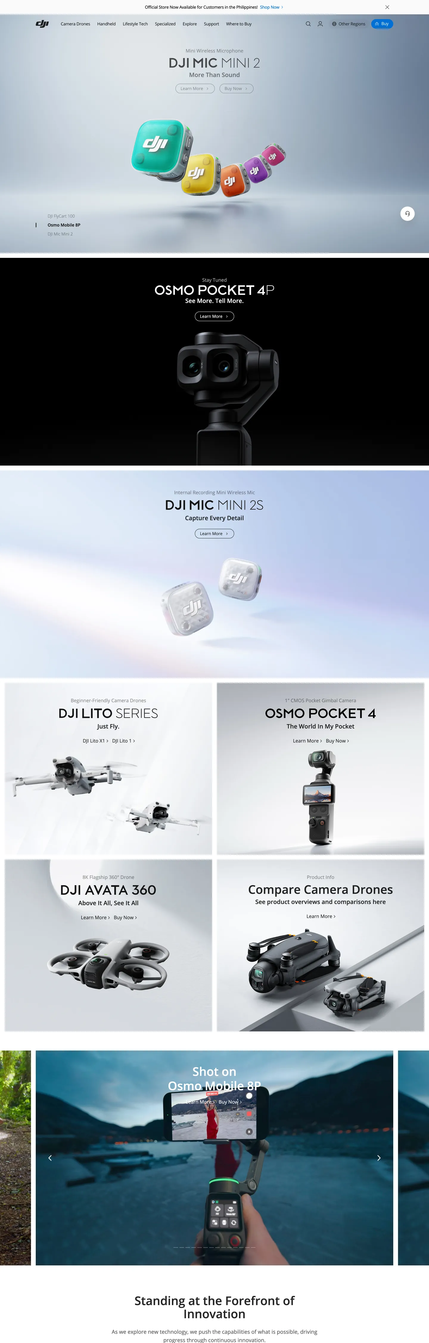
DJI's web presence reads like a hardware catalog re-staged inside an aerospace gallery. The homepage opens on a pure black "#000000" hero canvas with a stark white "OSMO POCKET 4" set at 40px Open Sans weight 500 — no gradient, no atmospheric mesh, no decorative chrome. Below that, the page settles into a predictable alternation: a 2-up grid of white product cards holding the Mini, Avata 360, and Lite drone lineups, then another black tile, then a deep landscape photograph of a pilot operating a drone over alpine water captioned "Standing at the Forefront of Innovation." The chrome itself is restrained to the point of invisibility, because the chrome is not the point — the aircraft is.
This file packages DJI's marketing chrome into a single Google Labs DESIGN.md spec. Inside: 18 colors tokens covering the two-blue split (Sky CTA "#0070d5" for buttons, DJI Brand Blue "#3b63a9" for accent fills, and a legacy hyperlink "#0000ee" for inline links), pure black and white as the dominant surface pair, plus a graded neutral ladder from "#272727" through "#ededed"; 10 typography roles all running Open Sans at weights 300 through 600; a 5-step radius scale topping out at the extreme 1408px pill used on every primary CTA; an 8px-based spacing system; and 20 components definitions covering pill buttons, product cards, the dark hero tile, the navigation row with the embedded blue search input, and the alpine atmospheric photograph footer card.
Drop the file into Claude, Cursor, or GitHub Copilot and the agent will produce React components that respect DJI's catalog grammar — single-blue CTA pills against alternating black/white tiles rather than a generic SaaS hero. Reference the tokens directly in Tailwind config or CSS variables; every hex and pixel value is quoted and ready to paste. The system is worth studying because it inverts the convention of hardware marketing: where most consumer-electronics brands lean on hero gradients and product glow, DJI runs flat black tiles and a single pill button.
What makes it distinct
5
- Two blues, two jobsSky CTA #0070d5 owns pill buttons; DJI Brand Blue #3b63a9 appears only on accent fills and the favicon-tier corner badge
- Pure #000000 hero canvasevery flagship product (Osmo Pocket, Mini, Air) launches against black with white 40px/500 Open Sans, no gradient, no atmospheric mesh
- Pill-radius extremismprimary CTAs render at 1408px border-radius (effectively full pill); cards use a flat 4px corner with no shadow
- Open Sans monopolyevery tier from 12px legal to 40px display runs the same family; weight ladder is 300/400/500/600 with 500 doing all hero work
- Catalog-grid compositiona 2-up product card stack alternates with full-bleed black product tiles, the surface flip itself acting as the section divider
dji.com
Live at dji.com
A snapshot of the brand in production. Scroll the frame to see the whole page.
Colors
18 colors
DJI's system runs on #0070d5 as its primary voltage, used in 3 of 20 components. Type is set in Open Sans across 10 tokens from 12px to 40px, weights 400–600. Shape language is sharp — components average 2px corner radius, favoring crisp rectangles.
Brand & Accent
Sparing, CTA-only voltage · 2
Surface
Page and card backgrounds · 5
Text
Headlines, body, captions · 9
Borders & Hairlines
Dividers, outlines, rules · 2
Typography
10 type tokens
Set in Open Sans across 10 tokens, from 12px to 40px, weights 400–600. Shown in its own stack: where the font isn't installed, the fallback the file names stands in.
- display-xl40px · weight 500 · lh 1.1The quick brown fox jumps over the lazy dog
- display-lg32px · weight 500 · lh 1.125The quick brown fox jumps over the lazy dog
- display-md32px · weight 600 · lh 1.125 · tracking -0.96pxThe quick brown fox jumps over the lazy dog
- heading-md24px · weight 500 · lh 1.5The quick brown fox jumps over the lazy dog
- heading-sm20px · weight 500 · lh 1.2The quick brown fox jumps over the lazy dog
- body-lg16px · weight 400 · lh 1.5 · tracking -0.32pxThe quick brown fox jumps over the lazy dog
- body-md14px · weight 400 · lh 1.43 · tracking -0.28pxThe quick brown fox jumps over the lazy dog
- body-sm12px · weight 400 · lh 2The quick brown fox jumps over the lazy dog
- button-md14px · weight 400 · lh 1 · tracking -0.28pxThe quick brown fox jumps over the lazy dog
- caption12px · weight 500 · lh 2The quick brown fox jumps over the lazy dog
Layout
Radii and spacing
5 corner radii and 7 spacing values. Shape language: sharp.
Radii
- none0px
- sm4px
- lg60px
- pill1408px
- full9999px
Spacing
- xxs4px
- xs8px
- sm12px
- md16px
- lg24px
- xl48px
- section112px
Components
20 components
Each rendered from its tokens (color, type, radius, padding) on DJI's own canvas.
- Button Primarybutton-primaryButton Primary
- Button Primary Activebutton-primary-activeButton Primary Active
- Button Secondarybutton-secondaryButton Secondary
- Button Accent Fillbutton-accent-fillButton Accent Fill
- Text Linktext-linkText Link
- Top Navtop-navTop Nav
- Nav Linknav-linkNav Link
- Search Inputsearch-inputSearch Input
- Product Tile Darkproduct-tile-darkProduct Tile Dark
- Product Tile Lightproduct-tile-lightProduct Tile Light
- Product Cardproduct-cardProduct Card
- Product Card Titleproduct-card-titleProduct Card Title
- Product Card Metaproduct-card-metaProduct Card Meta
- Hero Eyebrowhero-eyebrowHero Eyebrow
- Hero Headlinehero-headlineHero Headline
- Editorial Cardeditorial-cardEditorial Card
- Footer Headlinefooter-headlineFooter Headline
- DividerdividerDivider
- Fine Printfine-printFine Print
- icon-button-circularIcon Button Circular
In use
The system, in use
DJI's tokens on the kind of product it builds.
Build something people actually use.
A short paragraph of marketing copy that previews how the brand's display tier and body tier read together. Two sentences is usually enough.
FAQ
DJI design system FAQ
Common questions about DJI's tokens, components, and how to use this DESIGN.md in your project.
Read next
Related reading
Specs, directories, and component libraries that pair with this design system.
- Browse all design systemsThe full directory of DESIGN.md files on shadcn.io, with live mockups for each.shadcn.io
- DJI — official siteThe drone, gimbal, and aerial-imaging hardware brand whose marketing chrome this file documents.dji.com (opens in a new tab)
- The DESIGN.md specificationGoogle Labs' open spec for machine-readable design system files — the format this page is built on.github.com (opens in a new tab)
Use it
Use DJI in your project
One machine-readable file. Drop it into Claude, Cursor, or any AI tool that reads DESIGN.md.
Download the DESIGN.md
One machine-readable file: every color, type, radius, spacing, and component token of DJI.
Feed it to your AI tool
Drop it into Claude, Cursor, or GitHub Copilot. The agent writes React components and Tailwind classes that match DJI's visual language.
Reference the tokens directly
Or paste the values into your Tailwind config, CSS variables, or component library: every color, size and radius is a quoted, ready-to-copy value.
Read the full DESIGN.md: overview, rationale, do’s and don’ts
Overview
DJI's web presence is a hardware catalog re-staged inside an aerospace gallery — product-photography-first restraint carried by alternating black and white tiles, two specialized blues, and a single Open Sans family at weight 500. The homepage stack opens on a pure #000000 hero with white display type at 40px/500, drops into a 2-up product card grid on white that holds the Mini, Avata 360, and Lite drone lineups, then closes on a full-bleed alpine photograph of a pilot operating an aircraft over water — the editorial headline Standing at the Forefront of Innovation floats above it. Chrome itself is near-invisible, because the chrome is not the point.
Two blues, two jobs: Sky CTA at {colors.primary} (#0070d5) carries every pill button — Buy, Learn More, Add to Cart — while DJI Brand Blue at {colors.primary-deep} (#3b63a9) appears only as accent fill on small surfaces and the favicon-tier badge. A third blue at {colors.link} (#0000ee) remains as an inline anchor color carried through from the legacy browser default. Where most consumer-electronics brands collapse blue into one variable, DJI runs three with strict role separation.
The surface system is deliberately polarized. There are no graded card elevations, no atmospheric mesh, no drop shadows worth speaking of — the page rhythm is built entirely from the flip between black hero tiles and white card sections, with a soft {colors.divider-soft} (#ededed) wash beneath product imagery so silver drone bodies read against the canvas. The radius scale is equally polarized: a flat {rounded.sm} (4px) on every structural surface and an extreme {rounded.pill} (1408px) on the Buy button. There is nothing between them.
Key Characteristics:
- Alternating black/white tile rhythm; the surface flip is the section divider.
- Single CTA pill at
{rounded.pill}(1408px) — every primary button is the full-pill Sky CTA. - Two-blue split with strict role separation: Sky CTA
{colors.primary}for buttons, DJI Brand Blue{colors.primary-deep}for accent fills, hyperlink{colors.link}for inline links. - Open Sans monopoly across every tier; weight ladder is 300 / 400 / 500 / 600 with 500 doing all hero work.
- Hero display at 40px/500 with 44px leading; body at 14px/400 with
-0.28pxtracking. - Flat 4px corner on cards and inputs; no shadows on structural surfaces.
- Atmospheric depth comes from photography (alpine water vista with drone pilot), never from a CSS gradient.
- A 112px top-padding constant runs across every section tile — the rhythm shows up 11 times in the extracted layout.
Colors
Source page analyzed: the dji.com global homepage hero, the Mini / Avata / Lite product card grid, and the alpine atmospheric photograph footer card. The same chrome runs across most product subpages with only the hero photography swapping per device.
Brand & Accent
- Sky CTA (
{colors.primary}—#0070d5) — frequency 5. Used as text (2), border (2), background (1). The single load-bearing button color — every Buy, Learn More, and Add to Cart pill renders against this Sky blue. Reserved for primary action signals; never used on body type or hairlines. - DJI Brand Blue (
{colors.primary-deep}—#3b63a9) — frequency 3. Used as bg (3). The deeper, more saturated blue that fills the favicon-tier corner badge and small accent chips. Scoped tightly; never on body buttons. - Hyperlink Blue (
{colors.link}—#0000ee) — frequency 304. Used as text (162), border (142). The unstyled<a>default carried through inline body copy and footer link columns — a legacy browser-tone that DJI hasn't restyled because the navy contrast against white is already on-brand.
Surface
- Pure Black (
{colors.surface-dark}—#000000) — frequency 746. Used as text (366), border (373), bg (2), shadow (5). The dominant canvas: hero tiles, primary product backdrops, and edge-to-edge photographic overlays. Doubles as the body ink on white surfaces. - Pure White (
{colors.canvas}—#ffffff) — frequency 340. Used as text (159), border (171), bg (10). The body canvas. Cards, navigation strip, and product-grid container. - Soft Grey Wash (
{colors.surface-card}—#ededed) — frequency 17. Used as bg (17), exclusively. The neutral beneath product photography in card tiles — lets silver drone bodies read against the page without introducing a second tint. - Near-Black Soft (
{colors.ink-soft}—#272727) — frequency 2. Used as bg (2). The micro-step lighter variant used on darker card embeds and video frames where pure black would feel inert.
Text
- Ink (
{colors.ink}—#000000) — same hex as the surface ink. DJI uses one true black tone for body type on white surfaces. - Body Strong (
{colors.body-muted}—#303233) — frequency 18. Used as text (9), border (9). A graphite tone used on secondary body type and hairline strokes — the chrome-on-chrome separator color. - Body Mute (
{colors.body-mute}—#6c7073) — frequency 17. Used as text (8), border (8), bg (1). The muted caption tone — product subtitles, price-detail lines, and fine print under each product card. - On Dark (
{colors.on-dark}—#ffffff) — all text and small icons on black hero tiles, plus inset chip strokes on the dark canvas.
Hairlines & Borders
- Hairline (
{colors.hairline}—#6c7073) — same hex as Body Mute, repurposed as the 1px stroke on the navigation search input. There is only one hairline tone in the system; structural separators come from surface flip, not from rules. - Divider Soft (
{colors.divider-soft}—#ededed) — the wash beneath cards doubles as the soft horizontal rule between footer link columns. Light enough to disappear at viewport scale, present enough to anchor scan rhythm.
Brand Gradient
No decorative gradients. Atmospheric depth comes entirely from photographic content — the alpine water vista in the lower homepage section, the studio-lit silver drone bodies, the matte-black gimbal renders. Where most hardware sites lean on a hero-mesh blur, DJI's hero is literally #000000. Zero gradient tokens are defined in the chrome.
Typography
Font Family
- Brand:
Open Sans, PingFang SC, Microsoft YaHei, Helvetica Neue, Hiragino Sans GB, WenQuanYi Micro Hei, Arial, sans-serif— the same stack at every tier. Open Sans is the only Latin-script face; the rest of the stack covers East Asian locales without introducing a second display family. - OpenType features: No advanced features applied. The chrome relies entirely on size + weight contrast for hierarchy.
Hierarchy
| Token | Size | Weight | Line Height | Letter Spacing | Use |
|---|---|---|---|---|---|
{typography.display-xl} | 40px | 500 | 1.1 | 0 | Hero product headline (Osmo Pocket 4, Osmo Mobile 8P) |
{typography.display-lg} | 32px | 500 | 1.125 | 0 | Section heads (Standing at the Forefront of Innovation) |
{typography.display-md} | 32px | 600 | 1.125 | -0.96px | Rare emphasis heads with the brand's only tight-tracking move |
{typography.heading-md} | 24px | 500 | 1.5 | 0 | Sub-section heads |
{typography.heading-sm} | 20px | 500 | 1.2 | 0 | Product-card title (DJI Avata 360, DJI Lite Series) |
{typography.body-lg} | 16px | 400 | 1.5 | -0.32px | Primary paragraph copy |
{typography.body-md} | 14px | 400 | 1.43 | -0.28px | Card metadata, nav labels |
{typography.body-sm} | 12px | 400 | 2.0 | 0 | Legal fine print, footer column links |
{typography.button-md} | 14px | 400 | 1.0 | -0.28px | Pill CTA label |
{typography.caption} | 12px | 500 | 2.0 | 0 | Promo strip, micro-headings on small cards |
Principles
- One family, one job per tier. Every text role runs Open Sans. Hierarchy is built from size (10px → 40px) and weight (400 → 600) — color tinting plays no part. Where most consumer-electronics sites tint subheads to a muted grey, DJI keeps body type at full
#000000until the explicit{colors.body-mute}caption tier. - Weight 500 is the display tier. Unlike the fintech convention of holding display at weight 300 or 600, DJI sets every hero and product-card title at weight 500. The single tight-tracking move (
-0.96pxon 32px / 600) appears once. - Negative letter-spacing at body and label sizes. 14px and 16px copy carry
-0.28pxand-0.32pxtracking. The display tier above is set at0. The narrative is inverted from Apple's: DJI tightens body type, not headlines. - Body-sm at line-height 2.0. Footer link columns and fine print run at
1.0× line-heightdoubled — generous breathing room to scan tall column lists.
Note on Font Substitutes
- Open Sans is on Google Fonts and Bunny Fonts; direct substitution is rarely needed.
- If swapping: Inter at weight 500 with
letter-spacing: -0.2pxon body sizes matches Open Sans' cadence within ~2% at 14–16px. - Source Sans Pro is the closer typographic cousin if you want the same humanist warmth without the Inter geometry.
- Arial is the explicit final-tier fallback in the published CSS stack.
Layout
Spacing System
- Base unit: 8px (extracted at frequency 36 — the dominant gap token across the page).
- Tokens:
{spacing.xxs}4px ·{spacing.xs}8px ·{spacing.sm}12px ·{spacing.md}16px ·{spacing.lg}24px ·{spacing.xl}48px ·{spacing.section}112px. - Section vertical padding:
{spacing.section}(112px) at the top of every product tile. The 112px constant appears 11 times in the extracted layout — it is the spine of the page rhythm. - Card padding: 24px inside product cards.
- Button padding:
8px 16px 8px 34pxon the primary pill (note the asymmetric left-pad — accommodates a leading icon glyph). - Nav padding:
0px 48pxhorizontal on the top nav strip.
Grid & Container
- Hero width: full-bleed at all breakpoints; product imagery centers within a ~1392px content frame.
- Product-card grid: 2-up on desktop (
DJI Avata 360×DJI Lite Series), 1-up at mobile. Cards bind to a soft{colors.surface-card}wash so product photography reads against the page. - Editorial card: single-column atmospheric photograph with overlaid white text aligned to the bottom-center.
Whitespace Philosophy
DJI's whitespace is the aircraft's flight envelope. Every product card opens with at least 24px of air around its silver render; the hero tiles run a full 112px of top padding before the white display headline lands. Cards never crowd; the nearest content to a drone image is at least 16px away. The footer breaks pattern with denser link columns — a single concession to information density.
Elevation & Depth
| Level | Treatment | Use |
|---|---|---|
| Flat | No shadow, no border | Hero tiles, product cards, nav strip, footer |
| Surface flip | Black tile ↔ white tile transition | Section divider for the entire homepage |
| Soft wash | {colors.surface-card} (#ededed) beneath product imagery | Lets silver drone bodies read against white canvases |
| Photographic atmosphere | Full-bleed alpine vista with embedded text | Editorial moment near the page foot |
Shadow philosophy. The extraction surfaces shadow on only 5 elements across the entire homepage, all near-imperceptible. Elevation comes from (a) surface-color change (black hero ↔ white card section) and (b) the {colors.surface-card} wash that anchors product photography. Where most consumer-electronics brands lean on hero gradients and product-glow drop shadows, DJI runs flat tiles and lets the photography supply the atmosphere.
Decorative Depth
- Atmospheric photography on the editorial card (drone pilot, alpine water vista) supplies mood; no CSS gradient.
- Surface flip between
{colors.surface-dark}and{colors.canvas}is the primary section break. - Card wash at
{colors.surface-card}is the only "elevated" surface in the page.
Shapes
Border Radius Scale
| Token | Value | Use |
|---|---|---|
{rounded.none} | 0px | Full-bleed product tiles, hero canvas, footer |
{rounded.sm} | 4px | Product cards, search input, editorial card |
{rounded.lg} | 60px | Rare large pill on featured promo strips |
{rounded.pill} | 1408px | Primary CTA — effectively full pill at any realistic button width |
{rounded.full} | 9999px / 50% | Circular icon controls, avatar chips |
Photography Geometry
- Hero imagery: full-bleed product render against
{colors.surface-dark}; product shot dead-center, framed by 112px of vertical air. - Product card imagery: 1:1 or 4:3 silver-on-grey-wash product shots; rest on
{colors.surface-card}at{rounded.sm}radius. - Editorial photograph: 21:9 atmospheric vista with overlaid headline at the bottom.
- No rounded imagery in hero tiles — hero photography is full-bleed rectangular. Rounding (
{rounded.sm}) appears only on inline card imagery.
Components
Top Navigation
top-nav — Persistent white nav bar with 64px height and 0px 48px horizontal padding. Background {colors.canvas}, text {colors.ink} in {typography.body-md}. Holds the DJI wordmark, product menu, search input, and account chip. No border, no shadow — the strip sits flush against the page.
nav-link — Inline menu items in {typography.body-lg} (16px / 400) with 19px 48px 19px 0px asymmetric padding to lay out the horizontal menu row. Text color falls through to {colors.ink} by default.
search-input — Inline within the nav strip. Background transparent, text {colors.on-dark} in {typography.body-md} (14px), 1px hairline border at {colors.hairline} and {rounded.sm} (4px), padding 4px 0px 4px 12px, height 32px. Sits inside the dark mega-menu surface on hover.
Buttons
button-primary — The signature DJI action. Background {colors.primary} (Sky CTA #0070d5), text {colors.on-primary} in {typography.button-md} (Open Sans 14px / 400 / -0.28px), rounded {rounded.pill} (1408px — effectively full pill), padding 8px 16px 8px 34px, height 32px. The asymmetric left-pad accommodates a leading cart/play icon glyph on Buy and Learn More variants.
button-primary-active — Active state. Background and rounded inherit; the system uses a subtle transform: scale(0.97) micro-interaction on press without a hex change.
button-secondary — Ghost-pill variant. Background {colors.canvas}, text {colors.primary}, 1px hairline border in {colors.primary}, rounded {rounded.pill}, padding 8px 16px. Used when two pills sit together (Learn More / Buy).
button-accent-fill — Tertiary fill used inside promo strips and small cart chips. Background {colors.primary-deep} (#3b63a9), text {colors.on-primary}, rounded {rounded.pill}, padding 5px 16px. Distinct from the primary blue — never used as a body action.
text-link — Inline anchor in {colors.link} (#0000ee), the legacy browser-default blue. Carried through unmodified across body copy and footer columns.
Cards & Containers
product-tile-dark — Full-bleed hero tile. Background {colors.surface-dark} (#000000), text {colors.on-dark} in {typography.display-xl} (40px / 500), rounded {rounded.none}, padding 112px 48px. Centered stack: eyebrow line in {typography.body-md} → headline in {typography.display-xl} → product render dead-center.
product-tile-light — Full-bleed light tile. Background {colors.canvas}, text {colors.ink} in {typography.display-lg}. Same structural padding as the dark tile.
product-card — 2-up product card on the homepage grid (DJI Avata 360, DJI Lite Series). Background {colors.surface-card} (#ededed), text {colors.ink}, rounded {rounded.sm} (4px), padding 24px. Top: product photograph centered on the soft wash. Bottom: product title in {typography.heading-sm} and a one-line meta caption in {typography.body-md} at {colors.body-mute}.
product-card-title — Card heading slot in {typography.heading-sm} (20px / 500), {colors.ink}.
product-card-meta — Card subtitle slot in {typography.body-md} (14px / 400), {colors.body-mute} (#6c7073).
hero-eyebrow — Pre-headline eyebrow label on dark hero tiles. {typography.body-md} in {colors.on-dark}.
hero-headline — Hero display slot. {typography.display-xl} (40px / 500 / 1.1) in {colors.on-dark} on dark tiles or {colors.ink} on light tiles.
editorial-card — The lower-homepage atmospheric tile holding the alpine vista. Background {colors.surface-card} fallback color, text {colors.ink} in {typography.heading-md}, rounded {rounded.sm}, padding 48px. The card frames a full-bleed photograph with overlaid headline (Standing at the Forefront of Innovation).
footer-headline — Footer banner head in {typography.display-lg} (32px / 500).
divider — Horizontal rule between footer columns. Background {colors.divider-soft} (#ededed), height 1px, no border. Light enough to disappear at viewport scale but anchor scan rhythm.
fine-print — Legal and copyright lines in {typography.body-sm} (12px / 400 / 2.0 line-height), {colors.body-mute}.
icon-button-circular — Floats on hero photography for media controls. Transparent fill, icon in {colors.ink} or {colors.on-dark} depending on canvas, {rounded.full}, 32 × 32px.
Do's and Don'ts
Do
- Reserve
{colors.primary}(Sky CTA#0070d5) for pill buttons only. Every Buy, Learn More, and Add to Cart sits on this Sky blue and nothing else does. - Render every primary CTA at
{rounded.pill}(1408px) — the full-pill radius IS the brand action signal. - Alternate
{component.product-tile-dark}and{component.product-tile-light}to drive section rhythm. The surface flip is the divider. - Set body copy at
{typography.body-md}(14px / 400 /-0.28px) for card metadata and{typography.body-lg}(16px / 400 /-0.32px) for primary paragraphs. - Run all type at Open Sans with weight 500 reserved for display tiers — hierarchy comes from size and weight, never from a second color.
- Anchor product photography against
{colors.surface-card}(#ededed) so silver drone bodies read against the canvas. - Keep
{colors.primary-deep}(#3b63a9) scoped to accent fills and the favicon-tier badge — never use it on body buttons.
Don't
- Don't reuse
{colors.primary-deep}as a primary CTA — it's an accent-fill tone, not a button color. The button color is{colors.primary}Sky CTA. - Don't add drop shadows to product cards — the extracted shadow count is 5 across the entire page, all near-imperceptible. Card elevation comes from the
{colors.surface-card}wash beneath product imagery. - Don't restyle inline
<a>text away from{colors.link}(#0000ee) without intent — the legacy hyperlink blue is part of the brand's catalog grammar, not a CSS oversight. - Don't introduce a radius between 4px and 1408px — the geometry is deliberately polarized between flat structural surfaces and full-pill CTAs. A 12px or 24px card corner breaks the system.
- Don't tighten letter-spacing on the display tier —
{typography.display-xl}(40px / 500) runs at0tracking. The negative tracking lives at the body tier (-0.28 → -0.32px), inverted from most type systems. - Don't replace Open Sans with a tighter geometric like Inter without nudging tracking — Inter at default tracking runs ~2% wider and the catalog cadence loses density.
- Don't tint body type to a muted grey for "softness" —
{colors.ink}is pure black on white, and only the explicit{colors.body-mute}(#6c7073) caption tier breaks that rule.
Known Gaps
- Hover states are not surfaced in the extraction; per the system's general restraint, hover is likely a subtle opacity dip rather than a hex change.
- Mobile responsive breakpoints were not captured at extraction time — the documented chrome reflects the 1440px desktop viewport.
- The
cssVariablesmap returned empty, suggesting DJI does not expose its tokens as CSS custom properties — chrome is compiled into static class rules. - Form validation and error states are not present on the homepage capture; only the inline nav
{component.search-input}is documented. - Dialog, modal, and locale-switcher overlays are not represented in the extracted surfaces.
- Cart, checkout, and authenticated dashboard chrome are not in scope — this file documents the public marketing surface only.
- Product subpages (Mavic, Inspire, Ronin) follow the same chrome but introduce per-product hero photography variants not catalogued here.
Hardware & Robotics
More systems like this
More DESIGN.md files in Hardware & Robotics.
Pricing
Build it with Pro
The DESIGN.md files are free. Pro adds 6,000+ blocks, premium templates and the MCP server, so your AI editor builds in your system for you.
4.9/5 out of 5 · 150+ reviewsfrom 150+ founders and developers.
Billing
Billed once a year in USD. Cancel anytime.
- How many people can use the license.
- Client work, SaaS products and anything you charge for.
- Production-ready React sections: hero, pricing, features, dashboards and more.
- Complete multi-page sites you can ship as they are.
- React icons from every major library, installable with one command.
- Presets that restyle every block, in light and dark.
- Lets your AI editor search, preview and install blocks for you.
- Priority requests are answered first.
Individual
For personal projects & open source
$32instead of $49/mo
$389 billed yearly
- Seats: 1 seat
- Commercial use: Personal & open source only
- Pro blocks: 6,000+ blocks
- Templates: All 14 templates
- React icons: 294k+ icons
- Themes: All 59 themes
- MCP server: Basic usage
- Support: Standard
Team
Most popularFor freelancers, agencies & startups
$66instead of $99/mo
$789 billed yearly · ≈ $13/dev/mo
- Seats: Up to 5 seats
- Commercial use: Included
- Pro blocks: 6,000+ blocks
- Templates: All 14 templates
- React icons: 294k+ icons
- Themes: All 59 themes
- MCP server: High usage
- Support: Priority
Organization
For companies with larger teams
$132instead of $199/mo
$1,589 billed yearly
- Seats: Unlimited seats
- Commercial use: Included
- Pro blocks: 6,000+ blocks
- Templates: All 14 templates
- React icons: 294k+ icons
- Themes: All 59 themes
- MCP server: Unlimited usage
- Support: Priority
Billed once a year in USD. Cancel anytime.
Individual
For personal projects & open source
$32instead of $49/mo
$389 billed yearly
- How many people can use the license.Seats: 1 seat
- Client work, SaaS products and anything you charge for.Commercial use: Personal & open source only
- Production-ready React sections: hero, pricing, features, dashboards and more.Pro blocks: 6,000+ blocks
- Complete multi-page sites you can ship as they are.Templates: All 14 templates
- React icons from every major library, installable with one command.React icons: 294k+ icons
- Presets that restyle every block, in light and dark.Themes: All 59 themes
- Lets your AI editor search, preview and install blocks for you.MCP server: Basic usage
- Priority requests are answered first.Support: Standard
Team
Most popularFor freelancers, agencies & startups
$66instead of $99/mo
$789 billed yearly · ≈ $13/dev/mo
Everything in Individual, plus
- How many people can use the license.Seats: Up to 5 seats
- Client work, SaaS products and anything you charge for.Commercial use: Included
- Lets your AI editor search, preview and install blocks for you.MCP server: High usage
- Priority requests are answered first.Support: Priority
Organization
For companies with larger teams
$132instead of $199/mo
$1,589 billed yearly
Everything in Team, plus
- How many people can use the license.Seats: Unlimited seats
- Lets your AI editor search, preview and install blocks for you.MCP server: Unlimited usage
- Secure checkout via Stripe
- Code lives in your repo
- Keep what you've shipped if you cancel
- License terms
Your system, built for you
Every block, template and icon, installed by your AI agent in your design system. The DESIGN.md files stay free.