Groq Design System
Groq's LPU inference design system as a DESIGN.md file. #f43e01 orange, Space Grotesk weight 300, IBM Plex Mono overlines, 22 colors, 17 components. For React, Next.js, and AI tools.
Add shadcn.io to your AI agent. · Pro It installs blocks, icons and templates in your design system from a prompt, with Pro.
Set up MCP- Primary
- #f43e01
- Typeface
- Space Grotesk
- Shape
- Mixed
- Base radius
- 10px
- Colors
- 22
- Type tokens
- 12
- Components
- 17
- Spacing values
- 8
About
About Groq DESIGN.md
Curated by Dov Azencot · Updated May 13, 2026 · Source groq.com (opens in a new tab)
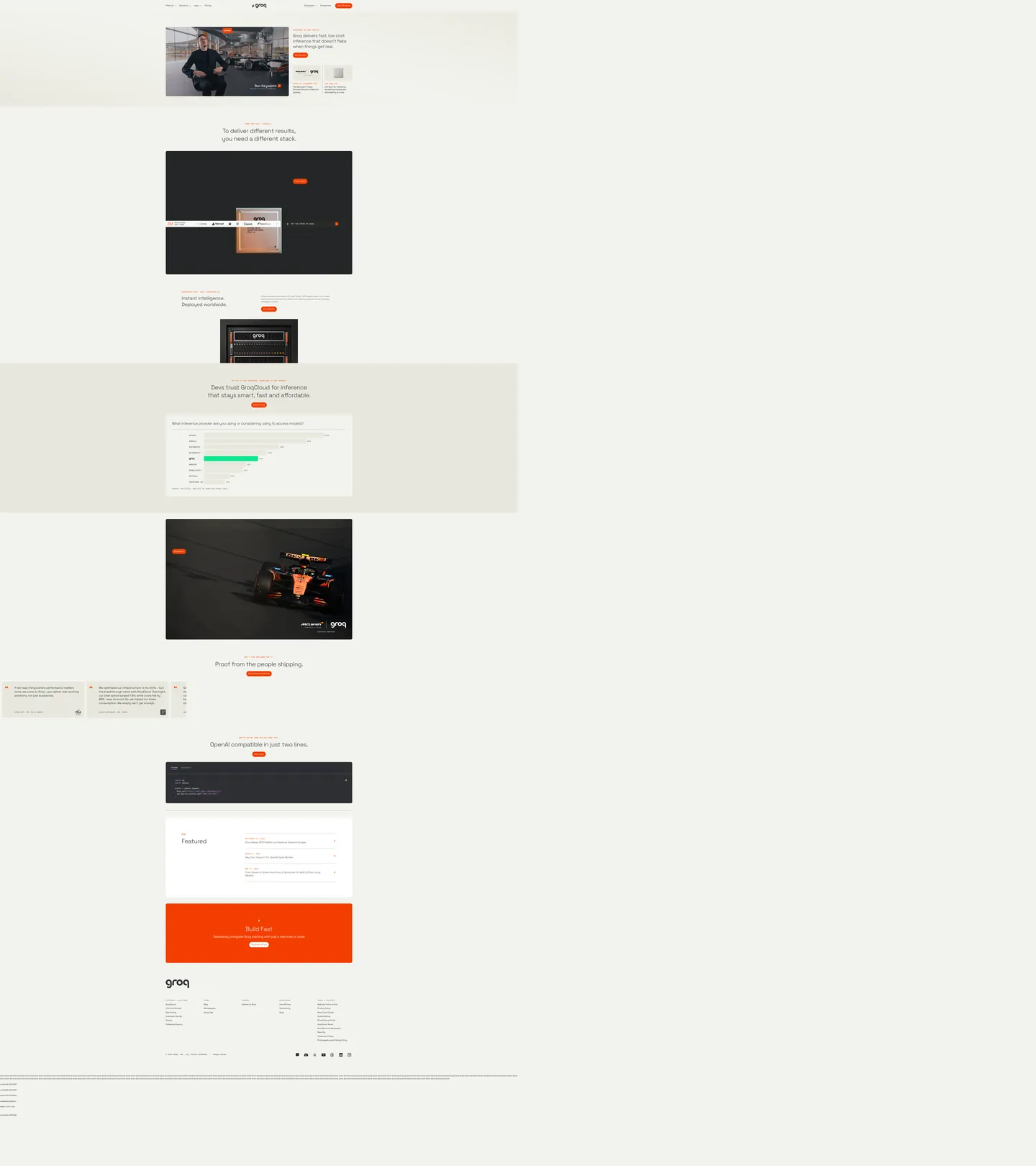
Groq sells inference on a custom LPU chip, and the marketing surface refuses every AI-infrastructure visual cliche. There is no purple-to-blue gradient mesh, no animated globe, no glassmorphic console screenshot. The canvas is a warm bone (#f3f3ee) — not white, not gray — sitting under charcoal ink (#2d2f33) that handles every paragraph, nav link, and rule. The only chromatic event on the page is a single Groq orange (#f43e01) doing three jobs: it fills the primary pill CTA at 1000px radius, paints the uppercase mono overline above each section headline, and underlines hovered link text. Everything else — the McLaren F1 hero card, the rack-mounted LPU photograph, the OpenAI-compatibility code well — renders in black, cream, or charcoal.
This page packages the captured system as a single DESIGN.md file written to the Google Labs spec. Inside the frontmatter: 22 colors tokens covering the bone canvas, the charcoal ink ladder, the orange voltage with its pressed variant, and a five-stop fluorescent reserve (purple, green, yellow, blue, pink) that ships in CSS variables but never appears on the home surface. There are 12 typography tokens split across two families — Space Grotesk for every display tier and body line, IBM Plex Mono for overlines and inline code — plus 5 radii, 8 spacing values from 4px to 80px, and 17 components covering the pill primary CTA, the bordered secondary, the dark code well at #2d2f33, the McLaren-style media card, and the bottom "Build Fast" full-bleed orange band.
Feed the file to Claude, Cursor, or GitHub Copilot and the agent will write React and Tailwind that match Groq's discipline: cream canvas, weight-300 display, mono overlines, scarce orange. The result is not a generic AI-infra dark theme — it's an inference-hardware product brochure that trusts a single voltage hex to carry every call to action across the page. Read it as a reference if you are building any developer-facing platform where the brand needs to feel both technical and warmly editorial, and where the convention to default to dark canvases and saturated gradients is exactly what you want to avoid.
What makes it distinct
5
- Single-pill voltage#f43e01 orange used as the only filled CTA (1000px radius), every secondary action is a transparent text link
- Display at weight 300Space Grotesk runs 46px / 32px / 28px at fontWeight 300 with negative tracking, refusing the heavy grotesque convention of the AI-infra category
- Mono overline laneIBM Plex Mono at 12px / 500 / 1.2px letter-spacing carries every uppercase eyebrow above the headline, giving the page a chip-spec cadence
- Pill-or-rectangle, nothing betweenradii cluster at 1000px (15 uses) for pills and 10px (11 uses) for outer cards, with 5px / 3px reserved for inline code chips
- Fluorescent reserve palettepurple #d377fd, green #10e68d, yellow #fdeb20 ship in CSS variables but render zero times on the home surface, kept for code-snippet syntax and dashboard chrome
groq.com
Live at groq.com
A snapshot of the brand in production. Scroll the frame to see the whole page.
Colors
22 colors
Groq's system runs on #f43e01 as its primary voltage, used in 4 of 17 components. Type is set in Space Grotesk across 12 tokens from 12px to 46px, weights 300–500. Shape language is mixed across 17 components, blending pills, soft rounds, and squarer corners.
Brand & Accent
Sparing, CTA-only voltage · 3
Surface
Page and card backgrounds · 4
Text
Headlines, body, captions · 5
Borders & Hairlines
Dividers, outlines, rules · 1
Other
Specialty colors · 9
Typography
12 type tokens
Set in Space Grotesk across 12 tokens, from 12px to 46px, weights 300–500. Shown in its own stack: where the font isn't installed, the fallback the file names stands in.
- display-xl46px · weight 300 · lh 1.3 · tracking -0.92pxThe quick brown fox jumps over the lazy dog
- display-lg36px · weight 300 · lh 1.3 · tracking -0.72pxThe quick brown fox jumps over the lazy dog
- display-md32px · weight 300 · lh 1.3 · tracking -0.64pxThe quick brown fox jumps over the lazy dog
- display-sm28px · weight 300 · lh 1.3 · tracking -0.56pxThe quick brown fox jumps over the lazy dog
- heading-md24px · weight 400 · lh 1.3 · tracking -0.48pxThe quick brown fox jumps over the lazy dog
- heading-sm19px · weight 400 · lh 1.3 · tracking -0.38pxThe quick brown fox jumps over the lazy dog
- body-lg21px · weight 400 · lh 1.4The quick brown fox jumps over the lazy dog
- body-md17px · weight 400 · lh 1.4The quick brown fox jumps over the lazy dog
- body-sm15px · weight 400 · lh 1.3The quick brown fox jumps over the lazy dog
- overline12px · weight 500 · lh 1.4 · tracking 1.2pxThe quick brown fox jumps over the lazy dog
- code-block14px · weight 400 · lh 1.3The quick brown fox jumps over the lazy dog
- caption14px · weight 400 · lh 1.57The quick brown fox jumps over the lazy dog
Layout
Radii and spacing
5 corner radii and 8 spacing values. Shape language: mixed.
Radii
- none0px
- xs3px
- sm5px
- md10px
- full1000px
Spacing
- xxs4px
- xs8px
- sm12px
- md16px
- base24px
- lg32px
- xl48px
- section80px
Components
17 components
Each rendered from its tokens (color, type, radius, padding) on Groq's own canvas.
- Button Primarybutton-primaryButton Primary
- Button Primary Hoverbutton-primary-hoverButton Primary Hover
- Button Secondarybutton-secondaryButton Secondary
- Button Tertiarybutton-tertiaryButton Tertiary
- Top Navtop-navTop Nav
- Nav Linknav-linkNav Link
- OverlineoverlineOverline
- Hero Headlinehero-headlineHero Headline
- Body Paragraphbody-paragraphBody Paragraph
- Media Cardmedia-cardMedia Card
- Section Band Lightsection-band-lightSection Band Light
- Section Band Darksection-band-darkSection Band Dark
- Code Wellcode-wellCode Well
- Code Highlightcode-highlightCode Highlight
- Data Rowdata-rowData Row
- Cta Banner Orangecta-banner-orangeCta Banner Orange
- FooterfooterFooter
In use
The system, in use
Groq's tokens on the kind of product it builds.
Build something people actually use.
A short paragraph of marketing copy that previews how the brand's display tier and body tier read together. Two sentences is usually enough.
FAQ
Groq design system FAQ
Common questions about Groq's tokens, components, and how to use this DESIGN.md in your project.
Read next
Related reading
Specs, directories, and component libraries that pair with this design system.
- Browse all design systemsThe full directory of DESIGN.md files on shadcn.io, with live mockups for each.shadcn.io
- Groq — official siteThe marketing site this DESIGN.md was extracted from — fast, low-cost inference on the LPU.groq.com (opens in a new tab)
- The DESIGN.md specificationGoogle Labs' open spec for machine-readable design system files — the format this page is built on.github.com (opens in a new tab)
Use it
Use Groq in your project
One machine-readable file. Drop it into Claude, Cursor, or any AI tool that reads DESIGN.md.
Download the DESIGN.md
One machine-readable file: every color, type, radius, spacing, and component token of Groq.
Feed it to your AI tool
Drop it into Claude, Cursor, or GitHub Copilot. The agent writes React components and Tailwind classes that match Groq's visual language.
Reference the tokens directly
Or paste the values into your Tailwind config, CSS variables, or component library: every color, size and radius is a quoted, ready-to-copy value.
Read the full DESIGN.md: overview, rationale, do’s and don’ts
Overview
Groq's web chrome is hardware-spec restraint wearing a marketing skin — a bone-cream canvas, a single hot-orange voltage, and a typographic system that holds every display headline at weight 300 while pretending the rest of the AI-infrastructure category isn't shouting at weight 700. Where most LPU and GPU vendors anchor their pages on a saturated indigo-to-violet mesh and a glassmorphic console screenshot, Groq holds the entire page on #f3f3ee warm bone with charcoal #2d2f33 ink and the McLaren F1 livery as the only piece of brand atmosphere. The orange — #f43e01 — appears 42 times across the page and never more than once per viewport.
Stamped voltage: the orange is treated as a stamp, not as a palette. It fills exactly one shape — the pill primary CTA at 1000px radius — and stains exactly one role of text — the uppercase mono overline above each section. It never gradients, never tints, never carries a secondary action. Every transparent-border button and every nav link is charcoal on bone.
Weight as restraint: the entire display ladder runs at fontWeight 300 — 46px hero, 36px section, 32px sub-section, 28px callout — with negative letter-spacing scaling from -0.92px down to -0.56px. There is not a single weight-600 or weight-700 glyph on the home surface. This is not the convention of the infrastructure category; it is the convention of editorial print.
Key Characteristics:
- Single brand voltage (
#f43e01) used as the only filled CTA color, never as a secondary or as a tint. - Two-family typographic split — Space Grotesk for everything visual, IBM Plex Mono for overlines and code.
- 1000px pill controls sitting inside 10px rectangular content cards — no in-between radii on the page.
- Bone canvas (
#f3f3ee) instead of white; charcoal ink (#2d2f33) instead of true black. - Five-stop fluorescent reserve palette shipped in CSS variables but unused on the marketing surface.
- IBM Plex Mono overlines at 12px / fontWeight 500 / 1.2px letter-spacing on every section.
- Dark code well at
#2d2f33with white type and purple#d377fdsyntax highlighting. - Full-bleed orange "Build Fast" CTA band at the page foot — the only large orange surface.
Colors
Brand & Accent
- Groq Orange (
#f43e01) — frequency 42. Used as text (16), bg (10), border (16). The single brand voltage; lives in--color-orange-brand,--color-text-accent,--color-icon,--color-focus-btn,--color-overline. Reserved for the primary pill CTA, the uppercase mono overline above every section, the "Build Fast" footer band, and the focus outline. - Pressed Orange (
#c23101) — frequency 2. Used as text (1), border (1). Lives in--color-orange-darkand--color-text-link-hover. The only color shift in the entire page is the link-hover state; even pressed-state CTAs reuse the base orange. - Orange Light (
#ffd1a3) — frequency 0 on the home surface. Ships in--color-orange-lightfor inline status chips on dashboard surfaces.
Surface & Background
- Bone Canvas (
#f3f3ee) — frequency 5. Used as bg (5). Lives in--color-utility-200,--color-utility-95-yellow,--color-bg. The dominant page background; warmer than gray-100, cooler than parchment, and the temperature signal that the brand is a hardware company rather than a SaaS dashboard. - Soft Elevated (
#e8e8de) — frequency 8. Used as bg (6), gradient (2). Lives in--color-utility-300,--color-utility-91-yellow,--color-bg-section-91. Section-band fill behind the GroqCloud chart and the McLaren feature row — half a step darker than canvas without crossing into gray. - Surface White (
#ffffff) — frequency 111. Used as bg (3), text (54), border (54). The white is for inverted text on dark surfaces and for the rare elevated media card; the page itself is never pure white. - Charcoal Surface (
#2d2f33) — frequency 650 (the dominant color). Used as text (324), bg (4), border (322). Not black, not gray — a near-neutral charcoal with a hint of cool blue (oklch hue 264). Carries every paragraph, every nav link, every hairline, and inverts to fill the code well and dark product band.
Text & Rules
- Ink Soft (
#69695d) — frequency 18. Used as text (9), border (9). Lives in--color-tabs-icon-btn-text,--color-text-secondary. Inactive nav and tab labels, secondary metadata. - Ink Muted (
#9c9c90) — frequency 4. Used as text (2), border (2). Lives in--color-code-snippet-text-comment,--color-utility-61-yellow. Code-comment color inside the dark well, footer microcopy. - Hairline (
#cecebf) — frequency 8. Used as text (4), border (4). Lives in--color-utility-81-yellow. Section dividers and the secondary-button stroke. - Charcoal Ink (
#2d2f33) — see Surface section; this hex serves as both the inverted dark fill and the default text color on light surfaces.
Fluorescent Reserve
- Fluorescent Purple (
#d377fd) — frequency 0 on home. Lives in--color-code-snippet-highlight. Reserved for syntax highlighting inside dark code wells on doc pages. - Fluorescent Green (
#10e68d) — frequency 0 on home. The GroqCloud chart bar uses this on the inference-share row. - Fluorescent Yellow (
#fdeb20), Blue (#5fc0ff), Pink (#f392dd) — frequency 0 each. Documented runway for product surfaces; never deployed on the marketing canvas.
Semantic
- Yellow Warn (
#f6ab45) —--color-yellow. Reserved for status warnings. - Navy Deep (
#2c364a) / Navy Mid (#3e4c69) —--color-utility-29-blue/--color-utility-41-blue. Internal tool palette for tabular surfaces, not used on the home page.
Typography
Font Family
- Display & UI:
Space GroteskwithSpace Grotesk Fallback, thensystem-ui,Helvetica Neue,Helvetica,Arial. Lives in--ff-display,--ff-text,--ff-sans. - Mono:
IBM Plex MonowithIBM Plex Mono Fallback, thenui-monospace,Cascadia Code,Source Code Pro,Menlo,Consolas. Lives in--ff-mono,--ff-ibm-plex-mono. - There is no third family. Headlines, body, captions, button labels — all Space Grotesk. Overlines, code wells, inline commands — all IBM Plex Mono.
Hierarchy
| Role | Font | Size | Weight | Line Height | Letter Spacing | Notes |
|---|---|---|---|---|---|---|
| Display XL | Space Grotesk | 46px | 300 | 1.30 | -0.92px | Section h2 hero headlines. |
| Display LG | Space Grotesk | 36px | 300 | 1.30 | -0.72px | Secondary section headlines. |
| Display MD | Space Grotesk | 32px | 300 | 1.30 | -0.64px | Hero h1 on solution sub-pages. |
| Display SM | Space Grotesk | 28px | 300 | 1.30 | -0.56px | h3 callouts. |
| Heading MD | Space Grotesk | 24px | 400 | 1.30 | -0.48px | Pull-quote body. |
| Heading SM | Space Grotesk | 19px | 400 | 1.30 | -0.38px | Card titles inside dark bands. |
| Body LG | Space Grotesk | 21px | 400 | 1.40 | 0 | Hero subtext paragraphs. |
| Body MD | Space Grotesk | 17px | 400 | 1.40 | 0 | Section body. |
| Body SM | Space Grotesk | 15px | 400 | 1.30 | 0 | Default UI text, nav, buttons. |
| Overline | IBM Plex Mono | 12px | 500 | 1.40 | 1.2px | Uppercase eyebrow above every section. |
| Code Block | IBM Plex Mono | 14px | 400 | 1.30 | 0 | Inside the dark code well. |
| Caption | Space Grotesk | 14px | 400 | 1.57 | 0 | Footer microcopy, dates, metadata. |
Principles
- Hold every display tier at weight 300 with negative letter-spacing; resist promoting to weight 500 or 600 even when the headline carries the page.
- Use the IBM Plex Mono overline as the structural rhythm marker — every section above the fold and below carries one.
- Keep mono usage to two roles only: uppercase overlines (12px) and code wells (14px). Do not let mono leak into body copy or buttons.
- The base UI size is 15px, not 16px — match Space Grotesk's slightly larger x-height by sitting one step below.
Layout
Spacing System
The captured scale runs 4px, 8px, 12px, 16px, 24px, 32px, 48px, and 80px. The dominant spacing value on the page is 32px (18 uses), followed by 16px (12 uses), and the outer section padding is 48px (--space-outer: 3.43rem). Hero band vertical padding sits at 80px (--space-section-top: 5.71rem), giving every section a generous breath above and below the headline.
Grid & Container
- Global nav uses a three-zone layout: logo center, menu links left and right of logo, sign-in CTA far right at 88px height.
- Hero alternates between centered single-column text (above the McLaren video card) and split two-column compositions (left media card + right body copy).
- Section bands run full-bleed; content sits inside a 12-column grid with 32px gutters and a 1024px max-width container.
- The OpenAI-compatibility section uses a single full-width dark code well rather than a split syntax/explanation layout.
- The featured-articles strip renders as a three-row rule-separated list with date column left, title column center, source-mark right.
Whitespace Philosophy
Groq uses vertical empty space as a pacing signal between hardware claim, customer proof, code proof, and CTA. The home page is roughly 4500px tall and every section is separated by at least 80px of bone canvas. Dense content arrives only inside the dark code well and the footer link grid.
Elevation & Depth
Groq is mostly flat with a measured shadow ladder defined in CSS variables. Depth comes from surface inversion (cream → charcoal), corner radius (10px content cards), and one drop-shadow tier reserved for the floating nav.
| Level | Token | Treatment | Use |
|---|---|---|---|
| 0 | --elevation-0 | none | Default surfaces, body sections |
| 1 | --elevation-1 | drop-shadow(0.5px 1px 1px rgba(0,0,0,0.3)) | Inline chips and the McLaren badge over the F1 photo |
| 2 | --elevation-2 | layered drop-shadows at 2/4/6px | Floating media cards on cream canvas |
| 3 | --elevation-3 | layered drop-shadows at 2/4/8/16/32px | Modal-tier surfaces (not used on home) |
| 4 | --elevation-4 | 0 4px 80px rgba(0,0,0,0.04) | Soft ambient lift on the bottom CTA band |
Shapes
Radius Scale
| Token | Value | Role |
|---|---|---|
none | "0px" | Full-bleed bands, section dividers |
xs | "3px" | Thumbnail rounding inside code wells |
sm | "5px" | Inline code chips (--bdrs-inner) |
md | "10px" | Every content card — McLaren media, code well, data table (--bdrs-outer, 11 uses) |
full | "1000px" | Every interactive control — primary CTA, secondary button, nav pill (--bdrs-l, 15 uses) |
Image Treatment
Imagery on the home surface is two things only: the McLaren F1 video card at 10px radius (the only photographic warmth on the page) and the LPU rack-mount render at the same radius. There are no decorative illustrations, no abstract 3D shapes, no avatar circles. Every other piece of "imagery" is a code snippet inside the dark well.
Components
button-primary
Filled orange pill at 1000px radius with white 15px Space Grotesk label, 10px / 16px padding, zero border. The single chromatic CTA — appears in the hero ("Get Started"), above each section break, and at the foot of the "Build Fast" banner.
button-primary-hover
Inverts to white fill with a 1px orange border and orange label. The only color-shifting CTA state in the captured spec.
button-secondary
Transparent fill, 1px hairline border (#cecebf), charcoal label. Same 1000px pill geometry as primary, used for "Read Article" and "View Details" in section bands.
button-tertiary
White fill, no border, charcoal label. Sits inside the dark code-well section as the "Copy" affordance.
top-nav
Cream-canvas nav band, 88px tall, 48px horizontal padding, logo centered with links splitting left/right around it and the "Get Started" pill anchored far right.
nav-link
Charcoal 15px Space Grotesk on transparent background, 8px / 12px padding, 1000px hit-target radius. No underline, no separator marks — links rely on hover state for affordance.
overline
Uppercase IBM Plex Mono 12px / fontWeight 500 / 1.2px letter-spacing, colored Groq orange. Appears 17 times — once at the top of every distinct section.
hero-headline
Space Grotesk 46px / fontWeight 300 / -0.92px tracking. Carries the strongest typographic identity on the page — the absence of weight is what reads as confidence.
body-paragraph
Space Grotesk 17px / fontWeight 400 / lineHeight 1.4 on charcoal. The workhorse paragraph style across hero subtext and section copy.
media-card
White surface, 10px radius, zero padding (content is full-bleed image or video). The McLaren video card, the LPU rack render, and the customer testimonial photos all use this geometry.
section-band-light
Soft elevated fill (#e8e8de) running full-bleed with 80px / 48px padding. Used for the GroqCloud bar-chart section and the featured-articles strip.
section-band-dark
Charcoal surface (#2d2f33) at 10px outer radius (when contained) with white type and 80px / 48px padding. Carries the McLaren racing video band.
code-well
Charcoal #2d2f33 background, white IBM Plex Mono 14px type, fluorescent purple #d377fd syntax highlighting, 10px radius, 24px / 32px padding. The OpenAI-compatibility section is a single full-width code well.
code-highlight
Inline mono span colored fluorescent purple — the only fluorescent token that renders on the home page, and only inside the code well.
data-row
Rule-separated row on canvas with charcoal Space Grotesk 15px text and 16px vertical padding. Used in the featured-articles three-row list.
cta-banner-orange
Full-bleed Groq orange (#f43e01) band at the page foot, 80px / 48px padding, 10px outer radius when contained, white 32px display type centered above a white-fill secondary CTA. The only large orange surface on the page.
footer
Cream canvas continuing from the page body, 80px / 48px padding, four-column link grid in charcoal 15px Space Grotesk. No background change — the footer reads as the natural continuation of the page rather than a sealed band.
Do's and Don'ts
Do
- Hold every display tier at fontWeight 300 with negative letter-spacing; resist the AI-infra default of weight 600+.
- Use
#f43e01as the only filled accent color and reserve it for primary CTAs and uppercase overlines. - Open every section with a 12px IBM Plex Mono overline at 1.2px letter-spacing.
- Use 1000px radius on interactive controls and 10px on content cards — never a value in between.
- Render the canvas as
#f3f3eebone, not#ffffffwhite.
Don't
- Don't promote the fluorescent purple (
#d377fd) to a marketing surface — it's reserved for code-snippet highlights (--color-code-snippet-highlight) and renders zero times on the home page. Use Groq orange (#f43e01) for any non-code accent. - Don't render display headlines at weight 500 or above — the captured ladder is strictly weight 300, and bumping to 500 reads as a third-party page mistakenly using the Groq palette.
- Don't use the
#69695dink-soft for body paragraphs — it's the inactive-tab and footer-metadata token (18 uses, half text half border). Default paragraph color is#2d2f33charcoal. - Don't add a secondary filled-color button (blue, green, dark). The captured spec defines exactly two button surfaces: filled orange and transparent-border charcoal.
- Don't apply 5px (
--bdrs-inner) radius to anything larger than an inline code chip — the inner radius is a 4-use token reserved for character-scale containers, not card-scale geometry. - Don't replace the IBM Plex Mono overline with a Space Grotesk small-caps treatment — the mono lane is the page's structural rhythm marker and renders 17 times across the home page.
Known Gaps
- Active and pressed component states are captured only for
button-primary-hover(white fill, orange border) and thelink-hovercolor shift to#c23101. Focus rings extracted via--color-focus-outline: #f43e01but per-component focus visuals are not broken out as variants. - The logged-in GroqCloud console, the inference dashboard, and the API-key management surfaces live behind authentication and were not part of the home-page capture. The five-stop fluorescent reserve (purple, green, yellow, blue, pink) is documented as runway for those surfaces.
- Mobile screenshots were not regenerated in this capture; mobile behavior is inferred from the existing
--max-nav-media-query: (max-width: 67.5em)breakpoint and the--grid-col-widthcalc — the 12-column grid collapses to a single column below 1080px.
AI & LLM Platforms
More systems like this
More DESIGN.md files in AI & LLM Platforms.
Pricing
Build it with Pro
The DESIGN.md files are free. Pro adds 6,000+ blocks, premium templates and the MCP server, so your AI editor builds in your system for you.
4.9/5 out of 5 · 150+ reviewsfrom 150+ founders and developers.
Billing
Billed once a year in USD. Cancel anytime.
- How many people can use the license.
- Client work, SaaS products and anything you charge for.
- Production-ready React sections: hero, pricing, features, dashboards and more.
- Complete multi-page sites you can ship as they are.
- React icons from every major library, installable with one command.
- Presets that restyle every block, in light and dark.
- Lets your AI editor search, preview and install blocks for you.
- Priority requests are answered first.
Individual
For personal projects & open source
$32instead of $49/mo
$389 billed yearly
- Seats: 1 seat
- Commercial use: Personal & open source only
- Pro blocks: 6,000+ blocks
- Templates: All 14 templates
- React icons: 294k+ icons
- Themes: All 59 themes
- MCP server: Basic usage
- Support: Standard
Team
Most popularFor freelancers, agencies & startups
$66instead of $99/mo
$789 billed yearly · ≈ $13/dev/mo
- Seats: Up to 5 seats
- Commercial use: Included
- Pro blocks: 6,000+ blocks
- Templates: All 14 templates
- React icons: 294k+ icons
- Themes: All 59 themes
- MCP server: High usage
- Support: Priority
Organization
For companies with larger teams
$132instead of $199/mo
$1,589 billed yearly
- Seats: Unlimited seats
- Commercial use: Included
- Pro blocks: 6,000+ blocks
- Templates: All 14 templates
- React icons: 294k+ icons
- Themes: All 59 themes
- MCP server: Unlimited usage
- Support: Priority
Billed once a year in USD. Cancel anytime.
Individual
For personal projects & open source
$32instead of $49/mo
$389 billed yearly
- How many people can use the license.Seats: 1 seat
- Client work, SaaS products and anything you charge for.Commercial use: Personal & open source only
- Production-ready React sections: hero, pricing, features, dashboards and more.Pro blocks: 6,000+ blocks
- Complete multi-page sites you can ship as they are.Templates: All 14 templates
- React icons from every major library, installable with one command.React icons: 294k+ icons
- Presets that restyle every block, in light and dark.Themes: All 59 themes
- Lets your AI editor search, preview and install blocks for you.MCP server: Basic usage
- Priority requests are answered first.Support: Standard
Team
Most popularFor freelancers, agencies & startups
$66instead of $99/mo
$789 billed yearly · ≈ $13/dev/mo
Everything in Individual, plus
- How many people can use the license.Seats: Up to 5 seats
- Client work, SaaS products and anything you charge for.Commercial use: Included
- Lets your AI editor search, preview and install blocks for you.MCP server: High usage
- Priority requests are answered first.Support: Priority
Organization
For companies with larger teams
$132instead of $199/mo
$1,589 billed yearly
Everything in Team, plus
- How many people can use the license.Seats: Unlimited seats
- Lets your AI editor search, preview and install blocks for you.MCP server: Unlimited usage
- Secure checkout via Stripe
- Code lives in your repo
- Keep what you've shipped if you cancel
- License terms
Your system, built for you
Every block, template and icon, installed by your AI agent in your design system. The DESIGN.md files stay free.