Bolt.new Design System
Bolt.new's marketing system is its product surface — near-black canvas, Inter Display 48px headline, an electric azure CTA, and the live prompt box dropped into the hero. Tokens for React, Next.js, and AI coding tools.
Add shadcn.io to your AI agent. · Pro It installs blocks, icons and templates in your design system from a prompt, with Pro.
Set up MCP- Primary
- #1488fc
- Typeface
- Inter
- Shape
- Mixed
- Base radius
- 6px
- Colors
- 14
- Type tokens
- 11
- Components
- 13
- Spacing values
- 7
About
About Bolt.new DESIGN.md
Curated by Dov Azencot · Updated May 18, 2026 · Source bolt.new (opens in a new tab)
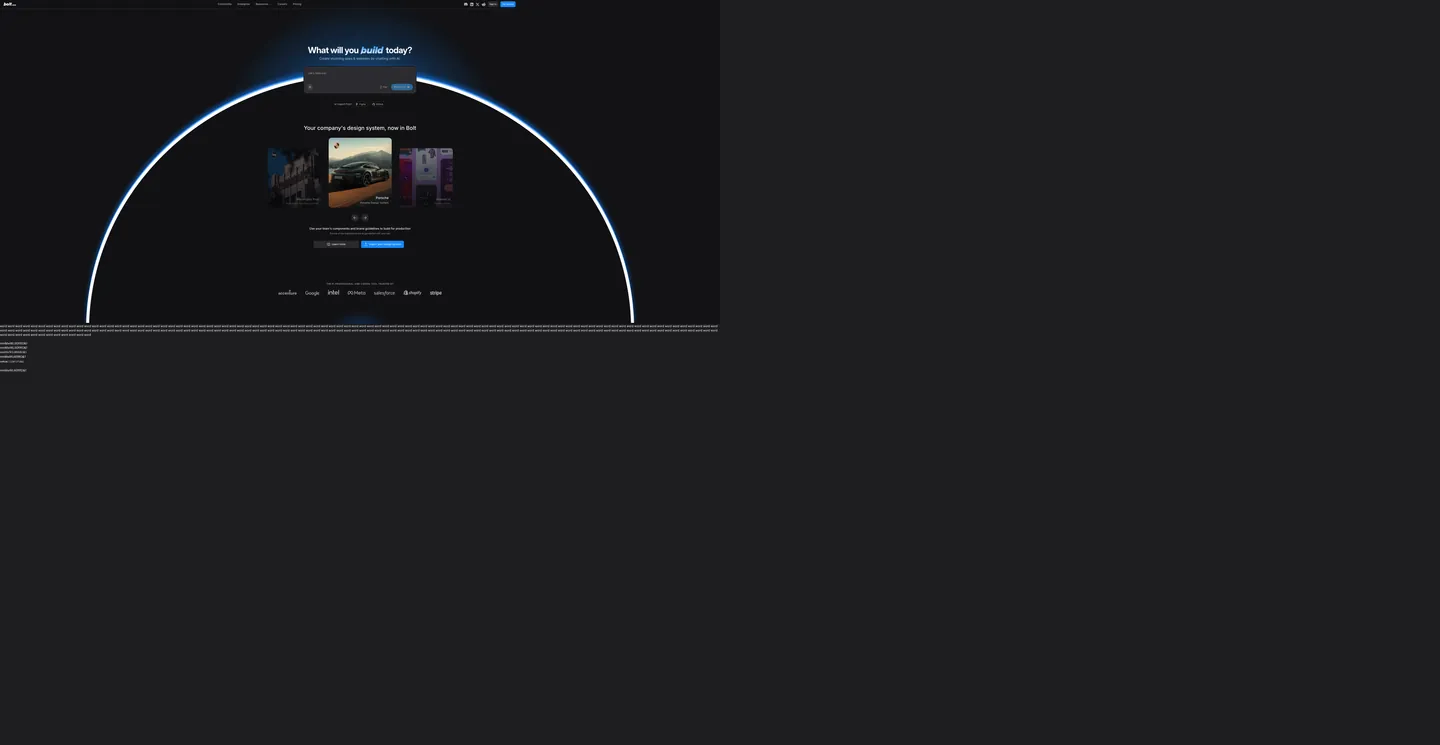
Bolt.new's landing surface does something most AI-builder brands tiptoe around: it puts the actual prompt box in the hero. The page opens on a near-black canvas, with an Inter Display headline "What will you build today?" at 48px / weight 700 floating above a live multi-line input — submit a sentence and the page tears down into a four-panel workspace (chat, file tree, code editor, web preview). There is no rotating product video, no animated demo loop; the marketing surface and the editor surface are the same dark workbench. Where Lovable wraps its hero in a candy gradient and Replit pushes a colorful avatar wall, Bolt.new keeps the whole landing chrome inside its own product palette and lets a single azure pill carry the only chromatic brand moment above the fold.
The DESIGN.md file packages the system into a machine-readable spec for React tooling. Inside: 14 colors tokens drawn from the 250+ `--bolt-*` and `--cm-*` CSS custom properties StackBlitz exposes (a brighter azure and a deeper cobalt as twin brand voltages, near-black as the page floor, a parallel charcoal surface tier for the editor and terminal panels, a full terminal-color subpalette borrowed from xterm.js); 11 typography tokens running Inter and Inter Display at the same modest body weights but a sharper 700 display tier; a binary 12px / pill radius pair; and 13 components definitions covering the cobalt primary pill, the dark transparent prompt textarea, the white-alpha secondary button, the code-editor gutter, and the terminal cell.
Feed this file to Claude or Cursor and it reproduces Bolt.new's specific moves: near-black canvas instead of charcoal, twin azure voltages reserved for action surfaces, Inter Display for the hero with a heavier 700 weight than Spline or Vercel use, 12px default rounding without a 4px or 8px tier underneath, and the in-product terminal palette wired in as legitimate brand colors rather than buried inside the editor. The one move worth borrowing only if your product genuinely IS a workspace tool: the willingness to put the live prompt box above the fold instead of a marketing screenshot of it.
What makes it distinct
5
- Prompt-as-herothe centered input field reading what will you build today is the live editor prompt, not a marketing screenshot of one
- Twin azure voltagesa brighter azure carries chrome (focus rings, link text, loader progress) and a deeper cobalt fills the primary CTA, both reserved for action surfaces only
- Inter plus Inter Displaybody sits on Inter at 14-16px / 400, the 48px hero hits Inter Display at weight 700 with tight tracking for a sharper marketing voice
- Twelve-pixel default roundingcards, prompt box, and most surfaces hold at 12px while secondary chips and primary CTAs jump to fully-rounded pill
- Terminal-palette colors live in the specbright ANSI green, magenta, red, and cyan map directly to the in-browser xterm.js terminal that ships inside every Bolt project
bolt.new
Live at bolt.new
A snapshot of the brand in production. Scroll the frame to see the whole page.
Colors
14 colors
Bolt.new's system runs on #1488fc as its primary voltage, used in 1 of 13 components. Type is set in Inter across 11 tokens from 12px to 48px, weights 400–700. Shape language is mixed across 13 components, blending pills, soft rounds, and squarer corners.
Brand & Accent
Sparing, CTA-only voltage · 3
Surface
Page and card backgrounds · 3
Text
Headlines, body, captions · 2
Borders & Hairlines
Dividers, outlines, rules · 1
Other
Specialty colors · 5
Typography
11 type tokens
Set in Inter across 11 tokens, from 12px to 48px, weights 400–700. Shown in its own stack: where the font isn't installed, the fallback the file names stands in.
- display-xl48px · weight 700 · lh 48px · tracking -1.2pxThe quick brown fox jumps over the lazy dog
- display-md36px · weight 700 · lh 40px · tracking -0.9pxThe quick brown fox jumps over the lazy dog
- heading-lg30px · weight 500 · lh 36pxThe quick brown fox jumps over the lazy dog
- heading-md20px · weight 600 · lh 28pxThe quick brown fox jumps over the lazy dog
- body-lg18px · weight 500 · lh 28pxThe quick brown fox jumps over the lazy dog
- body-md16px · weight 400 · lh 24pxThe quick brown fox jumps over the lazy dog
- body-sm14px · weight 400 · lh 20pxThe quick brown fox jumps over the lazy dog
- label-md14px · weight 500 · lh 20pxThe quick brown fox jumps over the lazy dog
- caption12px · weight 400 · lh 16pxThe quick brown fox jumps over the lazy dog
- eyebrow12px · weight 600 · lh 16px · tracking 1.2pxThe quick brown fox jumps over the lazy dog
- mono-sm14px · weight 400 · lh 20pxThe quick brown fox jumps over the lazy dog
Layout
Radii and spacing
6 corner radii and 7 spacing values. Shape language: mixed.
Radii
- none0px
- sm4px
- md6px
- lg12px
- xl16px
- pill9999px
Spacing
- xs4px
- sm8px
- md12px
- base16px
- lg24px
- xl32px
- 2xl48px
Components
13 components
Each rendered from its tokens (color, type, radius, padding) on Bolt.new's own canvas.
- Button Primarybutton-primaryButton Primary
- Button Primary Hoverbutton-primary-hoverButton Primary Hover
- Button Secondarybutton-secondaryButton Secondary
- Top Navtop-navTop Nav
- Nav Linknav-linkNav Link
- Hero Headinghero-headingHero Heading
- Section Headingsection-headingSection Heading
- Body Paragraphbody-paragraphBody Paragraph
- Prompt Textareaprompt-textareaPrompt Textarea
- CardcardCard
- Type here…text-inputText Input
- Editor Guttereditor-gutterEditor Gutter
- Terminal Cellterminal-cellTerminal Cell
In use
The system, in use
Bolt.new's tokens on the kind of product it builds.
Build something people actually use.
A short paragraph of marketing copy that previews how the brand's display tier and body tier read together. Two sentences is usually enough.
import { build } from "./build"

export async function main() {
  const result = await build()
  console.log("done", result)
}
FAQ
Bolt.new design system FAQ
Common questions about Bolt.new's tokens, components, and how to use this DESIGN.md in your project.
Read next
Related reading
Specs, directories, and component libraries that pair with this design system.
- Browse all design systemsThe full directory of DESIGN.md files on shadcn.io, with live mockups for each.shadcn.io
- Bolt.new — official siteBolt.new's public marketing site — the source of truth for the live tokens captured in this file.bolt.new (opens in a new tab)
- The DESIGN.md specificationGoogle Labs' open spec for machine-readable design system files — the format this page is built on.github.com (opens in a new tab)
Use it
Use Bolt.new in your project
One machine-readable file. Drop it into Claude, Cursor, or any AI tool that reads DESIGN.md.
Download the DESIGN.md
One machine-readable file: every color, type, radius, spacing, and component token of Bolt.new.
Feed it to your AI tool
Drop it into Claude, Cursor, or GitHub Copilot. The agent writes React components and Tailwind classes that match Bolt.new's visual language.
Reference the tokens directly
Or paste the values into your Tailwind config, CSS variables, or component library: every color, size and radius is a quoted, ready-to-copy value.
Read the full DESIGN.md: overview, rationale, do’s and don’ts
Overview
Bolt.new's landing surface does something most AI-builder brands tiptoe around. Prompt-as-hero. The page opens on a near-black canvas with an Inter Display headline "What will you build today?" at 48px / weight 700 floating above a live multi-line input — submit a sentence and the page tears down into a four-panel workspace (chat, file tree, code editor, web preview). There is no rotating product video, no animated demo loop; the marketing surface and the editor surface are the same dark workbench. Where Lovable wraps its hero in a candy gradient and Replit pushes a colorful avatar wall, Bolt.new keeps the whole landing chrome inside its own product palette and lets a single azure pill carry the only chromatic brand moment above the fold.
The system's chromatic discipline reinforces the move. There are two brand voltages on the same hue family — a deeper cobalt ({colors.primary} — #1488fc) wired into the primary CTA fill, and a brighter azure ({colors.accent-azure} — #2ba6ff) wired into focus rings, link text, sidebar buttons, loader progress, and brand container fills across 18+ custom properties. Both appear only on action surfaces; the rest of the page stays on the near-black canvas ({colors.canvas} — #111114) and its parallel surface tier ({colors.surface-1} — #1e1e21). This is the inverse of Cloudflare's voltage-as-canvas move — Bolt.new holds two cousin blues in reserve against a dark workbench instead of one orange across the whole floor.
Typography splits Inter and Inter Display by scale rather than by role. Inter carries body, navigation, and small labels at 14-16px / 400-500; Inter Display is reserved for the 48px hero and a small set of moments above 20px, hitting weight 700 with -1.2px letter-spacing. The 700 display tier is sharper than Spline's modest 500 or Vercel's 600 — a deliberately loud headline that signals "type a prompt" rather than "read a story."
Key Characteristics:
- Near-black canvas (
{colors.canvas}— #111114), not pure black — the slight blue tilt keeps the cobalt CTA from haloing against the floor. - Twin azure voltages — cobalt
{colors.primary}for the primary CTA fill, brighter azure{colors.accent-azure}for chrome (focus rings, link text, sidebar buttons, loader progress). - Inter for body and labels, Inter Display only above 20px, weight 700 on the hero — a sharper display tier than peer AI-builder brands.
- Binary radius scale: 12px on cards, prompt box, panels; 9999px on pill CTAs and chips. No 4-6-8px micro-tier on chrome surfaces.
- Editor / terminal palette declared as brand tokens — green
{colors.terminal-green}, magenta{colors.terminal-magenta}, cyan{colors.terminal-cyan}, red{colors.terminal-red}— borrowed from xterm.js for the in-browser terminal. - White-alpha hairlines (rendered as pure white at 10-26% opacity) mark every panel divider; the system never paints a fully opaque border.
- The customer-logo strip below the fold renders Accenture, Google, Intel, OO/Meta, Salesforce, Shopify, Stripe in monochrome white at uniform size — single-voltage discipline carried through to the trust band.
Colors
Brand
- Cobalt Primary (
{colors.primary}— #1488fc): frequency 11. Used as background (3), gradient stop (8). Wired into CSS as--bolt-elements-button-primary-backgroundand--bolt-ds-brand. The primary CTA fill — the single saturated cobalt moment in the hero. - Cobalt Hover (
{colors.primary-hover}— #1172e2): frequency 5. Used as border (2), shadow (2), gradient (1). The press state for the primary CTA, declared as--bolt-elements-button-primary-backgroundHover. - Accent Azure (
{colors.accent-azure}— #2ba6ff): frequency 2 as background fill, but wired into 18+ CSS custom properties —--bolt-ds-brandHighlight,--bolt-elements-sidebar-buttonText,--bolt-elements-loader-progress,--bolt-ds-borderColorActive, focus rings, brand container fills. The chrome voltage; everywhere the primary CTA isn't.
Surface
- Canvas (
{colors.canvas}— #111114): frequency 35. Used as background (28), gradient stop (7). The page floor, wired as--bolt-ds-surfacein RGB triplet 17 17 20. A slight-blue near-black rather than pure #000000. - Surface-1 (
{colors.surface-1}— #1e1e21): frequency 9. Used as background (6), shadow (2), gradient (1). The editor body, terminal background, prompt-attachment panels, and code-action background. Declared as--bolt-ds-surfaceAltLight(30 30 33). - Surface-2 (
{colors.surface-2}— #2c2c30): frequency 2 as background. The prompt textarea fill and search-button background — one step brighter than surface-1.
Text
- Ink (
{colors.ink}— #ffffff): frequency 440 across text (367), background (44), border (25), shadow (2), gradient (2). The dominant text color across every tier. Wired into 50+ custom properties as button text, item content active, ds-textPrimary at full opacity. - Ink Muted (
{colors.ink-muted}— #d4d4dd): frequency 1. Used sparingly for secondary text on dark surfaces.
Hairlines
- Hairline (
{colors.hairline}— #e5e7eb at low opacity in practice): frequency 340 as border — the dominant border tone, almost always rendered as pure white at 10-26% alpha in the actual page (--bolt-ds-borderDividerresolves to white at roughly 15% alpha). The token spec resolves to a soft cool gray that approximates the rendered hairline.
Terminal (product surface)
- Terminal Green (
{colors.terminal-green}— #5af78e), Terminal Magenta ({colors.terminal-magenta}— #ff6ac1), Terminal Cyan ({colors.terminal-cyan}— #9aedfe), Terminal Red ({colors.terminal-red}— #ff5c57): these are the in-browser xterm.js terminal palette, wired as--bolt-terminal-green,--bolt-terminal-magenta, etc. Not brand chrome — they appear only inside the terminal panel that ships with every Bolt project. Bright, saturated ANSI-style colors against the dark surface-1 background.
Semantic
- Warn (
{colors.warn}— #f79009): wired as--bolt-elements-item-backgroundWarnand the warn button family. Reserved for warning surfaces inside the workbench; not used in marketing chrome.
Typography
Font Family
The system runs Inter for body, navigation, and small labels, and Inter Display for the 48px hero and a small set of moments above 20px. The mono tier is the system stack — ui-monospace, "Fira Code", Menlo, Monaco, Consolas, "Liberation Mono", "Courier New", monospace — declared as --bolt-font-monospace and used inside the editor and terminal. There is no separate serif tier; Inter and Inter Display do every prose job.
Hierarchy
| Token | Size | Weight | Line Height | Use |
|---|---|---|---|---|
{typography.display-xl} | 48px | 700 | 48px | Hero h1 ("What will you build today?") |
{typography.display-md} | 36px | 700 | 40px | Stat numbers, large display moments |
{typography.heading-lg} | 30px | 500 | 36px | h2 ("Your company's design system, now in Bolt") |
{typography.heading-md} | 20px | 600 | 28px | Section h3 |
{typography.body-lg} | 18px | 500 | 28px | Body emphasis, paragraph leads |
{typography.body-md} | 16px | 400 | 24px | Default running text |
{typography.body-sm} | 14px | 400 | 20px | Default paragraph, nav-adjacent text |
{typography.label-md} | 14px | 500 | 20px | Nav links, button labels |
{typography.caption} | 12px | 400 | 16px | Metadata, dates, small labels |
{typography.eyebrow} | 12px | 600 | 16px | Uppercase eyebrow text with 1.2px tracking |
{typography.mono-sm} | 14px | 400 | 20px | Editor body, terminal output |
Principles
Inter and Inter Display split by scale — Inter Display takes over above 20px because it is tuned for larger sizes with tighter spacing. The hero h1 at 48px / 700 / -1.2px is the loudest typographic moment, deliberately heavier than Spline's modest 500 to signal a builder tool rather than a portfolio. Body weight stays at 400 across most prose; weight 500 is the emphasis tier for paragraph leads and labels. The 12px eyebrow at weight 600 with 1.2px tracking and uppercase transform is the only place letter-spacing goes positive.
Note on Font Substitutes
Inter and Inter Display are open-source from Rasmus Andersson and shipped by Google Fonts. Direct usage works for any React project — no substitute needed. If you want a tighter alternative for the 48px display tier, Geist (Vercel's open-source sans) has comparable cap height with slightly looser counters. For the mono tier, the system stack already loads Fira Code first when available, which provides programming ligatures inside the editor.
Layout
Spacing System
- Base unit: 4px (with 8px as the dominant module).
- Tokens:
{spacing.xs}4px ·{spacing.sm}8px ·{spacing.md}12px ·{spacing.base}16px ·{spacing.lg}24px ·{spacing.xl}32px ·{spacing.2xl}48px. - Frequency: 8px is the most-used value (32 occurrences in the extraction), followed by 4px (18), 6px (15), 12px (10).
- Section padding (vertical): ~96px between major bands on the landing surface.
- Card internal padding:
{spacing.base}(16px) on prompt panels,{spacing.lg}(24px) on larger feature cards. - Hero padding: 16px horizontal on the centered prompt stack, with the headline and CTA aligned to the same vertical axis as the input field.
Grid & Container
- Max content width: ~1080px on the hero, ~1428px on the dashboard editor (
--dashboard-content-max-width). - Workbench split: the editor view divides into a 448px chat panel (
--chat-min-width/--chat-max-width) and a remainder workbench column (--workbench-width: calc(100% - 448px)). - Sidebar: 300px (
--dashboard-sidebar-width); side menu 35px (--side-menu-width). - Header height: 50px (
--header-heightand--panel-header-height).
Rhythm
The landing surface alternates between prompt-anchored hero (the input and CTA at center) and constrained dark editorial (typography-anchored sections below the fold with the brand-aura gradient halo). Every band terminates on the same near-black canvas; depth comes from {colors.surface-1} and {colors.surface-2} cards lifted off the floor by 7-15 points of lightness rather than from any background-color shift.
Elevation
The system has essentially no shadow tier on the marketing surface — the canvas is too dark for traditional drop shadows to read. Hierarchy comes from a three-step surface ladder rather than from blur. Inside the editor, a single dropdown shadow --bolt-elements-sidebar-dropdownShadow resolves to a near-black at roughly 30% alpha, used only on floating menus.
- Flat (no shadow): body, hero, footer, every editorial band — 99% of marketing surfaces.
- Tonal lift:
{colors.surface-1}cards sit on{colors.canvas};{colors.surface-2}panels sit on{colors.surface-1}. The two 7-15-point lightness gaps read as elevation without any shadow being drawn. - Hairline outlines: white-at-low-opacity (the
{colors.hairline}token resolves to pure white at roughly 15% alpha in CSS) marks every panel divider, prompt-border, and dropdown edge.
Shapes
The radius scale is binary — 12px for surfaces, 9999px for pills, with a small 4-6px utility tier inside the editor only:
{rounded.none}0px — code-block backgrounds, terminal cells.{rounded.sm}4px — editor-internal chips, dropdown items (8 occurrences).{rounded.md}6px — small icon buttons and tooltip surfaces (4 occurrences).{rounded.lg}12px — cards, prompt box, panel surfaces, modal containers (12 occurrences, tied for highest).{rounded.xl}16px — larger feature cards and welcome surfaces (8 occurrences).{rounded.pill}9999px — primary CTA, secondary chips, brand-container badges (12 occurrences, tied for highest).
The radius distribution is bimodal: 12 occurrences each at 12px and 9999px, with the 4-6px tier appearing only inside the editor chrome. The marketing surface itself uses essentially only 12px and pill.
Components
button-primary — The signature CTA. Cobalt {colors.primary} fill, white text, {rounded.pill} 9999px radius. "Continue with GitHub" and the hero submit pill are the canonical instances.
button-primary-hover — Background flips to {colors.primary-hover} for the press state, declared as --bolt-elements-button-primary-backgroundHover.
button-secondary — Transparent fill with white text and a white-alpha hairline border at roughly 10% alpha. {rounded.pill} radius, same 36px height as primary. Used for "See all options" tertiary CTAs.
top-nav — Transparent against the canvas, 50px height. Houses the bolt.new wordmark on the left and the right-aligned cluster (Community, Enterprise, Resources, Careers, Pricing, plus social icons and the Sign In / Get Started buttons).
nav-link — Transparent background, white text in {typography.label-md} (14px / 500), 0x10 padding. No hover background visible in the captured surface.
hero-heading — White text on the transparent hero, {typography.display-xl} (48px / 700 / Inter Display / -1.2px). The "build" word is italicized for emphasis — the only italic moment on the page.
section-heading — White text, {typography.heading-lg} (30px / 500 / Inter). Used for "Your company's design system, now in Bolt" and the feature-band intros.
body-paragraph — Default white text at {typography.body-md} (16px / 400). The hero sub-paragraph and section leads.
prompt-textarea — {colors.surface-2} (#2c2c30) fill, white text, {rounded.lg} 12px radius, 16px internal padding, white-alpha hairline border. The live input that submits to the agent — the most important component on the marketing page.
card — {colors.surface-1} fill, white text, {rounded.lg} 12px radius, 16px padding. The default content card on the dark canvas; used for design-system showcase tiles below the fold.
text-input — {colors.surface-1} fill, white text, {rounded.md} 6px radius, 8x12 padding, 36px height. Inline form fields inside the editor.
editor-gutter — {colors.surface-1} background, muted-white-alpha line-number text at roughly 60% alpha, {typography.mono-sm}. The CodeMirror gutter strip that runs down the left edge of the editor panel.
terminal-cell — {colors.surface-1} background, white foreground text, {typography.mono-sm}, 8x12 padding. The xterm.js terminal panel uses this as its base cell; the bright ANSI colors ({colors.terminal-green} etc.) overlay only on individual lines.
Do's and Don'ts
Do treat the two azure voltages as scarce action signals. {colors.primary} belongs exclusively to the primary CTA fill; {colors.accent-azure} belongs to chrome surfaces (focus rings, link text, loader progress). Mixing them on the same surface confuses the action hierarchy.
Do use a three-step surface ladder — {colors.canvas} floor, {colors.surface-1} panels, {colors.surface-2} interactive fills — rather than reaching for a shadow. Drop shadows do not read on near-black, but the 7-15 point lightness gaps do.
Do keep Inter Display reserved for sizes above 20px. Below that, Inter does the work; Inter Display's tighter spacing reads cramped at body sizes.
Do render the trust-band logo strip in monochrome white. The captured page shows Accenture, Google, Intel, OO/Meta, Salesforce, Shopify, Stripe at uniform size in white — each customer logo in its native color would create competing chromatic voices and destroy the single-voltage discipline.
Don't swap the canvas from {colors.canvas} #111114 to pure #000000. The slight blue tilt is what prevents the cobalt CTA from haloing against the floor; true black makes the saturated {colors.primary} glow aggressively.
Don't use the terminal-color palette ({colors.terminal-green}, {colors.terminal-magenta}, {colors.terminal-cyan}, {colors.terminal-red}) anywhere outside the editor or terminal panel. They are xterm.js ANSI colors, not brand chrome — pulling them into marketing would turn the page into a rainbow.
Don't introduce an 8px corner-radius tier on the marketing surface. The scale is deliberately binary at 12px / pill; an 8px middle tier would feel borrowed from a dev-tools system (Vercel, Linear) rather than from Bolt.new's own workbench rhythm.
Don't drop the prompt textarea below the fold. The whole point of the marketing surface is that the prompt IS the CTA — relegating it under a screenshot of the editor would lose the entire "page-is-the-product" move.
Known Gaps
- Hover and focus states: the primary CTA hover is captured as
{component.button-primary-hover}. Focus rings exist (--un-ring-colorresolves torgb(147 197 253 / .5)) but the full state matrix (disabled tints, error states across every component) is not exposed on the marketing surface. - Form input error states: the prompt textarea carries the resting state; error and validation styling live inside the editor and are not exposed in marketing.
- Light mode: the captured marketing surface is dark-only. The product editor does not appear to ship a light variant; the entire system is single-mode.
- Motion: the hero brand-aura gradient animates continuously (
--prompt-stream-anglecycles) and the loader uses a shimmer (--shimmer-color), but the spec captures end-state values only. - Toast / notification surface: the system ships react-toastify (
--toastify-*variables), but no toast renders on the captured landing page. - Subscription tier accents: the success-tier green (
--bolt-ds-successresolving to 22 163 74) appears in pricing-page promos but is not present in the captured hero — the marketing snapshot stops above that band. - Editor syntax colors: the CodeMirror syntax theme uses additional values (
--cm-matching-bracketblue, search highlight orange) that are part of the editor surface, not the marketing chrome.
AI & LLM Platforms
More systems like this
More DESIGN.md files in AI & LLM Platforms.
Pricing
Build it with Pro
The DESIGN.md files are free. Pro adds 6,000+ blocks, premium templates and the MCP server, so your AI editor builds in your system for you.
4.9/5 out of 5 · 150+ reviewsfrom 150+ founders and developers.
Billing
Billed once a year in USD. Cancel anytime.
- How many people can use the license.
- Client work, SaaS products and anything you charge for.
- Production-ready React sections: hero, pricing, features, dashboards and more.
- Complete multi-page sites you can ship as they are.
- React icons from every major library, installable with one command.
- Presets that restyle every block, in light and dark.
- Lets your AI editor search, preview and install blocks for you.
- Priority requests are answered first.
Individual
For personal projects & open source
$32instead of $49/mo
$389 billed yearly
- Seats: 1 seat
- Commercial use: Personal & open source only
- Pro blocks: 6,000+ blocks
- Templates: All 14 templates
- React icons: 294k+ icons
- Themes: All 59 themes
- MCP server: Basic usage
- Support: Standard
Team
Most popularFor freelancers, agencies & startups
$66instead of $99/mo
$789 billed yearly · ≈ $13/dev/mo
- Seats: Up to 5 seats
- Commercial use: Included
- Pro blocks: 6,000+ blocks
- Templates: All 14 templates
- React icons: 294k+ icons
- Themes: All 59 themes
- MCP server: High usage
- Support: Priority
Organization
For companies with larger teams
$132instead of $199/mo
$1,589 billed yearly
- Seats: Unlimited seats
- Commercial use: Included
- Pro blocks: 6,000+ blocks
- Templates: All 14 templates
- React icons: 294k+ icons
- Themes: All 59 themes
- MCP server: Unlimited usage
- Support: Priority
Billed once a year in USD. Cancel anytime.
Individual
For personal projects & open source
$32instead of $49/mo
$389 billed yearly
- How many people can use the license.Seats: 1 seat
- Client work, SaaS products and anything you charge for.Commercial use: Personal & open source only
- Production-ready React sections: hero, pricing, features, dashboards and more.Pro blocks: 6,000+ blocks
- Complete multi-page sites you can ship as they are.Templates: All 14 templates
- React icons from every major library, installable with one command.React icons: 294k+ icons
- Presets that restyle every block, in light and dark.Themes: All 59 themes
- Lets your AI editor search, preview and install blocks for you.MCP server: Basic usage
- Priority requests are answered first.Support: Standard
Team
Most popularFor freelancers, agencies & startups
$66instead of $99/mo
$789 billed yearly · ≈ $13/dev/mo
Everything in Individual, plus
- How many people can use the license.Seats: Up to 5 seats
- Client work, SaaS products and anything you charge for.Commercial use: Included
- Lets your AI editor search, preview and install blocks for you.MCP server: High usage
- Priority requests are answered first.Support: Priority
Organization
For companies with larger teams
$132instead of $199/mo
$1,589 billed yearly
Everything in Team, plus
- How many people can use the license.Seats: Unlimited seats
- Lets your AI editor search, preview and install blocks for you.MCP server: Unlimited usage
- Secure checkout via Stripe
- Code lives in your repo
- Keep what you've shipped if you cancel
- License terms
Your system, built for you
Every block, template and icon, installed by your AI agent in your design system. The DESIGN.md files stay free.