Arc Design System
Arc Browser's design system as a DESIGN.md file. Cream #fffcec canvas, blue #3139fb voltage, Marlin Soft SQ display, 19 colors, 21 components.
Add shadcn.io to your AI agent. · Pro It installs blocks, icons and templates in your design system from a prompt, with Pro.
Set up MCP- Primary
- #3139fb
- Typeface
- Marlin Soft SQ
- Shape
- Mixed
- Base radius
- 8px
- Colors
- 19
- Type tokens
- 13
- Components
- 21
- Spacing values
- 9
About
About Arc DESIGN.md
Curated by Dov Azencot · Updated May 13, 2026 · Source arc.net (opens in a new tab)
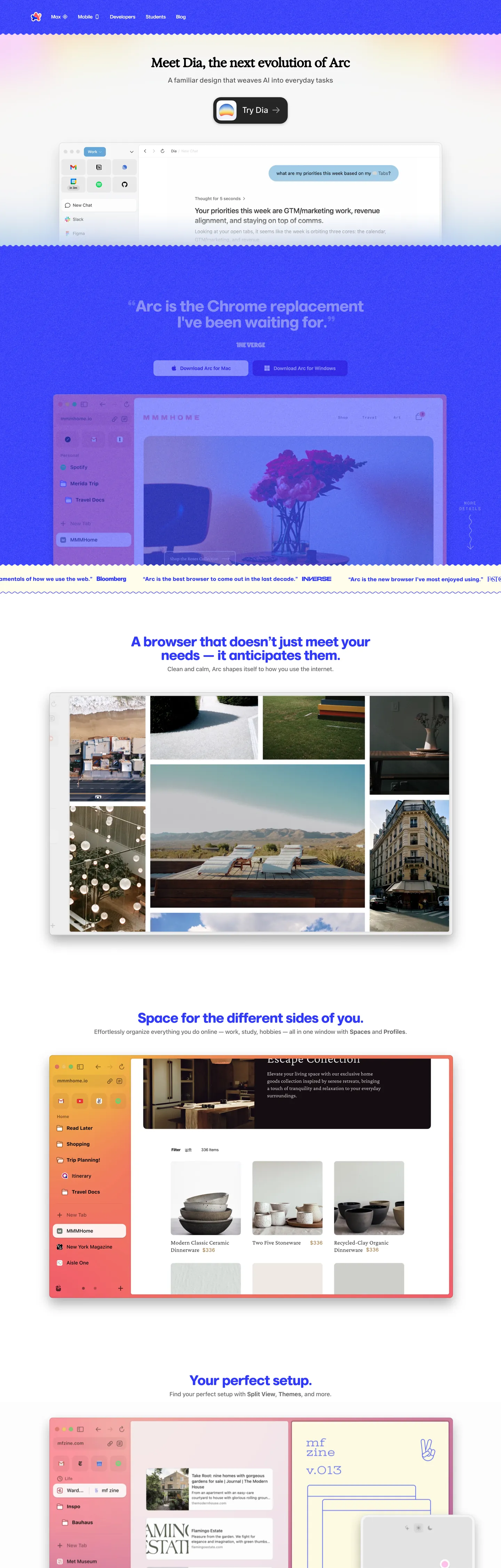
Arc's marketing canvas inverts the category default. Where most browser landing pages default to true-white "#ffffff" or a dark gradient mesh, Arc lays everything on Arc Offwhite ("#fffcec") — a warm cream with a hint of yellow that reads as paper rather than screen. On top sits Marlin Soft SQ at weight 700, pulled to "-1.8204px" tracking on the 45.5px hero, and a primary CTA that is not a pill button but a 76px-tall black card at radius "22px" advertising Dia, the AI browser successor. One blue band ("#3139fb") flashes across mid-page as a full-bleed quote section, then the page returns to cream. The voltage is rare on purpose — it never appears as a button fill on the core chrome and never repeats inside the same section.
This page packages the whole system into a single DESIGN.md file written to the Google Labs spec. Inside: 19 colors tokens grouped into brand voltage, neutral canvas, hairline, and a separate students sub-palette ("#f25e6b" arc pinkish, "#f2c2ac" salmon, "#d3e081" light green, "#0c50ff" arc blue, plus a "#f5f4e2" off-white); 13 type tokens across five families — Marlin Soft SQ display, InterVariable body, ABC Oracle dek, ABC Favorit Mono eyebrows, Exposure VAR for the rare feature head; 7 corner radii from "2px" up to "32px" plus the signature 22px CTA radius; an 8-point spacing scale from "4px" through "72px"; and 21 components covering the oversized Try Dia card, nav links, hero heading, body paragraphs, eyebrow tags, and the students section variants.
Feed the file to Claude, Cursor, or GitHub Copilot and the agent reproduces Arc's discipline — cream canvas over true white, one blue voltage band per page, the 76px-tall CTA card, the uppercase mono eyebrows — rather than a generic browser landing template. Or reference the tokens directly: every hex, font name, radius and spacing value is a quoted scalar you can paste into Tailwind config or CSS variables. Arc is worth studying because it proves a software product can use paper-warm cream as its primary surface and still read as a 2026 AI-browser brand, with the high-voltage blue earning its presence by appearing only once per page.
What makes it distinct
5
- Cream canvasArc Offwhite #fffcec carries hero, body and footer where most browser sites default to true white #ffffff
- High-voltage blue band#3139fb appears once as a full-bleed section ground, then never as a button fill on the core chrome
- Oversized CTA cardthe Try Dia button stands 76px tall at corner radius 22px, double the height of a conventional pill
- Five-family type stackMarlin Soft SQ display, Inter body, ABC Oracle dek, ABC Favorit Mono eyebrows, Exposure VAR feature heads
- Separate students sub-palette#f25e6b arc pinkish, #f2c2ac salmon and #0c50ff arc blue surface only inside the for-students section
arc.net
Live at arc.net
A snapshot of the brand in production. Scroll the frame to see the whole page.
Colors
19 colors
Arc's system runs on #3139fb as its primary voltage, used in 3 of 21 components. Type is set in Marlin Soft SQ across 13 tokens from 12px to 45.51px, weights 400–700. Shape language is mixed across 21 components, blending pills, soft rounds, and squarer corners.
Brand & Accent
Sparing, CTA-only voltage · 5
Surface
Page and card backgrounds · 4
Text
Headlines, body, captions · 5
Other
Specialty colors · 5
Typography
13 type tokens
Set in Marlin Soft SQ across 13 tokens, from 12px to 45.51px, weights 400–700. Shown in its own stack: where the font isn't installed, the fallback the file names stands in.
- display-hero45.51px · weight 700 · lh 0.93 · tracking -1.8204pxThe quick brown fox jumps over the lazy dog
- display-lg40px · weight 700 · lh 0.975 · tracking -1.6pxThe quick brown fox jumps over the lazy dog
- display-md28px · weight 700 · lh 1.07 · tracking -1.4pxThe quick brown fox jumps over the lazy dog
- feature-head36px · weight 700 · lh 1 · tracking -0.72pxThe quick brown fox jumps over the lazy dog
- dek-lg24px · weight 400 · lh 1.2The quick brown fox jumps over the lazy dog
- dek-md20px · weight 400 · lh 1.2The quick brown fox jumps over the lazy dog
- body-lg17px · weight 500 · lh 1.5The quick brown fox jumps over the lazy dog
- body-strong17px · weight 700 · lh 1.5The quick brown fox jumps over the lazy dog
- nav-link16px · weight 700 · lh 1.2The quick brown fox jumps over the lazy dog
- label-sm14px · weight 500 · lh 1.4 · tracking -0.28pxThe quick brown fox jumps over the lazy dog
- eyebrow12px · weight 700 · lh 1.4 · tracking 0.6pxThe quick brown fox jumps over the lazy dog
- eyebrow-loose12px · weight 400 · lh 1.4 · tracking 1.8pxThe quick brown fox jumps over the lazy dog
- tab-label12px · weight 600 · lh 1.2 · tracking 0.4pxThe quick brown fox jumps over the lazy dog
Layout
Radii and spacing
7 corner radii and 9 spacing values. Shape language: mixed.
Radii
- xs2px
- sm4px
- md8px
- lg10px
- cta22px
- xl32px
- full9999px
Spacing
- xxs4px
- xs8px
- sm12px
- md16px
- lg24px
- xl32px
- xxl40px
- section56px
- band72px
Components
21 components
Each rendered from its tokens (color, type, radius, padding) on Arc's own canvas.
- Button Primarybutton-primaryButton Primary
- Button Primary Hoverbutton-primary-hoverButton Primary Hover
- Button Secondarybutton-secondaryButton Secondary
- Button Blue Bandbutton-blue-bandButton Blue Band
- Top Navtop-navTop Nav
- Nav Linknav-linkNav Link
- Hero Headinghero-headingHero Heading
- Hero Blue Bandhero-blue-bandHero Blue Band
- Feature Cardfeature-cardFeature Card
- Feature Card Imagefeature-card-imageFeature Card Image
- Body Paragraphbody-paragraphBody Paragraph
- Eyebrow Tageyebrow-tagEyebrow Tag
- Type here…text-inputText Input
- Type here…text-input-focusText Input Focus
- Students Sectionstudents-sectionStudents Section
- Students Cardstudents-cardStudents Card
- Students Chipstudents-chipStudents Chip
- Students Chip Hoverstudents-chip-hoverStudents Chip Hover
- Press Quote Bandpress-quote-bandPress Quote Band
- FooterfooterFooter
- Shadow Cardshadow-cardShadow Card
In use
The system, in use
Arc's tokens on the kind of product it builds.
Build something people actually use.
A short paragraph of marketing copy that previews how the brand's display tier and body tier read together. Two sentences is usually enough.
FAQ
Arc design system FAQ
Common questions about Arc's tokens, components, and how to use this DESIGN.md in your project.
Read next
Related reading
Specs, directories, and component libraries that pair with this design system.
- Browse all design systemsThe full directory of DESIGN.md files on shadcn.io, with live mockups for each.shadcn.io
- Arc — official siteThe live arc.net marketing page this spec was extracted from — see the cream canvas, the blue band, and the oversized Try Dia card in motion.arc.net (opens in a new tab)
- The DESIGN.md specificationGoogle Labs' open spec for machine-readable design system files — the format this page is built on.github.com (opens in a new tab)
Use it
Use Arc in your project
One machine-readable file. Drop it into Claude, Cursor, or any AI tool that reads DESIGN.md.
Download the DESIGN.md
One machine-readable file: every color, type, radius, spacing, and component token of Arc.
Feed it to your AI tool
Drop it into Claude, Cursor, or GitHub Copilot. The agent writes React components and Tailwind classes that match Arc's visual language.
Reference the tokens directly
Or paste the values into your Tailwind config, CSS variables, or component library: every color, size and radius is a quoted, ready-to-copy value.
Read the full DESIGN.md: overview, rationale, do’s and don’ts
Overview
Arc's marketing canvas is the rare software-product surface set on cream rather than white. The page floor is {colors.canvas} ("#fffcec") — Arc Offwhite, a warm yellow-tinted neutral that reads as paper, not screen — and it carries hero, body, footer and most cards across the page. The single high-voltage moment is {colors.primary} ("#3139fb"), a royal blue that appears once as a full-bleed press-quote band mid-page, then returns the canvas to cream. Deep brand variants {colors.primary-deep} ("#2404aa") and {colors.primary-dark} ("#000354") extend the same hue family for hover and pressed states, but never paint a full section.
Cream-as-canvas: where most browser landing pages default to true-white "#ffffff" or a dark gradient mesh, Arc sets the entire page on a paper-warm yellow neutral. The unexpected pairing — saturated royal blue voltage on a warm cream canvas — is the brand's tonal signature.
The CTA hierarchy inverts the category default. Where competitors run a 36-44px pill button, Arc's primary CTA is a 76px-tall black card at corner radius {rounded.cta} ("22px"), advertising Dia — the AI browser successor to Arc itself. The padding is asymmetric ("8px 22px 8px 8px") to reserve room for an inline product icon. Standard nav links and secondary buttons stay at conventional sizes; only the Dia card breaks scale.
Display type runs Marlin Soft SQ at weight 700 with tight negative tracking, scaling from "-1.8204px" on the 45.5px hero down to "-1.4px" on the 28px feature heads. ABC Oracle handles the 20-24px dek paragraphs in regular weight, InterVariable carries body and tabs, and ABC Favorit Mono in uppercase with positive tracking (+0.6 to +1.8px) marks every eyebrow tag. A separate students sub-palette — {colors.students-arc-pinkish} ("#f25e6b"), {colors.students-salmon} ("#f2c2ac"), {colors.students-light-green} ("#d3e081"), {colors.students-arc-blue} ("#0c50ff") — surfaces only inside the for-students section, never on the core chrome.
Key Characteristics:
- Cream-canvas software system —
{colors.canvas}("#fffcec") carries every band; pure white never appears on chrome. - High-voltage blue band —
{colors.primary}("#3139fb") flashes across one full-bleed press-quote section per page, then disappears. - Oversized CTA card — the Try Dia button is a 76px black pill at radius
{rounded.cta}("22px") with asymmetric padding, not a conventional pill. - Five-family type stack — Marlin Soft SQ display, InterVariable body, ABC Oracle dek, ABC Favorit Mono eyebrows, Exposure VAR for the rare feature head.
- Separate students sub-palette — pinkish, salmon, light green and arc-blue tones surface only inside the for-students band, scoped by the
--colors-students-CSS variable namespace. - Display tracking pulls negative (
"-1.8204px"at 45.5px); eyebrow mono pushes positive ("1.8px"at 12px). - Photographic browser captures and image collages do the heavy lifting — the chrome stays sparse so the screenshots can carry the section.
Colors
- Arc Offwhite (
#fffcec) — frequency 142. Used as text (68), border (63), background (11). The canvas voltage. Carries hero, body, footer and most cards. The yellow cast (about 2% chroma in OKLCH) reads as paper, not screen. - Arc Brand Blue (
#3139fb) — frequency 124. Used as text (60), border (60), background (4). The single high-voltage moment. Appears once per page as a full-bleed press-quote band, reserved for that one mid-page voltage flash. - High Contrast Black (
#000000) — frequency 85. Used as text (40), border (40), shadow (4), background (1). The ink and the Try Dia card surface — load-bearing for body text and the oversized primary CTA only. - Text Dark Grey (
#696969) — frequency 18. Used as text (9), border (9). Secondary text on the cream canvas. Reserved for caption rows and label metadata, never display. - Arc Deep Blue (
#2404aa) — frequency 5. Used as text (2), border (2), background (1). The pressed and hovered variant of the brand blue — same hue, dropped lightness. - Focus Outline Light Blue (
#96c4ff) — frequency 0 on chrome. Declared in--colors-focusOutlineas the focus-ring color on inputs and links. Pale enough to read as a halo rather than a fill. - Arc Deep Brand Blue (
#2404aa) — same hex as the pressed variant; lives under--colors-brandDeepBluefor the deep-blue tier when stacked alongside--colors-brandDarkBlue. - Arc Dark Blue (
#000354) — frequency 0 on chrome. The deepest brand variant, used for navy text on cream where pure black would feel too hot. - Arc Brand Red (
#fb3a4d) — frequency 0 on chrome. Declared as--colors-brandRedfor the rare error-state or destructive-action moment. Not present on the inspected page. - Students Arc Pinkish (
#f25e6b) — declared in--colors-students-arc_pinkish. Surfaces only inside the for-students section, where it pairs with salmon and light-green for a photo-collage mood distinct from the cool main canvas. - Students Arc Blue (
#0c50ff) —--colors-students-arc_blue. A second blue hue, slightly cooler than the main brand blue, scoped to the students band. - Students Salmon (
#f2c2ac) —--colors-students-salmon. Warm photo-collage tone, scoped to the students band only. - Students Off-white (
#f5f4e2) —--colors-students-off_white. A slightly more saturated cream than the canvas, used as the students-section background tier.
Typography
Arc runs five typefaces in parallel — an unusually wide stack for a software product, but each family carries a single semantic role and the rules never overlap.
Marlin Soft SQ at weight 700 is the display family. Tracking pulls hard negative: "-1.8204px" on the 45.5px hero, "-1.6px" on the 40px sub-head, "-1.4px" on the 28px feature heads — roughly 4% of font size at the top of the ramp. The same family at weight 500 carries 14px chip and label rows with "-0.28px" tracking.
ABC Oracle in regular weight 400 handles the 20-24px dek paragraphs — the magazine-style sub-headlines that sit between display and body. Its presence is what gives the page its editorial cadence; without it the chrome reads as plain software-product type.
InterVariable carries 17px body at weights 500 and 700, plus 12px tab labels with "0.4px" positive tracking. ABC Favorit Mono in uppercase with "0.6px" to "1.8px" positive tracking marks every eyebrow tag — the small mono-stamped labels above section openers. Exposure VAR makes a single 36px appearance for one feature head, otherwise dormant. Fallback stacks documented in the CSS variables run to system-ui and sans-serif; Inter ships free from rsms.me as a substitute for the rest.
Layout
The page max-width is 1280px (the documented --max-width token), with "32px" page padding on each side (--page-padding-left / --page-padding-right) that collapses to a smaller value on narrow viewports. Section padding leans on a "56px" to "72px" rhythm — the cream hero and footer use the larger band spacing while interior content blocks settle at the section tier. Internal stack gaps are tightest at "4px" and "8px" for chip rows, climbing to "12px", "16px", "24px", "32px", "40px" and "48px" for content rhythm. The top nav is 64px tall (--navbar-height), with the announcement banner reserved at 0px until activated. Mobile CTAs rise to 56px (--mobile-cta-height). The page never breaks the cream-canvas continuity except for the single blue press-quote band, which runs full-bleed without inner padding shrink — the blue carries margin-edge to margin-edge.
Elevation & Depth
Arc documents three named shadow tiers in CSS variables — --shadows-small at "0 5px 10px rgba(0, 0, 0, 0.12)", --shadows-medium at "0 8px 30px rgba(0, 0, 0, 0.12)", and --shadows-large at "0 30px 60px rgba(0, 0, 0, 0.12)". All three share the same rgba(0, 0, 0, 0.12) color stop; the depth tiers vary by blur radius and offset, not by opacity. The page uses these sparingly: image collages and the Try Dia card carry the medium tier, while feature-card image surfaces lift on small. The blue press-quote band and the cream canvas both lay flat — no shadow ever lifts a section background. Depth on chrome comes from the warm canvas pulling slightly behind the white-on-blue band, not from drop shadows.
Shapes
The corner-radius scale is tight and intentional. CSS variables document --radii-2 at "2px", --radii-4 at "4px", --radii-8 at "8px", --radii-12 at "12px", --radii-16 at "16px", --radii-32 at "32px", plus --radii-round at "9999px". Extracted from the live page: "8px" carries 9 surfaces (most cards, inputs and chips), "10px" lifts 3 photographic image tiles, "4px" marks 1 utility chip. The signature radius is "22px" — non-standard, declared inline rather than in a token, and reserved for the Try Dia primary CTA card. No surface on the inspected page uses the full-circle "9999px" except students chip pills.
Components
- button-primary — the Try Dia card. Black surface (
{colors.ink}), cream text ({colors.canvas}), corner radius{rounded.cta}("22px"), padding"8px 22px 8px 8px", height 76px. ABC Oracle 24px at weight 400 typography. - button-primary-hover — primary card on hover swaps the surface to
{colors.primary-dark}("#000354"), keeping every other property. - button-secondary — cream surface with a 1px ink border. Used for the secondary nav CTA and inline outline actions.
- button-blue-band — the CTA that appears inside the blue press-quote band. Surface drops to the cream canvas for contrast; text returns to brand blue.
- top-nav — cream surface, 64px tall, padding
"0px 32px", Marlin Soft SQ 16px weight 700 nav links. - nav-link — individual nav anchor, no surface, ink text on cream canvas.
- hero-heading — 45.5px Marlin Soft SQ at weight 700,
"-1.8204px"tracking, line-height"42.25px"(0.93x). - hero-blue-band — the full-bleed mid-page press-quote section. Brand blue surface, cream text, 40px Marlin Soft SQ at
"-1.6px"tracking. - feature-card — content card on the cream canvas. 28px display-md heading, 8px radius, 24px padding.
- feature-card-image — the image-collage tile. Same cream surface but 10px radius and zero padding to let the photograph fill the frame.
- body-paragraph — 20px ABC Oracle dek paragraph. Used for the magazine-style sub-headlines between display and body.
- eyebrow-tag — uppercase ABC Favorit Mono 12px at
"0.6px"tracking,"4px 16px"padding. The small mono label above every section opener. - text-input — cream surface with 1px ink border, 8px radius,
"8px 12px"padding. - text-input-focus — same input on focus, but the border drops to 2px in
{colors.primary-soft}("#96c4ff") for a halo effect. - students-section — the for-students band. Surface drops to
{colors.surface-students}("#f5f4e2") for a slightly more saturated cream than the canvas, with{colors.ink-students}("#766e6a") replacing pure ink for warmer contrast. - students-card — content card inside the students section.
- students-chip / students-chip-hover — pill chips inside the students section at radius
{rounded.full}("9999px"). Hover lifts to{colors.surface-students-hover}("#d7d6c4"). - press-quote-band — the one full-bleed blue section per page. Brand blue surface, cream text, 72px vertical padding, no inner radius.
- footer — cream surface continuous with the canvas. Body-lg text, 56px vertical padding.
- shadow-card — the rare lifted card variant. Carries
--shadows-medium("0 8px 30px rgba(0, 0, 0, 0.12)") for image-collage emphasis.
Do's and Don'ts
- Don't use
#fffffffor canvas — pure white is not in Arc's surface vocabulary. Use#fffcec({colors.canvas}) instead. The 2% yellow chroma is what makes the page read as paper rather than screen, and the blue voltage band depends on the cream contrast to land. - Don't paint the blue
#3139fbon buttons or cards — the brand blue is reserved for the single full-bleed press-quote band per page. It appears 124 times in CSS but only 4 of those are background uses, all on that one band. For primary CTAs, use the 76px-tall black card at{rounded.cta}("22px") instead. - Don't shrink the Try Dia CTA below 76px — the oversized height is the brand's primary-action signature. A conventional 44-52px pill button reads as generic SaaS chrome and erases what makes Arc's CTA hierarchy distinct.
- Don't mix the students sub-palette with the main chrome — the seven
--colors-students-*tokens (arc pinkish, salmon, light green, light blue, arc blue, arc blue pale, off-white) are scoped to the for-students band only. Surfacing students arc pinkish (#f25e6b) on the main nav or hero would break the deliberate tonal separation between core marketing and the students mode. - Don't enable Marlin Soft SQ without the negative tracking — at 45.5px the type pulls to
"-1.8204px"and at 40px to"-1.6px". Without those values the display reads as plain rounded sans and loses its voice. Track positive only on the ABC Favorit Mono eyebrows ("0.6px"to"1.8px"). - Don't use the focus-outline blue
#96c4ffas a text or border color outside focus states — the token (--colors-focusOutline) is declared explicitly for the 2px focus ring on inputs and links. Painting it on text or chrome would dilute the focus signal.
Known Gaps
- The blue press-quote band on the inspected page captures one example of brand-blue surface use; pages on other arc.net routes may use the same blue on the products-tour and download pages — not extracted here.
- Hover states for the nav links and feature cards are not visible in the static screenshot; the documented
students-chip-hoveris inferred from the--colors-students-light_grey-hoverCSS variable. - Dark mode is not documented because the marketing site does not ship a dark theme — the in-product Arc Browser ships its own chrome with dark and light themes that are not part of this marketing-page spec.
- Marlin Soft SQ, ABC Oracle, ABC Favorit Mono and Exposure VAR are commercial typefaces. Open-source substitutes include Inter or Geist for the sans display, IBM Plex Mono or JetBrains Mono for the mono eyebrows, and Newsreader or Source Serif for the editorial dek role.
- The
--colors-primary*and--colors-secondary*12-step Radix-style color scales are declared in CSS but not surfaced on the inspected marketing page; they are likely used inside the in-product Arc Browser chrome. - Form-field validation and error styling beyond focus-ring color is not visible on the inspected pages.
AI & LLM Platforms
More systems like this
More DESIGN.md files in AI & LLM Platforms.
Pricing
Build it with Pro
The DESIGN.md files are free. Pro adds 6,000+ blocks, premium templates and the MCP server, so your AI editor builds in your system for you.
4.9/5 out of 5 · 150+ reviewsfrom 150+ founders and developers.
Billing
Billed once a year in USD. Cancel anytime.
- How many people can use the license.
- Client work, SaaS products and anything you charge for.
- Production-ready React sections: hero, pricing, features, dashboards and more.
- Complete multi-page sites you can ship as they are.
- React icons from every major library, installable with one command.
- Presets that restyle every block, in light and dark.
- Lets your AI editor search, preview and install blocks for you.
- Priority requests are answered first.
Individual
For personal projects & open source
$32instead of $49/mo
$389 billed yearly
- Seats: 1 seat
- Commercial use: Personal & open source only
- Pro blocks: 6,000+ blocks
- Templates: All 14 templates
- React icons: 294k+ icons
- Themes: All 59 themes
- MCP server: Basic usage
- Support: Standard
Team
Most popularFor freelancers, agencies & startups
$66instead of $99/mo
$789 billed yearly · ≈ $13/dev/mo
- Seats: Up to 5 seats
- Commercial use: Included
- Pro blocks: 6,000+ blocks
- Templates: All 14 templates
- React icons: 294k+ icons
- Themes: All 59 themes
- MCP server: High usage
- Support: Priority
Organization
For companies with larger teams
$132instead of $199/mo
$1,589 billed yearly
- Seats: Unlimited seats
- Commercial use: Included
- Pro blocks: 6,000+ blocks
- Templates: All 14 templates
- React icons: 294k+ icons
- Themes: All 59 themes
- MCP server: Unlimited usage
- Support: Priority
Billed once a year in USD. Cancel anytime.
Individual
For personal projects & open source
$32instead of $49/mo
$389 billed yearly
- How many people can use the license.Seats: 1 seat
- Client work, SaaS products and anything you charge for.Commercial use: Personal & open source only
- Production-ready React sections: hero, pricing, features, dashboards and more.Pro blocks: 6,000+ blocks
- Complete multi-page sites you can ship as they are.Templates: All 14 templates
- React icons from every major library, installable with one command.React icons: 294k+ icons
- Presets that restyle every block, in light and dark.Themes: All 59 themes
- Lets your AI editor search, preview and install blocks for you.MCP server: Basic usage
- Priority requests are answered first.Support: Standard
Team
Most popularFor freelancers, agencies & startups
$66instead of $99/mo
$789 billed yearly · ≈ $13/dev/mo
Everything in Individual, plus
- How many people can use the license.Seats: Up to 5 seats
- Client work, SaaS products and anything you charge for.Commercial use: Included
- Lets your AI editor search, preview and install blocks for you.MCP server: High usage
- Priority requests are answered first.Support: Priority
Organization
For companies with larger teams
$132instead of $199/mo
$1,589 billed yearly
Everything in Team, plus
- How many people can use the license.Seats: Unlimited seats
- Lets your AI editor search, preview and install blocks for you.MCP server: Unlimited usage
- Secure checkout via Stripe
- Code lives in your repo
- Keep what you've shipped if you cancel
- License terms
Your system, built for you
Every block, template and icon, installed by your AI agent in your design system. The DESIGN.md files stay free.