Anthropic Design System
Anthropic's design system as a DESIGN.md file. Slate #141413, Anthropic Serif + Sans + Mono, 21 colors, 21 components. For React, Next.js, and AI tools.
Add shadcn.io to your AI agent. · Pro It installs blocks, icons and templates in your design system from a prompt, with Pro.
Set up MCP- Primary
- #5e5d59
- Typeface
- Anthropic Serif
- Shape
- Soft
- Base radius
- 16px
- Colors
- 21
- Type tokens
- 11
- Components
- 21
- Spacing values
- 8
About
About Anthropic DESIGN.md
Curated by Dov Azencot · Updated May 12, 2026 · Source anthropic.com (opens in a new tab)
Anthropic's corporate site is what an AI lab's identity looks like when it refuses every category convention. The homepage paints slate ink (#141413) on ivory cream (#faf9f5) and nothing else — no gradients, no brand purple, no signature blue. Where most AI companies signal authority with cool-blue depth and saturated CTAs, Anthropic signals it with monochrome restraint and a serif body face that reads more like a printed essay than a marketing surface.
The system itself is richer than the front door suggests. Beyond the homepage's 6 painted colors, Anthropic declares 15 more on `:root` — including 8 muted accent swatches (clay, fig, cactus, sky, heather, olive, manilla, kraft) that surface only on research entries, the Economic Index dashboards, and news sub-pages. This DESIGN.md captures both layers: 21 colors tokens, 11 typography levels split across three custom typefaces (Anthropic Serif, Sans, Mono), a 4-step radius scale, 8-step spacing rhythm, and 21 components definitions covering buttons, surfaces, nav, and the cream-to-black band alternation that paces every page.
Feed the file to Claude, Cursor, or Copilot and the agent reproduces the editorial voice — black slate CTAs, ivory canvas, serif body prose, mono uppercase labels — rather than a generic AI-startup theme. Or use it as an audit: a benchmark for how much chromatic noise your own design system carries that Anthropic deliberately holds in reserve.
What makes it distinct
5
- Monochrome marketing surfaceslate #141413 on cream #faf9f5 paints the homepage, with no chromatic CTA in sight
- Dormant 8-color accent paletteclay #d97757, fig #c46686, cactus #bcd1ca, sky #6a9bcc and 4 more declared in :root but scoped to research and Economic Index sub-pages
- Cream-and-black band rhythmfull-bleed cream sections alternate with full-bleed #000000 black sections, replacing the gradient heroes other AI brands lean on
- Three-typeface stackAnthropic Serif (90px section displays, 24px body), Anthropic Sans bold (impact hero, nav), Anthropic Mono uppercase (eyebrow metadata)
- Backslash glyph wordmarkthe letter I in ANTHROP\C is a literal `\` character, codified across the brand
anthropic.com
Live at anthropic.com
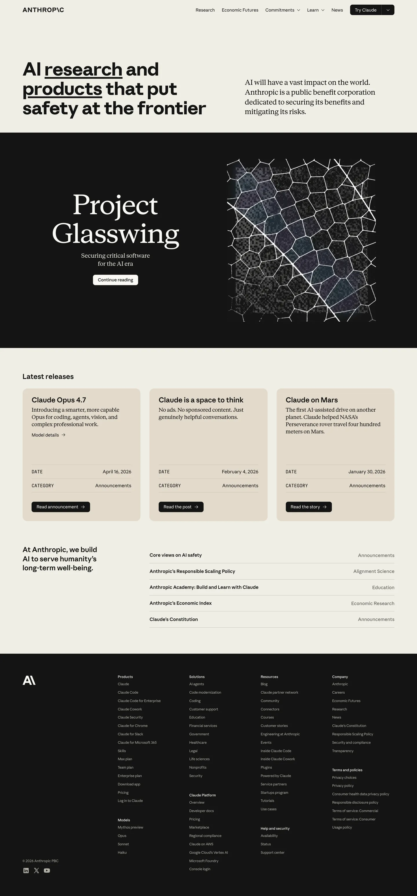
A snapshot of the brand in production. Scroll the frame to see the whole page.
Colors
21 colors
Anthropic's system anchors on #5e5d59 (text-muted) as its primary color. Type is set in Anthropic Serif across 11 tokens from 12px to 90px, weights 400–700. Shape language is soft — components average 15px corner radius, with no sharp interactive edges.
Brand & Accent
Sparing, CTA-only voltage · 8
Surface
Page and card backgrounds · 6
Text
Headlines, body, captions · 5
Borders & Hairlines
Dividers, outlines, rules · 1
Other
Specialty colors · 1
Typography
11 type tokens
Set in Anthropic Serif across 11 tokens, from 12px to 90px, weights 400–700. Shown in its own stack: where the font isn't installed, the fallback the file names stands in.
- display-hero88px · weight 700 · lh 1.05 · tracking -1.5pxThe quick brown fox jumps over the lazy dog
- display-section90px · weight 400 · lh 1.1 · tracking -0.5pxThe quick brown fox jumps over the lazy dog
- display-md48px · weight 400 · lh 1.15 · tracking -0.3pxThe quick brown fox jumps over the lazy dog
- heading-md24px · weight 600 · lh 1.3The quick brown fox jumps over the lazy dog
- body-lg24px · weight 400 · lh 1.4The quick brown fox jumps over the lazy dog
- body-md18px · weight 400 · lh 1.5The quick brown fox jumps over the lazy dog
- body-sm15px · weight 400 · lh 1.4 · tracking -0.04pxThe quick brown fox jumps over the lazy dog
- nav-link20px · weight 400 · lh 1.4The quick brown fox jumps over the lazy dog
- label12px · weight 500 · lh 1.4The quick brown fox jumps over the lazy dog
- eyebrow16px · weight 400 · lh 1.4The quick brown fox jumps over the lazy dog
- button18px · weight 600 · lh 1.4The quick brown fox jumps over the lazy dog
Layout
Radii and spacing
4 corner radii and 8 spacing values. Shape language: soft.
Radii
- none0px
- sm8px
- md16px
- lg24px
Spacing
- xs4px
- sm8px
- md12px
- base16px
- lg24px
- xl32px
- 2xl48px
- 3xl96px
Components
21 components
Each rendered from its tokens (color, type, radius, padding) on Anthropic's own canvas.
- Top Navtop-navTop Nav
- Nav Linknav-linkNav Link
- Nav Link Hovernav-link-hoverNav Link Hover
- Button Primarybutton-primaryButton Primary
- Button Primary Hoverbutton-primary-hoverButton Primary Hover
- Button Secondarybutton-secondaryButton Secondary
- Button Tertiarybutton-tertiaryButton Tertiary
- Card Creamcard-creamCard Cream
- Card Warmcard-warmCard Warm
- Hero Band Creamhero-band-creamHero Band Cream
- Hero Band Blackhero-band-blackHero Band Black
- Section Eyebrowsection-eyebrowSection Eyebrow
- Hero Heading Sanshero-heading-sansHero Heading Sans
- Hero Heading Serifhero-heading-serifHero Heading Serif
- Body Prosebody-proseBody Prose
- Link Inlinelink-inlineLink Inline
- DividerdividerDivider
- Type here…text-inputText Input
- Type here…text-input-focusText Input Focus
- Footer Bandfooter-bandFooter Band
- WordmarkwordmarkWordmark
In use
The system, in use
Anthropic's tokens on the kind of product it builds.
Build something people actually use.
A short paragraph of marketing copy that previews how the brand's display tier and body tier read together. Two sentences is usually enough.
FAQ
Anthropic design system FAQ
Common questions about Anthropic's tokens, components, and how to use this DESIGN.md in your project.
Read next
Related reading
Specs, directories, and component libraries that pair with this design system.
- Browse all design systemsThe full directory of DESIGN.md files on shadcn.io, with live mockups for each.shadcn.io
- Anthropic — official siteThe live source of this design system. Visit to see the cream-to-black band rhythm in motion.anthropic.com (opens in a new tab)
- The DESIGN.md specificationGoogle Labs' open spec for machine-readable design system files — the format this page is built on.github.com (opens in a new tab)
Use it
Use Anthropic in your project
One machine-readable file. Drop it into Claude, Cursor, or any AI tool that reads DESIGN.md.
Download the DESIGN.md
One machine-readable file: every color, type, radius, spacing, and component token of Anthropic.
Feed it to your AI tool
Drop it into Claude, Cursor, or GitHub Copilot. The agent writes React components and Tailwind classes that match Anthropic's visual language.
Reference the tokens directly
Or paste the values into your Tailwind config, CSS variables, or component library: every color, size and radius is a quoted, ready-to-copy value.
Read the full DESIGN.md: overview, rationale, do’s and don’ts
Overview
Anthropic's chrome runs on monochromatic restraint with dormant chroma — the homepage paints slate ink on cream and nothing else, but the system itself declares 8 muted accent swatches (clay, fig, cactus, sky, heather, olive, manilla, kraft) that surface only on research entries, the Economic Index dashboards, and news sub-pages. Where most AI companies signal authority through cool-blue gradients and saturated CTAs, Anthropic signals it through holding the chromatic palette in reserve. The slate #141413 carries every marketing CTA, every link, every border, every primary text. The cream #faf9f5 is the canvas across every text-driven section. Together they cover ~95% of the visible pixels on the front door.
The system's structural rhythm is band alternation: full-bleed cream sections (text, prose, research summaries) swap with full-bleed true-black sections (cinematic illustrations, feature reveals like Project Glasswing's hexagonal mesh). The cream-to-black contrast is the only visual divider — no gradients, no shadows, no decorative rules. Where conventional marketing sites lean on hero gradients to signal weight, Anthropic lets the canvas swap do the work.
The typographic move inverts the usual category convention: serif for body, sans for hero. The 24px body prose runs Anthropic Serif (Georgia-class), reading more like a long-form essay than marketing copy. The impact hero ("AI research and products that put safety at the frontier") runs Anthropic Sans bold at 88px. Section displays like "Project Glasswing" return to Anthropic Serif at 90px weight 400 — editorial, never bold. Mono uppercase eyebrows complete the three-typeface stack.
Colors
Anthropic's published design system declares 21 tokens on :root, but the marketing homepage only paints 6 of them. The other 15 are scoped to research entries, the Economic Index dashboards, and news pages — they exist in the system, just dormant on the front door. Both groups are documented below.
Marketing surface (painted on the homepage)
- Slate ink (
#141413) — frequency 357. Used as text (178), border (171), background (8). The system's load-bearing voltage: every CTA fill, every body text run, every divider edge, every primary border. CSS variables map it as--swatch--slate-dark,--swatch--brand-text,--_color-theme---button-primary--background,--_color-theme---text. - Cloud medium (
#b0aea5) — frequency 316. Used as text (158), border (158). The secondary text color — captions, metadata, divider hairlines. Reads warm rather than cool, derived from the cream canvas hue. Mapped as--swatch--cloud-medium,--_color-theme---text-agate. - Ivory canvas (
#faf9f5) — frequency 291. Used as text-on-dark (146), border-on-dark (141), background (4). The default page canvas and the inverse text color on black bands. Mapped as--swatch--ivory-light,--_color-theme---background. - Surface secondary (
#f0eee6) — card backgrounds. The faintly darker cream variant that lifts cards off the canvas without a shadow. Mapped as--_color-theme---background-secondary. - Surface warm (
#e3dacc) — accent cards, reaching toward oat. Mapped as--swatch--oat. - Inverse (
#000000) — full-bleed band backgrounds. True black for the cinematic feature sections. The cream-to-black swap is the page's only depth signal.
Extended chrome (dormant on the homepage, mapped in :root)
- Ink soft (
#3d3d3a) — primary button border-hover state. Mapped as--_color-theme---button-primary--border-hover,--_button-style---background-hover. - Text muted (
#5e5d59) — link-text hover,--swatch--slate-light. - Text tertiary (
#87867f) —--swatch--cloud-dark. Disabled-state captions. - Hairline (
#d1cfc5) —--swatch--cloud-light. Divider rules where the cloud-medium variant is too prominent. - Surface secondary hover (
#e8e6dc) —--_color-theme---background-secondary-hover. Card lift on hover. - Surface manilla (
#ebdbbc) —--swatch--manilla. Warm yellow-tinted alternate surface. - Surface kraft (
#d4a27f) —--swatch--kraft. The most saturated of the warm-paper tones.
Accent swatches (research/news/sub-page only)
The palette below is declared on :root but never paints the marketing homepage. It surfaces on research entries (per-paper accent cards), the Economic Index dashboards (chart palettes), and the news section (per-article spot color). All eight read as muted, dustier than fully-saturated brand colors.
- Clay (
#d97757) —--swatch--clay. Warm terracotta orange. The brand's strongest chromatic accent; appears on research featured-entry tiles. - Coral (
#ebcece) —--swatch--coral. Pale dusty pink, used as soft callout fills. - Fig (
#c46686) —--swatch--fig. Muted rose, used on Society & Economy research category tiles. - Deep (
#c6613f) —--swatch--accent. Burnt sienna, the deepest warm-orange in the system. - Cactus (
#bcd1ca) —--swatch--cactus. Pale sage green, on technical-research category tiles. - Olive (
#788c5d) —--swatch--olive. Muted olive-green for graph data points. - Sky (
#6a9bcc) —--swatch--sky. Soft mid-blue for AI-safety category tiles. - Heather (
#cbcadb) —--swatch--heather. Cool lavender-grey, the only chromatic-cool token in the system.
Typography
Three custom typefaces, each scoped to a strict role.
Anthropic Serif is the system's voice. It handles 90px section displays ("Project Glasswing", "What we're working on") at weight 400 with -0.5px tracking, and 24px body prose at weight 400 across every essay-style paragraph. Setting body in serif is the system's most distinctive typographic move — it makes Anthropic's marketing surface read like a published research paper rather than a SaaS site. Substitute Georgia or Tiempos Text where the proprietary face is unavailable.
Anthropic Sans handles the impact hero ("AI research and products that put safety at the frontier") at 88px weight 700, plus the nav links at 20px weight 400 and 15px caption labels. Unlike the serif's editorial discipline, the sans is short-form and weight-graded. Inter or Söhne substitute cleanly.
Anthropic Mono carries the eyebrow metadata — uppercase timestamps, section labels, code-adjacent markers — at 16px weight 400. The mono is scoped exclusively to short, uppercase strings; it never carries body content. JetBrains Mono or Berkeley Mono substitute.
The 88-and-90 dual-display tension (sans 88 for top-of-page, serif 90 for section reveals) is the typographic signature. Most systems pick one display tier; Anthropic ships both and uses each in separate contexts.
Layout
The system runs on an 8px scale: 4, 8, 12, 16, 24, 32, 48, 96. The 96px value handles vertical section padding — the page rhythm is generous, not dense. Cards use 32px internal padding consistently, giving content room to breathe within the structural restraint.
The container strategy alternates: text sections cap at a comfortable reading column (~640-720px), while feature illustrations span full bleed. Where Stripe or Linear use a fixed-width content grid, Anthropic lets each section pick its own width based on whether it carries prose or imagery.
Elevation & Depth
Elevation is achieved through surface contrast, not shadows. The system carries zero box-shadows in the marketing surface. Cards lift off the canvas via a faint cream-to-cream value step (#f0eee6 on #faf9f5) and a 1px hairline border in #e3dacc. Full-bleed black bands provide the page's only true depth signal — the cream-to-black swap reads as a section break, not as foreground/background.
The absence of shadows is the design move. Most AI competitor sites lean on glow-shadows and gradient atmospheres; Anthropic refuses both.
Shapes
A two-tier radius scale: 8px for buttons, inputs, and small chips; 16px for cards and surfaces. A 24px tier exists for the rare extra-large container. Everything else is 0px — hero illustrations are flush-edged, full-bleed bands have no rounded corners, the wordmark sits flat against its canvas. The "Try Claude" CTA pill in the nav uses ~24px radius and is the visual exception, not the rule.
Components
The component vocabulary is small and disciplined. Three button variants (primary slate-fill, secondary cream-with-border, tertiary transparent-with-hairline) cover every interaction. Two card variants distinguish cream-on-cream (#f0eee6) from warm-oat (#e3dacc) — both render at 16px radius with 32px padding and no shadow. Two hero bands (cream and black) handle the section alternation. The eyebrow label, the inline link with underline, the divider, and the text input round out the system.
Notable: the wordmark itself is a typography token, not an SVG asset. ANTHROP\C renders as a styled span using Anthropic Sans at the canvas's slate color — the backslash is a literal \ character. Treating the logo as type rather than asset is what allows it to scale and inherit color across surfaces.
Do's and Don'ts
- Do hold the slate ink
#141413for every CTA, link, border, and primary text — this color is the only brand voltage the system carries. - Don't introduce a chromatic accent. Anthropic's restraint is the brand position; a coral, teal, or indigo CTA would break the entire system identity.
- Do set body prose in Anthropic Serif at 24px. Body in sans is what every other marketing site does — the serif body is what makes Anthropic read as an essay rather than a sales page.
- Don't bold the section serif. The 90px Project-Glasswing-style display runs at weight 400, never 600 or 700. Bold serif at that size reads as commercial poster, not editorial.
- Do alternate cream and true-black full-bleed bands for section pacing. Single-color page rhythm flattens the entire system.
- Don't add box-shadows to cards. The cream-on-cream
#f0eee6lift + 1px#e3dacchairline is the depth model — shadows break the painted-on-paper aesthetic. - Do use the backslash glyph
\as the I in the wordmark across every surface. Anthropic uses it as a typographic mark, not an image. - Don't substitute Times New Roman for Anthropic Serif. Use Georgia or Tiempos Text — Times has too much contrast and reads commercial.
Known Gaps
The marketing-surface spec doesn't cover several adjacent surfaces. Anthropic Serif, Sans, and Mono are proprietary with no public web fonts — substitution recommendations are documented but exact-match isn't possible. Motion (the staggered card fade-in on scroll, the subtle wordmark hover, the band-transition timing) is not extracted. Form validation states beyond focus, hover micro-interactions on CTAs, and the chart palette used on the Economic Index dashboards are out of scope. The claude.ai product surface adds chat bubbles, model selectors, and a conversation sidebar that this corporate-marketing document does not capture — see content/design/claude.md for the product-side spec.
AI & LLM Platforms
More systems like this
More DESIGN.md files in AI & LLM Platforms.
Pricing
Build it with Pro
The DESIGN.md files are free. Pro adds 6,000+ blocks, premium templates and the MCP server, so your AI editor builds in your system for you.
4.9/5 out of 5 · 150+ reviewsfrom 150+ founders and developers.
Billing
Billed once a year in USD. Cancel anytime.
- How many people can use the license.
- Client work, SaaS products and anything you charge for.
- Production-ready React sections: hero, pricing, features, dashboards and more.
- Complete multi-page sites you can ship as they are.
- React icons from every major library, installable with one command.
- Presets that restyle every block, in light and dark.
- Lets your AI editor search, preview and install blocks for you.
- Priority requests are answered first.
Individual
For personal projects & open source
$32instead of $49/mo
$389 billed yearly
- Seats: 1 seat
- Commercial use: Personal & open source only
- Pro blocks: 6,000+ blocks
- Templates: All 14 templates
- React icons: 294k+ icons
- Themes: All 59 themes
- MCP server: Basic usage
- Support: Standard
Team
Most popularFor freelancers, agencies & startups
$66instead of $99/mo
$789 billed yearly · ≈ $13/dev/mo
- Seats: Up to 5 seats
- Commercial use: Included
- Pro blocks: 6,000+ blocks
- Templates: All 14 templates
- React icons: 294k+ icons
- Themes: All 59 themes
- MCP server: High usage
- Support: Priority
Organization
For companies with larger teams
$132instead of $199/mo
$1,589 billed yearly
- Seats: Unlimited seats
- Commercial use: Included
- Pro blocks: 6,000+ blocks
- Templates: All 14 templates
- React icons: 294k+ icons
- Themes: All 59 themes
- MCP server: Unlimited usage
- Support: Priority
Billed once a year in USD. Cancel anytime.
Individual
For personal projects & open source
$32instead of $49/mo
$389 billed yearly
- How many people can use the license.Seats: 1 seat
- Client work, SaaS products and anything you charge for.Commercial use: Personal & open source only
- Production-ready React sections: hero, pricing, features, dashboards and more.Pro blocks: 6,000+ blocks
- Complete multi-page sites you can ship as they are.Templates: All 14 templates
- React icons from every major library, installable with one command.React icons: 294k+ icons
- Presets that restyle every block, in light and dark.Themes: All 59 themes
- Lets your AI editor search, preview and install blocks for you.MCP server: Basic usage
- Priority requests are answered first.Support: Standard
Team
Most popularFor freelancers, agencies & startups
$66instead of $99/mo
$789 billed yearly · ≈ $13/dev/mo
Everything in Individual, plus
- How many people can use the license.Seats: Up to 5 seats
- Client work, SaaS products and anything you charge for.Commercial use: Included
- Lets your AI editor search, preview and install blocks for you.MCP server: High usage
- Priority requests are answered first.Support: Priority
Organization
For companies with larger teams
$132instead of $199/mo
$1,589 billed yearly
Everything in Team, plus
- How many people can use the license.Seats: Unlimited seats
- Lets your AI editor search, preview and install blocks for you.MCP server: Unlimited usage
- Secure checkout via Stripe
- Code lives in your repo
- Keep what you've shipped if you cancel
- License terms
Your system, built for you
Every block, template and icon, installed by your AI agent in your design system. The DESIGN.md files stay free.