character.ai Design System
character.ai's design tokens as a DESIGN.md file. Canvas #f4f4f5, brand blue #1a5eff, atHauss display, 18 components. For React, Next.js, and AI tools.
Add shadcn.io to your AI agent. · Pro It installs blocks, icons and templates in your design system from a prompt, with Pro.
Set up MCP- Primary
- #1a5eff
- Typeface
- atHauss
- Shape
- Soft
- Base radius
- 12px
- Colors
- 30
- Type tokens
- 9
- Components
- 18
- Spacing values
- 8
About
About character.ai DESIGN.md
Curated by Dov Azencot · Updated May 13, 2026 · Source character.ai (opens in a new tab)
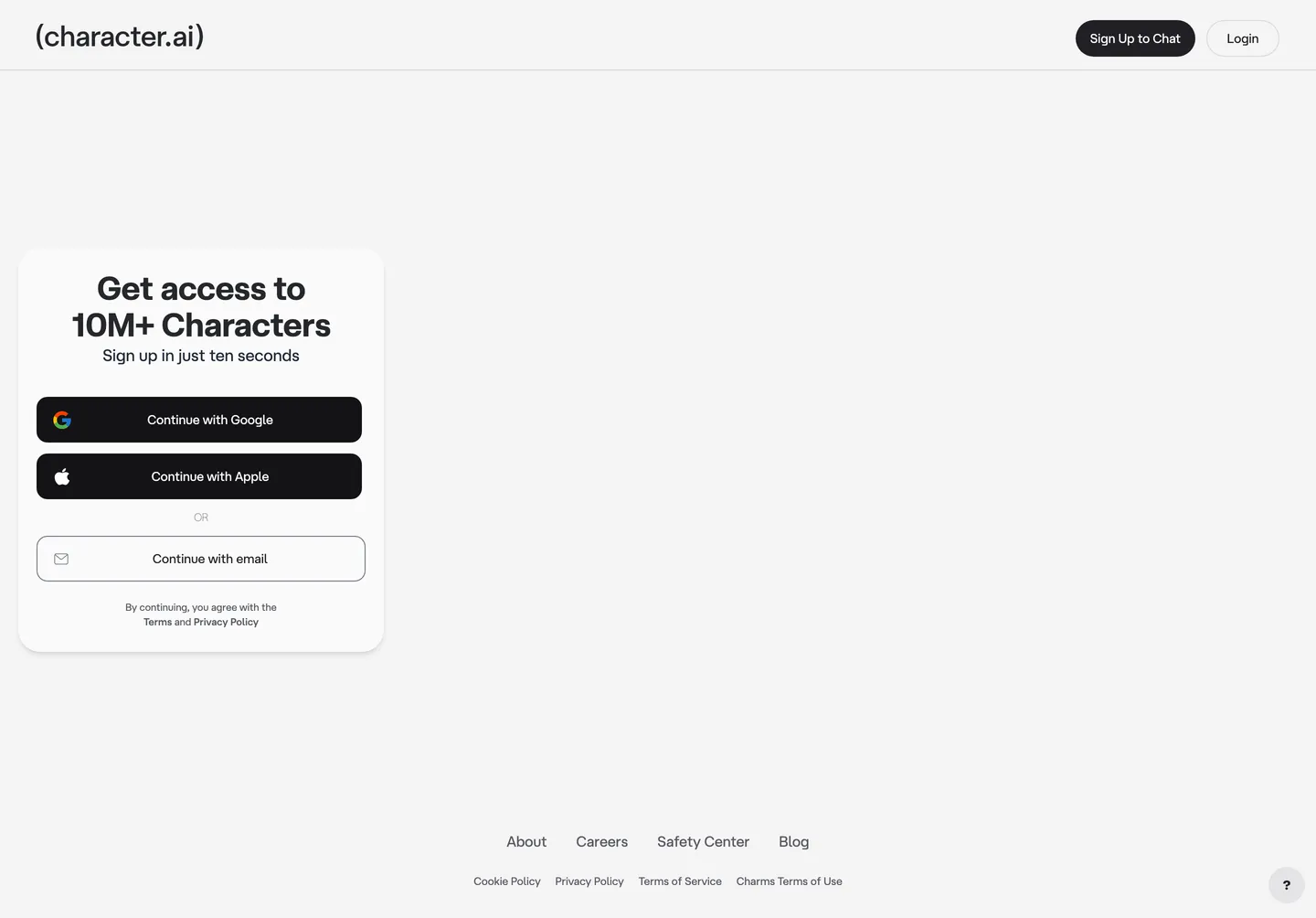
character.ai's landing surface is a sign-up gate, not a marketing brochure. The page is one card on a near-white canvas (#f4f4f5), holding a 36px atHauss h1 ("Get access to 10M+ Characters"), three auth buttons stacked vertically, and a footer link row. The wordmark sits top-left wrapped in literal parentheses — (character.ai) — a typographic move that treats the URL itself as the logo. There is no hero illustration, no testimonial band, no comparison table. The page exists to convert a click to an account.
This DESIGN.md packages the underlying token graph into one file. Inside: 30 colors tokens, 9 type styles built on atHauss with Inter as the declared --font-inter fallback, 6 corner radii anchored to a 30px pill, 8 spacing values on a 4px scale, and 18 components — every piece visible on the auth surface plus the latent product chrome the 379 :root variables expose. The colors include the brand-layer #1a5eff (declared as --primary-blue), the auth-CTA near-black #202024 (--button-background), and the cream canvas #f4f4f5 (--background) that distinguishes the site from a pure white default.
Download the file and feed it to Claude, Cursor, or GitHub Copilot. The agent reproduces character.ai's auth-card voice — pill buttons, near-black primaries, atHauss tightening at -0.72px, parentheses-wrapped wordmark — rather than a generic SaaS theme. Where most AI-chat consumer apps front-load a feature grid, this one front-loads a Google/Apple/email triplet on a single card. Studying the token graph reveals a NextUI-derived scale operating beneath a custom Tailwind layer.
What makes it distinct
5
- Pill CTA geometry30px radius on buttons paired with a 2rem (#1a5eff) root radius, the strongest formal signal in the chrome
- Wordmark-in-parenthesesliteral ( ) brackets wrap the (character.ai) lockup in atHauss, treating the URL itself as the logotype
- Near-black primary, blue in reservevisible CTAs run #202024 on white while #1a5eff lives in focus rings, link-text, and the primary-refresh token
- Two-typeface stackatHauss for product chrome, Inter declared as --font-inter for fallbacks, no third family across 7 weight tiers
- NextUI-derived token graph379 CSS variables on :root expose the underlying nextui scale (primary 212/100/47), surfaced through a Tailwind layer rather than hand-rolled
character.ai
Live at character.ai
A snapshot of the brand in production. Scroll the frame to see the whole page.
Colors
30 colors
character.ai's system anchors on #1a5eff (primary) as its primary color. Type is set in atHauss across 9 tokens from 11px to 36px, weights 400–600. Shape language is soft — components average 30px corner radius, with no sharp interactive edges.
Brand & Accent
Sparing, CTA-only voltage · 8
Surface
Page and card backgrounds · 5
Text
Headlines, body, captions · 8
Borders & Hairlines
Dividers, outlines, rules · 2
Semantic
Status, errors, success, links · 4
Other
Specialty colors · 3
Typography
9 type tokens
Set in atHauss across 9 tokens, from 11px to 36px, weights 400–600. Shown in its own stack: where the font isn't installed, the fallback the file names stands in.
- display-md36px · weight 600 · lh 1.11 · tracking -0.72pxThe quick brown fox jumps over the lazy dog
- title-lg18px · weight 400 · lh 1.5The quick brown fox jumps over the lazy dog
- title-md16px · weight 400 · lh 1.5The quick brown fox jumps over the lazy dog
- body-md14px · weight 400 · lh 1.43The quick brown fox jumps over the lazy dog
- button14px · weight 500 · lh 1.43The quick brown fox jumps over the lazy dog
- nav-link16px · weight 400 · lh 1.5The quick brown fox jumps over the lazy dog
- caption12px · weight 400 · lh 1.33The quick brown fox jumps over the lazy dog
- caption-label11px · weight 500 · lh 1.45The quick brown fox jumps over the lazy dog
- fine-print11px · weight 400 · lh 1.45The quick brown fox jumps over the lazy dog
Layout
Radii and spacing
6 corner radii and 8 spacing values. Shape language: soft.
Radii
- sm8px
- md12px
- lg14px
- pill30px
- card32px
- full9999px
Spacing
- xxs4px
- xs8px
- sm12px
- md16px
- base20px
- lg24px
- xl32px
- xxl40px
Components
18 components
Each rendered from its tokens (color, type, radius, padding) on character.ai's own canvas.
- Top Navtop-navTop Nav
- WordmarkwordmarkWordmark
- Nav Linknav-linkNav Link
- Button Primarybutton-primaryButton Primary
- Button Primary Hoverbutton-primary-hoverButton Primary Hover
- Button Secondarybutton-secondaryButton Secondary
- Button Auth Providerbutton-auth-providerButton Auth Provider
- Button Auth Emailbutton-auth-emailButton Auth Email
- Text Linktext-linkText Link
- Auth Cardauth-cardAuth Card
- Hero Headlinehero-headlineHero Headline
- Hero Subheadhero-subheadHero Subhead
- Divider Ordivider-orDivider Or
- Type here…text-inputText Input
- Fine Print Blockfine-print-blockFine Print Block
- Footer Link Rowfooter-link-rowFooter Link Row
- Help Fabhelp-fabHelp Fab
- Plus Badgeplus-badgePlus Badge
In use
The system, in use
character.ai's tokens on the kind of product it builds.
Build something people actually use.
A short paragraph of marketing copy that previews how the brand's display tier and body tier read together. Two sentences is usually enough.
FAQ
character.ai design system FAQ
Common questions about character.ai's tokens, components, and how to use this DESIGN.md in your project.
Read next
Related reading
Specs, directories, and component libraries that pair with this design system.
- Browse all design systemsThe full directory of DESIGN.md files on shadcn.io, with live mockups for each.shadcn.io
- character.ai — official siteThe chat-with-millions-of-AI-characters consumer app, gated behind the sign-up card this spec extracts.character.ai (opens in a new tab)
- The DESIGN.md specificationGoogle Labs' open spec for machine-readable design system files — the format this page is built on.github.com (opens in a new tab)
Use it
Use character.ai in your project
One machine-readable file. Drop it into Claude, Cursor, or any AI tool that reads DESIGN.md.
Download the DESIGN.md
One machine-readable file: every color, type, radius, spacing, and component token of character.ai.
Feed it to your AI tool
Drop it into Claude, Cursor, or GitHub Copilot. The agent writes React components and Tailwind classes that match character.ai's visual language.
Reference the tokens directly
Or paste the values into your Tailwind config, CSS variables, or component library: every color, size and radius is a quoted, ready-to-copy value.
Read the full DESIGN.md: overview, rationale, do’s and don’ts
Overview
character.ai's chrome is a sign-up wall dressed as a marketing page. The base canvas is a near-white {colors.canvas} (#f4f4f5), one shade off pure white — visible only because the 360px auth card sits on top in {colors.surface-card} (#fafafa) and the hairline contrast separates the two. The wordmark at top-left is literal: (character.ai) wrapped in parentheses, set in atHauss, treating the URL itself as the lockup. There is no hero illustration, no scrolling feature band, no testimonial column. The viewport ends where the footer link row ends.
Wordmark as parenthetical: where most AI-chat consumer brands run a sans-serif logotype with a custom glyph, character.ai sets the URL inside literal parentheses and calls it the logo. The choice mirrors a function call — (character.ai) reads as an invocation, fitting for a product that exposes character personas through a chat surface. The parentheses are not decorative; they are the brand mark.
Blue in reserve, near-black on the page: the underlying token graph declares --primary-blue as {colors.primary} (#1a5eff), but no visible CTA on the public surface renders in that blue. The Sign Up to Chat button, the Continue with Google button, and the Continue with Apple button all run {colors.cta} (#202024) — a near-black declared as --button-background. The blue surfaces only as {colors.link} (#138eed) on the Terms and Privacy fine-print and as the latent focus ring color. Where most consumer AI brands paint their primary CTA in their brand voltage, character.ai treats the brand color as a system token and leaves the auth surface in achromatic chrome.
Key Characteristics:
- Near-white canvas
{colors.canvas}(#f4f4f5) with{colors.ink}(#26272b) text — a one-step-off-white that registers visibly only against the auth card surface. - Pill geometry — every CTA uses
{rounded.pill}(30px) at 40-48px heights, reading as a full pill. The root--radiusis 32px, captured here as{rounded.card}. - atHauss display tightening — the 36px hero h1 carries -0.72px letter-spacing, the only non-default tracking value in the type system. Body and labels stay at zero tracking.
- Wordmark-as-parenthetical —
(character.ai)set in atHauss at 18px, weight 400, the URL itself functioning as logotype. - Near-black auth CTA
{colors.cta}(#202024) — the visible primary on the page, despite the underlying--primary-blue(#1a5eff) declared in the token graph. - Two-typeface declaration — atHauss as
--font-at-haussand Inter as--font-inter, with no third family across nine type roles spanning 11px through 36px. - NextUI scale beneath a Tailwind layer — 379 CSS variables on
:rootexpose--nextui-primary(212 100% 47%),--nextui-radius-large(14px),--nextui-spacing-unit-4(1rem), surfacing the underlying component library through custom tokens.
Colors
Brand & Accent
- Primary Blue (
{colors.primary}— #1a5eff): frequency 0 visible on the auth surface, but layer "brand" in the extraction, declared as--primary-blueand--primary-refresh. Reserved for focus rings, latent link states, and the primary-button slot when the auth wall opens into the product. - Primary Container (
{colors.primary-container}— #a0c9ff): frequency 0. Used as--primary-container-refreshand--link-light— the lightened brand tint for selected states and disabled link backgrounds. - Primary Deep (
{colors.primary-deep}— #0061a6): frequency 0. The darker container slot —--primary-containerproper in the Material-Design-derived ladder. - Primary On Container (
{colors.primary-on-container}— #001138): frequency 0. Text on a primary-container background. - Inverse Primary (
{colors.inverse-primary}— #d1dfff): frequency 0. The very-light blue tint used on inverse surfaces. - Link (
{colors.link}— #138eed): frequency 0 visible. Used on the Terms and Privacy Policy fine-print lines under the auth buttons. - Link Secondary (
{colors.link-secondary}— #1ba5fb): frequency 0. Declared as--plus-light-blue— used inside the c.ai+ subscription chrome.
CTA / Ink
- CTA Near-Black (
{colors.cta}— #202024): frequency 1 as background. Declared as--button-backgroundin the token graph. The visible primary on every auth CTA — Sign Up to Chat, Continue with Google, Continue with Apple. Not pure black, slightly warmed toward neutral 850. - CTA Text (
{colors.cta-text}— #fafafa): frequency 11 (7 text · 4 bg). Used as the text fill on every near-black CTA. Also functions as the card-fill surface tone. - Ink (
{colors.ink}— #26272b): frequency 39 (38 text · 1 bg). The dominant text color on the canvas — h1, navigation labels, the (character.ai) wordmark. - Ink Strong (
{colors.ink-strong}— #131316): frequency 3 (1 text · 2 bg). Reserved for emphasis text and a darker hover-state background on the near-black CTA. - Body (
{colors.body}— #1e1e1e): frequency 0 raw, declared as--on-surface-refresh. Used for the "Sign up in just ten seconds" sub-headline on the auth card. - Muted (
{colors.muted}— #585962): frequency 17 (all text). The workhorse secondary — nav links, footer links, fine-print body. Declared as--muted-foregroundand--on-surface-variant. - Muted Soft (
{colors.muted-soft}— #7c7c87): frequency 0 raw. Captions, placeholder text, tertiary labels. - Outline (
{colors.outline}— #a2a2ac): frequency 0 raw. Disabled icons, very-light borders.
Surface
- Canvas (
{colors.canvas}— #f4f4f5): frequency 0 raw, declared as--background. The default page floor — one step off pure white. - Surface Card (
{colors.surface-card}— #fafafa): frequency 11 (7 text · 4 bg). The auth card surface, the elevated-content fill. - Surface Cream (
{colors.surface-cream}— #ececee): frequency 0 raw. Declared as--surface-elevation-1and--brand-bg— slightly warmer than the canvas. - Surface Cream Strong (
{colors.surface-cream-strong}— #e5dfeb): frequency 0 raw. The brand off-white tone declared as--G175and--brand-off-white. - Hairline (
{colors.hairline}— #e2e8f0): frequency 61 (60 border · 1 bg). The dominant border tone on the entire page — auth card outline, input borders, footer divider. - Hairline Strong (
{colors.hairline-strong}— #d4d4da): frequency 2 (both border). A heavier hairline used on the email-button outline and elevated card borders. - Surface Elevation 3 (
{colors.surface-elevation-3}— #c8c8cf): frequency 0. The--accentand--surface-elevation-4slot — used inside product chrome behind the wall.
Accent / Semantic
- Accent Violet (
{colors.accent-violet}— #b460eb): frequency 0. Declared as--tertiary-refresh— used inside the labs-gradient (a three-stop pink-to-violet-to-soft-blue band defined on--labs-gradient). - Accent Violet Soft (
{colors.accent-violet-soft}— #e1bff7): frequency 0. Tertiary container fill. - Accent Green (
{colors.accent-green}— #1ebe53): frequency 0. Declared as--secondary-refreshand--secondary-green— used on connection status dots. - Accent Green Soft (
{colors.accent-green-soft}— #a8eac6): frequency 0. Secondary container fill. - Warning (
{colors.warning}— #ff9800): frequency 0. Standard amber warning fill. - Warning Soft (
{colors.warning-soft}— #ffe991): frequency 0. Warning container fill. - Error (
{colors.error}— #cc3434): frequency 0. Validation error fill, declared as--error. - Error Soft (
{colors.error-soft}— #fba7b9): frequency 0. Error container fill.
Typography
Font Family
The system runs atHauss as the single display + body face, declared as --font-at-hauss with a fallback chain through ui-sans-serif, system-ui, sans-serif. Inter is declared in parallel as --font-inter for secondary roles and as the closest open-source substitute. JetBrains Mono or another monospace face would be needed for code blocks but does not appear on the auth surface.
The display/body split is collapsed:
- atHauss weight 600 with -0.72px tracking → h1 (36px) — the only tightened tier
- atHauss weight 400-500 → body, navigation, button labels, captions
- All other type lands at zero letter-spacing
Hierarchy
| Token | Size | Weight | Line Height | Letter Spacing | Use |
|---|---|---|---|---|---|
{typography.display-md} | 36px | 600 | 1.11 | -0.72px | "Get access to 10M+ Characters" — the only display tier on the public surface |
{typography.title-lg} | 18px | 400 | 1.5 | 0 | Sub-headline ("Sign up in just ten seconds"), wordmark |
{typography.title-md} | 16px | 400 | 1.5 | 0 | Nav link text, card-title labels |
{typography.body-md} | 14px | 400 | 1.43 | 0 | Default running-text, auth button labels |
{typography.button} | 14px | 500 | 1.43 | 0 | Standard button labels — atHauss medium |
{typography.nav-link} | 16px | 400 | 1.5 | 0 | Top-nav menu items |
{typography.caption} | 12px | 400 | 1.33 | 0 | Footer secondary links |
{typography.caption-label} | 11px | 500 | 1.45 | 0 | "OR" divider, badge labels |
{typography.fine-print} | 11px | 400 | 1.45 | 0 | "By continuing, you agree" footer text |
Principles
The 36px h1 is the only typography role with non-zero letter-spacing in the entire system. The -0.72px tightening reads as a -0.02em em-relative ratio — character.ai's choice to round to exact pixels rather than ems. Below 18px, every label and link stays at zero tracking and 400 or 500 weight. There is no 700-weight tier on the public surface — atHauss carries headings at 600 only.
Note on Font Substitutes
If atHauss is unavailable, Inter at the same weights (400 body, 500 labels, 600 display) is the closest substitute since it is already declared as --font-inter in the system. Söhne or Haas Grot are paid alternatives. Helvetica or Arial would break the slightly humanist proportions of atHauss.
Layout
Spacing System
- Base unit: 4px.
- Tokens:
{spacing.xxs}4px ·{spacing.xs}8px ·{spacing.sm}12px ·{spacing.md}16px ·{spacing.base}20px ·{spacing.lg}24px ·{spacing.xl}32px ·{spacing.xxl}40px. - Most frequent values from extraction: 8px appears 12 times, "0px 16px" (button horizontal padding) appears 5 times, "8px 16px" (nav-link padding) appears 4 times.
- Auth card internal padding:
{spacing.xl}(32px) — the dominant card padding. - Button height tier: 40px for chrome CTAs (Sign Up to Chat, Login), 48px for auth-provider buttons (Continue with Google, Apple, email).
Grid & Container
- Max content width: the auth card caps at ~360px and sits centered on a 1440px canvas.
- Single-card layout: no grid — the page is one column with one card.
- Top-nav layout: wordmark left, two pill buttons (Sign Up to Chat, Login) right, no center navigation.
- Footer link row: two rows of inline-flex links centered at the bottom of the viewport.
Whitespace Philosophy
The auth card occupies one-quarter of the viewport, surrounded by canvas on every side. There is no second content band, so whitespace is the page's primary compositional element. The vertical gap between the wordmark and the auth card is roughly 240px of pure canvas — a deliberate emptiness that focuses every visual moment on the sign-up triplet.
Elevation & Depth
| Level | Treatment | Use |
|---|---|---|
| Flat | No shadow, no border | Body sections, footer link row |
| Soft hairline | 1px {colors.hairline} border | Auth card outline, button outlines |
| Heavier hairline | 1px {colors.hairline-strong} border | Email button, text input outline |
| Card surface | {colors.surface-card} background — no shadow | The auth card itself |
| Latent shadow | --toastify-toast-shadow: 0px 4px 12px rgba(0,0,0,0.1) | Reserved for toast notifications, not visible on the auth surface |
The elevation philosophy is hairline-first, shadow-rare. The auth card relies on a 1px {colors.hairline} border plus the {colors.surface-card} fill against the {colors.canvas} floor — the one-step contrast is the depth signal. Drop shadows exist in the token graph (--toastify-toast-shadow, --nextui-box-shadow-small/medium/large) but never render on the public surface.
Shapes
Border Radius Scale
| Token | Value | Use |
|---|---|---|
{rounded.sm} | 8px | --nextui-radius-small — reserved for small dropdowns |
{rounded.md} | 12px | --nextui-radius-medium — reserved for medium cards inside the product |
{rounded.lg} | 14px | --nextui-radius-large — reserved for larger card variants |
{rounded.pill} | 30px | Every visible CTA — Sign Up to Chat, Login, Continue buttons, text inputs |
{rounded.card} | 32px | The auth card outer radius (matches --radius: 2rem) |
{rounded.full} | 9999px | The help FAB at bottom-right and inline avatar tokens |
Iconography
The auth surface carries five icons total: the Google G in its colored form, the Apple wordmark in white, an envelope outline on the email button, and a "?" inside the help FAB at bottom-right. No other iconography appears on the public surface. The product side declares --swiper-navigation-size: 44px for carousel arrows, but those live behind the wall.
Components
Top Navigation
top-nav — Cream-canvas nav bar pinned to the top of the viewport, 72px tall, {colors.canvas} background. Carries the parentheses-wrapped wordmark at left, two pill CTAs ({component.button-primary} and {component.button-secondary}) at right. No center menu items, no logo glyph.
wordmark — The (character.ai) lockup, set in {typography.title-lg} (atHauss 18px / 400), {colors.ink-strong} text. The parentheses are part of the wordmark, not punctuation.
nav-link — Inline nav text link in {colors.muted} text. Padding 8px 16px. Used in the footer link row (About, Careers, Safety Center, Blog, Cookie Policy, Privacy Policy, Terms of Service, Charms Terms of Use).
Buttons
button-primary — The signature Sign Up to Chat CTA. Background {colors.cta} (#202024), text {colors.cta-text} (#fafafa), type {typography.button} (atHauss 14px / 500), padding 0px 16px, height 40px, rounded {rounded.pill} (30px).
button-primary-hover — Press state. Background darkens to {colors.ink-strong} (#131316). Radius unchanged.
button-secondary — The Login pill. Background {colors.surface-card} with a 1px {colors.hairline} border, text {colors.ink}, otherwise identical geometry to primary.
button-auth-provider — Continue with Google, Continue with Apple. Same near-black fill as {component.button-primary} but 48px tall and full-card-width — the auth-provider tier overrides the standard 40px chrome height.
button-auth-email — Continue with email. Inverts to a {colors.surface-card} fill with a 1px {colors.hairline-strong} border, text {colors.ink}. Reads as the secondary auth path beneath the OAuth duo.
text-link — Inline links in {colors.link} (#138eed). Used on the "Terms" and "Privacy Policy" anchors inside the fine-print block.
Cards & Containers
auth-card — The 360px-wide sign-up card. Background {colors.surface-card} (#fafafa), {colors.hairline} 1px outline, rounded {rounded.card} (32px), internal padding {spacing.xl} (32px). Holds the hero headline, sub-headline, three stacked auth buttons, the OR divider, and the fine-print block.
hero-headline — The "Get access to 10M+ Characters" h1. Type {typography.display-md} (atHauss 36px / 600 / -0.72px), color {colors.ink}. The card's only large-type element.
hero-subhead — "Sign up in just ten seconds" paragraph. Type {typography.title-lg} (atHauss 18px / 400), color {colors.body}. Sits directly under the h1 with no vertical divider.
Inputs & Forms
text-input — Pill-shaped text input. Background {colors.surface-card}, text {colors.ink}, type {typography.body-md}, rounded {rounded.pill} (30px), padding 0px 20px, height 48px, 1px {colors.hairline-strong} border. Matches the email-button geometry exactly.
Divider / Fine-Print
divider-or — The "OR" splitter between OAuth buttons and the email button. Type {typography.caption-label} (atHauss 11px / 500), color {colors.muted}, no background. The text floats centered with no horizontal rule.
fine-print-block — "By continuing, you agree with the Terms and Privacy Policy". Type {typography.fine-print} (atHauss 11px / 400), color {colors.muted}. Links inside use {component.text-link}.
Footer / Misc
footer-link-row — Inline-flex row of footer text links, centered horizontally at the bottom of the viewport. Type {typography.body-md}, color {colors.muted}, padding 16px 24px.
help-fab — A 32px circular help button anchored at bottom-right, holding a "?" glyph. Background {colors.surface-cream} (#ececee), text {colors.ink}. Rounded {rounded.full}.
plus-badge — The c.ai+ subscription marker. Background {colors.link-secondary} (#1ba5fb — --plus-light-blue), text {colors.cta-text}, rounded {rounded.pill}, padding 2px 10px. Does not appear on the auth surface but lives in the token graph behind the wall.
Do's and Don'ts
Do
- Anchor every CTA on the near-black
{colors.cta}(#202024) — declared--button-background— rather than on the brand-layer{colors.primary}(#1a5eff). The blue stays in reserve for focus rings and link text. - Use
{rounded.pill}(30px) on every button at 40-48px height. Do not substituterounded-mdorrounded-lgfrom a default Tailwind theme. - Wrap the wordmark in literal parentheses:
(character.ai). The brackets are part of the lockup, not punctuation around it. - Apply -0.72px letter-spacing on the 36px h1 only. Every smaller tier stays at zero tracking.
- Pair the 360px auth card with empty canvas on every side — the whitespace is the composition.
Don't
- Don't paint the Sign Up to Chat button in
{colors.primary}(#1a5eff). The brand color is declared but never visible on a CTA — fill it with{colors.cta}instead. - Don't use
{rounded.card}(32px) on small buttons or chips. The 32px radius is reserved for the auth card outer container; buttons under 56px tall use{rounded.pill}(30px) instead. - Don't apply -0.72px tracking to body or label tiers. Tightening below 18px crushes atHauss into illegibility.
- Don't substitute Helvetica or Arial for atHauss. Inter is the declared
--font-interfallback — use that, not a metric-incompatible neo-grotesque. - Don't add a 700-weight tier. atHauss tops out at 600 on the public surface; jumping to 700 reads as off-brand bombast.
- Don't fill the auth card with a hero illustration, testimonial column, or feature grid. The card holds exactly six elements: h1, sub-head, three buttons, fine-print. Adding a sixth row breaks the composition.
- Don't apply a drop shadow under the auth card. Elevation is signaled by the 1px
{colors.hairline}outline against{colors.canvas}— adding a shadow reads as Bootstrap default.
Responsive Behavior
Breakpoints
| Name | Width | Key Changes |
|---|---|---|
| Mobile | < 768px | Top nav stays — Sign Up + Login pills shrink to icon-only; auth card scales to ~92% viewport width; h1 drops to 28px; footer link row stacks into two rows |
| Tablet | 768–1024px | Top-nav pills retain text; auth card stays at 360px centered; footer remains single row |
| Desktop | 1024–1440px | Full top-nav pills; auth card at 360px; footer link row inline-flex centered |
| Wide | > 1440px | Same as desktop with more outer canvas; auth card never exceeds 360px |
Touch Targets
{component.button-primary}at 40px height — at the WCAG 44px floor for primary actions.{component.button-auth-provider}at 48px height — comfortably above the floor for the conversion-critical OAuth row.{component.text-input}at 48px height.{component.help-fab}at 32px diameter — slightly under WCAG 44 but visually centered.
Known Gaps
- atHauss is a licensed character.ai typeface with no public web font. Inter (declared as
--font-inter) is the closest substitute and is already in the fallback stack. - The 379
:rootCSS variables expose latent product-side tokens —--feed-item-width: 140px,--plus-gradient(a four-stop cyan-to-yellow-to-pink-to-neutral band),--labs-gradient(a three-stop pink-to-violet-to-soft-blue band), swiper carousel theming — that never render on the public auth surface. They are documented as token names but not extracted as components. - Dark-mode tokens exist in the graph (
--brand-bg-inverted,--inverse-surface-refresh, the--G900near-black slot) but the public marketing surface renders light-only. - Product-side components — chat bubbles, message-action menus, character cards in the discovery feed, the c.ai+ paywall sheet — live entirely behind the sign-up wall and were not captured.
- Animation and transition timings (auth button hover, modal entry, toast slide-in via the declared toastify variables) are out of scope.
- Form validation states beyond the default input are not extracted — error and success states would require triggering an auth failure to confirm.
AI & LLM Platforms
More systems like this
More DESIGN.md files in AI & LLM Platforms.
Pricing
Build it with Pro
The DESIGN.md files are free. Pro adds 6,000+ blocks, premium templates and the MCP server, so your AI editor builds in your system for you.
4.9/5 out of 5 · 150+ reviewsfrom 150+ founders and developers.
Billing
Billed once a year in USD. Cancel anytime.
- How many people can use the license.
- Client work, SaaS products and anything you charge for.
- Production-ready React sections: hero, pricing, features, dashboards and more.
- Complete multi-page sites you can ship as they are.
- React icons from every major library, installable with one command.
- Presets that restyle every block, in light and dark.
- Lets your AI editor search, preview and install blocks for you.
- Priority requests are answered first.
Individual
For personal projects & open source
$32instead of $49/mo
$389 billed yearly
- Seats: 1 seat
- Commercial use: Personal & open source only
- Pro blocks: 6,000+ blocks
- Templates: All 14 templates
- React icons: 294k+ icons
- Themes: All 59 themes
- MCP server: Basic usage
- Support: Standard
Team
Most popularFor freelancers, agencies & startups
$66instead of $99/mo
$789 billed yearly · ≈ $13/dev/mo
- Seats: Up to 5 seats
- Commercial use: Included
- Pro blocks: 6,000+ blocks
- Templates: All 14 templates
- React icons: 294k+ icons
- Themes: All 59 themes
- MCP server: High usage
- Support: Priority
Organization
For companies with larger teams
$132instead of $199/mo
$1,589 billed yearly
- Seats: Unlimited seats
- Commercial use: Included
- Pro blocks: 6,000+ blocks
- Templates: All 14 templates
- React icons: 294k+ icons
- Themes: All 59 themes
- MCP server: Unlimited usage
- Support: Priority
Billed once a year in USD. Cancel anytime.
Individual
For personal projects & open source
$32instead of $49/mo
$389 billed yearly
- How many people can use the license.Seats: 1 seat
- Client work, SaaS products and anything you charge for.Commercial use: Personal & open source only
- Production-ready React sections: hero, pricing, features, dashboards and more.Pro blocks: 6,000+ blocks
- Complete multi-page sites you can ship as they are.Templates: All 14 templates
- React icons from every major library, installable with one command.React icons: 294k+ icons
- Presets that restyle every block, in light and dark.Themes: All 59 themes
- Lets your AI editor search, preview and install blocks for you.MCP server: Basic usage
- Priority requests are answered first.Support: Standard
Team
Most popularFor freelancers, agencies & startups
$66instead of $99/mo
$789 billed yearly · ≈ $13/dev/mo
Everything in Individual, plus
- How many people can use the license.Seats: Up to 5 seats
- Client work, SaaS products and anything you charge for.Commercial use: Included
- Lets your AI editor search, preview and install blocks for you.MCP server: High usage
- Priority requests are answered first.Support: Priority
Organization
For companies with larger teams
$132instead of $199/mo
$1,589 billed yearly
Everything in Team, plus
- How many people can use the license.Seats: Unlimited seats
- Lets your AI editor search, preview and install blocks for you.MCP server: Unlimited usage
- Secure checkout via Stripe
- Code lives in your repo
- Keep what you've shipped if you cancel
- License terms
Your system, built for you
Every block, template and icon, installed by your AI agent in your design system. The DESIGN.md files stay free.